The primary focus of a user interface design is anticipating what a user might need to do to make their experience as intuitive as possible. How do UI designers accomplish this goal with so many apps, websites and software? One way is through the 10 user interface (UI) guidelines.
User interface design is all about usability, utility and desirability. By following these ten broad rules of thumb, you’ll have a strong foundation for achieving your UI goals. Read on to learn the guidelines, dive into simple explanations of each and see examples of real-world implementations.
What are the 10 user interface guidelines?
These are 10 rules of thumb for every UI designer. The conventions, also called heuristics, were developed by Jakob Nielsen and Rolf Molich. Neilsen, a partner at Nielsen Norman Group, is a renowned web usability consultant. Molich is also a prominent usability expert. They combined their experience to create UI guidelines in the 1990s. Most recently, the guidelines were updated in November 2020.
1. Visibility of system status
Users want to know what is going on throughout their experience with your product. Making the system status visible helps them understand the outcome of their prior interactions and decide the next steps intuitively – without having to think too hard about it.
Provide feedback to users immediately through pop-up windows or status bars. Creating a product with routine, predictable interactions builds trust with the user. Predictable experience helps them trust both your product and your brand.
Example: Google Maps status bar and GPS arrow
Google Maps uses an arrow, or a car icon, to indicate where the user is in their journey. Additionally, they’ve placed a status bar at the top of the screen that displays their next step and how far to go until their next step. They also went above and beyond to include a trip time indication at the bottom of the screen. Each of these components changes based on the users’ actions – whether they’re following the route or not.
2. Match between the system with the real world
While you might use it every day in the office with your team, users aren’t going to understand the jargon. It’s essential to speak the users’ language. That includes the words you choose but also phrases and concepts.
When it comes to UI design, keep it simple. Put information in natural and logical order. Terms, icons and images should correspond to predictable outcomes. Icons like a magnifying glass or arrow are clear to your user. This practice is also called “natural mapping”.
Adhering to this practice makes learning and remembering how your interface works much easier for a user. It reduces a user’s cognitive load – the amount of working memory resources used for a task. Lower cognitive loads make users’ experiences with your product feel intuitive.
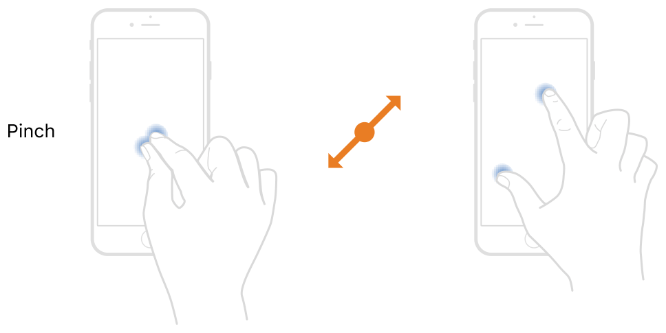
Example: Pinch-to-zoom
Pinch-to-zoom was invented in 1983 but it wasn’t used in consumer devices until 2005 with JazzMutant’s product, the Lemur. The Lemur was a multi-touch device that served as a controller for musical devices like synthesisers and mixing consoles. Now, you’ll see pinch-to-zoom on nearly every touch screen device worldwide.
3. User control and freedom
Users need clearly marked exits from accidental or unwanted actions. This saves them from having to redo an entire process. “Emergency exits” create a feeling of freedom for users. The exits need to be clearly labelled and discoverable too.
Clearly defined exits and the feeling of freedom they create for a user also fosters trust in your product and brand. They reduce frustration and negative feelings and help make your product more user-friendly.
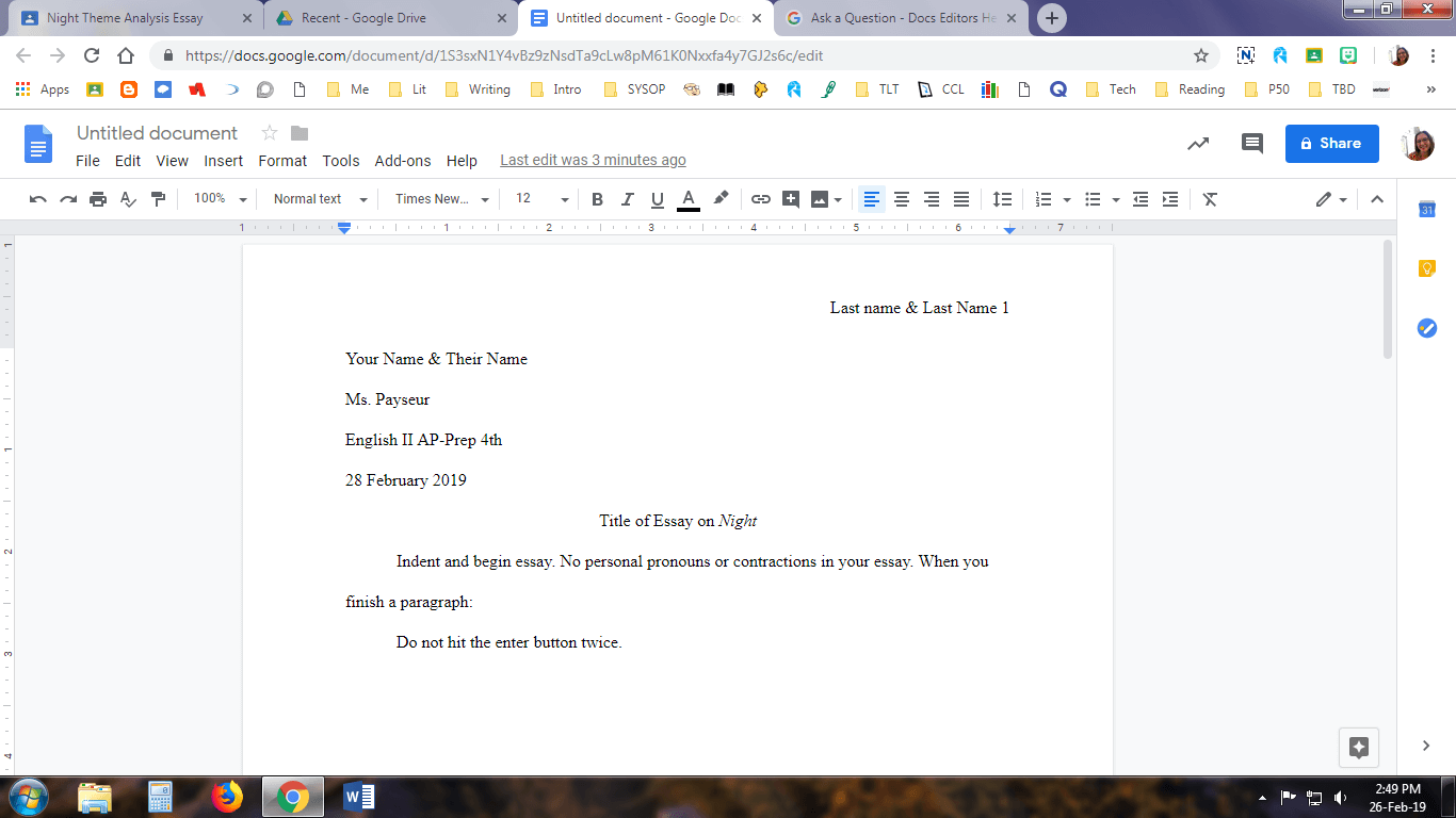
Example: Undo and redo in Google Docs
In most word processors, Google Docs included, you’ll find “undo” and “redo” functions in the toolbar. You might also recognise the common keyboard functions control or command + Z or control and command + Y. This allows users to quickly and easily fix a mistake without experiencing too much frustration.
4. Consistency and standards
Users interact with multiple apps every day. Typically, it’s best to assume they interact with your app the least and that your users’ expectations for your app will be based on the apps they use the most.
Predictability is important for trust. By maintaining consistency, you’ll avoid making users learn something new. Sticking to industry standards reduces cognitive load and allows users to feel like your app is intuitive.
There are two types of usability; internal and external. Internal usability means that all of your wording, icons, fonts, layouts and actions are uniform throughout your user interface. External usability refers to adhering to other apps’ industry standards for those same components.
Example: Search magnifying glass
A magnifying glass always means “search.” The search function, indicated by the magnifying glass, is usually located at the top of the page on desktop and bottom of the screen on mobile. They are easy to find in these areas and easy to navigate quickly.
5. Error prevention
One piece of advice that UI designers hear often is to have a great error message and hope that no one ever sees it. There are two types of errors.
- Slips: errors that happen unconsciously – usually caused by inattention
- Mistakes: errors consciously made – usually a result of cognitive load or a mismatch between the user’s mental model and the design
UI designers should prevent errors before they come up for the user. That means finding and eliminating error-prone functions during user testing before launch. If it’s necessary to keep a function that tends to be error-prone, present the user with a confirmation before they can commit the action to avoid mistakes and frustration.
To design efficiently, focus on preventing high-cost errors first. Then, make a plan to tackle the more minor frustrations. UI designers can use practical constraints, change default settings or provide confirmation options to prevent slips. They can minimise mistakes by making the cognitive load lighter.
Example: Shake to undo confirmation box on iPhone’s latest OS
Apple introduced shake-to-undo with iOS 13 back in 2019. This feature allows users to completely clear a text or note they’ve typed by simply shaking their phone. The feature, though, is hidden. Many users shook their phones only to find their text mistakenly missing. Seeing users’ frustrations, Apple quickly introduced a confirmation option.
6. Recognition rather than recall
Humans’ short-term memory only lasts 20-30 seconds. It’s much easier for a human to recognise the capital city of a country than it is to remember it. On top of that, they’re using many other interfaces in addition to the one you’ll design. It is unreasonable to expect them to remember where key functions are located.
As a UI designer, you should ensure that users don’t need to remember or transfer information from one part of your interface to another. All key elements, actions and options should be visible or easily retrievable throughout the app. They should also be located in the same place.
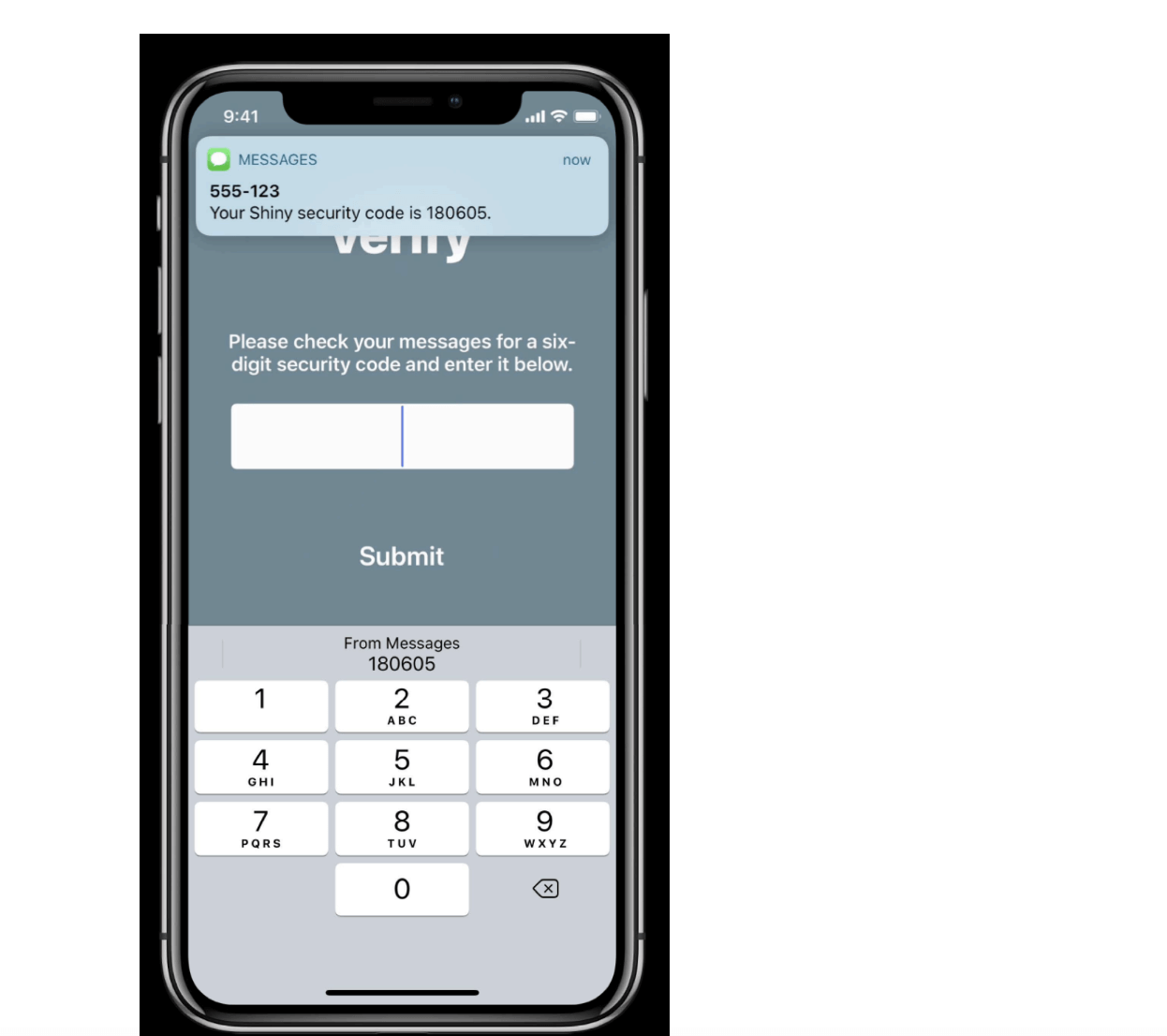
Example: Security code autofill
iOS 13 also introduced a security code autofill function. When a user requests a security code from an app, the keyboard will grab the code from their text and suggest it above the user’s keyboard. No short-term memory is required anymore.
7. Flexibility and efficiency of use
While consistency and uniformity are important to build trust and intuition with users, flexibility can be crucial too. Making your interface efficient by providing shortcuts and customisations can build a different kind of trust with your user.
This can look like a customisable dashboard, keyboard shortcuts or touch gestures that speed up common functions. Alternatively, like most social media platforms, you could offer your user content personalisation. This might be a way to tailor their feed like Pinterest or a hidden algorithm like Instagram or TikTok.
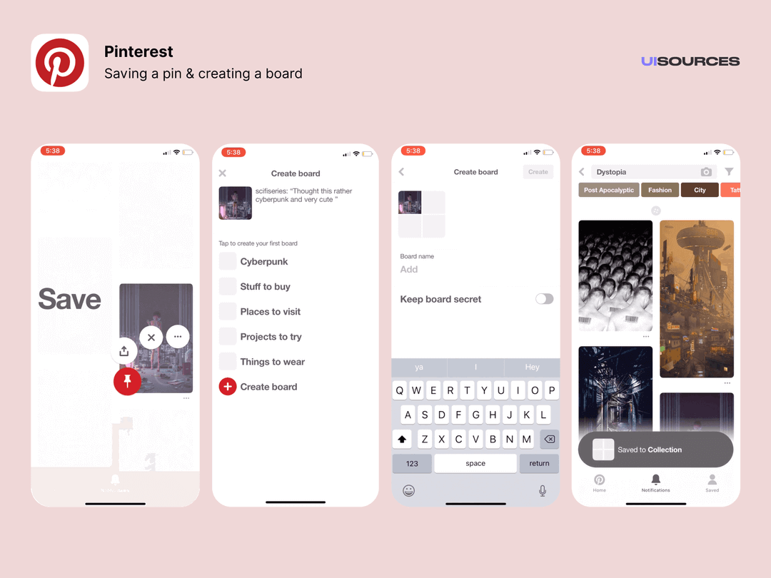
Example: Pinterest’s press and hold shortcuts on mobile
Pinterest offers a lot of customisation and efficiency functions for its users. From customisable boards, board segments, and feed tuning to touch gestures and board suggestions. By far, the feature that maximises efficiency the most are touch gestures.
They use industry conventions for the icons of their buttons on a simple pie menu. Pie menus, while not often used, are proven to be the most efficient type of menus for user experience.
8. Aesthetic and minimalist design
Minimalist designs dominate user interfaces for a reason. Streamlining an interface to only include relevant information is vital. Designs shouldn’t feature something that’s rarely needed. Keeping unimportant components in a design reduces the relative visibility and importance of key elements.
This doesn’t mean your design has to be flat design. But it does mean that you should focus your content and visual design on the essentials. Above all else, your interface should support the users’ primary goals.
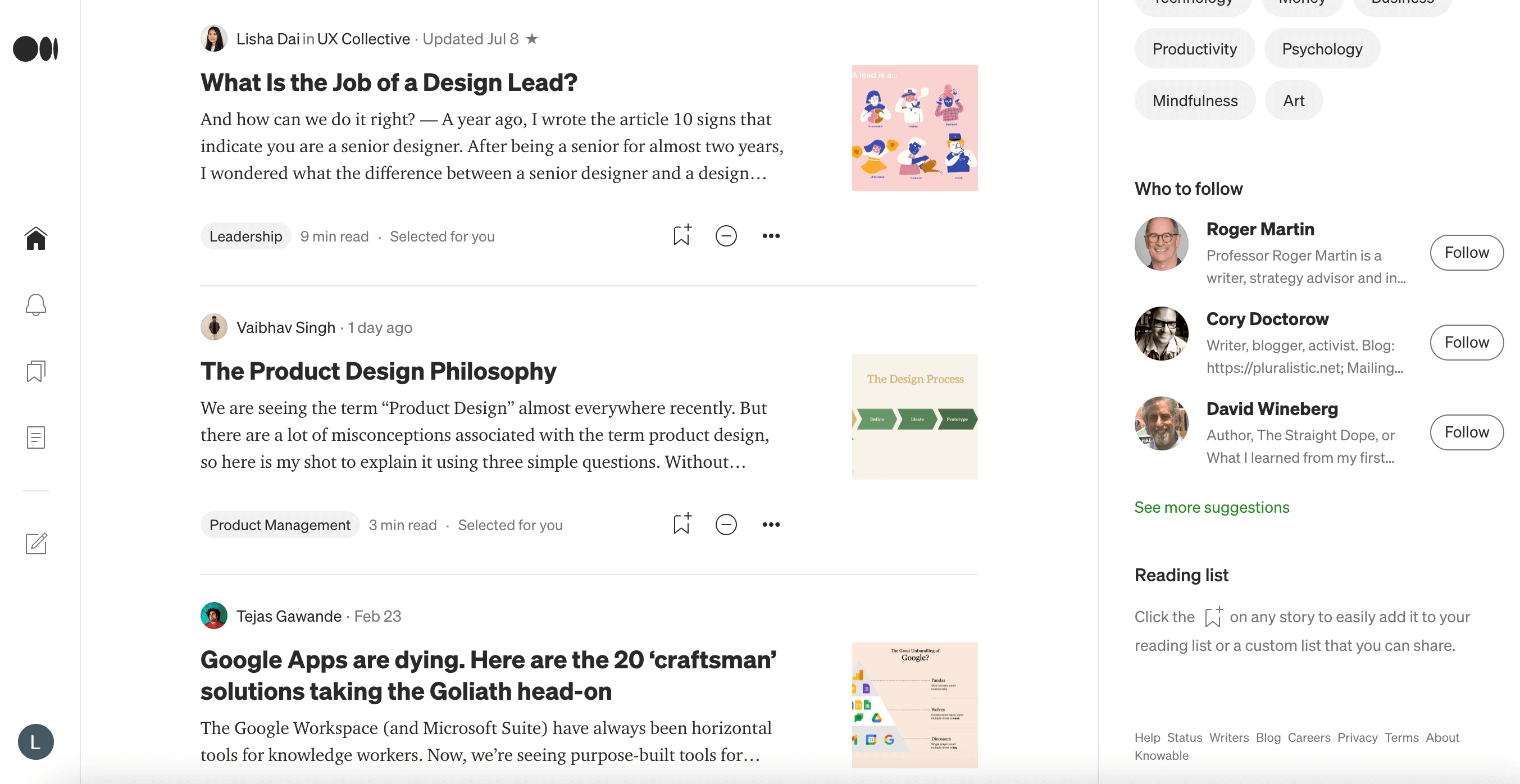
Example: Medium
Medium uses a slick black-and-white interface. Buttons are clearly labelled in grey or outlined. Their site is easy to navigate and includes very few menu options.
9. Help users recognise, diagnose and recover from errors
Users want autonomy and control. They don’t want to reach out to your company when they encounter an error and you don’t want that either. To avoid this, it’s essential to help users recognise, diagnose and recover from mistakes independently.
Clear, plain language error messages that offer a constructive solution can accomplish this. Avoid using error codes. Include a graphic or visual representation of the error for even faster recognition.
Example: Spotify’s failed payment notification
Spotify does a great job with its error message. In plain language, they offer clear next steps to resolve the problem and it’s highlighted in bright red so that users can’t miss it. They even provide an “emergency exit” in the top right corner so that users can opt to perform this task later, as it’s not essential at the moment to use the app’s free version.
10. Help and documentation
Strong error messages are not enough to completely cover all of your bases. Providing help and documentation that is searchable and easy to find is crucial for the long term success of any piece of software or hardware.
This should be kept concise. The next steps to solve a problem or learn a function should be listed in a concrete way. Where possible, it’s best to present the documentation to the user at the moment that they actually need it.
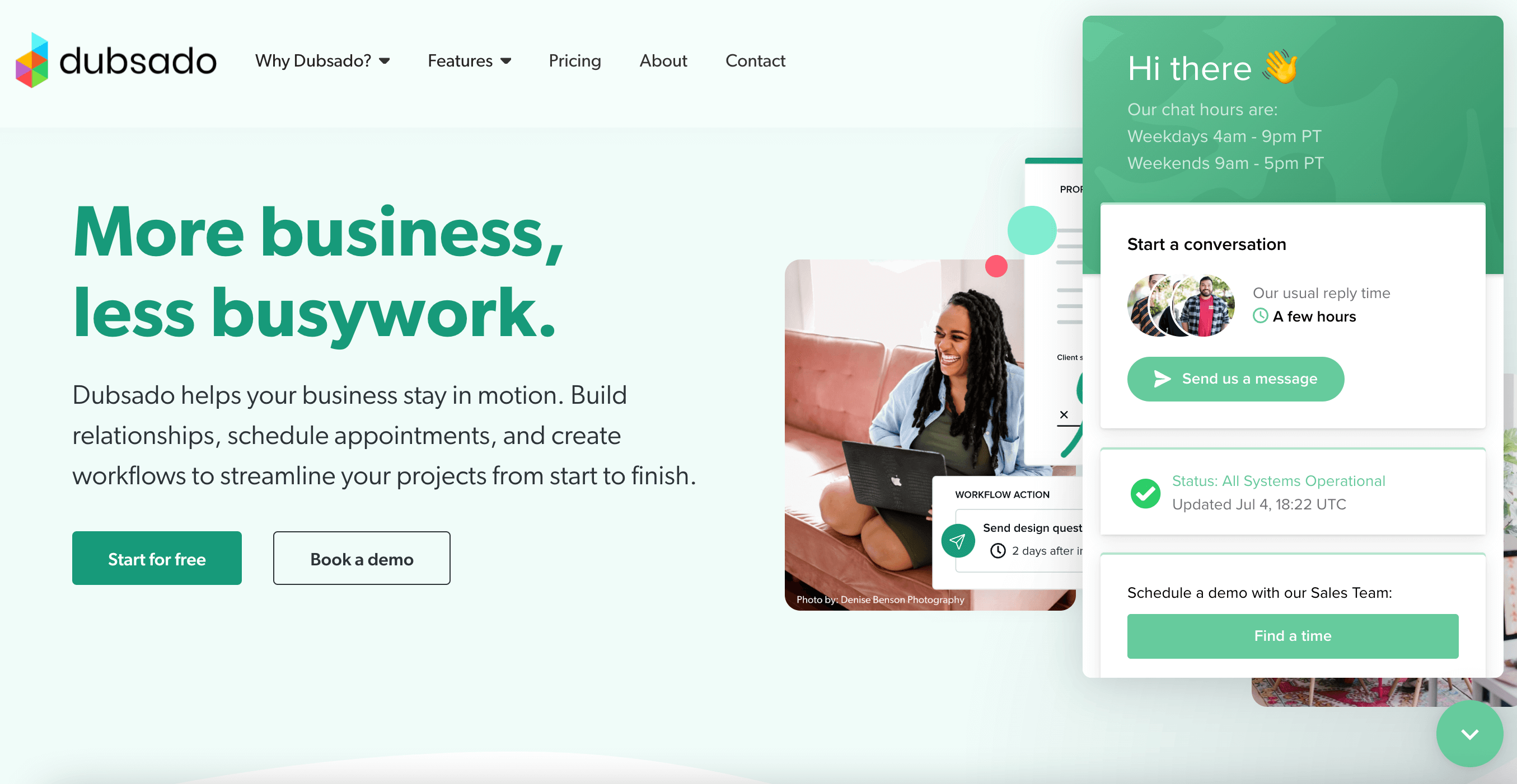
Example: Chatbots
Chatbots are a prime example of offering help at the moment. Rather than exploring the website for help, Dubsado offers potential customers a chatbot that helps them search documentation quickly and easily. If you can’t find what you’re looking for through the chatbot, they’ll email you and you can continue your conversation with a real person or schedule a live one-on-one demo.
Why are the 10 guidelines for user interface design so important?
Following these rules of thumb, or heuristics, will give you a foundation for good UI design. UI leaders developed these ten proven principles over decades to help make user experiences better across the board. Now, they aren’t the law. You don’t have to follow them all the time. However, starting your design with these ideas in mind is beneficial for efficiency.

