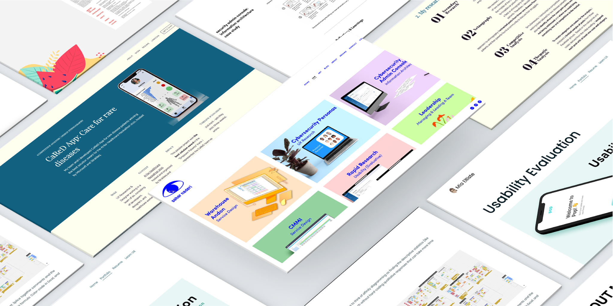
If you’re thinking about taking a UX course, you might be wondering: What will my portfolio look like at the end of it?
Maybe you’re questioning if it’s even possible to create a professional portfolio without any industry experience.
The answer is yes – but don’t just take our word for it. Here’s a selection of some of the best UX design portfolios, all created by students of the UX Design Institute. For each example, you’ll find a key takeaway that you can apply to your own portfolio.
Prepare to be inspired!
1. Anca Dobrea
Anca Dobrea is a digital marketer turned UX designer. She obtained her UX diploma in 2020 and then went on to land her first design role at Space 48, an award-winning ecommerce agency.
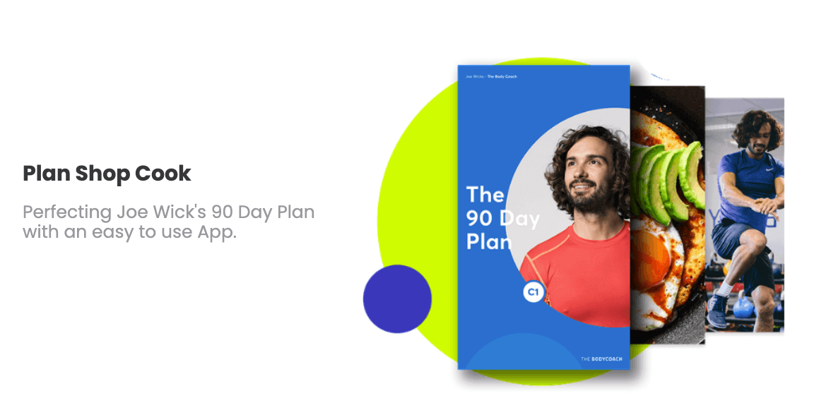
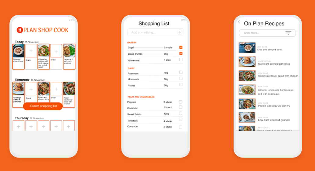
As a newcomer to the field, Anca built her UX portfolio without any on-the-job experience. In addition to the Fly UX project she completed as part of her studies, Anca also came up with her own unique project: the Plan Shop Cook app.
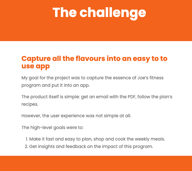
In her Plan Shop Cook case study, Anca turns a real user problem she was facing into a fully-fledged UX project.
She explains how as she was following the Joe Wicks Body Coach programme during lockdown, she encountered a major flaw. All the workouts and recipes were delivered in PDF format.
“It took me over four hours every week to plan and shop the recipes. It’s exhausting to copy and paste the ingredients, multiply it by how many portions you plan to cook and also for how many people. An app urgently needed to happen.”
Like a true UX professional, Anca set out to solve her own user problem. She defined the challenge, conducted real user research, devised a design strategy and prototyped screens for her app.
In doing so, Anca built a unique case study for her UX portfolio and proved that she’s a proactive designer with an eye for problem-solving. Impressive!
Key takeaway from Anca’s UX portfolio:
Don’t wait for on-the-job experience to add to your UX portfolio. Follow in Anca’s footsteps and create your own projects based on real user problems. Approach it like any other project: work through the entire UX process, document your thoughts and learnings and present your results.
2. Jack Thorpe
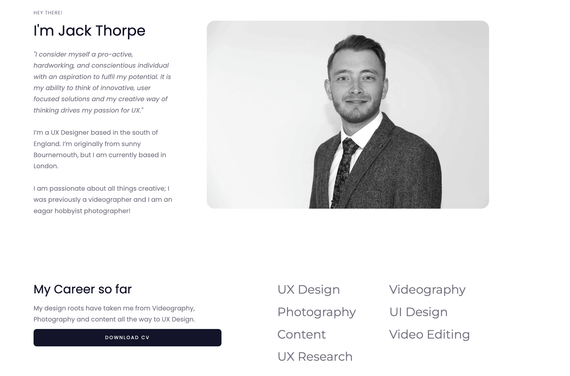
Jack Thorpe is a London-based UX designer with a background in psychology. Jack is also a skilled videographer and hobbyist photographer and his knack for creativity and mastery of both good UX and UI are evident throughout his portfolio.
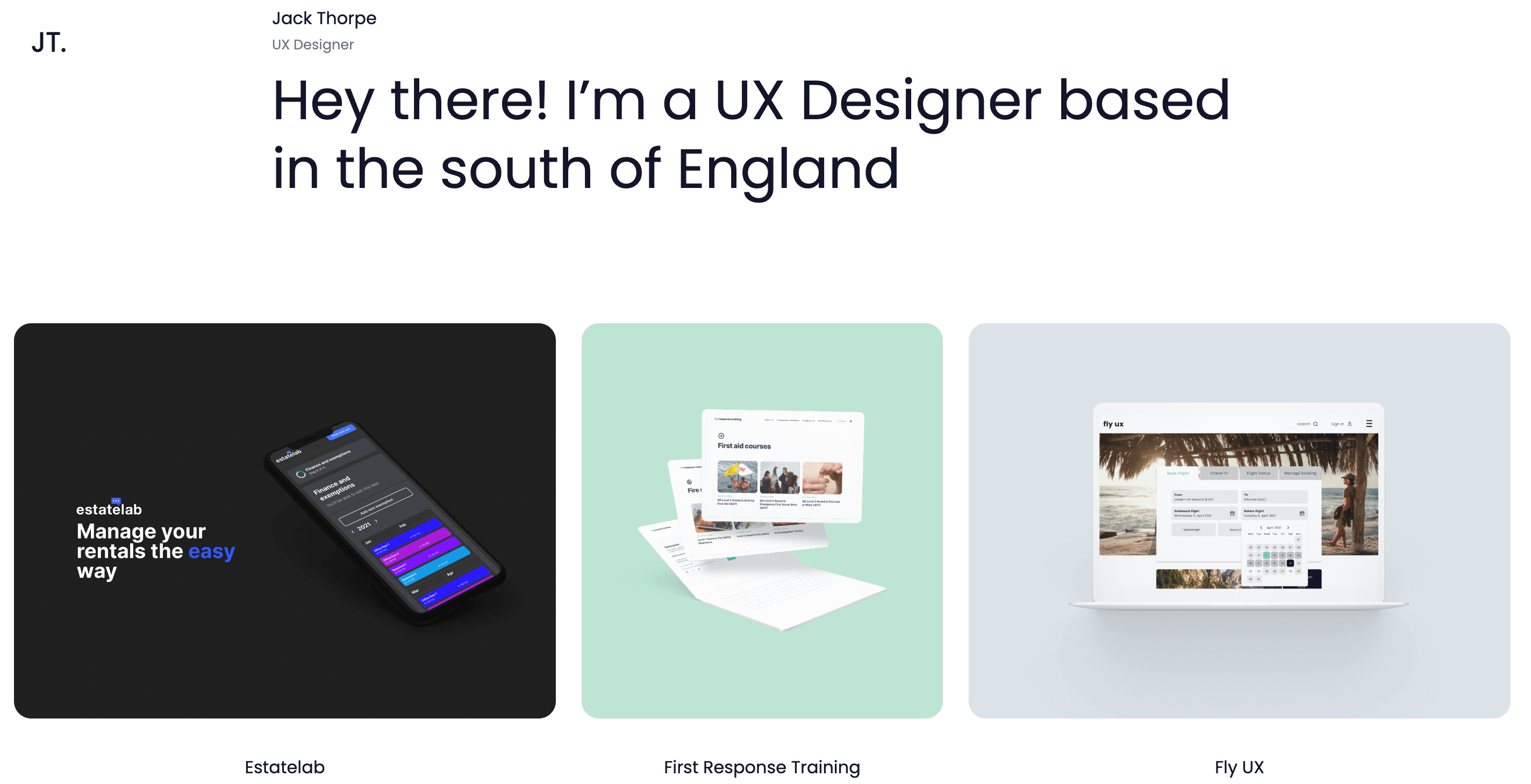
Jack’s portfolio ticks many boxes: A strong introductory headline on the homepage, a detailed “About” page which clearly highlights his key skills and his career so far, and—most importantly—well-structured case studies.
What really stands out about Jack’s portfolio is his attention to detail. He’s not just built a website to showcase his work; he’s created a portfolio that’s an impressive UX project in itself.
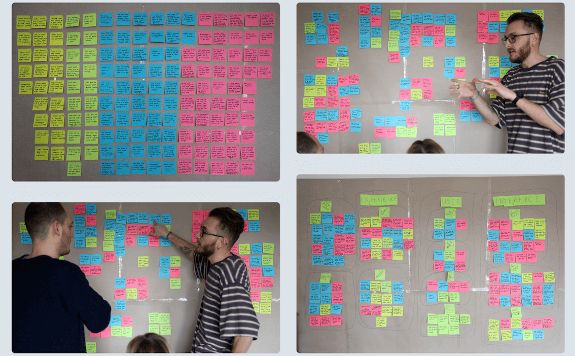
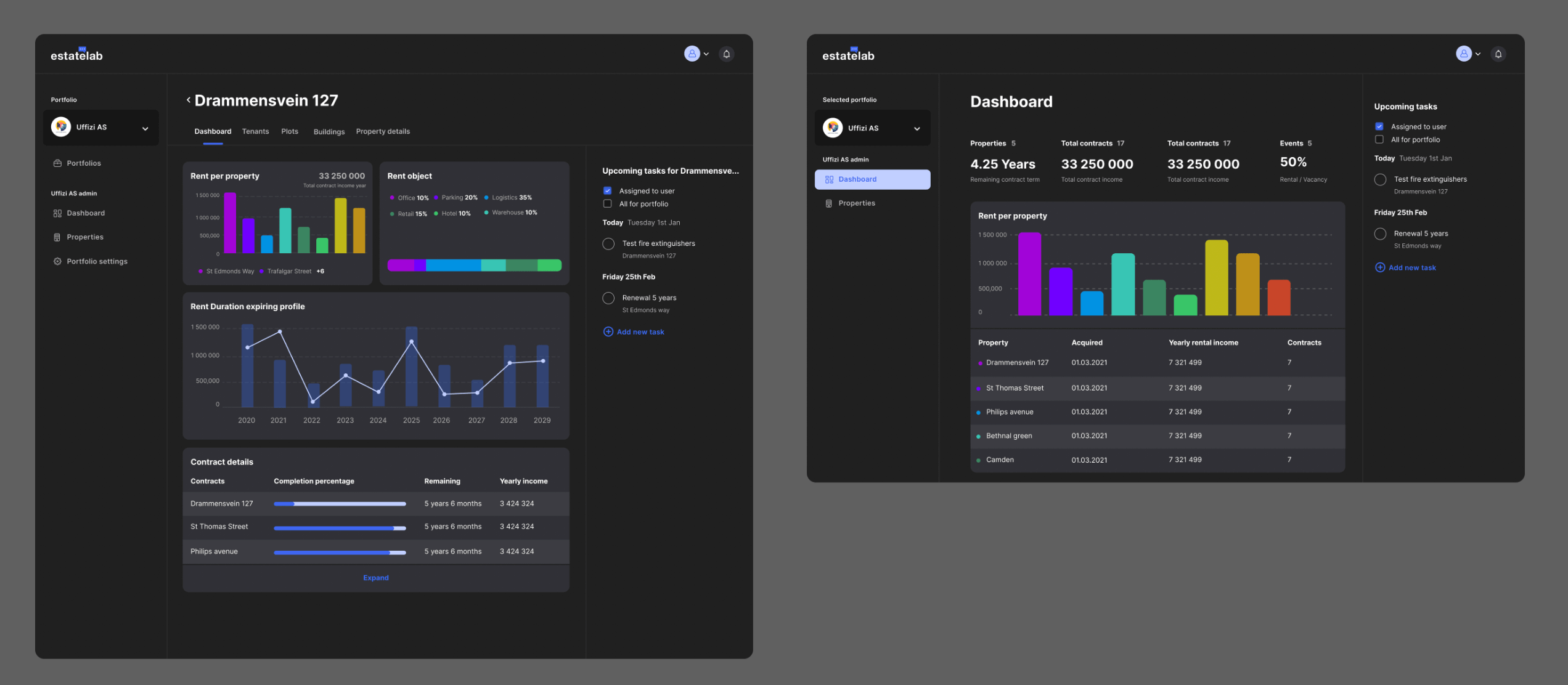
He’s gone the extra mile to add special touches — like the timelapse video embedded in his Fly UX case study which shows him going through the process of creating an affinity diagram, and the sharp visuals used to illustrate his process throughout both his Estatelab and First Response Training case studies.
As you navigate through Jack’s portfolio, you get a real sense of professionalism. It doesn’t just look great; it feels effortless and smooth. It’s a delightful user experience.
Key takeaway from Jack’s UX portfolio:
Your portfolio isn’t just a selection of your work; it’s a design project in itself. Once you’ve perfected your individual case studies, spend the extra time and effort refining the overall look and feel of your website. Pay attention to the finer details and ensure your portfolio is a joy to use.
3. Dani Raykova
Dani Raykova is a UX and visual designer with an extensive background in graphic design. She got her UX design certification in 2021 and has forged a successful freelance career utilising both her design and marketing skills.
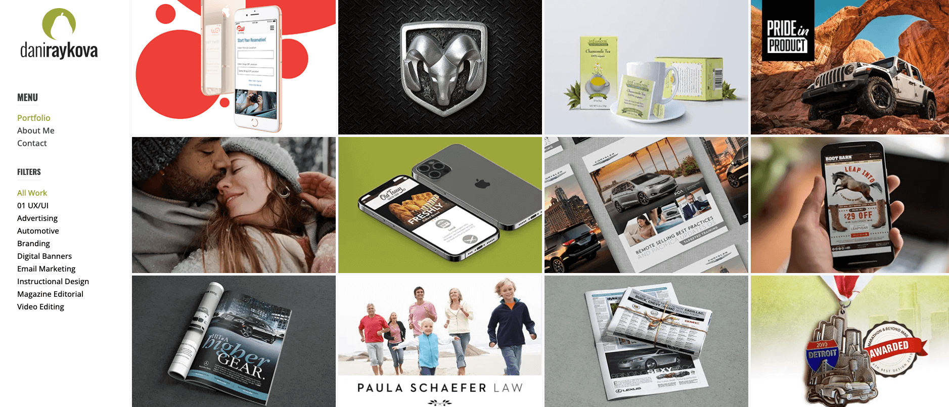
Dani’s UX portfolio contains a wealth of case studies, spanning everything from logo design and editorial to design systems and mobile apps.
Dani may have a large quantity of projects but she certainly hasn’t scrimped on quality. All of her case studies do an excellent job of showcasing her process, giving clients a clear view of how she tackles design problems.
A major stand-out factor is Dani’s use of visuals and supporting materials to illustrate her work.
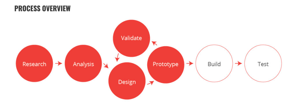
Take her EW Car Rental Mobile App case study for example. First, she provides a clear, visual overview of her process:
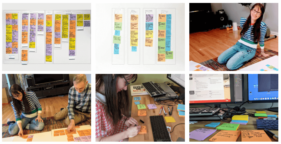
She then goes on to share the results of her user research and even includes photos of herself completing an affinity diagram exercise.
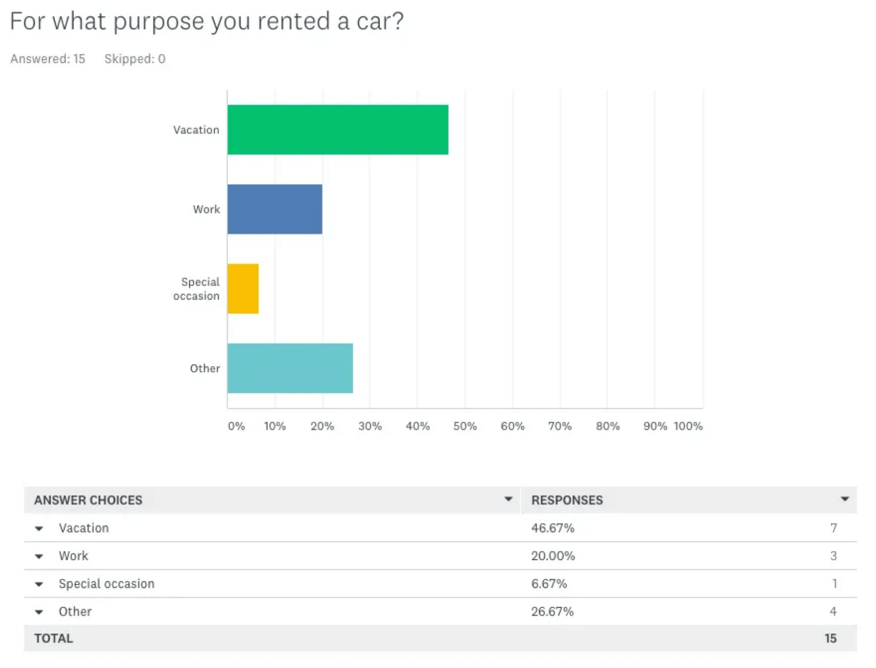
We really get to see how Dani moved from one phase to the next — and that’s exactly what hiring managers want from a UX portfolio.
Key takeaway from Dani’s UX portfolio:
Employers don’t just want to see the final product of your work; they want to know how you got there. When building your UX case studies, bring them to life with a variety of materials. Include screenshots, data, videos and interactive prototypes —anything that helps to convey your process.
4. Solveig Berge
Solveig is an Oslo-based designer with a background in sales, customer service and marketing. After completing her studies with the UX Design Institute in 2021, she landed a job as UX designer at consultancy firm Atkins Norge AS.
In her UX portfolio, Solveig does a great job of structuring her case studies into a logical story but that’s not all. She also includes a dedicated section sharing her learnings from each project.
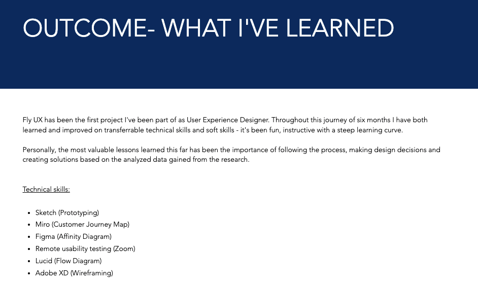
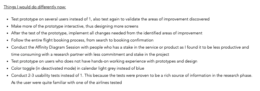
In her Fly UX case study, she divides her learnings into two categories: “Technical skills” and “Things I would do differently now”.
This makes it easy for employers to see exactly what UX hard skills she practised throughout the project and shows that she’s determined to improve as a designer.
For new designers especially, this is an important quality to have. UX itself is all about iteration and it’s essential that you’re able to reflect on and improve your own work. If you can convey that in your portfolio, you’re sure to leave a lasting impression with hiring managers.
Key takeaway from Solveig’s UX portfolio:
Employers aren’t looking for perfection. Often, they just want to see that you’ve got the fundamental skills and are willing to learn, grow and receive feedback. Take inspiration from Solveig and add a “Learnings” section to your case studies. This demonstrates critical thinking, a tendency to reflect and an ability to spot your own areas for improvement.
5. Sarah Fenn
Sarah Fenn is a UX consultant based in Colchester, England. Prior to obtaining her UX design certification, Sarah completed a degree in digital design, so she already knew a thing or two about what makes for a great website.
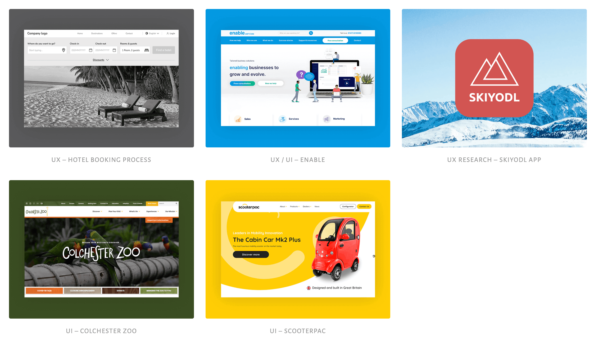
Sarah’s UX portfolio demonstrates the power of keeping things simple. When you land on the home page, you’re greeted with a clear, powerful headline explaining who she is, what she does and where you can view her work, plus a very cool illustration.
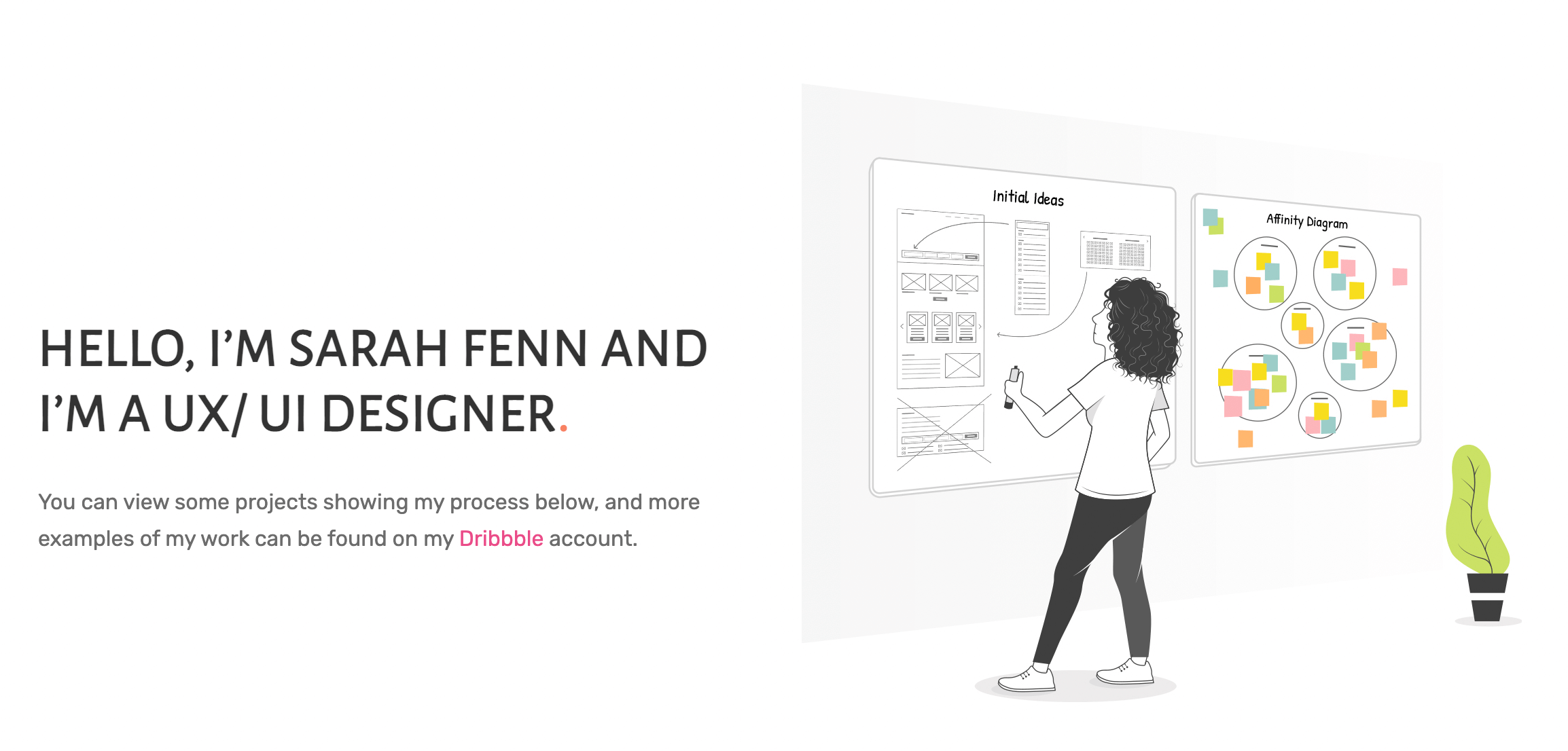
To view some of Sarah’s case studies, you simply need to scroll down a little and click on the projects that pique your interest. Each project preview is clearly labelled, so you can easily see whether it’s focusing on UX, UI or UX research.
The simple, clean aesthetic continues through each individual case study — all of which follow a logical narrative and provide plenty of detail regarding her process. Tick!
Sarah’s portfolio doesn’t have all the bells and whistles. It’s simple in structure, layout and design, but it certainly doesn’t compromise on detail or quality.
You can get fancy with the design of your portfolio, and you absolutely should if you have the time, know-how and desire. But, equally, if you’re short on time and resources or just want to keep things simple, that works too.
Key takeaway from Sarah’s UX portfolio:
Sometimes, less is more. It’s important that your UX portfolio demonstrates your design skills in action and conveys a hint of your personality—but you don’t need to go all out. Clean design and easy navigation speak volumes, and you can still showcase your smarts as a UX designer without spending weeks on your website. As long as your portfolio website is user-friendly, easy to navigate, and clearly demonstrates your UX design process, you’re onto a winner.
6. Kinga Kocemba
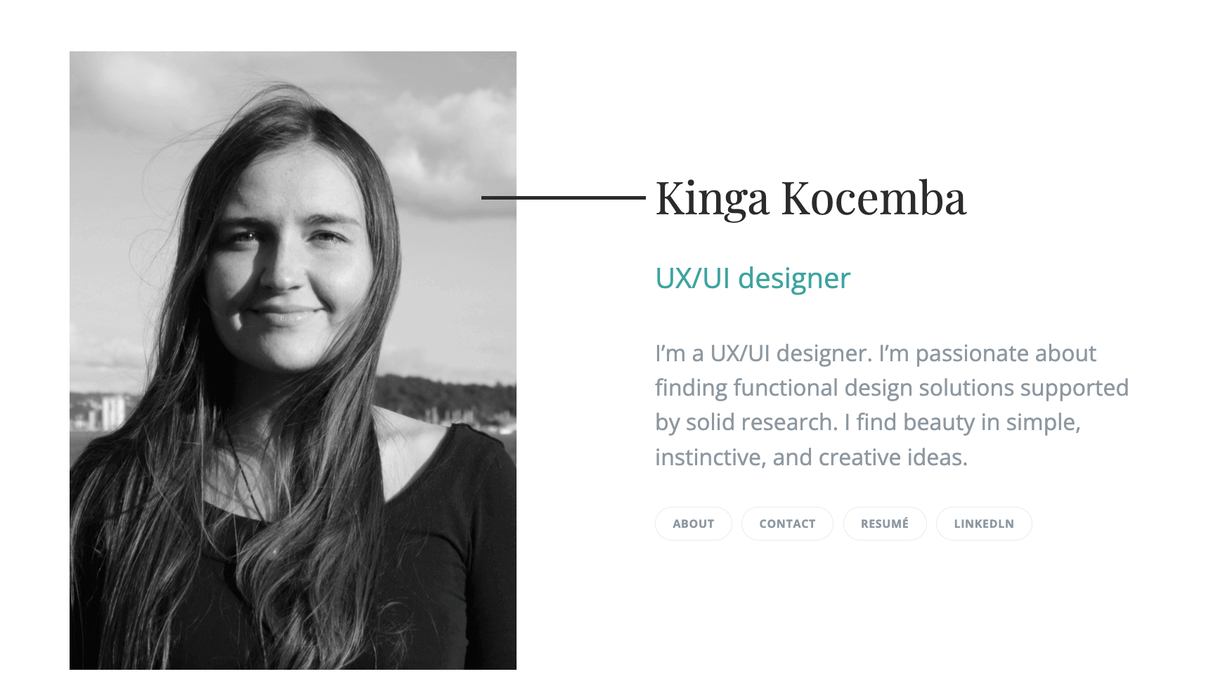
Kinga Kocemba is a newly-qualified UX designer based in Oslo, Norway. She graduated from the UX Design Institute in 2021 and now works as a UX/UI designer at a risk management firm.
Like many others on our list, Kinga launched her UX career and built her portfolio with limited industry experience. However, once she was familiar with the UX process, she was able to draw similarities with her previous work as an architect.
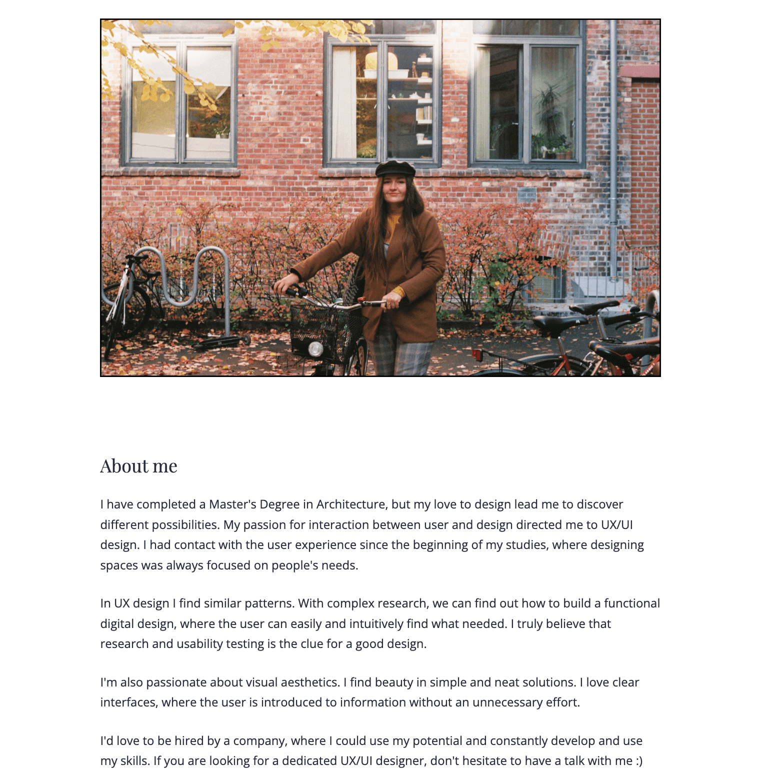
On the “About” Page of her portfolio, Kinga does an excellent job of telling the story of how she transitioned from architecture to UX design.
She describes how she first encountered the concept of UX when designing physical spaces to meet specific users’ needs and how, with her experience conducting qualitative research as an architect, she was able to transfer the practice of physical design to the realm of digital design.
From there, Kinga explains the proactive steps she took to become a UX designer (attending events, listening to podcasts and completing the course at the UX Design Institute) and how she was able to build up her experience and add UI design to her skill set when she landed her first job in the field.
But why does all this matter?
This storytelling technique is especially important for new UX designers who don’t have much experience in the field, as it allows employers to see how your previous experience can be transferred to UX. In Kinga’s case, it also conveys a passion for the craft and a proactive approach to making her career change happen.
Key takeaway from Kinga’s UX portfolio:
If you’re new to UX, use your portfolio as an opportunity to tell a story. Share how your past experience led you to UX design and highlight the transferable skills you’re bringing with you to the field. This shows potential employers that you’re passionate about UX—and makes it easier for them to view you as a bona fide UX designer.

