When building a UX portfolio, it’s important to adhere to industry best practices. At the same time, you want to make sure your portfolio is unique enough to stand out.
So how do you tick all the right boxes and create a portfolio that’s truly memorable?
Here are 8 tips and best practices to guide you, with examples throughout.
You can also check out our recent webinar with Mitchell Clements where he gives a low down on all things portfolios and best practices:
1. Honour the tried-and-trusted UX portfolio format
It’s great to be creative, but you don’t need to reinvent the wheel when building your portfolio.
If you look at existing UX portfolios, you’ll see that they tend to follow the same structure:
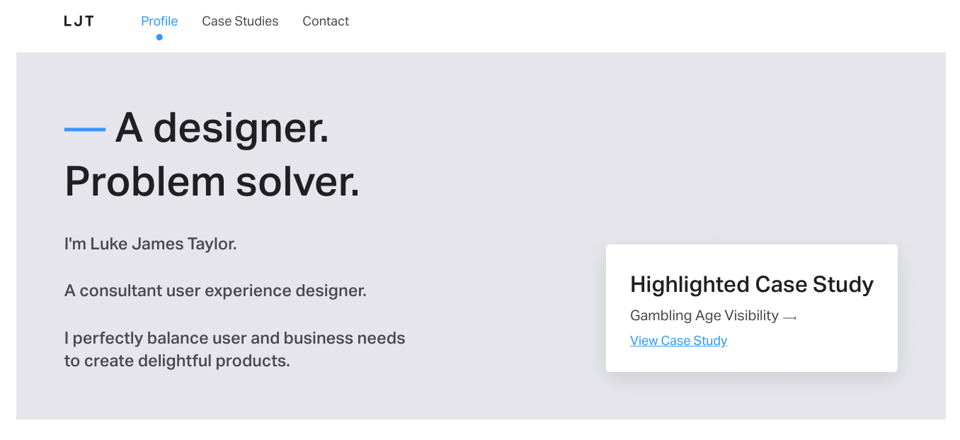
- A homepage with an introductory “elevator pitch” and links to case studies
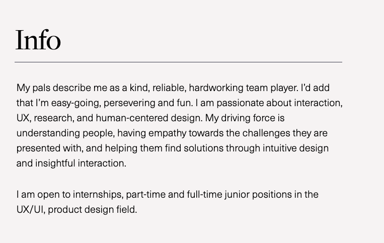
- A more detailed “About me” section or page
- A portfolio section hosting several case studies
- A “Contact” page
This format has stood the test of time because it’s logical and it works.
UX hiring managers will come to your portfolio expecting something similar (think about how we develop mental models based on our experience with similar products). If you stray too far from this familiar format, you risk creating a portfolio that’s confusing and tricky to navigate.
Luke James Taylor’s design portfolio
Key takeaway
Give hiring managers the user experience they expect; stick with the tried-and-trusted UX portfolio structure.
You can learn more about the elements that make up a UX portfolio in this guide.
2. Clearly communicate what kind of designer you are
Your UX portfolio isn’t just a showcase of your work. It’s an extension of your personal brand, and a very important marketing tool.
When a hiring manager lands on your portfolio, they should immediately see what kind of designer you are and where you can add value. As such, you need to be intentional about how you portray yourself.
Ask yourself:
- What do I do? This is how you define yourself as a designer. For example, are you a UX designer, a UX and UI designer, or a UX researcher?
- What kinds of design problems do I solve? Is there a particular space you operate in, such as digital product design, interaction design, or service design? Are you passionate about designing for social impact, or helping startups launch awesome new products?
- What are my most valuable skills? Come up with a shortlist of your top 5 skills, focusing on those that are most relevant to your two previous answers (what you do and the kinds of problems you solve).
This forms the foundation of your personal brand. The next step is to communicate it in your UX portfolio. You’ll do this through:
- Your headline and elevator pitch (a concise, introductory summary featured on your homepage)
- The key skills you list on your “About” page
- The projects you choose to showcase in your portfolio
For inspiration, take a look at these examples:
Dalya Green’s UX portfolio
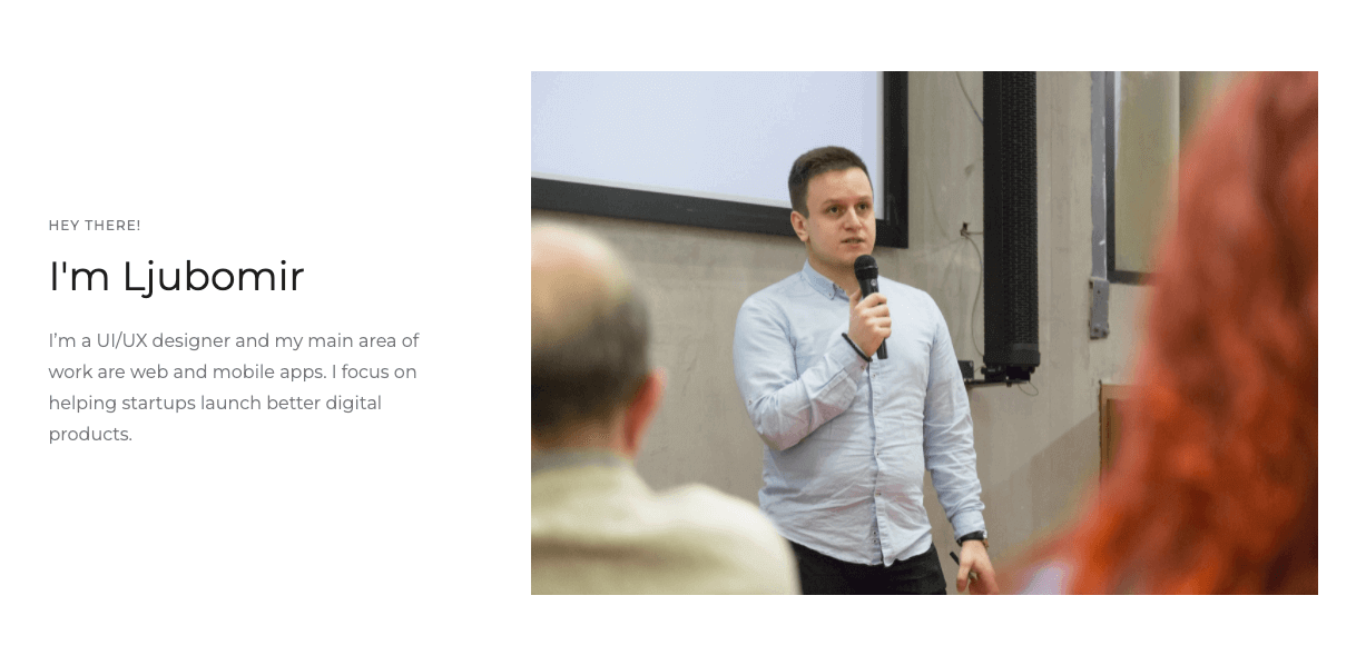
Ljubomir Bardžić’s UX portfolio
Key takeaway
Define your personal brand and convey it clearly throughout your UX portfolio. Write an “About” section that tells the story of you, and showcase projects that support this narrative.
3. Ensure that problem-solving and process take centre stage
Remember in maths exams where you were always told to show your workings? The same applies to your UX portfolio.
In fact, this is a non-negotiable golden rule. Hiring managers want to see how you work and solve problems—it’s not enough to only show the final solution.
There are several things you can do to bring your process to the fore and demonstrate your aptitude as a problem-solver. As you craft your UX case studies:
-
- Lead with the problem, and frame it as such. Instead of writing “My task was to redesign the checkout process for an ecommerce website,” say something like “The XYZ ecommerce website was losing out on customers because the checkout process was too long and complicated. I saw an opportunity to simplify the process and boost customer retention.”
- Follow a logical structure. Once you’ve outlined the problem, structure your case study to mirror the process you followed, detailing your research and analysis, early designs, and any challenges you encountered along the way.
- Look beyond the final solution. Once you’ve shared your outcomes, reflect on the impact of your work. How will it help to solve the original problem? What difference will it make to the end user?
Here are some examples from real UX portfolios to guide you.
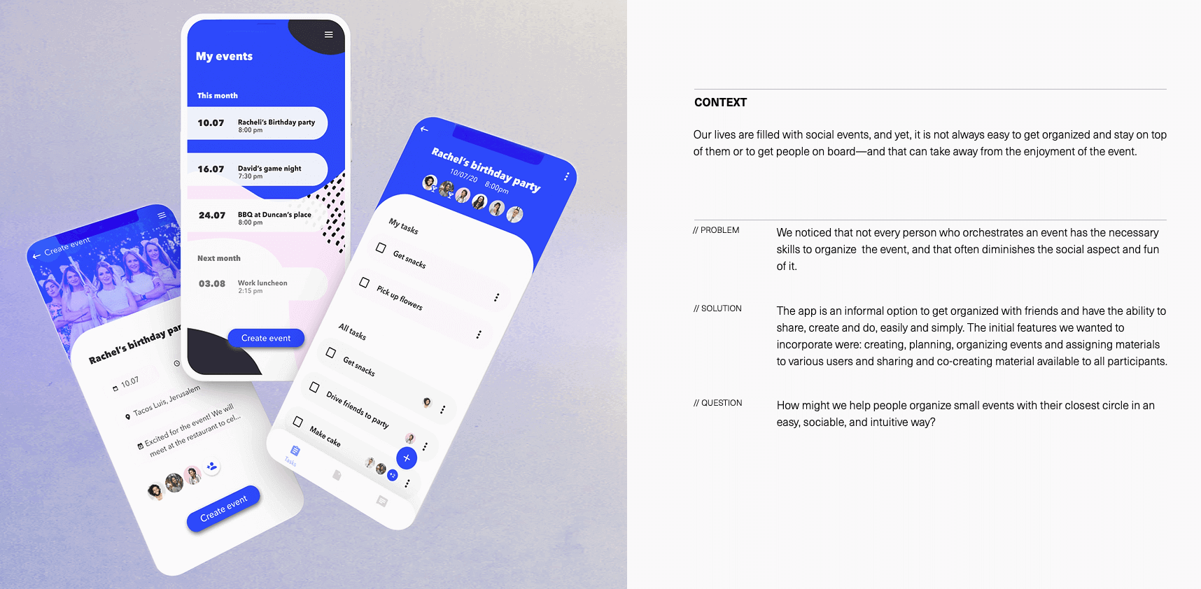
Dalya Green’s ‘Eventually’ case study
Daniel Autry’s Goldman Sachs case study
Key takeaway
Treat each case study as a story, documenting your process from problem to solution. You didn’t just design an app or come up with a new feature; you solved a user problem. Be sure to frame it as such.
4. Back yourself up with data and proof of impact
The best UX portfolios don’t just talk about the value of the designer’s work; they prove it.
If you really want your portfolio to stand out, validate your work with concrete results. This can be anything that speaks to the tangible impact of your work. You solved a user problem and you have the final deliverables to show for it, but how does this translate into real-world value?
Back yourself up with quantitative and/or qualitative data. For example:
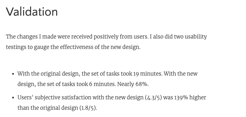
- My redesign of the XYZ ecommerce checkout process reduced abandoned cart rates by 67%, which ultimately resulted in more sales
- When we tested the new design, 15/20 users rated the experience as a significant improvement
- A quote from a user or client about the impact of your work, for example: “With the new system design, we have been able to significantly streamline our operations and reduce the time spent on X, Y and Z”.
See how Lola Jiang uses a mixture of data and quotes to convey the impact of her AI training platform redesign:
It’s not always possible to get hard-and-fast proof, and it’s certainly not a deal-breaker if you can’t. But, if you can find a way to measure and report on the success of your work, your portfolio will definitely stand out.
Key takeaway
Where possible, add proof of impact to your UX case studies. Include data in the form of percentages, ratios or charts, and/or quotes. Anything that can testify to the value of your work will set your portfolio apart.
5. Adopt “Less is more” as your UX portfolio mantra
The ultimate goal of your UX portfolio is to showcase your best work and tell a story about who you are as a designer. Anything that doesn’t achieve this goal should not be included.
Earlier, we looked at the importance of defining your personal brand and using your portfolio as a marketing tool (scroll up to tip number 2 for a refresher).
Keep this in mind as you select your portfolio case studies. Which projects demonstrate the core skills you want to highlight? What work best illustrates your process and captures your value?
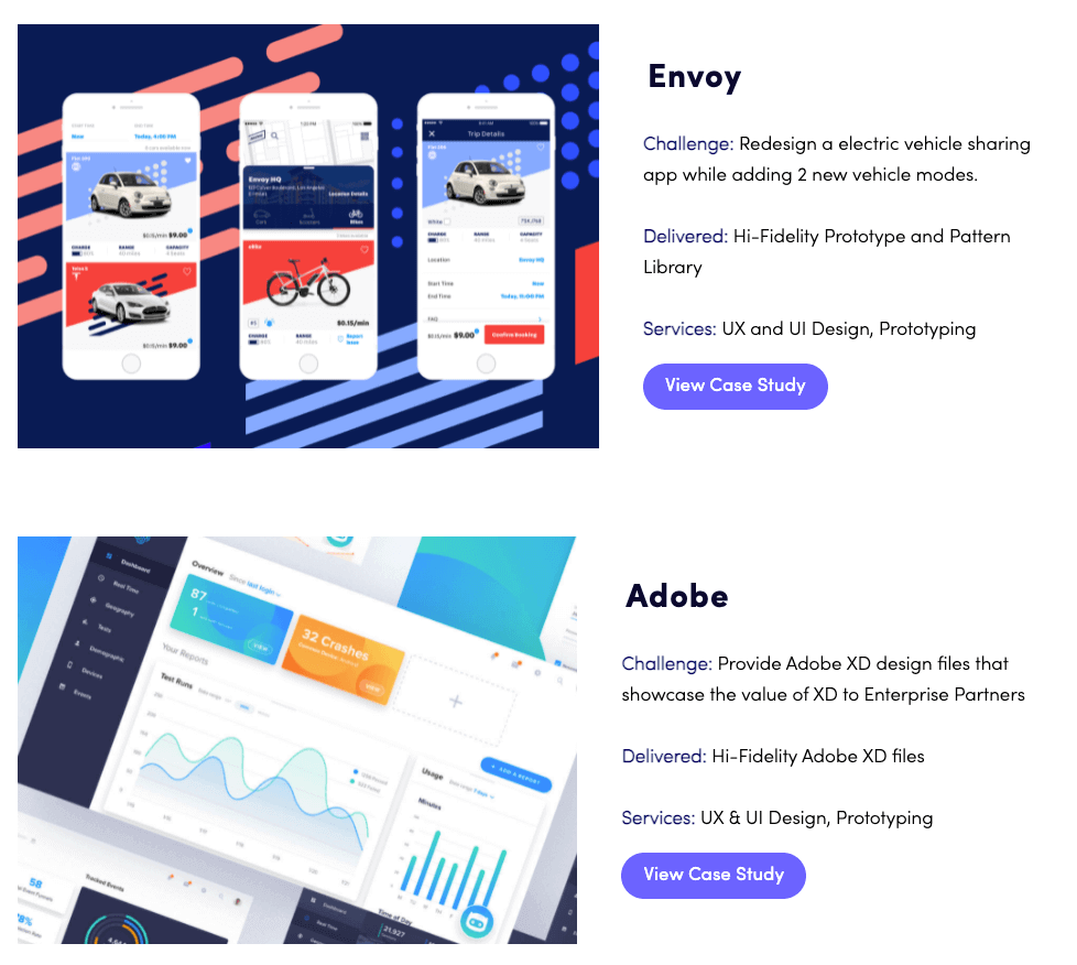
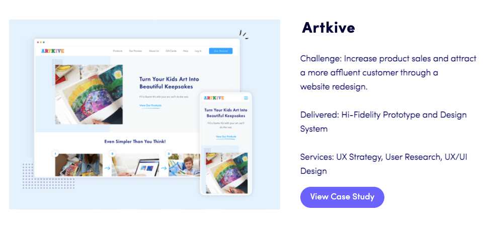
Elizé Todd is an accomplished designer with a wealth of experience. Notice how, in her portfolio, she only features three case studies? This doesn’t cover the entirety of her work; instead, it shines the spotlight on her best and most relevant projects.
You don’t need to fill your portfolio with everything you’ve ever done. Focus on the story you’re trying to tell, and remember: Less is (often) more.
Key takeaway
Be selective when deciding what to include in your UX portfolio. If it doesn’t contribute to the story you want to tell—or align with the direction you want to take in your career—leave it out. Two relevant, detailed case studies are better than twelve random ones.
6. Keep your portfolio a jargon-free zone
The best UX portfolios are clear, accessible, and easy to understand. Your portfolio might pass through a recruiter before it gets to a UX professional, so you want to make sure that anyone can make sense of it—not just the experts.
Pay attention to the language you use throughout. Is your meaning clear? Is it jargon-free and coherent, even to a non-UX professional? Is it user-friendly and digestible?
Steer clear of long, complicated sentences and overly technical explanations. Instead, aim to write concisely and approachably.
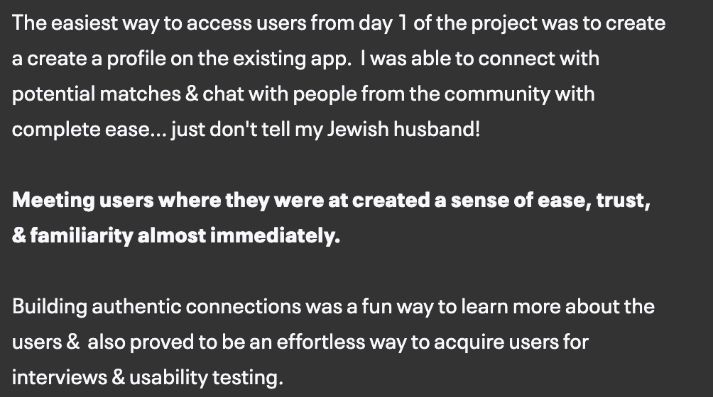
See how product designer Jonathon Dakarai uses short, clear sentences and user-friendly language in their Believr dating app case study:
You don’t need to be a skilled writer to nail this best practice; just try to write as you would speak. Read your writing back and trim any unnecessary prose that doesn’t contribute to the story you’re trying to tell (in the literary world, this is known as “killing your darlings”).
You can also make use of spacing to break your writing up into shorter sections. This is easier on the eye and will make the text more scannable.
Finally, have someone else (ideally a non-UX professional) read through your portfolio. If they can easily understand the gist of your case studies, you can consider this box checked.
Key takeaway
Aim to appeal to a broad audience of both UX professionals and non-experts. Stick to clear, user-friendly language and avoid unnecessary jargon.
7. Deliver a flawless user experience (with beautiful UI)
You’re building a portfolio to showcase your UX skills, so it’s absolutely crucial to deliver a flawless user experience.
That almost goes without saying. But if you want to jump from “solid UX portfolio” to the “truly impressive and memorable” category, you’ll need to polish up the UI.
Starting with the basics, your colour palette and typography should create a harmonious and consistent brand (while adhering to the usual rules regarding contrast and legibility). From there, go the extra mile with special effects such as hover reveals, background fades and animations.
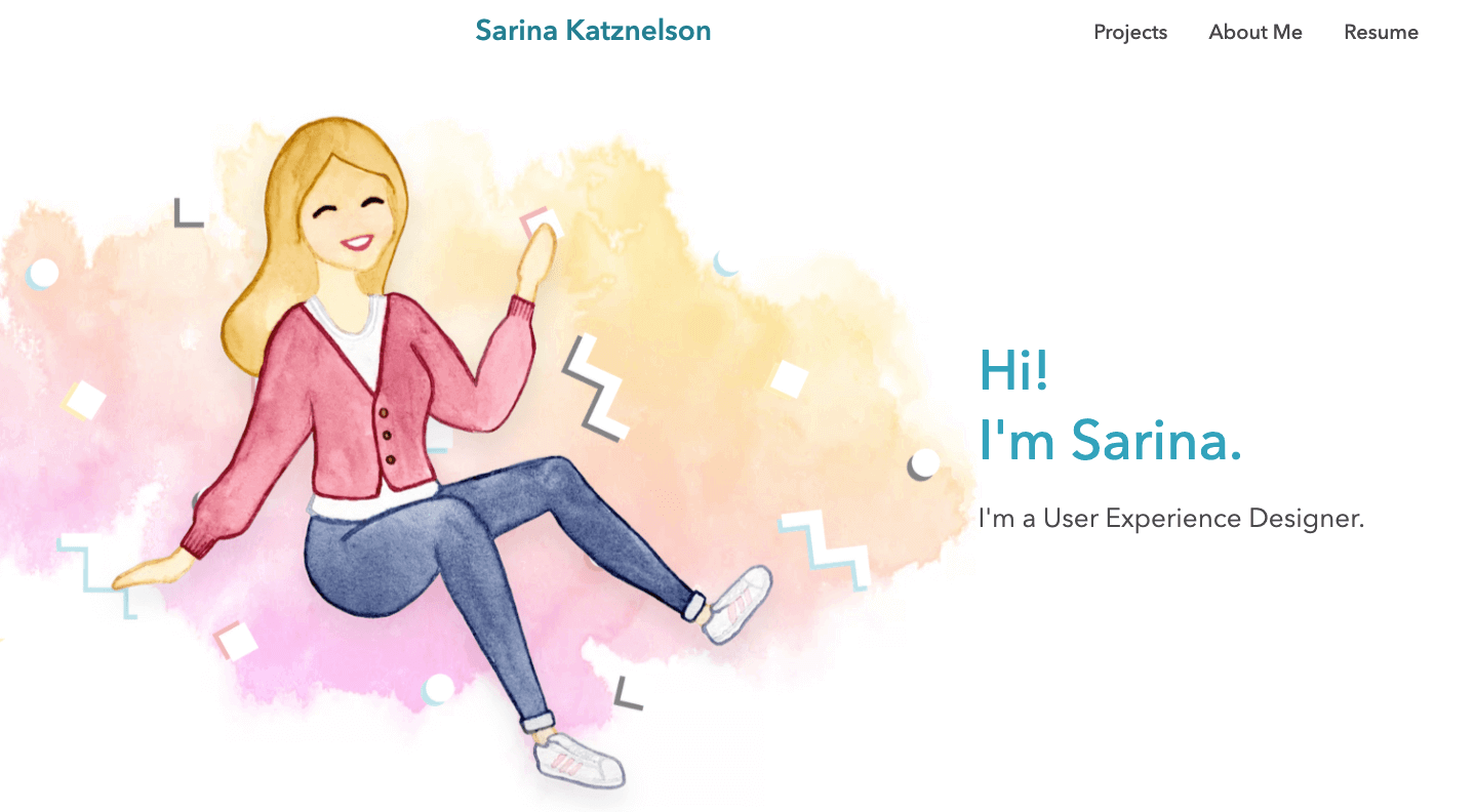
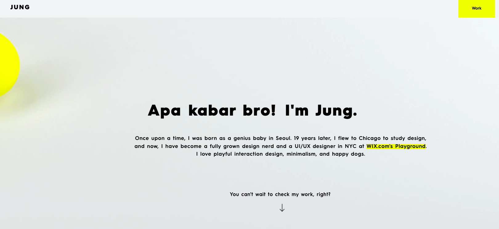
Here are some examples of UX portfolios with impressive UI design:
Sarina Katznelson’s UX portfolio
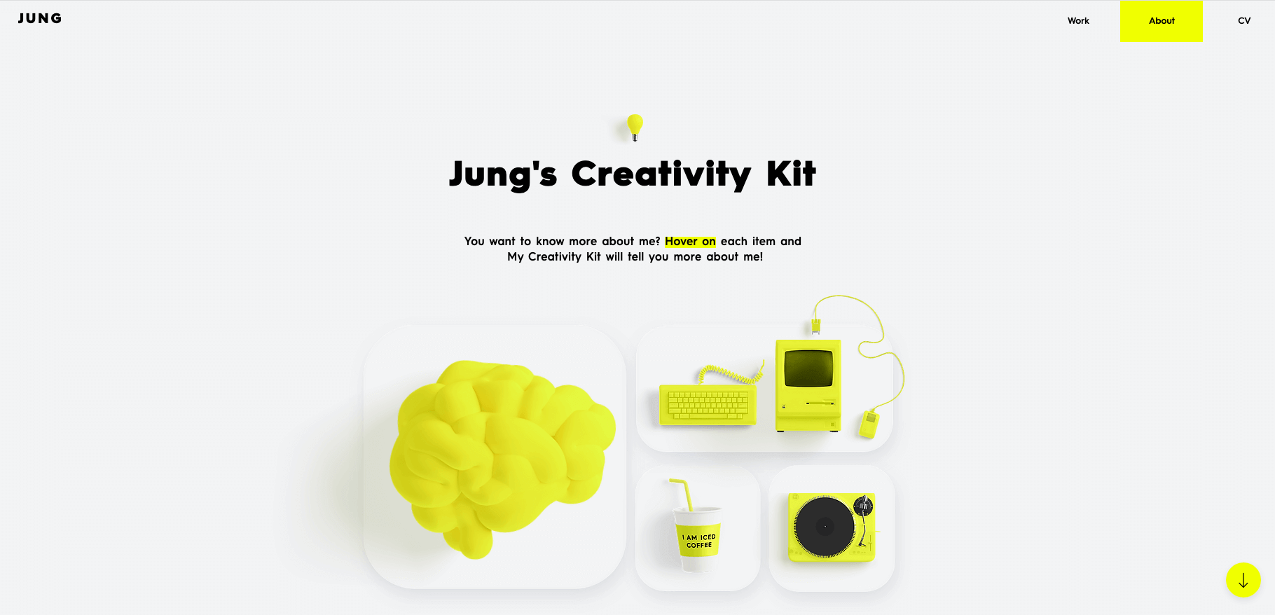
Jung Hoe’s UX portfolio (view their portfolio live for the full interactive effects)
The best UX portfolios by far are those that deliver the whole package: seamless UX and impressive UI. If you’ve got the skills and resources, it’s well worth going the extra mile with your portfolio’s design.
Key takeaway
Good UX is a must for your portfolio, but if you really want to stand out, do something unique with your UI design. Whether it’s opting for bold colours, adding special effects, or getting custom illustrations created—the web is your oyster.
8. Treat your portfolio as a work-in-progress
Last but not least, make sure your UX portfolio evolves with you. Treat it as a work-in-progress and update it in line with your development as a designer.
You might start out as a UX generalist but end up specialising in UX research. Perhaps you go on to learn UI design and become a UX/UI unicorn. That’s the great thing about working in UX; it can take you absolutely anywhere!
Wherever you end up, make sure your portfolio still tells the right story. Remember: it’s a powerful branding tool, so it should always accurately reflect who you are as a designer, the value you can offer, and where you’re at in your career.
Key takeaway
Your portfolio isn’t a one-time project. Keep it updated in line with your career evolution: swap out old case studies for newer, more relevant ones, update your core skills, and ensure your “About me” copy is still true to your brand.
With these tips and best practices, you’ll be well on your way to creating an industry-approved portfolio. For help building your portfolio from scratch, follow this actionable step-by-step guide.

