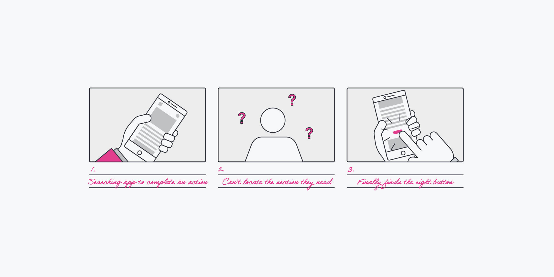
When you are building a website, an app or other digital product, you have a lot to think about. How big are the buttons? What colour are the headings? What shape are the icons? These things make up the core of how your product will look and function. So with a product that’s hundreds of pages long, how do you make sure that you retain consistency? That’s where a design system comes in.
A design system is the standards and principles that determine a brand’s design. When design systems are done well, they can have a noticeable effect on how the brand’s digital products are created and implemented.
Let’s get started!
What is a design system?
A design system is a collection of reusable components that have clear standards for use. These components can be used together to build any number of components in a company’s digital presence.
A design system is comprehensive but also ever-growing and evolving. It has pages about everything from content to language to design to patterns. It’s like a toolbox containing everything you need to build your products. Design systems are typically housed online so that everyone in the company can access the most up-to-date version of it at any given time.
What’s the difference between a design system and a style guide?
The terms ‘design system’ and ‘style guide’ are often used interchangeably, and while there is some overlap, they each serve different purposes in the design process.
One of the parts of a design system is a style guide but a design system is much more than that. It provides a comprehensive overview of the design principles, patterns, and code snippets that should be used throughout a company’s digital products. As a result, a design system maintains consistent design and reduces the design and production of multiple versions of the same elements.
A style guide, on the other hand, is a document that focuses on a product’s visual references, design principles, and implementation guidelines. It includes brand attributes, voice and tone guidelines, audience information, word usage rules, and other details about a brand’s style.
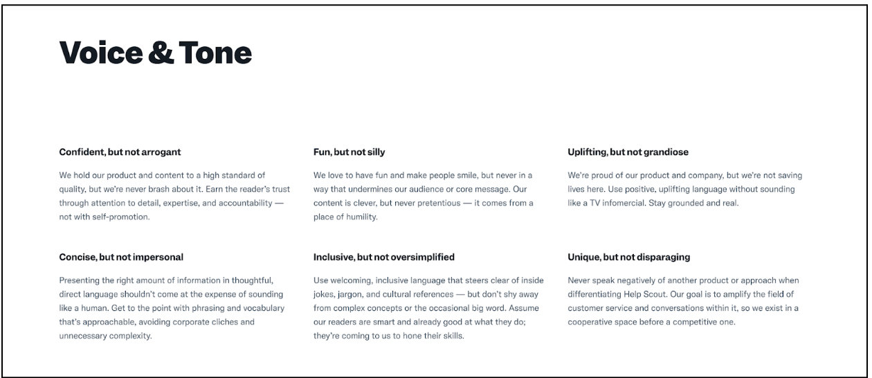
A company’s style guide can focus on one of three style needs. First, a content style guide focuses on tone of voice, grammar, spelling, and formatting rules. For example, Help Scout’s voice and tone page explains how they should write and sound on their various channels:
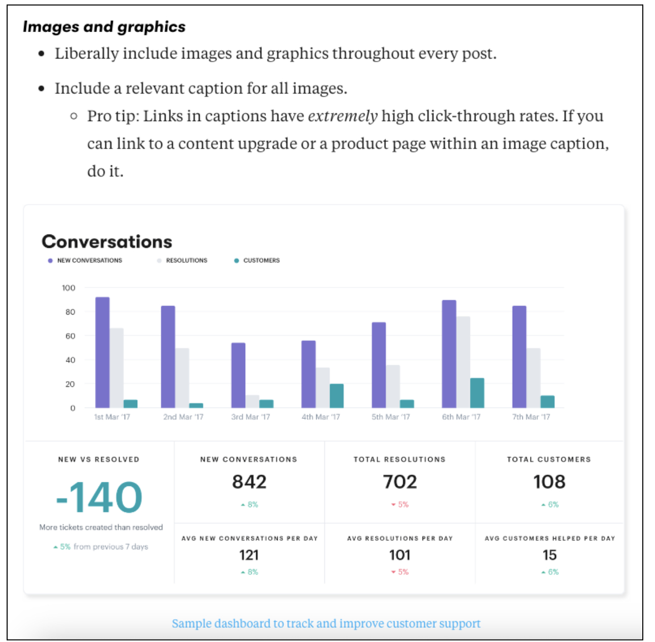
Second, a brand style guide includes colour palettes, typography, logos and icons, and imagery. For example, Groove’s style guide has this to say about images and graphics:
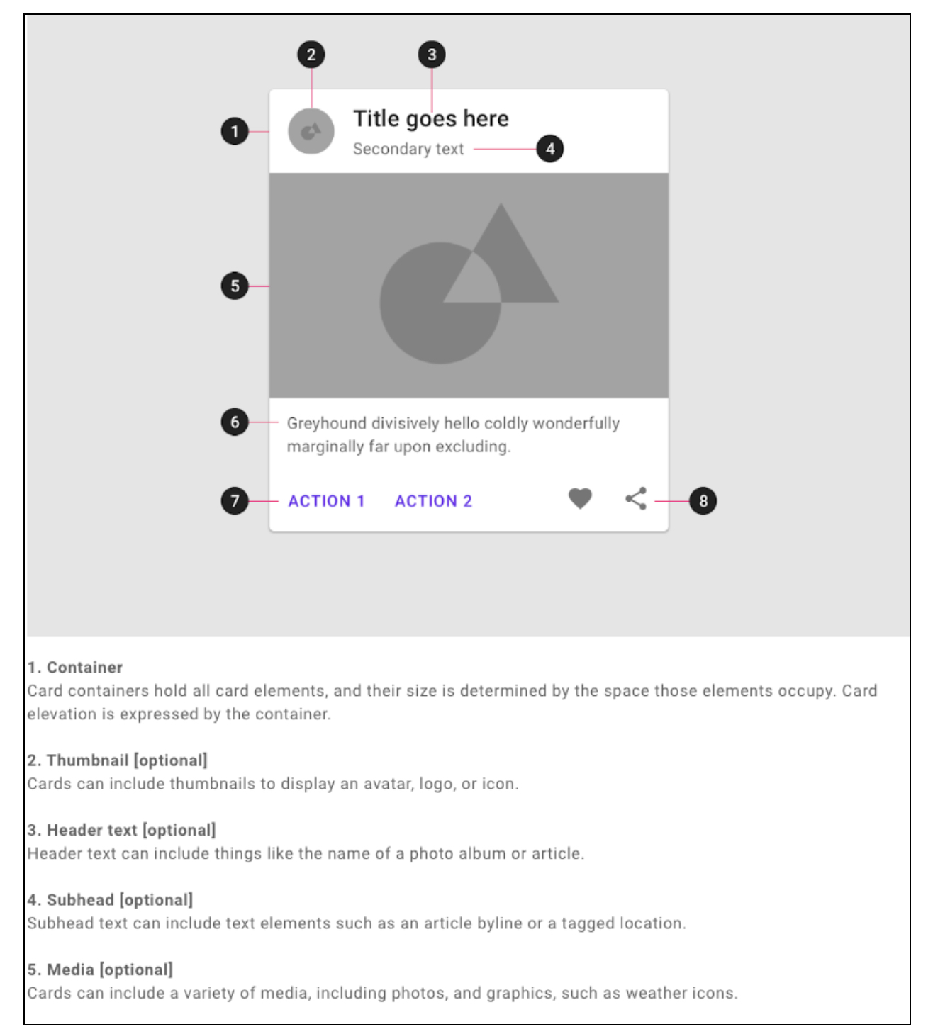
Third, a visual style guide includes the elements of your product’s user interface and guidelines for how to use them. It may include responsive layout systems, color palettes, typefaces, and common UI elements. For example, Google’s Material Design style guide includes ideas about where various parts of the layout should be consistently placed.
Google’s Material Guide style guide
A style guide is a part of a design system, but a style guide alone is only one part of keeping designs consistent across multiple projects. Meanwhile, the design system is the total package.
Who uses design systems?
While just about everyone who designs for a company can use a design system, there are some who will refer to it more than others. Product designers, UX designers, UI designers, and visual designers will use the design system the most. On the coding side, it will also be extensively used by developers and engineers.
These are the people who create and manage the design system as well. If the design system is new or just shaping up, the company will likely put dedicated UX and UI designers, visual designers, and developers on the project. Big companies that have mature design systems can have a whole department made up of everyone needed, from product designers to project managers to visual designers, to capture anything new needed for the design system.
What is the purpose of a design system?
As the digital landscape gets increasingly complex, with websites, apps, social media, and other types of content, more and more companies are seeing the value of design systems to make the design process easier. The purpose of a design system is to provide an organized set of components and principles that can be used across projects, instead of having to create these components from scratch each time. That not only saves time, but it ensures that the look and feel of a company’s products or services is consistent.
The benefits of having a design system
There are myriad benefits to having a design system but these are the most important ones.
- Faster Development. With a design system, design teams no longer have to start from square one each time they need to develop a new feature. They have guidelines on where to put buttons, which colours to use, and what icons should look like. This saves them a lot of time and gets them to develop products quickly.
- Improved Collaboration. Design systems provide a shared design language that improves collaboration within teams and makes the functionality of each project better. Plus, everyone has the latest version of various features so they can produce an optimized product.
- Better Efficiency. When all the components designers and developers need are stored in a central place, it’s easier for them to find and use what they need for the product to work. This helps designers and developers focus on problems that are higher on the list rather than getting caught up in the details.
- Maintain Consistency. With different teams working on various products, including webpages, apps, social media posts, and campaigns, having a design system can tell you how to make the experience consistent across all these channels. That way different components don’t look out of place from product to product.
- Enhances Scalability. Design systems ensure that not just designers and coders can make design decisions at scale but so can everyone else, including freelancers, marketers, and advertising agencies. This allows companies to distribute the workload without giving up on quality.
What does a design system include?
While design systems often start with standard use cases and guidelines, like what buttons should look like, where logos should go, and what color palette is approved, as they mature they get more complex. They may eventually include principles for every product, from emails to Instagram videos to digital ads. Design systems typically include:
A brand style guide
A style guide focuses on branding, such as the colours, logos, and fonts that the brand uses. But it also will often offer standards for content, interaction design, and visual design.
A component library
A component library is a complete set of reusable UI elements. They show designers and developers how to implement these elements by including visual examples along with the name, description, attributes, and code snippets of the element.
A pattern library
A pattern library takes the UI elements in the component library and combines them into layouts, structures, and templates. These are reusable and scalable, just like the elements in the component library.
Design system examples
Here are several mature design systems that can serve as inspiration as you start your own.
Shopify’s Polaris Design System
A page from Shopify’s Polaris Design System on the foundation of the system.
Shopify’s Polaris Design System is meant to be a one stop shop for all the stores that use their system. It includes the building blocks, including design elements and content, that easily convey to Shopify’s merchants how to use them to make great user experiences for customers.
BBC Global Experience Language
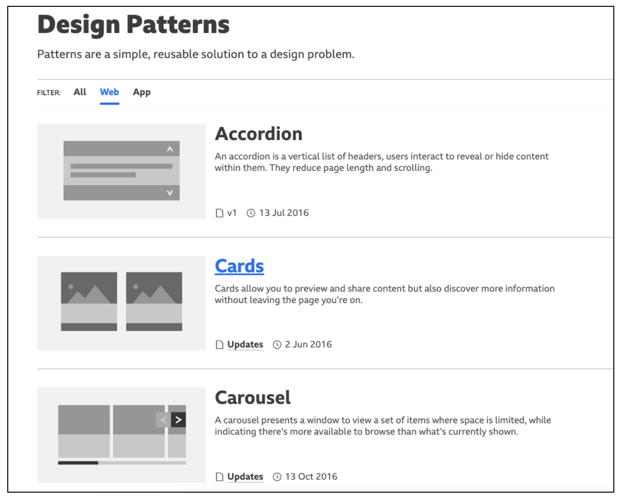
A page from BBC’s Global Experience Language on design patterns
The BBC’s Global Experience Language is a design system that includes everything from foundations to design patterns to how-tos, all to ensure everyone across the company’s vast network will be on the same page when designing any of their brand experiences. The system also includes articles and playbooks to make sure there won’t be any design problem that won’t have support.
Audi Design System
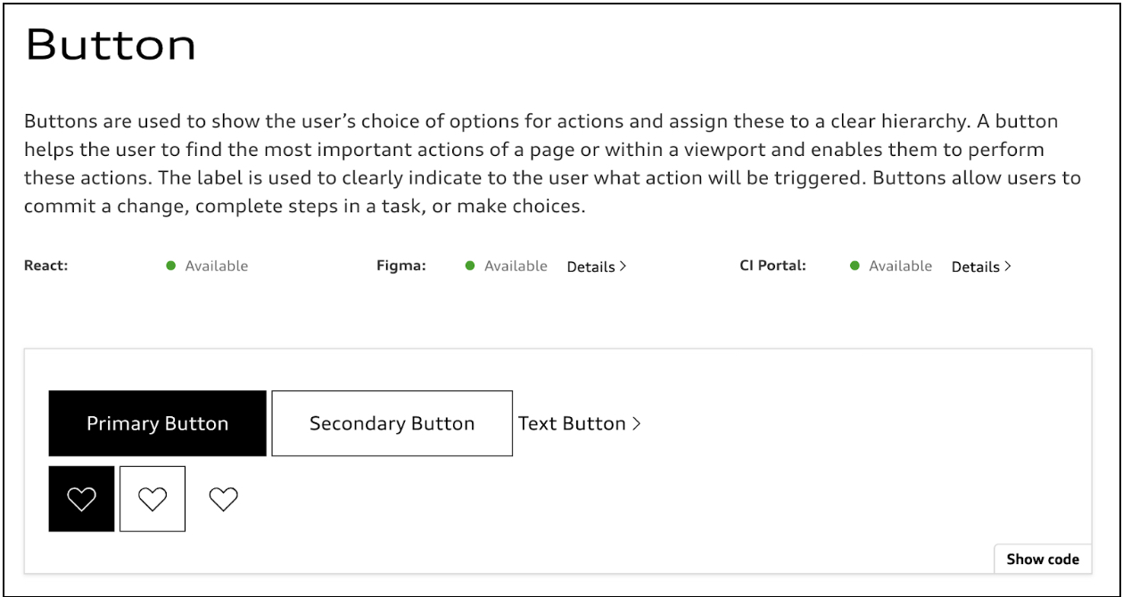
A page on buttons from the Audi Design System
Audi offers a complete design system that includes everything from a “Getting Started” guide to global and regional components for everything you could need to design a product for them. It’s meant to be the single place for anything anyone could need to create a great user experience.
What is the process of building a design system?
Building a design system is an intensive process that must include at least one UX designer, one UI designer, and one developer. It requires that these individuals
look at a company’s web or app designs that are currently being used and ask thoughtful questions about whether these designs are appropriate or not, and then revise and overhaul the components as needed.
These are some steps to get started building a design system:
Take inventory
Look at your existing digital designs, and categorize everything into design patterns, styles, and components. Keep track of what’s working well and what’s not working so well so you can get an idea of how much of an undertaking building a design system will be.
Create a design language
The design language is made up of the main components of your digital products: colour, typography, sizing, and imagery. You should create each of these while considering the role each of these components play in your designs. Often Figma will be used to create and store these components so others can access and use them too.
Build a design system
Now that you know the components you are working with, you need to put them into a design system. You’ll take the basics of the design language and use that framework to make reusable patterns and templates. You’ll also use those building blocks to create documents that will explain all anyone would want to know about using the system, including best practices and code snippets.
Keep the design system up-to-date
It’s a big undertaking to get a design system up and running, but even with all that work, you can’t rest on your laurels. Creating a design system is never done, and someone will constantly be updating it to make sure it has the latest and greatest components. This includes updating the component library in Figma and making sure each team’s projects have the most recent design system thinking in them.
Key takeaways
- A design system is a collection of reusable components for a company’s digital products that have clear standards for use.
- A design system is more comprehensive than a style guide. It provides a comprehensive overview of the company’s design, whereas a style guide is just focused on a product’s visual design.
- On the visual side, product designers, UX designers, UI designers, and visual designers use a design system; on the coding side, developers and engineers use a design system.
- The purpose of a design system is to provide an organized set of components and principles that can be used across projects.
- Among the many benefits of having a design system, the most important ones are it encourages faster development, improves collaboration, enhances efficiency, maintains consistency, and increases scalability.
- A design system includes a brand style guide, a component library, and a pattern library.
- To get started building a design system, first, take inventory, then, create a design language, and next build the system. Follow that up with keeping the system up-to-date.
To learn more about UX and design systems, consider taking the UX Design Institute’s Professional Diploma in UX Design. And read these blog posts: The 10 best user interface (UI) design tools to try in 2024 and 7 fundamental UX design principles all designers should know.

