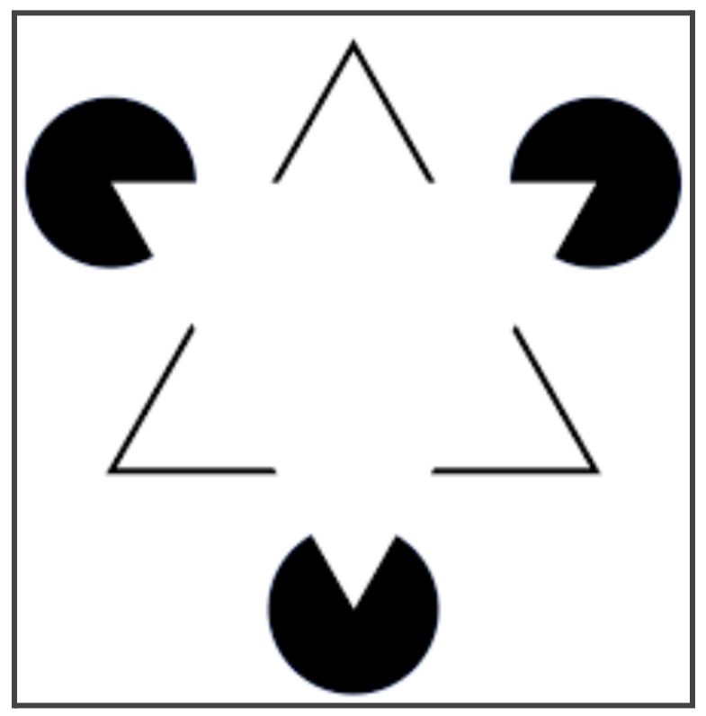
The human brain is exceptionally good at simplifying and organising complex images into an ordered system. Take the figure below—to most people, it looks like a bright white triangle with the outline of a darker triangle underneath it, but really it’s just three circles with strategically placed cut-outs and three Vs. But those disparate parts are organised in such a way that our brains turn them into a greater whole.
Source: Wikipedia
As a result of this process, our mind can comprehend all sorts of information due to things like proximity, similarity, and closure. These principles belong to what’s known as the Gestalt principles of perceptual organisation.
The Gestalt principles are a set of psychological principles that are valuable for product designers, UX designers, and UI designers because they shed light on how people interpret and assess their work.
In this article, we’ll explain everything you need to know about the Gestalt principles and how to use them.
Let’s get started!
What are the Gestalt principles and where do they come from?
The German psychologists Max Wertheimer, Kurt Koffka, and Wolfgang Kohler proposed the first Gestalt principles in the 1920s. Their goal was to understand how humans perceive meaningful information. They came up with a set of principles that explain how the mind perceives a series of disparate elements as a unified whole, influencing what the individual sees.
The Gestalt principles are mental shortcuts that emphasise that, in perception, the whole is greater than the parts. They allow us to see things in a manner that’s orderly and structured.
These principles influence our visual perception, which means that designers can use them to create behavioural change, including by getting us to focus on specific things or take specific actions.
The 7 Gestalt principles and how to use them, explained
We’ll explain seven of the Gestalt principles that are most often used in design today and how to use them.
1. Proximity
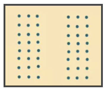
Proximity states that elements that are closer together are perceived as a group. The opposite is true as well: putting space between elements can cause separation.
For example, look at the pattern below. Notice how the lines of circles on the right and left are closer together, and therefore perceived as two groups. Also notice how the blank space in the middle makes it seem like the groups are in opposition to one another, even though they’re made of exactly the same elements.
Source: verywellmind.com
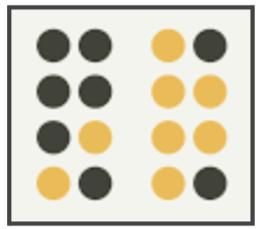
Even colour is less powerful than proximity. Notice how you continue to organise the circles below into two groups despite the different colours.
Source: Gestalt principles and their effect on user experience | UXtweak
How to use proximity:
Proximity is often used in product design (UX/UI) to group things without the need for hard borders. Putting space in between each group with similar elements closer together will enable the user to immediately understand the organisation as you want them to.
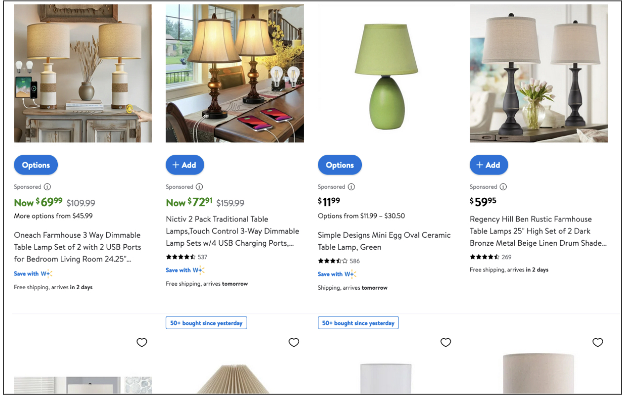
For example, on Walmart’s website, the nearness of each image with its name, price, star rating, and either an “options” or “add” button communicates that these are a unit despite the lack of lines between each item.
Source: Walmart website
2. Figure-ground
The figure-ground principle says that the way our brains process negative space will cause people to see things as either in the foreground or background.
For example, look at the FedEx symbol below. The words FedEx are foregrounded but if you look closely you’ll see an arrow between the ‘E’ and the ‘X’, showing that, although it’s often ignored, there’s more to this logo than first meets the eye.
Source: Gestalt Theory: How Our Minds React to What We See
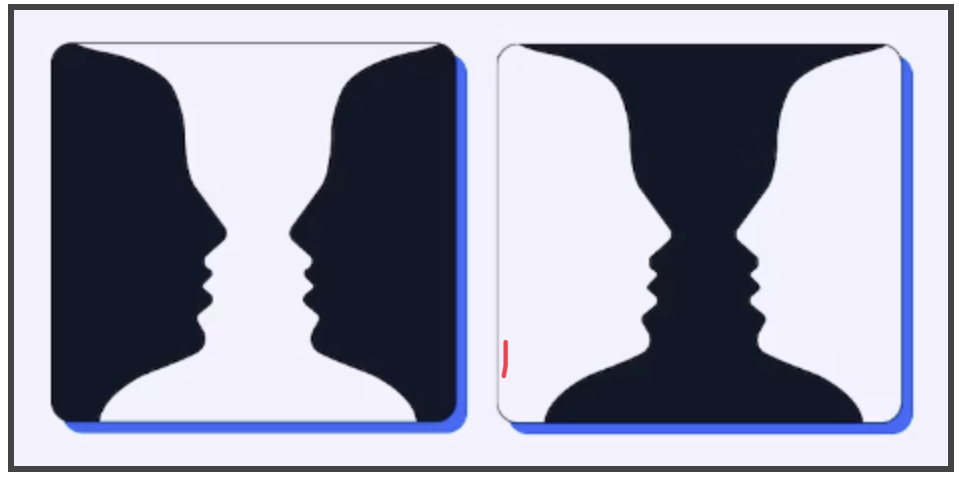
Similarly, look at the figure of the faces on the left below, then take a look at the figure of the candlestick on the right. You’ll notice they’re the same figure but, depending on which one’s black and which one’s white, either the faces or the candlestick take the foreground.
Source: A Guide to Gestalt Grouping Principles of Design | Maze
How to use figure-ground:
For product designers, it’s valuable to know that one of the first things people do when they come to a website or mobile app is determine what’s in the background and what’s in the foreground. That makes it easier to highlight a specific point of focus on a product.
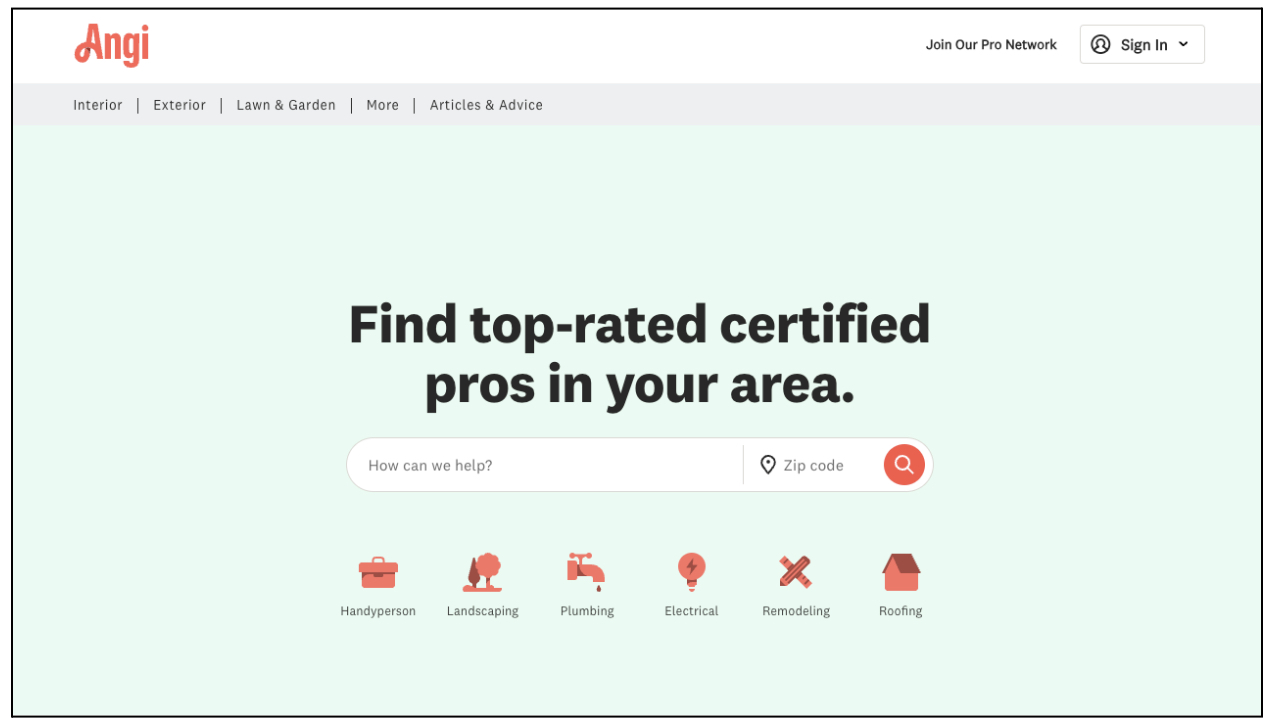
For example, when users look for professionals to help with their household projects on Angi, they first see the logo of the website at the top and then they see the searchbox in the middle of the screen below. There are other options available as well, but those are seen first because those are in white and, therefore, stand out the most.
3. Similarity
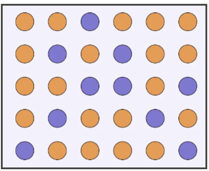
While elements in proximity to one another will make up a group, groups of similarity make up groups too, as long as their proximity is consistent. Similarity can be achieved through colour, shape, or size, whatever it takes to tie different elements together.
Take, for example, the below image. In our brains, the blue dots are grouped separately from all the orange dots, even though they have no meaningful difference.
How to use similarity:
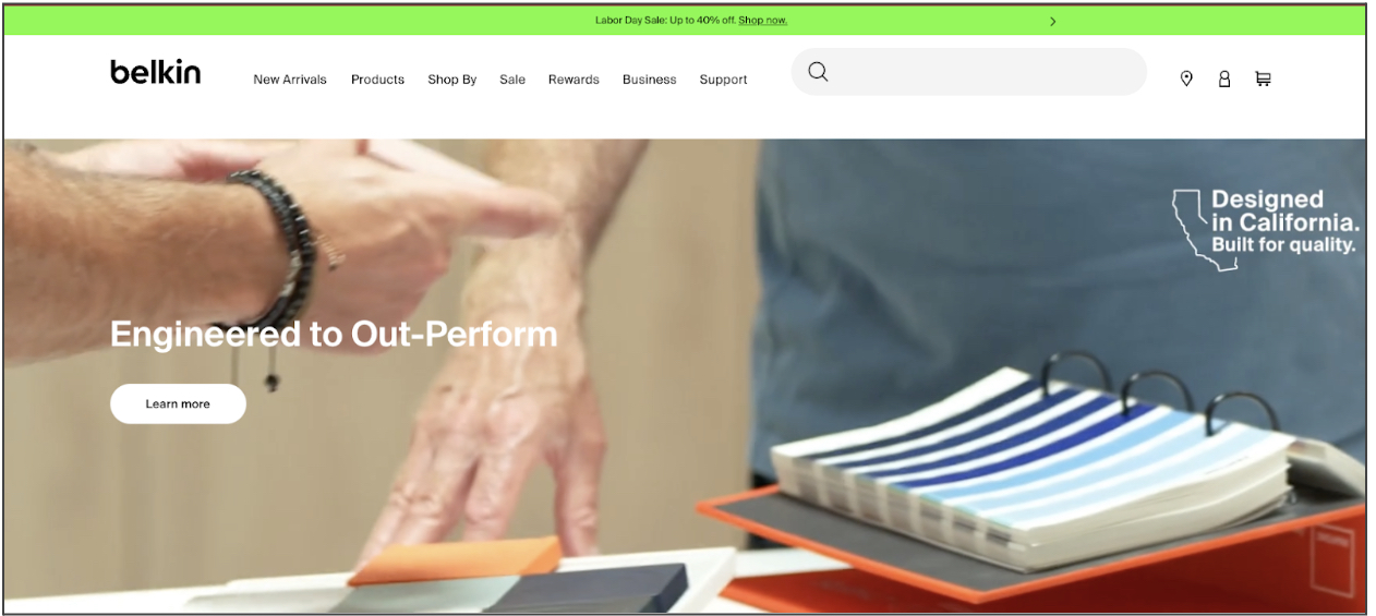
In UX and UI design, this can be used to distinguish one thing from another. For example, when the text is blue, we know that it is a link.
Take the Belkin homepage below for instance. The screen is automatically divided into three distinct areas because of the different colours of each of them. There’s the green banner about a Labor Day sale at the top which is separate from the logo, primary navigation, and search box in the white which is separate from the picture of hands at the bottom.
4. Common region
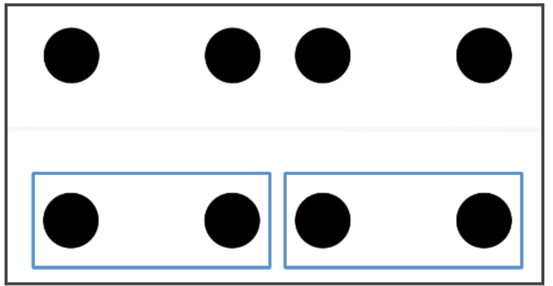
According to this Gestalt principle, when elements are located in the same closed region, we perceive them as related. These elements stand apart from other individual elements or groups due to borders or other visible barriers, even if they look the same in other aspects.
Take a look at the example below. In the top row without the boxes, the middle two circles are perceived as a group. But, in the bottom example, the boxes make the left two circles and the right two circles two groups. The principle of common region can overpower other principles.
Source: The Principle of Common Region: Containers Create Groupings
How to use common region:
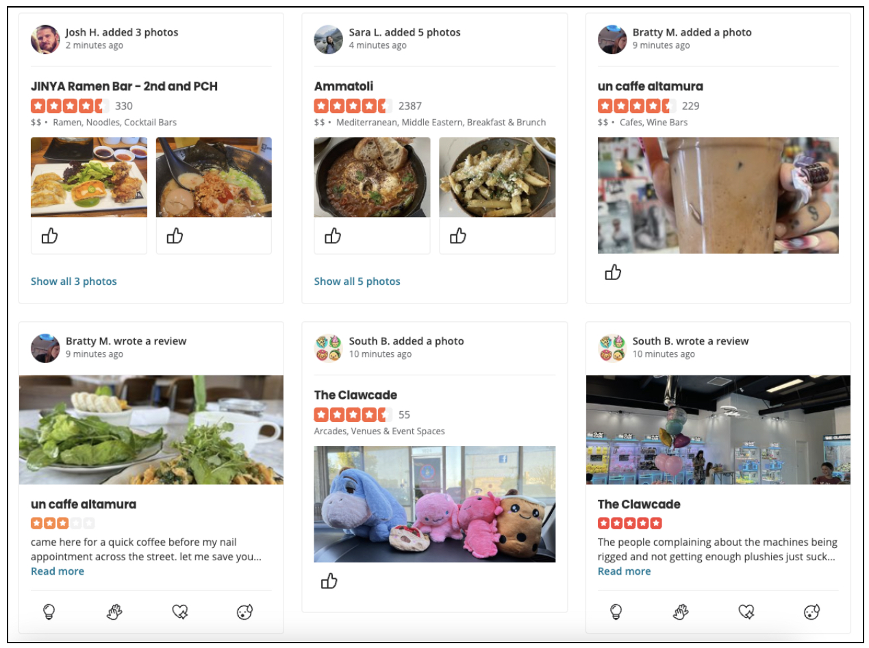
When websites like Pinterest or Facebook use boxes to separate one group of similar elements from another group of similar elements, the principle of common region is at work.
For example, on Yelp, every individual establishment with recent activity is enclosed in its own box with the photos, videos, or comments that it garnered to make it clear that these interactions are associated with this business, not any other.
5. Continuity
The principle of continuity says that the human eye will perceive the smoothest path possible when seeing points that could be connected. Take the image below. The circles are arranged to be perceived as two lines: one in orange and one in blue. There’s nothing in the design that demands these lines be seen this way, but our brains put them in order.
Source: A Guide to Gestalt Grouping Principles of Design | Maze
How to use continuity:
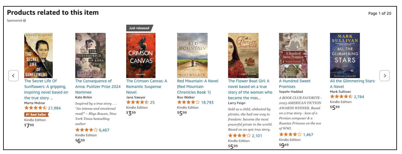
In product design, this can be used to guide a user’s eye in a specific direction. For example, the related products on Amazon are listed in a line so the user can keep following (and comparing) the individual products.
For example, the products below are all similar to the book that was originally picked, easily furthering your shopping.
amazon.com related products bar
6. Closure
When we look at an arrangement of visual elements, we look for a single recognizable pattern that allows us to create a whole. The simplest form of this rule is following a dotted line to its end, but there are more complex arrangements too.
Take, for example, the World Wildlife Fund logo below. There are large parts of the panda missing from this drawing, but you can easily fill in the missing parts to see the whole.
Source: World Wildlife Fund
How to use closure:
Closure is often used in logos like this one. But for product designers, an important example of closure is showing images fading off and onto the screen, indicating there’s more information to be found by clicking or swiping left or right. If the user only saw full images, they would be less likely to scroll and the new images would be jarring.
For instance, on the imdb.com homepage, there is continuous scroll that you can see every few seconds. It shows one image and text going and another coming in, from left to right. Without the fade between them the new images would be unexpected.
7. Focal point
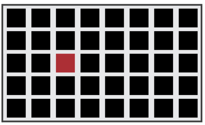
This Gestalt principle states that whatever stands out visually, i.e. the focal point, will capture the viewer’s attention. The brain places a visual hierarchy on things that stand out, so for example the red box below is processed before the black boxes, even though the red box is not even centred in the pattern.
Source: 5 Ways To Create A Focal Point – Alvalyn Creative Illustration
How to use focal point:
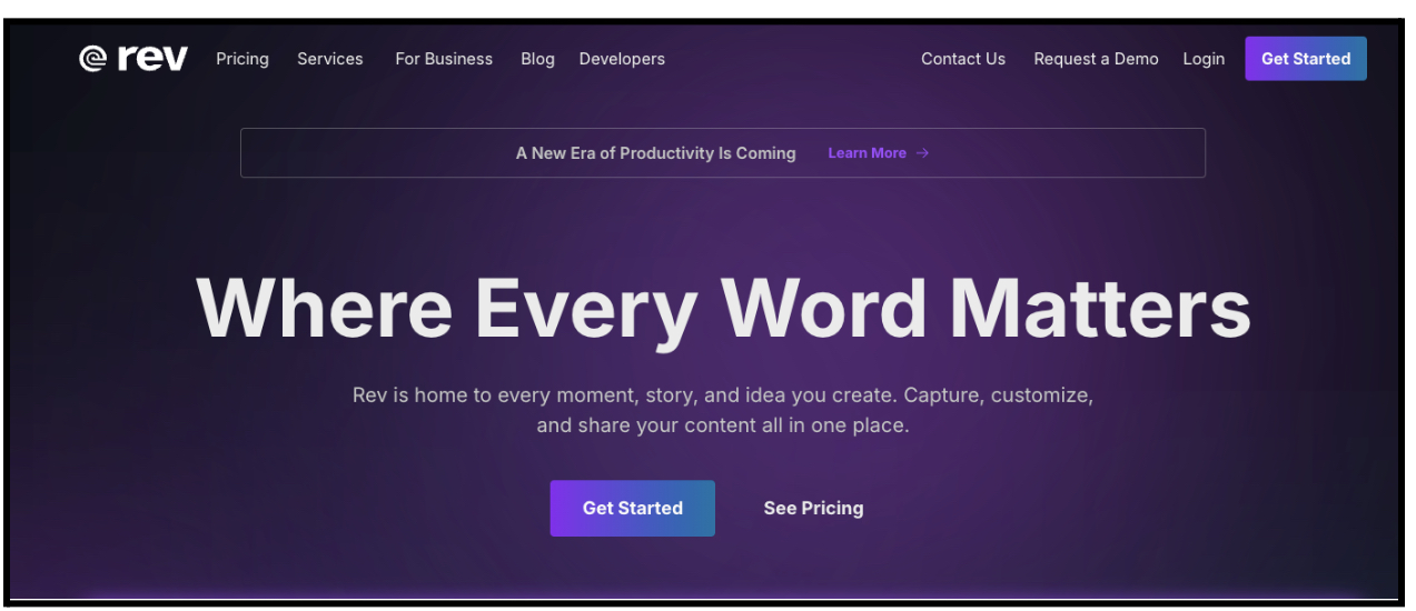
In product design, using a button of a different colour, like making the most important button red when everything else is black, white, or muted shades, is an example of this principle in action.
For example, the most important buttons on the rev.com homepage are the two “Get Started” buttons. They stand out the most, especially in contrast to the other links they’re next to like “Login” and “See Pricing.”
How do designers use the Gestalt principles?
Like any psychological principle, understanding how to use the Gestalt principles in your work as a product designer can help you improve your designs. Designers use the Gestalt principles to create a more seamless user experience for users. By using the Gestalt principles, they exploit people’s natural tendencies and ensure the user feels comfortable with their product, even on their first visit.
Gestalt principles are so easy to incorporate, that you may already be using them. And if you’re not, it’s easy to start. They can quickly improve a design and direct users towards the interactions you would like them to take.
Gestalt principles in summary
The seven principles we covered—proximity, figure-ground, similarity, common region, continuity, closure, and focal point—can be seen again and again in UX and UI design. The Gestalt principles give product, UX, and UI designers insight into how people perceive their designs, and work off the idea that the whole is greater than its parts.
Want to learn more about product design? Consider taking the UX Design Institute’s Product Design (UX/UI) Programme. Want to learn more about the rules and principles that guide designers in their work? Check out the 7 fundamental UX principles all designers should know, discover 7 essential principles of icon design, or perfect your UX writing with the 6 most important content design principles.

