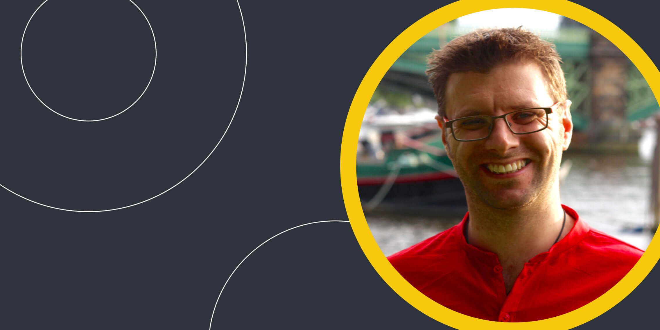
As a consultant, James helps companies to hire the right UX candidates, improve diversity and build a positive working culture. His clients have spanned early stage startups to the world’s largest media organisations. In this piece, James shares his expert advice on how to stand out during the hiring process and what pitfalls to avoid during an interview for UX designers.
The typical hiring process
Portfolio – I use a candidate’s portfolio to gauge their understanding of UX. I look for candidates who talk about UX processes rather than show me finished UI designs. These are the candidates who’ll proceed to the first round interview.
I’m a big believer in UX being a great conversion career so I’ll look at the CV not so much for employment history but to get a sense of what’s important to you professionally.
First round interview – This will be a ‘getting-to-know-you’ conversation, seeing how you approach professional scenarios and probing your understanding of UX. This first round is trying to work out where you might fit in my organisation and what support you would need to grow into the role. A good attitude and the ability to explain your work is most important in this round.
Task – There is some controversy about interview tasks being used as free labour. But when used right, tasks are a valuable way to get a sense of a candidate’s practical skills. I make sure the tasks I set are time-limited and based on fictional products. I also ensure the brief clearly states the purpose and expected outcomes.
Final round interview – This will include my boss and another representative of the product or technical team. We’ll review your task and have a more technical conversation about your abilities and how well you collaborate.
We’ll ask you to play out some scenarios to see how you would approach specific challenges relevant to the business. And we’ll ask you what questions you have for us. This is where you can really impress us.
During an interview, never say that you have no questions, unless you’ve already decided you don’t want the job.
Ask probing questions that show you have a critical business mind. Make us persuade you to come work for us. W hen I’m the interviewee, m y favourite question to ask is “what are your main organisational challenges when it comes to building products right now?” Depending on what they tell me, I describe a situation where I solved that kind of problem in the past . This has won me some of my favourite roles.
Other good examples are:
- Can you tell me how UX typically works in your organisation?
- What made you choose to work for this organisation?
- And if you’re feeling cocky: What question are you scared I will ask right now?
The most desirable hard skills and qualifications in a UX designer
At junior level I look for awareness of the basics – a couple of research techniques and a few ideas of what makes a successful wireframe. Discovery techniques like affinity diagrams or okay if you haven’t heard of certain techniques but I would expect you to be able to discuss a plan for research, analysis, design, prototyping and validation. If any of that is missing, it’s a red flag.
At senior level, we’ll be having a conversation about how to do a given technique really well. Again, you may not know all the same techniques I do (there are far too many out there for any one person to know) but if I tell you the intent behind a particular technique you should be able to pull out an equivalent and tell me how you’d use it.
It’s hard to hire by qualification in UX because there are so few accredited courses out there. So when I do see a qualification on your CV or LinkedIn, it immediately grabs my attention.
It tells me you’ve invested in this as a career, and you’re interested in personal growth. Those are both key attributes I’m looking for in a new colleague.
Important soft skills in a UX designer
I can’t overstate how important your soft skills are when it comes to getting hired. Any good UX lead can teach you the techniques you need if you’re willing to learn. However, if you’re incredibly skilled but you lack empathy with users or can’t collaborate without becoming argumentative, only time and maturity can fix that.
I look for candidates who can tell a story about their work, explaining the why and how as well as the what. I see how candidates respond to having their decisions challenged – are you defensive or do you listen and give a considered response?
These are signs to me that you can do more than just wireframe – you can shepherd an experience through the winding and sometimes rocky road of product development. Soft skills for a designer are among the most difficult to obtain but there are books and other resources that can help you.
The difference between a good UX portfolio and a great one
There are two critical parts to a great portfolio: how you organise information and how you illustrate UX processes over UI designs.
On the first point, your portfolio (and your CV) needs to be clear, consistent and easy to navigate. If it’s over-designed or hard to read it tells me you haven’t considered the reader’s needs. Whether you’re making it as a website or a PDF, make yourself a good, clear template and stick to it. Think about the overall structure before you start putting content in and keep it relevant.
I don’t need to know the same five things about every project you’ve worked on. Choose the best example of each of your techniques.
To the second point, if I’m hiring you for a UX role it’s unlikely I’ll expect you to do UI design as well. You need to focus on showing me your UX techniques, tell me a story about what you did, how it worked and what outcomes you got as a result.
A dirty secret of the industry is that it doesn’t matter whether the work you show me ever made it into production. There are lots of pitfalls on the way to release.
What’s valuable to me is to know that you’ve done the right things from a UX point of view, even if the organisation couldn’t execute on them.
CV pitfalls to avoid during the hiring process
Your CV needs to show me you can edit and organise information. Don’t open a template in Word and fill in every section just because it’s there. Only tell me the important things – I don’t need to know about your Saturday job during school! Your CV needs to complement your portfolio; it tells me the relevant things about your approach and experience, and persuades me to take a look at your portfolio.
Some candidates make basic errors in their CVs. Proofread it at least twice. Any typos will stand out like a sore thumb. This is supposed to be an important document to you – make sure it gets the polish.
It might be trendy to add in capability graphs saying things like you have a 7/10 skill level in Sketch but these are of no benefit. The scale is arbitrary and they only open up an opportunity to ask why you’re not 10/10.
Don’t include a headshot either. I had a Creative Director who automatically rejected CVs with headshots. They make it harder to anonymise your CV and a lot of larger companies now do this to avoid bias in their hiring processes.
Targeting your CV for specific roles
I have two versions of my CV, depending on the focus of the contract. One is more focused towards my research skills, the other is broader and covers leadership and education as well. Look at the job description and align your application to it. You can also use a cover letter to frame your CV and direct attention to particularly relevant experience.
My favourite questions to ask at interviews
When I’m the interviewer, there’s a question I will always ask first, to gauge your level. “We have a product that attracts two different groups of users. One is women in their 30s who are looking for X. The other is men in their 50s and 60s who are looking for Y. Can you explain how you’d approach this product, so their differing needs are balanced?”
A good answer is something like “This sounds like a case where personas can really help, so I’d…”
A great answer is “Well, you might use a persona for this but actually a demographic split like that sounds artificial to me, so here’s what I’d do to validate the user needs…”
A bad answer is “I’d think really carefully while I was designing so that the ladies didn’t feel left out.”
I actually got this answer once. You can imagine whether or not that candidate progressed to the second round.


