Card sorting is an essential part of a UX designer’s process. It allows them to understand how the user thinks, which is incredibly important as a user’s ability to find what they’re looking for is a key parts of a positive user experience with a product. If it takes them a long time to find the content or information they’re seeking, they’re unlikely to use the product again.
In this article, you’ll learn about the different types of card sorting, the basic steps to conduct a card sort, and the pros and cons of in-person and remote card sorting. We’ll cover:
- What is card sorting used for
- Different types of card sorting
- How to conduct a card sort
- Ways to conduct a card sort
- Conclusion
What is card sorting used for
According to the Nielsen Norman Group, one of the biggest UX problems identified by users is that the information they’re seeking from a product is not where they expect to find it. They recommend involving users in the creation of the navigation and structure of a product and one way to do this is through card sorting.
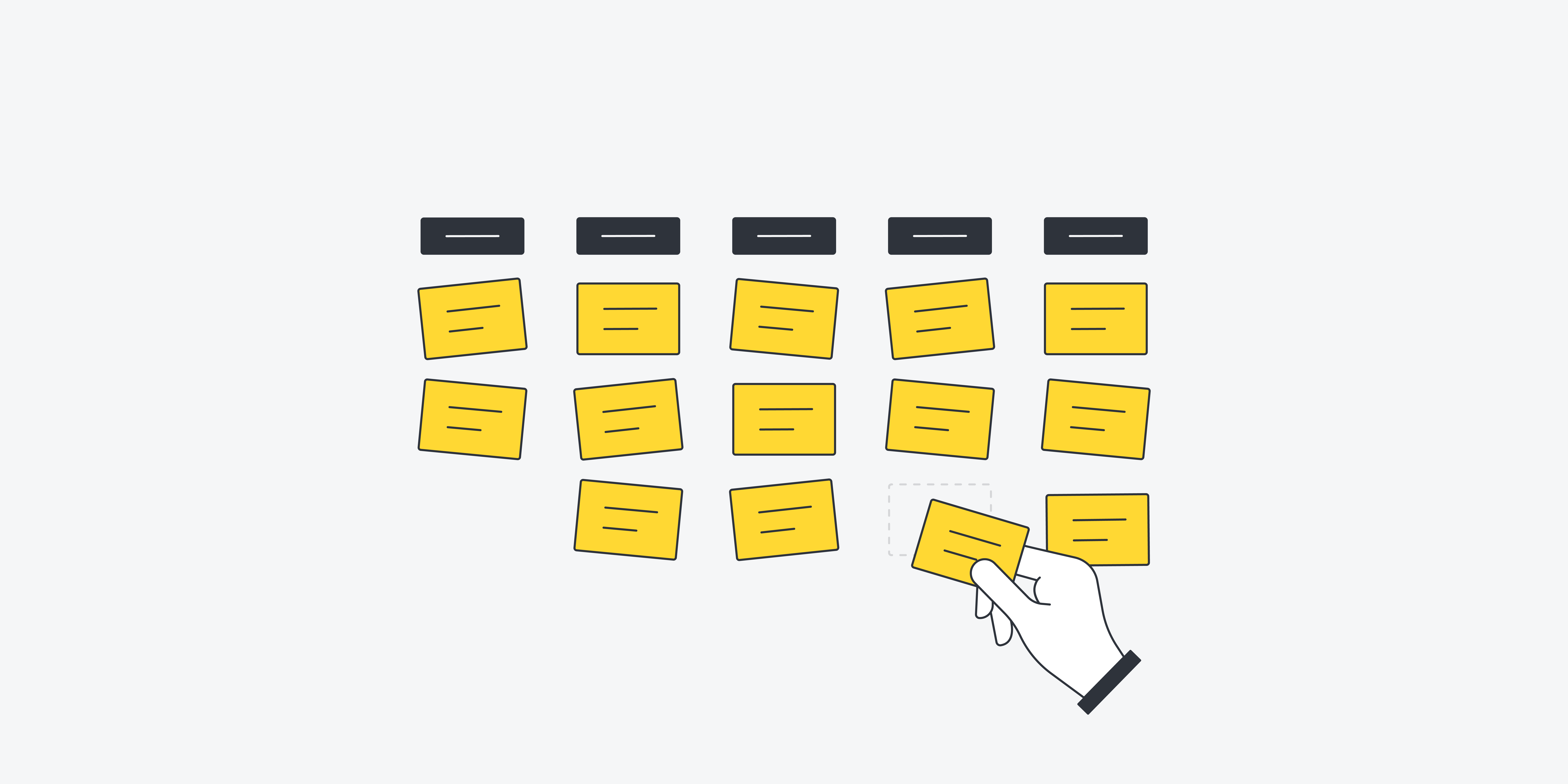
Card sorting is a UX research technique in which research participants sort labels for content into larger categories. Card sorting provides insight into how participants group a product’s content, enabling the UX team to design an information architecture that makes sense to users.
For example, if you’re creating a website for a store that sells office products and services, how do you organise the categories on the website to encompass everything that’s offered in a way that the user can understand?
Do you have a category specifically for school supplies, under which you place every item a student might require for the academic year or does it make more sense to include separate categories for supplies like pens, folders and notebooks?
Card sorting enables you to see how users would organise the information. If you conduct a card sort with multiple participants, you’ll see patterns emerge that will help you organise the product’s information architecture in a way that will make the most sense to your users.
Different types of card sorting
There are two main ways to conduct a card sort – open and closed – but there is also a third hybrid approach. Each option has its own pros and cons.
Open card sort: In an open card sort, participants organise a set of cards into categories. They then label each category with whatever name they think fits it best.
Open card sorts help you to understand not only how users organise content but also the terms they use to classify these items. This will ensure the UX team understands how users naturally think about a product’s content when designing its information architecture.
Closed card sort: In a closed card sort, participants organise a set of cards into a predetermined group of categories.
Closed card sorts help you to validate a group of categories that have already been defined by the UX team. Closed card sorting will shed light on whether a set of predetermined categories are understood by users and if they agree on what content belongs in each category.
Hybrid card sort: In a hybrid card sort, participants are given a predetermined group of categories that users can organise their cards into but it also enables participants to create and label new categories if they want to.
Hybrid card sorts help you to discover if users understand a predetermined set of categories. If not, the users will inform you on how they would prefer the content to be categorised. This is especially useful if the UX team has arrived at a partial navigation structure but is having a hard time deciding how the remainder of the content should be organised.
How to conduct a card sort
Conducting a card sort is a fairly easy process that roughly follows these steps:
-
Choose the content labels you want your test participants to sort.
These should be agreed on by the UX team. Each individual item should be written onto a separate card or piece of paper. So for example, an office supply store will have individual cards that might include labels like staples, paper clips, pens and pencils
The Nielsen Norman Group recommends limiting the number of labels to between 40 and 80 to represent the most important content in your product. This will ensure there are enough items to provide insight into the way users organise the content but not so many that they become overwhelmed.
-
Have research participants organise the items into groups.
Present the set of cards to the participant after shuffling them to ensure they’re in no particular order and instruct them to read each one and organise them into categories.
If it’s an open card sort, participants should be instructed to organise the cards into as many categories as they’d like. If it’s a closed card sort, participants should be instructed to organise the cards into a predetermined group of categories. Either way, the groups the user creates can be as large or small as they’d like.
If there’s a card that the participant doesn’t feel fits into any group or that they don’t understand, they should leave it off to the side. Users should keep in mind that this is a fluid process, so if they change their minds about anything, they should feel free to rearrange the cards in any way they want to.
-
Analyse the data.
After repeating this procedure with at least 15 participants from each group of users, it’s time to analyse. Go through the data to see which items tended to be grouped together, if there were groups or group names that frequently came up or if there were any other patterns in the data, such as items that were frequently set off to the side. This will help the UX team determine the navigation system and information structure that will provide the smoothest user experience.
Ways to conduct a card sort
Card sorting can be conducted in a number of situations. Which option you choose will depend on the amount of time and money you can spend and what you want to get out of the research.
In-person card sorting
Card sorting is traditionally conducted in person, and can be remarkably analog when it’s done this way. All it requires is a participant, a set of cards and a facilitator to explain what the participant must do.
Pros: It’s very simple to execute and participants can easily organise the physical cards in a way that will quickly provide the insights UX designers are looking for.
Cons: It falls on the person or people conducting the research session to meticulously document the results provided by each participant and then to organise those results so they can be input into whatever tool is being used to analyse the data.
There are several types of in-person card sorting.
- Moderated card sorting involves one-on-one sessions where, in addition to the information on content categories, researchers collect qualitative data on the participants’ rationale for their card categories. This can be accomplished by having a participant think out loud as they sort the cards. The researcher can also ask the participant a series of questions after they’ve finished categorising the cards about the reasoning behind the groups they created. Researchers can use one or both options.Pros: It provides more insight into why participants categorised the cards the way they did, which can help shed light on any uncertainties or confusion they may have had.
Cons: It takes substantially more time (and money) than unmoderated card sorting. - Unmoderated card sorting involves having participants organise cards with no interpersonal interaction outside of the researcher providing instructions at the beginning of the session and debriefing participants at the end.Pros: It is especially time and cost effective as several participants can be run at the same time with only one researcher overseeing them.
Cons: There must be enough cards and space for every participant. The sessions also provide less insight than moderated sessions. - Group card sorting involves having several participants sort cards as a group. The groups work collaboratively throughout the process with a researcher to provide instructions and debrief the group.Pros: It can be especially quick to conduct, enabling researchers to gather insights quickly.
Cons: One person may influence the others group members choices, skewing the results. Researchers should monitor sessions closely to ensure groups are collaborating and not just representing the thinking of one or two individuals.
Remote card sorting
Card sorting can now be conducted using software or web-based applications. Researchers create a set of labeled cards with a remote card sorting tool and participants then drag and drop them into groups. Some highly rated web-based card sorting tools include OptimalSort, Maze.co, and UXTweak. If you want to read more about other useful research tools, check out this blog post.
Remote card sorts can be open or closed and are typically unmoderated. However, tools like UserTesting make it possible to watch the participants through a web camera as they sort cards or to provide a series of questions for participants to answer when they’re done.
Pros: Remote card sorting enables participants from all over to be part of the research, instead of just those that can make it to an in-person research location. This is also the most time effective method for UX designers and researchers as the remote card sorting tool can analyse the data it collects.
Cons: If the remote tool is difficult to use, it can lead to frustration, cause participants to abandon the study, or skew results by preventing participants from creating the categories they want. In addition, participants may not be able to see all the cards in a study on the screen of their device, leading to a more disjointed card sorting process.
Conclusion
Card sorting is a powerful but simple way to discover how users would organise the content in your product. While it isn’t difficult to conduct a card sort, there are many important decisions to make about how to conduct this UX research technique – open or closed card sort, moderated or not, in-person or remote.
No matter which options you choose, a card sort is bound to offer a wealth of information that will ensure your product’s structure and information architecture is as intuitive for your users as it can be. Ultimately, card sorting will enhance the user experience of the end product.


