A/B testing is your ticket to understanding what works and what doesn’t. It allows you to get into your users’ heads in a quantifiable way. As a UX designer, there’s nothing more valuable than that.
A/B testing is a standard method used to understand user preferences quantifiably. Designers can also use it to solve a debate within the design team. When it comes to user experience, relying on data and not intuition is an important part of the design process.
Testing in the design phase and during the rollout of new features helps you create the best possible product. In doing so, you may realise that a feature is unnecessary or not beneficial after testing it. Or, you could find that you’ve completely missed a feature your users really need.
In this guide, you’ll find out what A/B testing is, how to conduct one and why you should A/B test.
What is A/B testing?
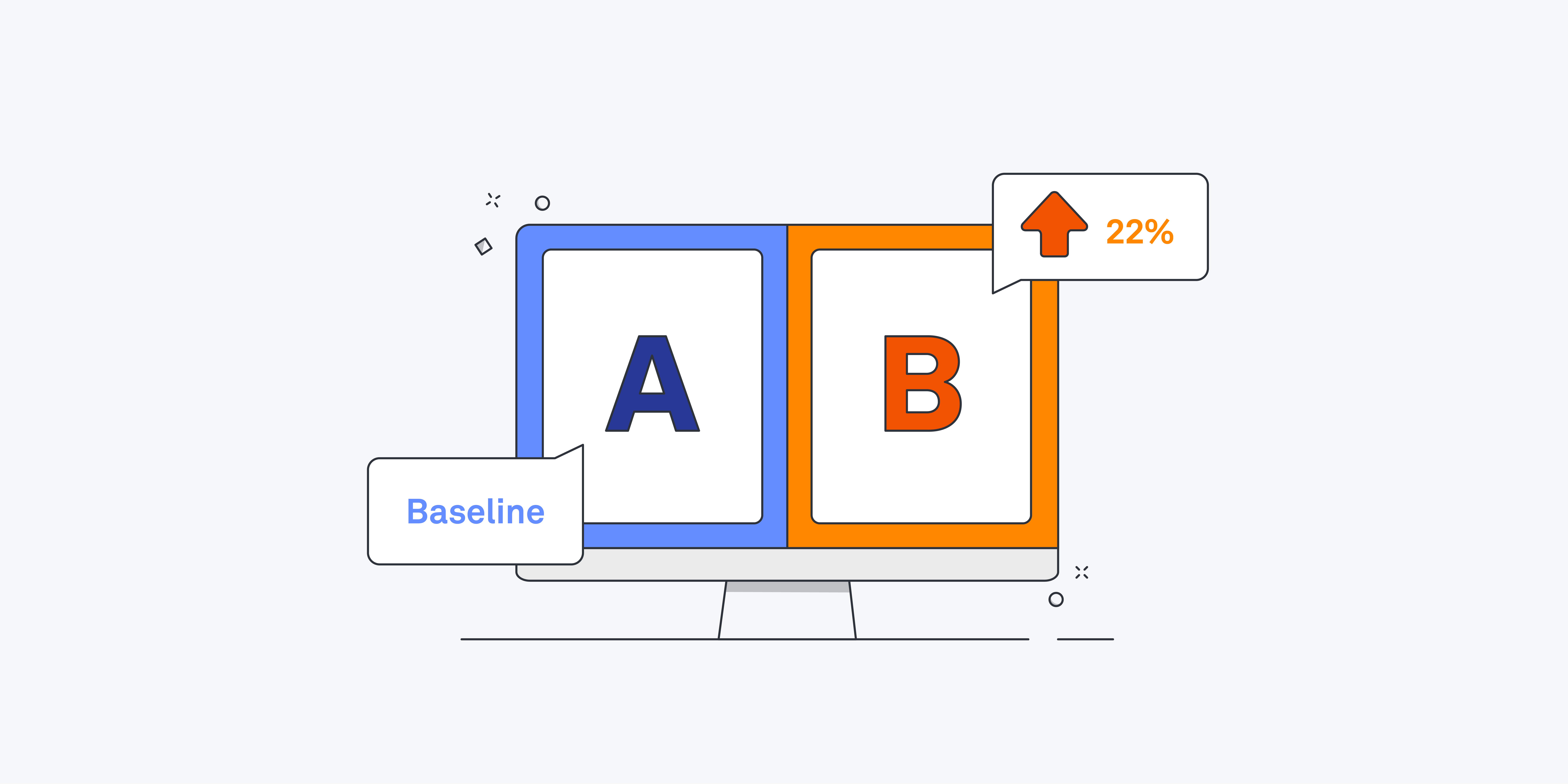
A/B testing compares two versions of a product, web page, app or concept against each other to determine which performs better. It’s a quantitative way of finding the best possible version of your work.
Also known as split testing or bucket testing, A/B testing is basically an experiment where two options are shown to users at random. Then, marketers, developers, designers or analysts use statistical analysis to determine which variation works better for their outcome goals. A/B testing is all about finding out what the user prefers.
What are the benefits of A/B testing?
A/B testing removes the guesswork from user experience (UX), user interface (UI) design, as well as many other professions like marketing and data analytics. A/B testing directly measures the impact of any changes you make so that you can ensure you’re actually creating an optimal result.
Testing your designs helps you improve your product and ensure it’s what people want. In the long run, A/B testing also saves companies money – especially if they conduct it in the design phase. Testing often prevents mistakes or subpar designs before they’ve invested in development.
Why A/B test?
A/B testing isn’t just for the initial design phase of a project. Even after a product has been launched and developed, you can still conduct A/B testing. It helps designers find out what users want, optimise and iterate.
Here are some reasons you might want to conduct an A/B test:
- To settle a design team conflict
- Get quantitative data about your designs
- Make informed, user-focused decisions
- Confirm the validity of a design change
- Determine which copy or UI elements work best
- Iteration
- Find out how a small change influences user behaviour
- Improve user experience
- Optimise conversion rates
What to A/B test
It’s essential to conduct targeted A/B testing. That means changing only one aspect of your design per test. This will be the “variable”. You’ll have to determine what you actually want to test.
For example, you might change the size of one button, the colour of one button, the location of one submission box, the CTA copy on one button… You get the idea – test only one variable.
You may want to consider testing things that will have a big impact on user experience or that you don’t have enough data to understand. Look for high bounce rates, low conversion rates, high traffic areas, abandon points or common error points.
Here are some variables you might want to test:
– Layout
– Copywriting, which includes:
- Voice and tone
- Calls to Action (CTAs)
- Statements vs. questions
- Positive vs. negative
– Content
– Icons
– Buttons, which includes:
- Size
- Colour
- Shape
- Location
- Hyperlinks vs. buttons
– Fonts, which includes:
- Size
- Weight
- Serif vs. Sans Serif
– Colours, which includes:
- Buttons
- Background
- Typography
Images, including:
- Background Images
- Illustrations vs. Real Images
- People featured in images: race, gender, age, groups of people, one person
How to conduct A/B testing
To determine which version of a design is better, two versions are created at the same time. Then, version A will be shown to one half of the target audience, while the other version will be shown to the other half of the audience. The option that prompts users to take the desired action is the winner of the test and usually the design that gets implemented.
Let’s learn how to conduct an A/B test step-by-step with examples.
1. Set a goal
Before conducting your test, you need to know why you’re running the test. Set a goal that you want to achieve. That way, you can determine which version to continue using or testing. Be sure to gather any data you can before your test so that you can quantifiably see changes.
Examples:
- Improve conversion rates for newsletter sign-ups
- Get more form responses
- Get more shares
2. Determine what to test
Think about the goal you want to achieve. Consider what single aspect of your design you could change to get closer to that goal. For a list of ideas, scroll back up to “What to A/B Test.”
Examples:
- Move the newsletter signup box to the middle of blog posts
- Reduce the number of questions in the form
- Increase the size of the social media share buttons
3. Hypothesise
Make an assumption on which version do you think will perform better. This will help you solidify why you’re conducting the test and critically consider your designs. What could be preventing the result you’re trying to accomplish? Try writing out your hypothesis as a single sentence.
Examples:
- I think that moving the newsletter signup box to the middle of blog posts will result in more newsletter sign-ups
- I think reducing the number of questions on the form will increase the number of completed forms
- I think increasing the button size will increase shares because they’ll be more accessible and visible
3. Conduct test
Create two versions of your design to test: A and B. This could be a prototype of almost any fidelity. Then, determine your sample audience size to get statistically significant responses. Then, randomly expose half of the target audience to version A and the other half of the target audience to version B.
4. Wait
Monitor the test to make sure it’s working properly but don’t look at the results. You’ll need to wait for the test to be complete before looking at the results. It’s tempting to watch the results and assume a winner early on but you need to give it time.
The test must run long enough to produce a statistically significant, meaningful result. Wait until you’ve reached the minimum sample size you determined in the last step before looking at the data. Meaningful results can take anywhere from 48 hours up to two months, depending on your chosen sample size.
5. Analyse results
Once the results are in, crown the clear winner by implementing the results.
Examples:
- Moving the newsletter signup box to the middle of blog posts resulted in 15% more signups. We’ll move the newsletter up to the middle of all blog posts going forward.
- We reduced the number of questions in the form but it only resulted in 2% more completions. The data was not meaningful enough to determine our hypothesised solution as the clear winner so we will rerun the test with a different variable.
- We increased the size of the social media share buttons and our shares increased by 20%. We will implement the larger social buttons sitewide.
How to analyse A/B testing results
When you’re analysing your test results, you first need to make sure they’re statistically significant. Statistical significance is a threshold that determines the level of certainty that the results of a test are not due to a sampling error. It accounts for the uncertainty that comes along with randomised tests.
You’ll rely on the number of users and the number of conversions for each of your variations to determine statistical significance. The goal is to reach 90% or more statistical significance before assuming meaning from an A/B test.
Once you determine whether your results are statistically significant, you can decide how you’ll use your data. Maybe version B performed better and you implement it. Maybe your original design performed marginally better, so you choose to test it again. You could notice that your test was statistically significant but it still didn’t achieve your goal. In that case, you may decide to conduct another test.
Whatever you do, don’t guess
The number one rule of A/B testing is not to guess. The whole point of testing is using quantifiable data to inform your design decisions. A/B tests are a waste of time, energy and money if you don’t wait for the test to play out or ignore the results.
The amount you’ll use A/B testing in your UX design career will depend on where you’re employed. Some companies use A/B testing most of the time, while others rely primarily on usability testing. Regardless, it’s one of the most useful skills to have as a UX designer.


