If you are looking to become a UX designer, you’ve probably heard of ‘wireframes’ once or twice in your research so far. Wireframing is an essential part of the product design process. But you might be wondering what wireframes are and how to create them.
Everything you need to know about wireframes is in this guide. We’ll dive in by learning:
What is wireframing?
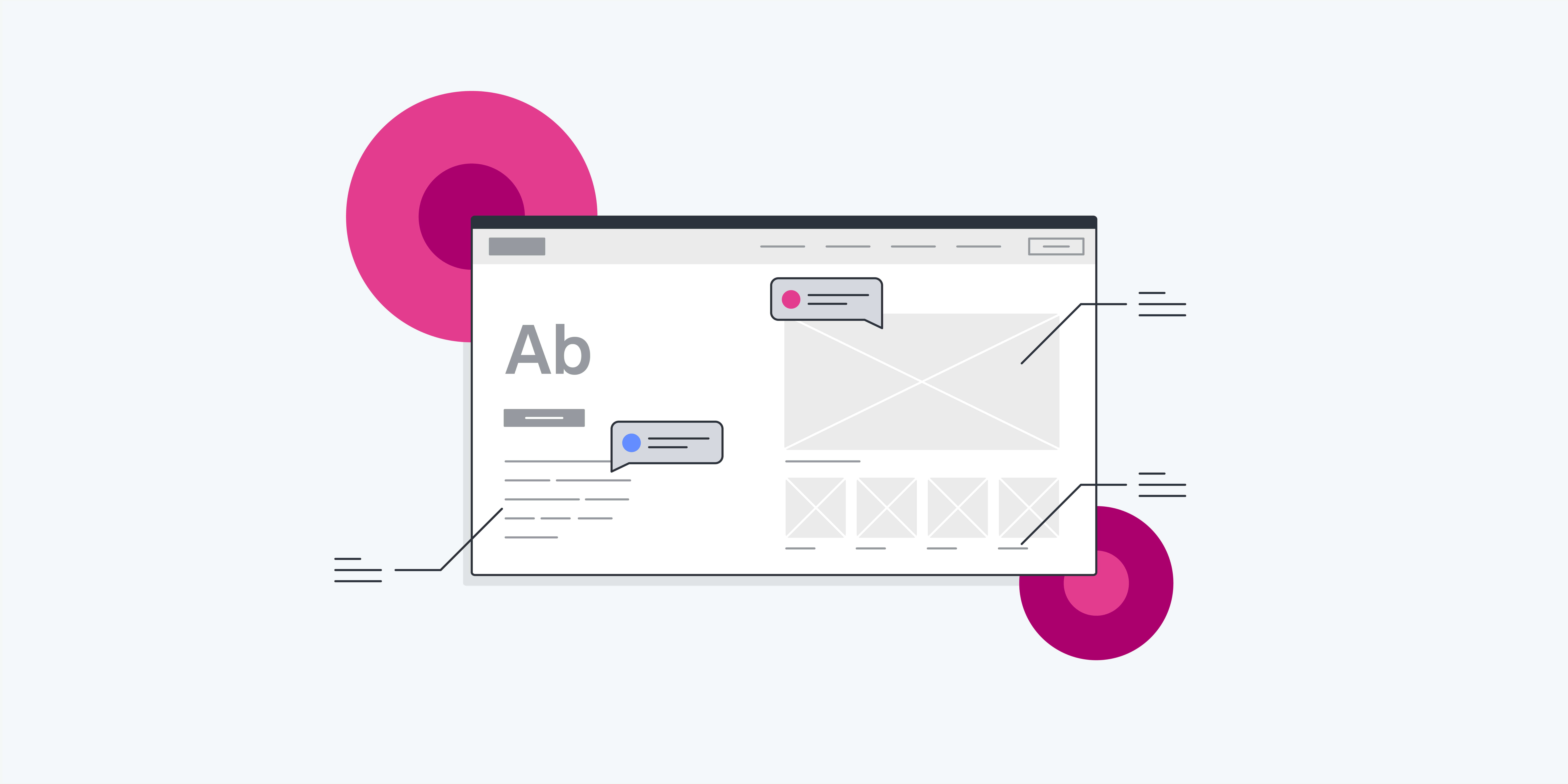
A wireframe is an outline of a webpage or app. It’s usually a two-dimensional skeleton outlining what you’ll include in each view of your app, kind of like a blueprint. Wireframes can be hand drawn on paper or built out digitally.
Wireframes are used by UX designers and web designers to provide a clear visual understanding of page structure, layout, information architecture, user flow, functionality and intended behaviours. Wireframes are presented to stakeholders like designers, developers, researchers and investors to agree on concepts before the interface is built out with code.
The downsides of wireframing
Sometimes there are downsides to wireframing but they’re pretty minute compared to the benefits. For starters, wireframes can feel complicated to present to clients or non-technical team members. You may find yourself explaining that wireframes aren’t prototypes more than once during your career.
It can also be easy to get bogged down by your wireframes. You might spend too much time designing them or even over-designing them. Plus, changing your wireframes multiple times can be tricky if you’re hand drawing or using a complicated technical system.
The benefits of wireframing
Wireframing allows all stakeholders to get on the same page before an app or webpage is built out with code. This saves time because developers won’t have to re-do their work if the functional prototype isn’t to the designer’s liking. It also saves money because companies won’t have to pay for as many design phases.
Additionally, wireframing helps designers see if the ideas they have in their heads translate well into real life. Wireframes are sometimes presented in user testing to determine whether they’ll work for the final prototype. Wireframes help designers keep users at the centre of their focus, which leads to the best results.
When should I wireframe?
Wireframing generally occurs during the exploratory design phase of the product life cycle. This phase is where designers begin to understand the product’s scope, collaborate on ideas and nail down business requirements. The wireframe is usually the first iteration of a webpage or app. It’s used as the basis for the rest of the product’s design.
After the initial wireframe is created, it’s usually presented to users to gain user feedback. Then, designers can make the next iteration of the product’s design, another wireframe, the prototype or a mockup. Want to learn more about the next phase? Check out our complete guide to prototyping.
The 3 types of wireframes
Much like prototypes, wireframes are made with varying levels of fidelity. Fidelity simply means how precisely a wireframe lines up with the final product. Different fidelities of wireframes have different uses, functionality, visual design and content.
Regardless of fidelity, nearly all wireframes include pseudo-Latin placeholder text, headers, search fields, image placeholders, logos, share buttons and menus. Most wireframes are created in shades of grey to represent colours but keep it simple.
Let’s take a look at the three most commonly used wireframes.
Low-fidelity wireframes
Use: a starting point, mapping user flow, deciding navigation layout, explaining initial concepts
Low-fidelity wireframes, sometimes called lo-fi, are rough visual representations of a webpage or app. This is usually what the designer starts with. They’re simple and don’t usually consider scale, grid or pixel accuracy.
Lo-fi wireframes are often hand-drawn and don’t include actual content. Instead of images or text, they’ll often have boxes with an X through them, basic labels or scribbles instead of actual text or pictures. They also don’t include typography or colour in this phase.
Mid-fidelity wireframes
Use: explore design ideas, establish spacing and buttons, establish user flow
Unlike lo-fi wireframes, mid-fidelity wireframes provide more precise representations of the layout. They still don’t include images, typography or detailed content. But more detail and attention are dedicated to showing specific components and features clearly.
Mid-fidelity wireframes are still in black and white. But designers will often use different shades of grey and different font weights to convey visual differences. This wireframe phase is usually created with a digital design tool. Keep reading to learn more about the best tools for wireframing.
High-fidelity wireframes
Use: exploring complex concepts, finalising design features for prototypes, user testing
High-fidelity wireframes, a.k.a. hi-fi, have pixel-specific layouts that are designed to scale. Hi-fi wireframes are often presented as initial prototypes.
A high-fidelity wireframe will usually have actual images and written content that is proposed to appear in later iterations of the app or webpage. High-fidelity wireframes are created using a digital tool. They feature actual typography, detailed features and menu systems.
Top 7 wireframing tools
We rounded up the top 7 wireframing tools for you to try out and their benefits, so you don’t have to search. We’ve listed them here in order of popularity.
1. Sketch
Sketch might be the most popular digital wireframing tool. Designers can combine artboards and vector design shapes to create pixel-accurate wireframes efficiently. Unlike Balsamiq, there’s no UI library.
But once you create a UI element yourself, you can reuse it easily with the symbols feature. Plus, it allows you to update styles across every view you’ve created which will save you so much time. Third parties offer UI kits to make your wireframes even more detailed.
2. Balsamiq
Balsamiq is another popular wireframing tools. Its interface is minimalist and clean. Balsmiq uses a static canvas with drag-and-drop tools for a simple, but not pixel-perfect, experience. It also offers auto-alignment, making it easy for even beginners to use. With a built-in UI component library, you can test out your design on various screen sizes too.
3. Invision Freehand
Invision Freehand allows you to digitally create a “hand-drawn” wireframe using your cursor. Or you can add basic images and shapes to a template. You can move your work from Invision Freehand over to Sketch and Photoshop, too.
4. Photoshop
Photoshop is a more advanced option for wireframes. Designers can create pixel-perfect wireframes using their own components or a third-party kit. This one has a steep learning curve, but once you understand it, you’ll easily be able to create high-fidelity wireframes quickly and beautifully.
5. Marvel
If you don’t want to seek out UI components or make your own, Marvel offers pre-designed sections to help you rapidly create wireframes and prototypes. It also has a handy comment feature, allowing your co-workers to easily comment on your design.
6. Proto.io
Proto.io is a cloud-based prototyping tool that can be used for wireframing. Like Invision Freehand, multiple designers can use Proto.io simultaneously, making it easy to collaborate. You can even seamlessly transfer your designers to apps like UserTesting and Userlytics to gather feedback.
7. Figma
Figma provides a straightforward, rapid wireframing interface. It’s a browser-based tool that offers easy visual organisation in the “layers” sidebar. Like Proto.io and Invision Freehand, you can collaborate with your teammates in real time.
The takeaway
Whether you’re attempting to present your initial design idea to your team or collaborating with another designer, wireframing is the way to do it. It’s a vital skill for any UX designer. This simple tool can be the key to solving complex design problems.
As a designer, you’ll probably create wireframes multiple times throughout each product development phase on every project throughout your career. Learning the lingo, the process and the expectations of wireframes is useful.


![The 10 best prototyping tools for UI/UX designers [2025 Update] 4 UI UX prototyping tools header image](https://www.uxdesigninstitute.com/blog/wp-content/uploads/2025/01/93_UX_Prototyping-tools_Illustration_blog-1.png)