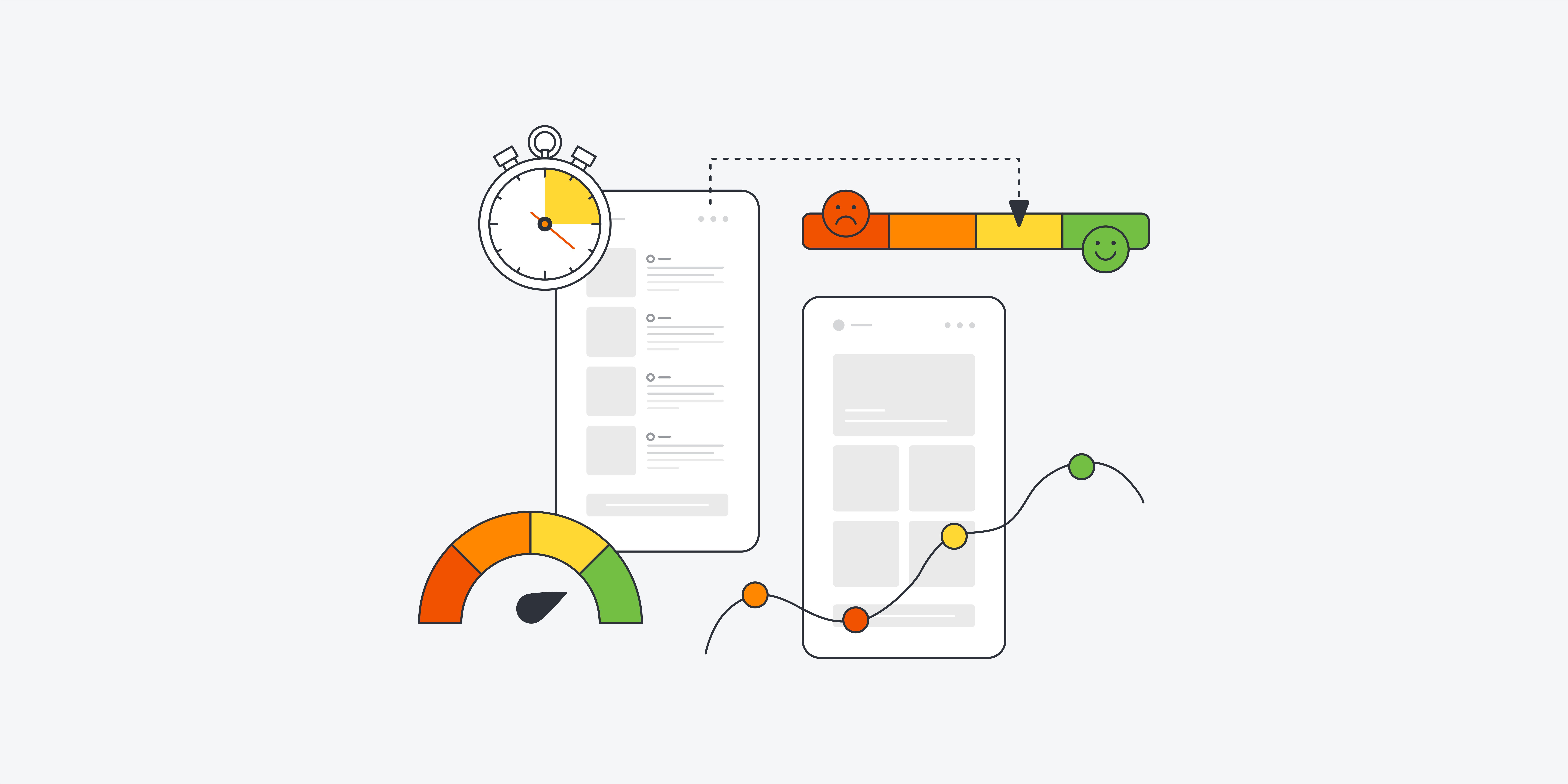
Key performance indicators (or KPIs) are increasingly being integrated into the UX designer’s toolkit. With the right KPIs, you can track and measure how your users interact with your product—and, most importantly, how the experience makes them feel.
But which KPIs should you be tracking? And how do you go about measuring different KPIs and interpreting the data they give you?
All will become clear in this post. Keep reading to discover the 7 most important UX KPIs and step-by-step instructions for how to measure and interpret them.
Here are the top KPIs all UX designers should keep an eye on:
- Task success rate
- Time-on-task
- User error rate
- Navigation vs. search
- System usability scale (SUS)
- Net promoter score (NPS)
- Customer satisfaction score (CSAT)
Ready to become a more data-driven UX designer? Let’s go!
First, though, a quick word on why UX KPIs are so useful…
What are UX KPIs and why should you measure them?
KPIs (or key performance indicators) measure, in quantifiable terms, your performance in relation to a specific goal.
For example: a marketing team might have the goal of increasing brand awareness. Brand awareness itself is a rather abstract concept which can’t be directly measured. However, the team could track metrics such as ‘follower growth rate’ on Instagram and ‘brand mentions’. These indicators can provide insight into whether or not the team’s efforts to increase brand awareness are achieving the desired results.
UX KPIs do the same thing. They allow UX designers to turn something abstract and subjective—the user experience—into measurable data. With UX design KPIs, you can measure the user experience on an ongoing basis and quickly identify areas for improvement. This ensures that you’re providing an excellent experience for the end user and meeting your strategic goals.
We’ve written more about why it’s so important to track UX KPIs in this guide. Now let’s outline the top UX KPIs you’ll want to keep an eye on.
The 7 most important UX KPIs (and how to measure them)
In this section, we explain how to measure the most important UX KPIs. Some KPIs are behavioural (they measure what the user does) and some are attitudinal (they measure what the user says).
The most important behavioural UX KPIs are:
- Task success rate
- Time-on-task
- User error rate
- Navigation vs. search
The most important attitudinal UX KPIs are:
- System usability scale (SUS)
- Net promoter score (NPS)
- Customer satisfaction (CSAT)
Let’s explore each KPI in detail.
The most important behavioural UX KPIs
1. Task success rate
What does task success rate measure?
Task success rate measures the percentage of users who are able to successfully complete a particular task.
What does this KPI tell you?
Measuring task success rate is important as it shows you how easy it is for users to achieve their goals when interacting with your product. If task success rate is low, you can assume there are some usability issues which need to be fixed. Studies show that 78% is a good task success rate to aim for.
How is task success rate calculated?
Task success rate is calculated by dividing the number of successfully completed tasks by the total number of attempts. You can then multiply by 100 for a percentage.
How to measure task success rate:
First, you need to decide which task you want to evaluate—for example, the task of completing a purchase via an ecommerce website. Then you need to define what constitutes successful completion of the task.
For example, the task is successfully completed once the user has entered their payment details and confirmed the purchase. If 73 out of 100 users successfully complete the task, you have a task success rate of 73%.
2. Time-on-task
What does time-on-task measure?
Time-on-task measures how long it takes the user to successfully complete a particular task. It’s usually reported as an average.
What does this KPI tell you?
In most cases, time-on-task gives you insight into how easy it is for the user to complete certain tasks. Shorter task times are usually associated with efficiency and therefore higher usability, while longer task times could indicate that the user is struggling to understand the product or find the information they need.
How is time-on-task calculated?
Time-on-task is calculated by recording how long it takes each individual user to complete the task (in seconds or minutes). You can then calculate the average time-on-task by adding all the completion times together and dividing by the number of users.
For example: if user 1 took 68 seconds to complete the task, user 2 took 55 seconds, and user 3 took 72 seconds, you’d do 68 + 55 + 72 (which equals 195) and then divide that by 3 for an average time-on-task of 65 seconds.
How to measure time-on-task:
As with task success rate, you need to determine which task you’re measuring and define the point of successful completion—for example, the moment a user hits “submit” on their registration form. Then you simply time, using a timer, how long it takes each user to complete the task. For your average time-on-task, run the calculation we outlined previously.
3. User error rate
What does the user error rate measure?
The user error rate measures how many mistakes a user makes when completing a certain task.
What does this KPI tell you?
User error rate is another indicator of usability. If the error rate is high, your design likely isn’t as user-friendly as it could (and should) be. Use this KPI as a sign that you may need to further investigate user pain-points and rethink certain aspects of your design.
How is user error rate calculated?
There are two ways to calculate the user error rate.
The first option is to calculate the average error occurrence rate. This is suitable if the task you’re measuring only involves one potential opportunity for error, or if there are several different errors the user could make but you only want to track one of them.
To calculate average error occurrence rate, you divide the total number of user errors which occurred (across all users) by the total number of possible errors for all users. You can then multiply this by 100 for a percentage.
The second option is to calculate the error rate. This is suitable if there are several potential errors per task and you want to measure the general error rate across that task. To calculate the error rate, divide the total number of errors made (across all users) by the total number of task attempts (this is calculated as follows: the number of users multiplied by the number of potential errors). You can then multiply this by 100 for a percentage.
For example: You’re running a test with 10 users. There are 5 potential errors (or error opportunities) within the task. Altogether, your 10 users make a total of 15 mistakes between them. You would calculate the error rate as follows: 15 divided by (10 x 15) = 0.1. Multiply by 100 for an error rate of 10%.
How to measure user error rate:
Determine which task you’re assessing and whether you want to measure the average error occurrence rate (for measuring just one error within the task) or the error rate (for measuring the occurrence of multiple errors). Then, track your selected users as they complete the task and calculate the user error rate accordingly.
4. Navigation vs. search
What does the navigation vs. search KPI measure?
When completing a given task, users will either follow the product’s navigational system to locate the information they need, or they’ll use the search function. The navigation vs. search KPI looks at how many users use the product navigation versus how many use the search function.
What does this KPI tell you?
The navigation vs. search KPI gives you insight into how users interact with your product when completing a particular task. If a high number of users are turning to the search function, this could hint at your navigation not being sufficiently clear or logical. However, it’s important not to jump to conclusions based on this KPI alone.
How is navigation vs. search calculated?
To compare how many users successfully complete a task using the navigation vs. those who use the search function, you divide the number of completed tasks using search by the total number of tasks completed. You then run the same calculation for the number of tasks completed using the navigation.
For example: You’ve asked 30 users to complete the task of purchasing a pair of shoes on your ecommerce site. If all 30 users completed the task successfully and 10 users did so via the navigation, you’d divide 10 by 30. You can then multiply this by 100 for a percentage. So, in this case, 33.33% of users used the navigation system for this particular task.
How to measure navigation vs. search:
To measure navigation vs. search, you’ll track your users as they complete a specific task. Here you can use usability testing software such as UsabilityHub, Hotjar and mouseflow to track exactly where users click/navigate throughout the test. At the end, you’ll calculate the proportion of users who completed the task via the navigation versus those who used the search function.
The most important attitudinal UX KPIs
5. System usability scale (SUS)
What does the system usability scale (SUS) measure?
The system usability scale (SUS) measures a product’s usability—or, more specifically, the end user’s perception of how usable and user-friendly the product is.
What does this KPI tell you?
This attitudinal KPI tells you how users rate the usability of your designs, asking them to score factors such as the ease, learnability, and consistency of your UX.
How to measure and calculate your system usability scale (SUS) score:
To measure system usability, you’ll first run a usability test (if you’re not sure how to do so, follow this step-by-step guide to UX testing). At the end of the test, you’ll ask your participants to complete the SUS questionnaire—a list of 10 items which they’ll rate with a choice of answers ranging from “strongly agree” to “strongly disagree.” The SUS questionnaire includes statements such as “I found the system unnecessarily complex” and “I thought the system was easy to use.”
Based on your users’ answers, you’ll then calculate an SUS score. This can be a bit tricky, but here are the steps you’ll need to follow:
- Convert each possible answer into numbers as follows:
- Strongly disagree: 1 point
- Disagree: 2 points
- Neutral: 3 points
- Agree: 4 points
- Strongly agree: 5 points
- Add up the user’s score for all odd-numbered questions (i.e. questions 1, 3, 5, 7, and 9 on the questionnaire), then subtract 5. This will give you the value of X.
- Add up the user’s score for all even-numbered questions (i.e. questions 2, 4, 6, 8, and 10), then subtract that number from 25. This will give you the value of Y.
- Add X and Y, then multiply this new value by 2.5. That’s your final system usability score. Research suggests that a usability score of 68 or higher is considered above-average. Use that to benchmark and interpret your findings.
You’ll find a copy of the system usability scale (SUS) questionnaire here. Bear in mind that you can adapt the wording of each question slightly to better suit your product.
6. Net promoter score (NPS)
What does net promoter score (NPS) measure?
Net promoter score (NPS) measures the likelihood that your users would recommend your product to a friend.
What does this KPI tell you?
Net promoter score (NPS) is a good measure of customer satisfaction and loyalty. A high NPS suggests that your users are happy enough with your product—and the experience it provides—to recommend it to someone they know.
However, this is an attitudinal KPI which shouldn’t be interpreted as a definitive “thumbs up” for the overall user experience. A user might say that they’d recommend your product to a friend, but this doesn’t automatically mean that they found the product easy to use or navigate.
How to measure and calculate your net promoter score (NPS):
To gather data for your net promoter score, you’ll ask a sample of users one simple question: How likely are you to recommend this product to a friend? The user can then answer on a scale of 0 (not at all likely) to 10 (extremely likely).
Let’s say you collect answers to this question from 100 users. Here’s how to calculate your overall net promoter score:
- Group your participants into one of three categories: Promoters (those who give a score of 9 or 10), Passives (those who give a score of 7 or 8), and Detractors (those who give a score between 0 and 6).
- Use the following formula to calculate your NPS: (Number of promoters – number of detractors) ÷ the total number of participants. You can then multiply this value by 100.
For example: 50 of your users scored as Promoters, while 30 of your users scored as Detractors. You had 100 participants in total, so your NPS score works out as follows:
(50 – 30) ÷ 100 = 0.2.
02 x 100 = NPS of 20.
What constitutes a ‘good’ NPS depends on your industry. According to global survey data collected by SurveyMonkey, the average NPS score across 150,000 organisations is 32. The top 25% reported an NPS of 72 or higher.
7. Customer satisfaction (CSAT)
What does the customer satisfaction (CSAT) score measure?
The CSAT measures how satisfied your users say they are with your product.
What does this KPI tell you?
This KPI tells you, quite simply, how satisfied your users are with your product or a specific feature. It’s a broad KPI so it doesn’t provide much (or any) insight into exactly what elements your users are or are not satisfied with. However, used in conjunction with other KPIs, it can give you an indicator as to your user’s happiness levels—and thus how your product is performing from a UX standpoint.
How to measure and calculate your CSAT score:
To measure customer satisfaction, you can ask your users to answer just one question: How satisfied are you with the product? Here, you can replace the word ‘product’ with whatever is relevant—feature, website, or app, for example.
Users can answer on a scale of 1-5, 1 being ‘very unsatisfied’ and 5 being ‘very satisfied’. Based on the answers you gather, you can calculate your final CSAT score as follows:
- Add up how many users answered with a 4 or a 5 (‘satisfied’ or ‘very satisfied’). These are your satisfied users (and the only users who will count for this score).
- Divide the number of satisfied users by the total number of responses you received. For example, if you surveyed 150 users and 50 of those count as satisfied customers, you would do: 50 ÷ 150 = 0.33. You can then multiply this by 100 for an overall customer satisfaction score (CSAT) of 33.
Again, the definition of a ‘good’ CSAT score varies by product and industry. Research suggests that the average CSAT for e-commerce products is 77. The software industry also reports an average score of 77, compared to 75 for the online travel industry. When interpreting your customer satisfaction score, it’s important to benchmark against the average for your industry as well as your own past performance.
The takeaway
With these 7 KPIs, you can capture both behavioural and attitudinal data to paint a detailed picture of how your users interact with your product and how the experience makes them feel. Armed with these insights, you have the power to identify pain-points and continuously improve your UX.
Want more tips on how to leverage data in the UX design process? Learn how to analyse and synthesise your user research with the help of this guide.


