You’ve probably heard of storyboarding in relation to films, animations, and video games. But did you know that they are also an extremely valuable UX design tool?
In UX and product design, storyboards are used to visualise the user’s experience with a product or service. They map out the user’s actions in chronological order, creating a comic strip-style depiction of their journey from A to B within a specific context or scenario.
But why is this useful? What are the benefits of storyboarding for UX, and how can you incorporate storyboards into your own design process?
We cover everything you need to know in this guide. Consider it your ultimate storyboarding handbook, complete with a step-by-step process you can follow to create your own.
Keep reading to learn:
- What are storyboards and how are they used in UX design?
- Where do storyboards fit into the UX and product design process?
- What are the benefits of storyboarding in UX design?
- What are the key elements of a storyboard?
- How do you create a storyboard? Step-by-step guide
- What are the best storyboarding software and tools?
- In summary
First, let’s define what storyboarding is and how it relates to UX.
What is a storyboard and how is it used in UX design?
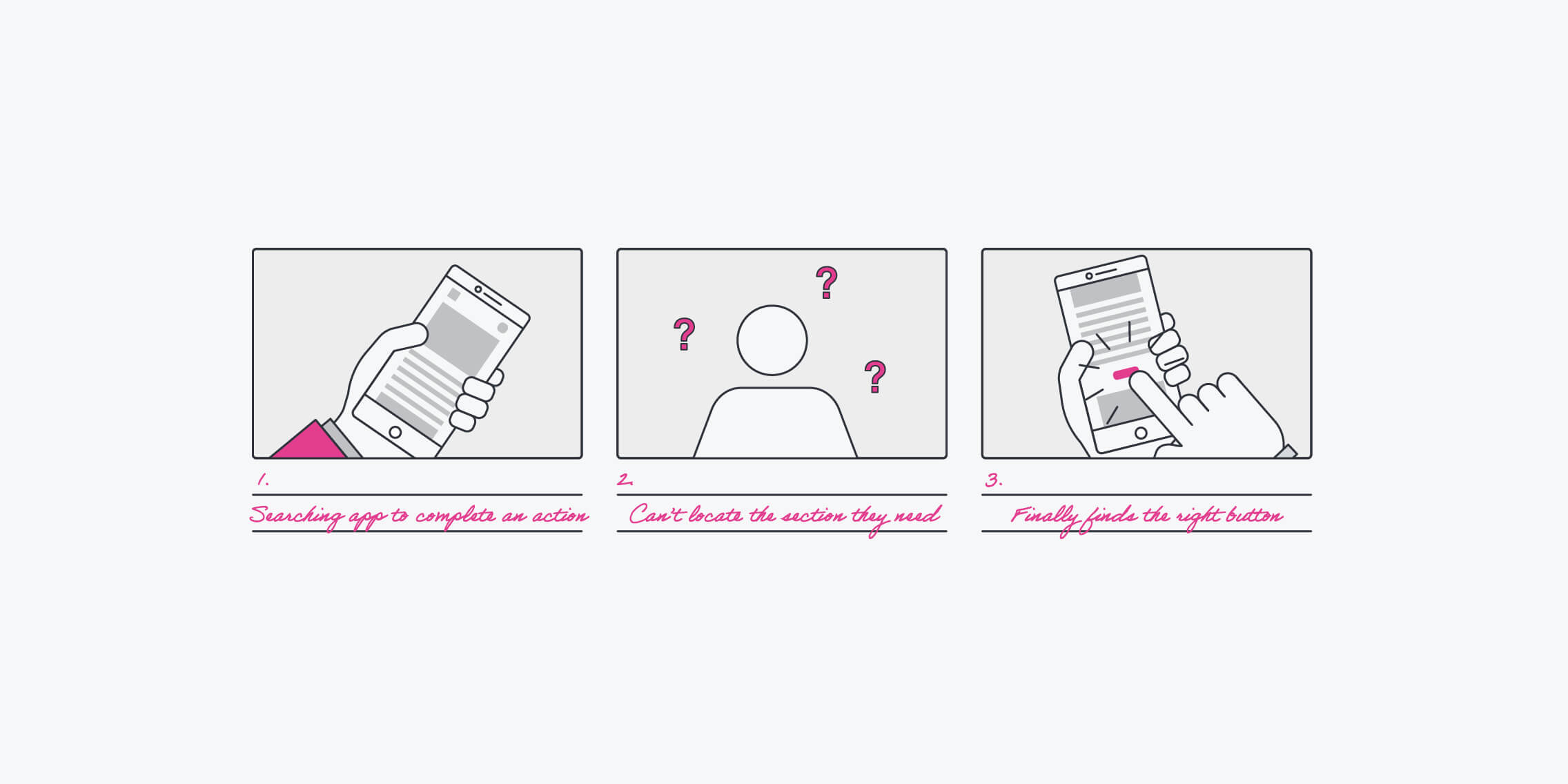
A storyboard is a sequence of illustrations used to visually depict a story or narrative. It breaks the story down into individual scenes, mapping them out in chronological order so you can see, step by step, how the story unfolds—just like a comic strip.
The storyboarding technique was developed by Walt Disney Studios in the 1930s as a way to construct coherent stories that would later become the animated films we all know and love.
So what do they have to do with UX?
In UX and product design, storyboards are used to visually map out the user’s experience with a product or service. They consider the different steps a user might go through when interacting with the product, predicting likely scenarios and sketching out what happens at each stage.
Just as Disney’s animators used storyboards to carve out a coherent and compelling narrative, UX and product designers use boards to map out the story of the user (the main character in the story) and the product. In doing so, they can identify “plot holes”, i.e. gaps or roadblocks within the user experience, and identify opportunities to write a better story for the user—i.e. to design a better user experience.
Storyboards also serve as a communication tool, helping designers to express and communicate their ideas in a way that’s quick, engaging, and memorable.
Where do storyboards fit into the UX and product design process? When should you create them?
The UX design process begins with user research and defining the problem to be solved. From there, designers focus on ideation, coming up with potential solutions and choosing one to take forward. With a solution in mind, the process moves to designing, prototyping, and validating that solution before it’s developed and launched. After launch, continuous UX testing seeks to improve, update, and add to the existing product in line with the user’s needs.
That’s the UX design process in a nutshell. So where does storyboarding come into play?
It can be useful at various stages of the UX/product design process. You can use them:
- After user research, before defining the problem and ideating solutions. boards are great for organising your research data, pulling out key themes, and turning your findings into a visual story about your users. In what scenarios do they use your existing product or encounter the problem space you’re exploring? What issues do they run into along the way?
- By presenting your research findings as a comic strip-style story, you can (quite literally) paint a picture of the problem space. This makes it easier to communicate and share your research findings, but also to guide you towards defining the right problem and coming up with solutions.
- As part of the ideation process. You’ve done your user research and defined the problem you need to solve. As you come up with different solutions, storyboarding enables you to visualise them in action. If you develop solution X, how will the user interact with it? Does it address the necessary pain-points or generate new issues? How does it compare to solution Y? Mapping out potential solutions helps you to evaluate their validity before moving on to design and development.
- Throughout the design phase to guide product decisions. Just as you might refer back to your user personas to remind you of who you’re designing for and what they need, they can be a useful “north star” throughout the design phase. Creating storyboards, or referring back to existing ones, can help to keep the user’s pain-points at the forefront, enabling you to prioritise their needs and make user-focused design decisions.
Those are some scenarios where storyboards can come in handy. Now let’s dive deeper into the benefits of storyboarding for UX.
What are the benefits of storyboarding in UX design?
Thanks to their visual, concise, and sequential nature, storyboards are an excellent way to leverage the power of storytelling in UX design. Let’s consider the main benefits of storyboarding and why storyboards are such a valuable UX tool.
Storyboards enable you to communicate your ideas quickly and clearly
Our brains are wired to process images much faster than text—60,000 times faster, in fact. With storyboards, you can present your findings and ideas in a way that’s quick and easy for others to digest. This helps to foster collaboration and dialogue among key stakeholders, to build a shared understanding of the problem space, and to get buy-in for your proposed solutions.
In short: UX storyboards are easy to process and understand, making them a powerful communication tool.
Storyboards centre the user and cultivate empathy
How many times have you heard that empathy is crucial for good UX? The various steps in the UX process—and the fundamental principles of UX—are all geared towards meeting the user’s needs and generally designing an experience that will benefit them. Storyboards are no exception.
Storyboards centre the user by positioning them as the main character. So, as you create your storyboards, you have no choice but to consider the experience from your user’s perspective. That’s user-centric design at its best!
At the same time, storyboards present the user’s experience in a way that’s more engaging and relatable than, say, plain text or simple diagrams. This can help stakeholders who are not involved in the design process—and perhaps not so accustomed to prioritising the user—to empathise with their needs and better understand your ideas and design decisions.
In short: Storyboards put your end user into the role of main character, ensuring a user-first design process and helping to cultivate empathy across the board.
Save time and money
Storyboarding alone is not a sufficient means for validating your ideas, but it can help you to explore their potential before investing in any further design or development. You can take any seedling of an idea and quickly sketch out a storyboard which depicts that idea in action.
In doing so, you may uncover “plot holes” and realise that, actually, this idea isn’t worth pursuing. Or you might find that it appears to work well and is worth exploring further. With storyboarding, you can get a preliminary look at how your ideas might perform in the real world, with real users—allowing you to eliminate unsuitable ideas before you spend any real time or money on them.
In short: Storyboarding can be used to explore early-stage ideas and evaluate their potential, making sure you don’t waste time (or money) focusing on the wrong solution.
So far, we’ve established what a storyboard is, why it’s a useful UX tool, and how you can incorporate it into your design process. For the second half of our guide, let’s get into the practicalities of creating a storyboard.
What are the key elements of a storyboard?
Before we outline the storyboarding process, it’s helpful to consider all the key elements that make up a storyboard.
The main components are:
- A specific scenario: This is like the title of your story, summing up what the storyboard is about. It also references the persona who will feature in your storyboard. For example: Ellis, a single parent, wants to open a savings account for his/her/their children.
- A main character: Every good story has a protagonist, as does every good storyboard! As specified in your storyboard scenario, the story you’re telling will focus on a specific user persona and their interaction with/experience of the problem space and/or your product. You might provide a brief bullet-point summary of the persona beneath the storyboard scenario. For example: Ellis, 43 years old, single parent to two children aged 5 and 8; works full-time, average income. Relatively tech-savvy but doesn’t have much time; needs a straightforward and manageable saving solution.
- Visuals: Storyboards comprise a series of panels or frames, with each frame depicting a step in the narrative. This narrative is communicated mostly through visuals, so you’ll need to fill each blank frame with sketches or images (e.g. photos or illustrations). The type of visuals will depend on the fidelity of your storyboard and the tools you’re using—are you going for low-fidelity pencil sketches or a high-fidelity digital format?
- Accompanying text: Each frame in your storyboard sequence should be accompanied by some explanatory text which helps to clarify and/or elaborate on what’s being depicted visually. This describes, in brief, what the user is doing, the context in which they’re doing it, and how they’re feeling in the process.
That’s the framework of a UX storyboard. Now: How do you go about creating one? Let’s find out.
How do you create a storyboard? Step-by-step guide
We’ve divided the process into seven key steps. Ready? Here’s how to create a storyboard:
- Define the purpose
- Compile any data and artefacts you’ll use to inform
- Gather your tools
- Craft your scenario statement
- Draft your story in writing
- Add visuals and accompanying text
- Present
And now in more detail…
1. Define the purpose
Before you get started on your storyboard, it’s important to have a clear goal in mind.
Why are you creating a one? What will it help you to achieve? What stage of the design process is it supporting you with?
Earlier in this guide, we outlined some common scenarios where storyboards can come in handy—for example, to visualise and make sense of your user research data, as part of the ideation process, or as a low-stakes way to evaluate your early-stage ideas.
Having a clearly-defined goal will enable you to determine the scenario and user persona your storyboard will focus on, as well as who should be involved in the storyboarding process.
Are you clear on your goals? Then proceed to step two!
2. Compile useful data and artefacts
How you approach this step will depend on the goal of your storyboard and at what stage of the design process you’re creating it (as covered in step one).
If you’re building a storyboard to visualise user research data, gather that data and, if necessary, condense it into key points. This might be responses from user surveys, transcripts from user interviews, or insights from usability tests.
In the absence of data (for example, if you’re creating storyboards as part of the ideation process), compile any artefacts or documentation that might be useful. For example, if you’ve got a well-defined user persona—or a set of personas, even—you might want those close by while you work on your storyboard.
3. Prepare your tools
Next, have your tools at the ready. The tools you use will depend on whether you’re creating a low-fidelity, hand-drawn storyboard or a higher fidelity digital one.
If you’re going for low-fidelity, you’ll just need pencils and paper. You may also want to download and print a template which you can fill out.
If you’re going down the digital route, you can use a tool like Figma, Canva, or Miro. We outline some of the best software in the penultimate section of this post—check them out once you’re finished with this step-by-step guide.
That’s your essential prep done! Now let’s get underway…
4. Craft your scenario statement
Earlier in this post, we set out the key components of a UX storyboard, the first two being 1) A specific scenario, and 2) A main character.
In this step, you’re going to craft what we’ll call your “scenario statement”—a headline which states what the storyboard is about and who the main character is. Bear in mind that anyone reading this title should be able to deduce what’s going on, even without any prior knowledge or context. So: make it meaningful and relevant.
Beneath the scenario statement, you can flesh out the details of your main character (i.e. your user persona). Limit this to one or two essential bullet points; you don’t need to provide a full persona description, just a few extra details for context.
5. Draft your story in writing
Now you’re going to draft your story in writing. For this step, we recommend using pen and paper.
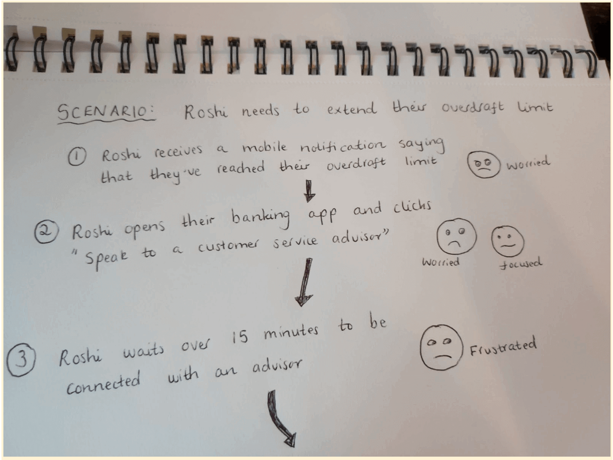
Write out each step in the story, focusing on the actions the user takes. Each little block of text should represent one step or action; these will soon become the individual frames in your storyboard. And, for each action, note down (or visually depict) the user’s emotions—for example, frustrated, confused, worried, overwhelmed, relieved, excited, and so on.
Here’s how this might play out:
- Roshi receives a mobile notification saying that they’ve reached their overdraft limit [Emotion: worried]
- Roshi navigates to their mobile banking app and clicks “Speak to a customer service advisor” [Emotion: Worried, focused]
- Roshi waits over fifteen minutes to be connected with an advisor [Emotion: Frustrated]
As you draft the narrative, keep in mind that each storyboard should focus on just one sequence or “flow”. If there are multiple stories to be told (i.e. different actions the user could take that would send them down a different pathway), you’ll need to create multiple storyboards.
6. Add visuals and accompanying text
You’ve written out a logical and cohesive narrative; now you’re going to convey that narrative visually.
In each blank frame or panel, sketch out the individual steps in your story (or, if you’re using some other kind of visual representation, insert the relevant media). If you’re sketching by hand, don’t get too hung up on the quality of your drawings—simple stick figures will do just fine!
Underneath each frame, write a brief accompanying text which explains what’s going on: namely, what action the user is taking and how they feel.
Repeat that process for each step in your narrative until you have a fully-fledged storyboard.
7. Present your board
Congratulations! You’ve just created a UX storyboard. Now it’s time to loop back to your original goal and put your storyboard to good use.
Who should see your storyboard? Will you present it to key stakeholders to share, in visual form, your user research findings? Or will you use it to inform and inspire an ideation session with your fellow designers?
Whatever its purpose, we’re sure your UX storyboard will prove extremely valuable. Now, as promised, let’s outline some of the best storyboarding software and tools.
What are the best software and tools?
If you’re creating boards digitally and/or collaboratively with remote or distributed teams, consider using software (or a tool with storyboarding templates and functionality).
Here are some of the best storyboarding tools worth exploring:
- Miro—a collaborative whiteboard tool, ideal for ideation sessions, workshops, design sprints, user journey mapping and, of course, storyboarding.
- Canva—a drag-and-drop graphic design tool offering a wide range of customisable templates.
- Figma—something of a UX design staple, Figma is a browser-based collaborative design tool which also works well for storyboarding.
- StoryboardThat—not a UX design tool per se, but worth considering if you’re looking for nothing more than a storyboarding program.
- Boords—an all-in-one storyboarding solution, complete with frame-specific commenting for streamlined feedback.
In summary
Whew! That was quite a deep dive into storyboards. We hope you enjoyed learning about this valuable UX tool and feel inspired to create your own.
To recap: storyboards provide a comic strip-style visualisation of the user’s experience with a product or service, mapping out each step the user takes as they interact with the product. Each depicts a specific scenario, with a user persona as the main character. The goal is to communicate your findings and ideas in a way that’s visual, memorable, and engaging—and, perhaps most importantly, encourages everybody to walk in the user’s shoes.
Storyboarding is just one of many techniques you can use to optimise your design process and create delightful, user-friendly products. For more tips and insights, learn how to create an effective design handoff for developers here, master the art of creating affinity diagrams with the help of this guide, or check out this post on how to create user journeys.
![The 10 best prototyping tools for UI/UX designers [2025 Update] 5 UI UX prototyping tools header image](https://www.uxdesigninstitute.com/blog/wp-content/uploads/2025/01/93_UX_Prototyping-tools_Illustration_blog-1.png)