In UX design, the KISS principle is all about embracing simplicity to improve usability. Learn how to use the KISS principle for better UX in this guide.
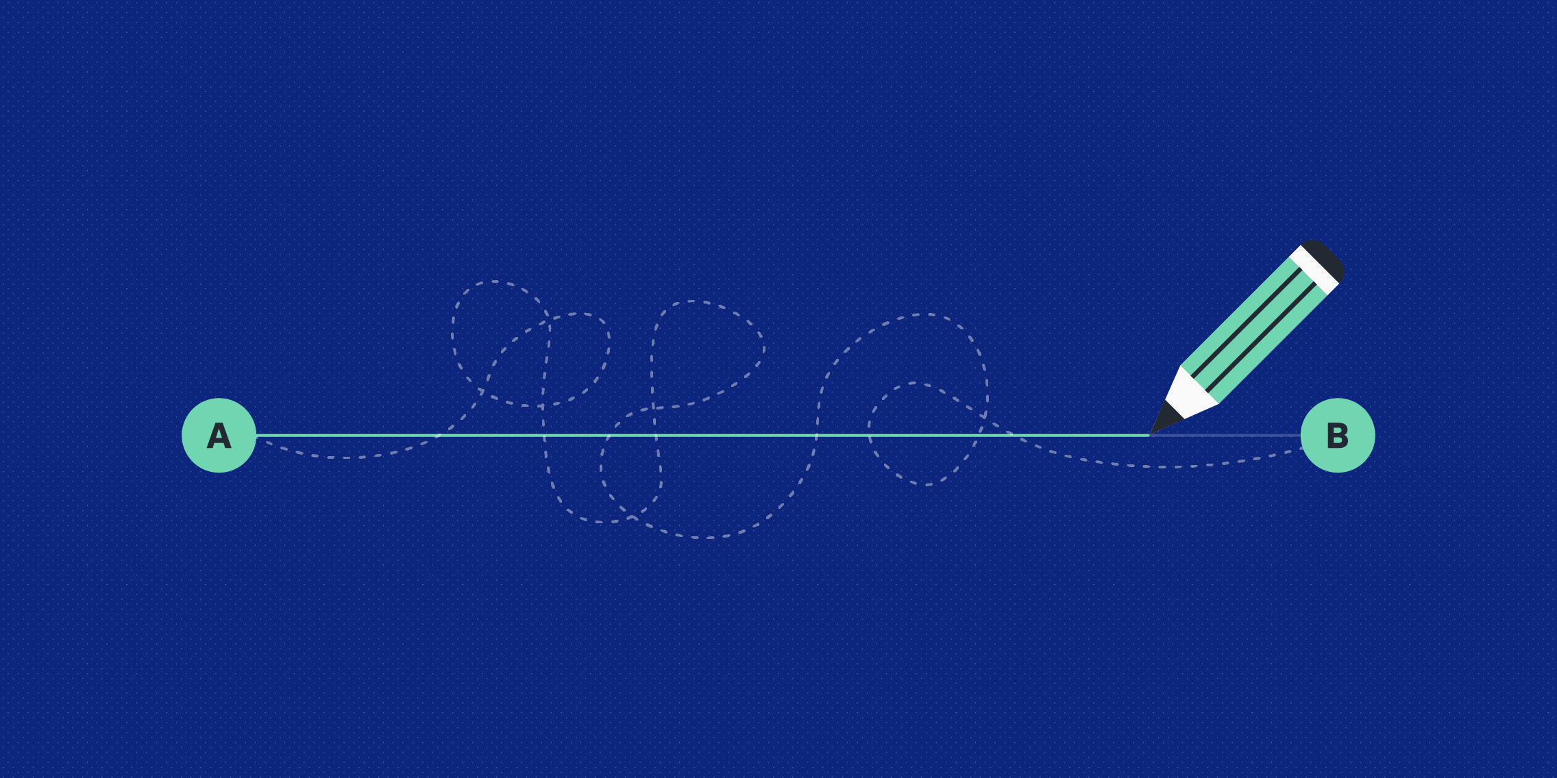
KISS (Keep it simple, stupid!) is a design principle that favours simplicity.
According to KISS, the most simple, straightforward solutions are often the best ones. Embracing the KISS principle can help you to prioritise your end users’ needs, improve usability and accessibility, and generally provide a more positive user experience.
So what exactly does KISS mean in the context of UX design? What are some practical ways you can apply the KISS principle—and when is the KISS principle not appropriate?
We cover everything you need to know in this guide. Keep reading to learn:
- What is the KISS principle?
- Where does the KISS principle come from?
- How does the KISS principle apply to UX and product design?
- What are the benefits of applying the KISS principle to UX?
- Examples of the KISS principle in action
- How to use the KISS principle: 5 practical tips for designers
- When should you NOT apply the KISS principle?
- The takeaway
Let’s begin.
What is the KISS principle?
KISS stands for “Keep it simple, stupid!” Variations include “Keep it short (and) simple” or “Keep it simple (and) straightforward.”
The KISS principle reminds us that simple solutions are often the most effective ones. It can be applied to almost any field—engineering, software development, marketing, project management and, of course, design.
Whatever scenario you apply it to, the KISS principle advocates for approaches and solutions that are simple, uncomplicated, clear, and straightforward.
We’ll take a closer look at how the KISS principle applies to UX design shortly. First, let’s consider where KISS comes from.
Where does the KISS principle come from?
The KISS principle is thought to have been coined in the mid-1900s by Kelly Johnson, an American aeronautical engineer who worked for the Lockheed Skunk Works—a secret division of Lockheed Corporation responsible for designing and developing aircrafts.
Legend has it that Johnson told the designers he was working with that whatever they designed must be simple enough that someone could repair it quickly and easily within the context of battle, with only basic knowledge/training and simple tools.
This same message is meaningful in many different professions. In software development, the KISS principle favours clean, simple code. In marketing, KISS promotes the idea of communicating with your audience in a way that’s simple, easy to understand, and clearly conveys the core value or message.
Now how about KISS in UX and product design? Let’s take a look.
How does the KISS principle apply to UX and product design?
The KISS principle helps to design usable, accessible products
We know that the KISS principle encourages simplicity. In the field of UX and product design, this is often synonymous with usability.
Ultimately, the simpler a product or service is, the easier it is to use. This applies to how many options the user is presented with, the kind of language and messaging they encounter throughout the product or service, and the simplicity (or complexity) of the navigation system at play.
Imagine you’re using a new coffee machine for the first time. You just want to make a simple espresso, and you’re expecting to pop in a capsule and press a button—nothing more. But, when you approach the machine, you’re confronted with a dozen different buttons. Not only are you overwhelmed with options; the icons and labels used for each button don’t make it clear as to what type of coffee or function the button represents.
After fiddling around for ten minutes to no avail, you give up and make a cup of tea instead. The kettle, with its simple on/off switch, presents a much easier solution. The overly complicated coffee machine remains unused—and therefore useless.
If the coffee machine had been designed with fewer options, or at least more clearly-labelled options, it would be much more suitable for the everyday user. But, with its complex, over-engineered design, it’s rendered inaccessible and doesn’t actually serve the target user’s needs.
The same goes for apps, websites, and indeed any kind of product or service we encounter in our lives. The design needs to be clear, accessible, and usable for the intended audience—and often, this means keeping it simple.
The KISS principle streamlines the design process and keeps you focused
KISS can also be applied to the UX design process itself. In fact, you’re probably already applying it without even realising.
When you conduct user research and define the problem you want to solve, for example, you should always aim to focus on just one single problem at a time. The same goes for your design systems and your UX documentation; the simpler you keep them, the easier it will be for the whole design team to use them.
You can even adhere to the KISS principle when it comes to your tool stack, only using the UX design tools and software that are really necessary. Introduce too many and you’ll find that things soon get complicated and confusing!
From an operational perspective, the KISS principle helps to streamline your processes, keep you focused on solving one user problem at a time, and generally establish a more straightforward and efficient way of working.
What are the benefits of applying the KISS principle to UX?
When applied to UX and product design, the KISS principle benefits everybody: the designers, the end users, and the business.
Here are the key benefits of keeping things simple in UX:
- KISS improves product usability and boosts user satisfaction. Isn’t that the ultimate goal of UX?!
- Simplicity often goes hand-in-hand with accessibility—another key objective when designing for human users.
- KISS can have a direct impact on important UX KPIs. For example, a more straightforward design can help to reduce user error rate and increase task success rate.
- Increasing task success rate and boosting user satisfaction also helps to achieve key business objectives, such as conversions, sales, or user referrals.
- When applied to processes and day-to-day operations, KISS keeps the UX team streamlined, focused, and more efficient.
There’s a lot to be said for keeping things simple!
Examples of the KISS principle in action: Nespresso, the Hemingway app, and Indeed
Look around you and you’ll find countless examples of products and services that adhere to the KISS principle. Google, Apple, and Airbnb all spring to mind—renowned for their clean, clutter-free interfaces, simple language, and self-explanatory features.
What other brands and products effectively apply the KISS principle? Let’s take a look.
KISS principle example #1: The Nespresso app
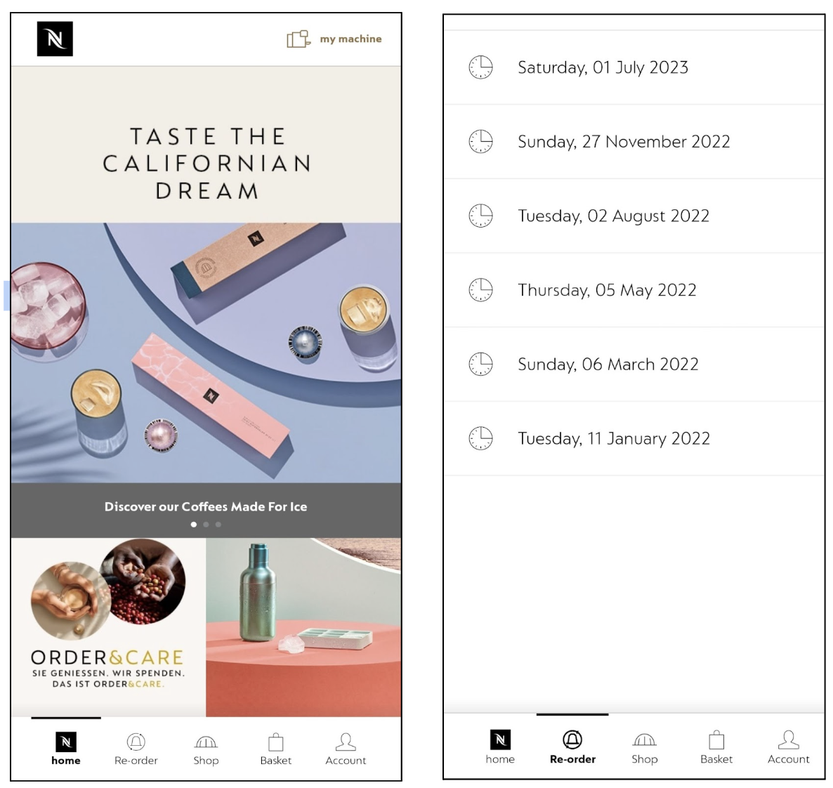
The Nespresso mobile app applies the KISS principle through and through. The home screen contains a simple menu comprising just five items—all of which are instantly recognisable thanks to clear labelling and icons.
This beautiful simplicity continues throughout the app. Select the “Re-order” function and you’re taken to an even simpler screen which lists the dates of all your previous orders. You can click on any order date to repeat that order—no need to browse through all the different coffee types again (unless you want to, of course).
The Nespresso app embraces the KISS principle in its UI design, its microcopy, its navigation, and its functionality. The result is a user-friendly, easy-to-navigate service that enables you to restock your favourite coffee in just a few clicks.
KISS principle example #2: The Hemingway app
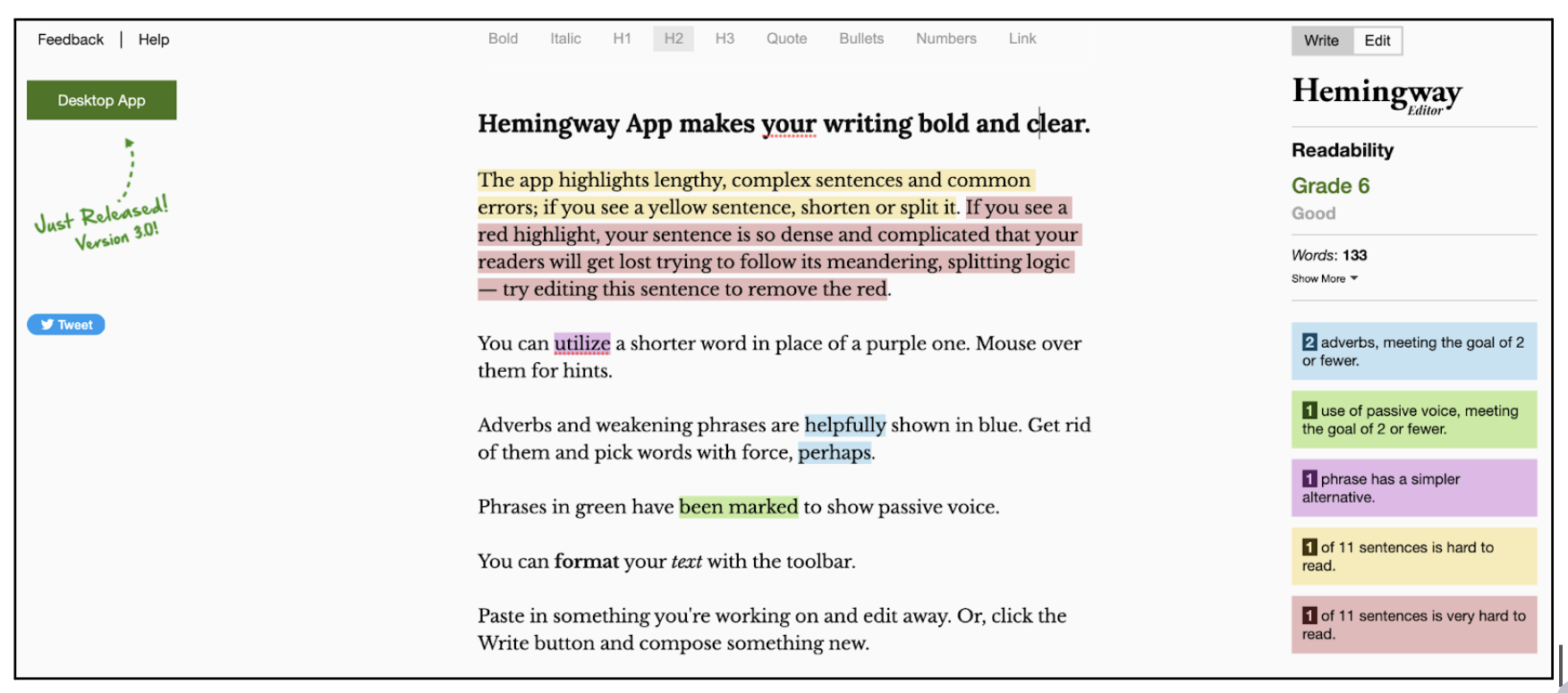
The Hemingway app is an in-browser editing tool that highlights grammar and readability issues in your writing. Anyone can paste their writing into the tool and immediately see areas for improvement.
The app is simple in both functionality and design. Even for first-time users, it’s unmistakably clear how the app works and where you need to paste your text. And, thanks to the straightforward explanations and colour-coded highlights, you can very quickly figure out what each highlight means.
By adhering to the KISS principle, the creators behind the Hemingway app have achieved something incredibly useful and user-friendly—a tool you’ll want to return to time and time again.
KISS principle example #3: The Indeed website
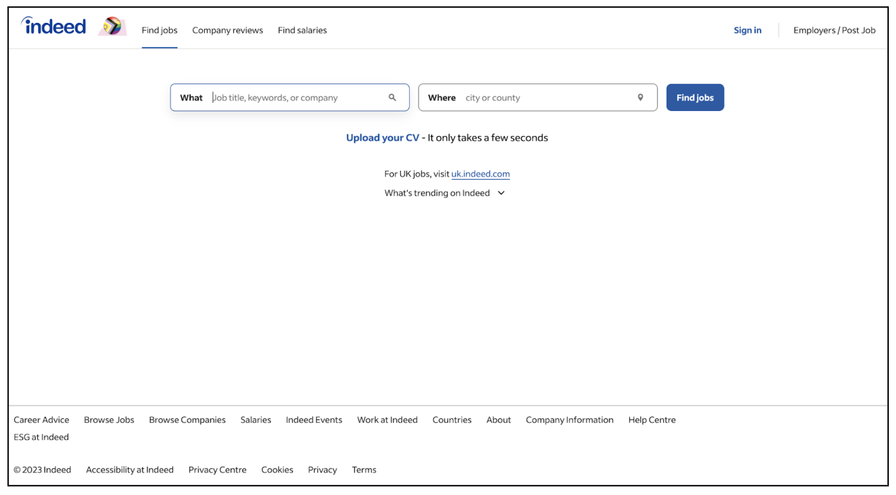
The Indeed website has been designed around one core goal: to help people browse jobs in their chosen location. As soon as you land on the site, its purpose and functionality is crystal clear. You’re greeted with just two search fields: one for the “What” (the job title or keywords you want to search for) and one for “Where” (the city or country you want to work in).
Other than that, there’s not much else to see! The Indeed homepage is abound with whitespace, accompanied by a few discreet additional menu items and available actions for the user to take.
In this case, the KISS principle doesn’t only serve to create a clean, clutter-free aesthetic. Most importantly, it makes it easy for the user to accomplish their task of browsing jobs. It ensures that the process is self-explanatory, straightforward, and as pain-free as possible—just as job-searching should be!
How to use the KISS principle: 5 practical tips for designers
We’ve seen the KISS principle in action. Now how do you apply it to your own UX work?
Here’s how designers can embrace the KISS principle.
- Focus on just one user problem at a time
- Be selective when it comes to features and functionality
- Simplify your language (KISS jargon goodbye!)
- Keep navigation as simple and straightforward as possible
- Remove unnecessary visual clutter
Let’s explore these in more detail.
1. Focus on just one user problem at a time
If you try to solve too many challenges at once, you’ll likely end up with an overcomplicated, feature-heavy product that’s difficult to use. Your users might not even understand what your product is supposed to do or how it’s meant to help them.
The most successful websites, apps, and services are those that have become known as the go-to for a specific thing. We know that Airbnb is the number one destination for holiday rentals, that Spotify is for listening to music, and that we open Google Docs if we want to create a text document. Sure, all of those platforms offer additional functionality, but they were originally built to serve one main purpose.
When it comes to UX, you don’t want your product to be a Jack of all trades, master of none. Focus on creating one solution to just one problem, and focus on doing it well.
2. Be selective when it comes to features and functionality
As you focus on solving just one main user problem, it’s important to be selective when choosing the features and functionality that your product or service will offer.
Remember our complex coffee machine example from earlier? In that scenario, all the user wanted to do was make a simple espresso. But the machine offered so many options and functions, making it overly complicated—impossible, even—for the user to find the function they wanted.
Consider what features and functionality are absolutely necessary for enabling your users to complete their desired tasks, and what ones are handy but not strictly essential. Depending on what it is you’re designing, you might want to leave out the nice-to-haves and focus on a simple, core feature set.
Take inspiration from Nespresso, the Hemingway app, and Indeed (the examples we shared previously). All of these products prioritise one main feature or function; everything else is in the background.
3. Simplify your language (KISS goodbye to jargon!)
UX writers and content designers must also embrace the KISS principle. All microcopy and messaging the user encounters throughout and in relation to your product should be clear, simple, and easy to understand.
Avoid jargon, keep sentences short and straightforward, and try to write in the active voice as much as possible.
Imagine you’re writing copy for a messaging app where the user needs to come up with a unique username. How might you inform them that the username they’ve typed in is already taken?
You could say: “Unfortunately, this username is not available—someone else is already using it. All users require a unique username.”
But that’s a pretty long message to have on an app screen. And, while it’s implied that the user must come up with a different name, it isn’t explicitly clear. You could simplify and improve the clarity of the message as follows:
“This username is already taken. Try another one!”
Simple, to the point, and absolutely clear as to what the user should do next.
As you embrace the KISS principle, make sure you’re also prioritising accessibility and inclusivity. You can learn more about how to design accessible and inclusive content in this guide.
4. Keep navigation as simple and straightforward as possible
One of the best things you can do for your users is to design a simple, straightforward navigation system.
Simplify the navigation by limiting the number of options or pathways available to the user, and make sure that your information architecture prioritises the most important steps in the user’s journey. You might use progressive disclosure, revealing additional options to the user only in certain contexts.
At the same time, make sure your navigation system is clearly labelled and signposted. Use immediately understandable, unambiguous labels for menu items—just like our Nespresso app example, where it’s instantly obvious that the “Re-order” button will start the process of repeating a past order—and adhere to the essential principles of icon design to ensure clarity of meaning, familiarity, and consistency.
5. Remove unnecessary visual clutter
KISS also applies to UI design—but keeping it simple doesn’t necessarily mean you have to limit your creative expression, do away with playful visuals or stick to unadventurous colour schemes.
Rather, the goal is to remove any unnecessary visual clutter so that the most important elements and features take centre stage. If your UI design is too “busy” or overwhelming, it may prove difficult for users to find what they’re looking for.
View your final designs with a critical eye (and have others do the same). Any visual elements that are confusing or detracting from the key message may need to be removed. Keep it beautiful, yes, but most importantly, keep it functional, accessible, and simple.
As you may have noticed, applying the KISS principle in UX design is often about prioritisation. What’s strictly necessary for helping the user achieve their goals? What elements can be simplified or removed for a smoother user journey? Ask yourself these questions throughout the design process and you’ll naturally move towards simpler, more straightforward, and altogether more user-friendly products.
When should you NOT apply the KISS principle?
Embracing the KISS principle can help you to design products and services that are easier to use and understand, and generally more human-friendly. But it’s important to note that simplicity isn’t always an appropriate end goal.
The KISS philosophy encourages designers to strip away any unnecessary features, and to eliminate any elements that may hinder the core functionality of the product or make it more difficult for the user to complete their desired tasks.
With some products and services, however, simplicity is impossible—and, indeed, undesirable.
Let’s once again return to our coffee machine example from earlier. Our user was just an everyday individual who wanted to make themselves a basic espresso. They needed a simple coffee machine to meet their needs.
But, if you’re designing a coffee machine for an artisan coffee shop where the goal is to serve customers with more diverse, elaborate drinks, you’d need to create something more complex with lots of different features and functions. In this instance, a coffee machine with a few buttons wouldn’t be sufficient.
The extent to which you apply the KISS principle must always depend on what you’re designing and who you’re designing it for. Simplicity should never be prioritised over providing the end user with all the features and functionality they need to achieve their goals.
So: KISS, but with caution. Always design with the end user’s goals in mind—that will forever remain the number one priority in UX!
The takeaway
KISS serves as a reminder to keep things as simple and straightforward as possible.
In UX and product design, this means focusing on just one user problem at a time and designing solutions that are easy to understand, use, and navigate. You can also apply KISS to your UX design process, simplifying your tool stack, your documentation, and your design systems.
But remember: KISS should never stand in the way of important functionality. Some products naturally call for more complexity in order to adequately serve the end user. That should always take priority.
Want to learn more about how to take your UX to the next level? Take inspiration from these real-world examples of excellent digital design, check out these 5 simple hacks to take your UI from good to great, or learn how to incorporate user feedback into your product design process (and why it matters).

