Designing inclusive and accessible content is more than a tick box exercise—it’s about creating user experiences that everyone can use, regardless of their needs, ability, or background.
By ensuring your product can reach as many users as possible, you’ll also maximise its potential impact. For content designers, this means taking steps to ensure your content appeals to (and is usable by) everyone, regardless of their unique needs.
Important as it is, designing accessible and inclusive content can feel like a sensitive and complex matter. To bring some clarity to the topic, we’ve developed this guide for designers and content designers who want actionable guidelines they can follow to ensure they’re crafting successful accessibility-oriented user experiences.
We’ll discuss how to design effective accessible content that upholds inclusionary principles while remaining true to your brand’s voice, and how developing a process around inclusion can maximise understanding and engagement with your users.
- Accessible content vs. inclusive content: What’s the difference? (With examples)
- Why inclusive and accessible content design matters
- 3 ways to design inclusive content
- 3 ways to design accessible content
- Bringing it all together to ensure your content is inclusive and accessible
Let’s dive in!
1. Accessible content vs. inclusive content: What’s the difference? (With examples)
While both accessible content design and inclusive content design are essential for creating a positive user experience, they have slightly different focuses.
Accessibility is primarily concerned with functionality; making sure a digital product or experience is usable, intuitive, and enjoyable for as many people as possible—including people with disabilities. This could include:
- Designing content that’s easy to navigate using assistive technologies such as screen readers,
- Ensuring video and interactive content has closed captioning, and
- Ensuring people can quickly locate key information on the page to reduce cognitive load.
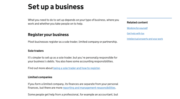
The UK government website is a leading example of accessible content. On this page, we can see a clear use of headings—which makes the content easier to navigate for visually impaired people using shortcut keys. With clear, well-signposted content, visitors can quickly and easily find what they need.
[Via Gov.uk]
It’s also important to note that many countries have laws and regulations in place that require digital content to be accessible. Non-compliance can lead to lawsuits and financial penalties in some cases (especially for public sector bodies), so it’s good practice to get familiar with accessibility legislation in your local area.
Read next: Accessible UX with Deque Systems’ Glenda Sims and Patrick Sturdivant
Inclusive content design, on the other hand, is focused on making sure that everyone, regardless of their background or identity, feels welcome and represented in the content. It involves incorporating diverse perspectives and experiences into the content design process and creating products that aren’t just functional, but enjoyable for everyone—fostering a sense of belonging and community for all users.
This includes:
- Using culturally sensitive and appropriate language,
- Avoiding exclusionary or biased language, and
- Diversifying the use of visuals throughout the content.
Designing inclusive content requires an intersectional lens, which acknowledges the different types of bias, discrimination, and exclusion people regularly face, so you can ensure your content avoids harmful assumptions.
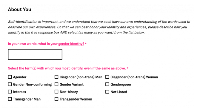
For example, this form acknowledges that self-identification is personal, and allows users to describe their own gender identity before providing the option to select as many of the listed terms as they feel suits them best.
[Via Keshet]
2. Why inclusive and accessible content design matters
As technology becomes more widespread, and audiences interact with online products in new ways, accessible and inclusive content has gone from being a ‘nice to have’ to a cornerstone of good UX.
Not only does accessible and inclusive content provide an enhanced user experience for people of varying abilities, it also helps create a more harmonious, positive atmosphere where everyone feels their lived experiences are respected and valued.
Designing accessible content means removing barriers to information and communication for those with disabilities or impairments, which can lead to improved engagement, understanding, and empowerment for all individuals.
Designing inclusive content means representing, championing, and celebrating the diversity among the world’s users, which can help you expand your audience and increase the impact of your message.
Overall, the standards of accessible and inclusive content are quickly evolving—and designing content for everyone will help you stay ahead of the curve. To learn more, check out our trends forecast for content design and UX writing.
3. How to design inclusive content: 3 actionable steps
Develop guidelines for inclusive language
Language plays a critical role in how people perceive and relate to content. Inclusive language helps to create a welcoming and respectful environment, where people feel safe, welcomed, celebrated, and valued. On the other hand, exclusive or offensive language can alienate people, perpetuate stereotypes and discrimination, and hinder effective communication.
To ensure your content resonates with as many people as possible, it’s worth developing comprehensive guidelines around writing for everyone. Developing these guidelines requires in-depth research into your audience, familiarising yourself with the appropriate terminology for different communities, and consulting with experts and members of marginalised communities to ensure that the guidelines are comprehensive, accurate, and up-to-date. You should also be aware of any cultural or social nuances that may affect how the language could be interpreted.
Once you’ve developed these guidelines, you can audit and update your content for maximum inclusivity. You’ll also need to regularly review and update the guidelines to reflect changes in language use.
Design inclusive forms
From registration to applications: forms are vital for collecting and sharing information and are an unavoidable part of the digital experience. By designing forms that are accessible, user-friendly, and inclusive, you’ll ensure users can comfortably share their information without facing unnecessary barriers or discrimination.
Closed-ended questions with limited response options don’t always capture the full scope of people’s identities and experiences. As a result, they might force people to choose from options that don’t accurately reflect their situation. Instead, opt for open fields. This way, your users can use their own words and phrases to describe their identity, experiences, and needs, without being limited by pre-determined categories or options—allowing them the flexibility to describe themselves in a way that’s comfortable, accurate, and meaningful to them.
It’s also important to reflect on what you’re asking from your users. As you design your form, ask yourself: “Do I actually need this information?” Think about which fields are required and which are optional, and you’ll find your way to more inclusive and streamlined forms in no time.
Test your content with diverse audiences
People from different backgrounds, identities, cultures, and experiences will have unique interpretations of the content. But without diverse user data—or perspectives on your team—you risk unintentionally excluding or marginalising certain groups.
By testing your content with a diverse user base (different ages, ability levels, gender identities, races, cultural backgrounds, jobs, religions, foreign language speakers, etc.), you can identify potential biases, assumptions, or misunderstandings in your content and make necessary adjustments to ensure it’s relevant and respectful to everyone.
Testing content with diverse users can also help you to identify gaps in your knowledge or assumptions about certain groups of people. It can validate or challenge your assumptions about language use, preferences, and cultural norms, and provide you with insights you otherwise might not have considered.
4. How to design accessible content: 3 actionable steps
It’s essential to be aware of the different user needs and contexts associated with your audience when developing web copy. Here are some steps you can take to create accessible content:
Incorporate multimedia
Not all users consume information in the same way. Text-heavy web pages, for example, can present significant barriers for people with visual, cognitive, or learning disabilities.
Providing alternatives to text, such as video and audio, is essential for ensuring that all users have equal access to the content—regardless of their abilities or limitations. Not only does it benefit those with accessibility needs, but it also makes the content more engaging and appealing to a broader audience.
Similarly, it’s equally important to provide alternatives for individuals with auditory disabilities when designing video or audio content. This means providing captions or transcripts so that users with hearing impairments can access videos or audio content.
Overall, the more you distil your content through a variety of mediums (text, video, audio, etc.) the easier it will be for your users to access the content in a way that’s comfortable for them.
Signpost your content
One of the goals of accessible content design is to make the information easy to access and understandable for as many people as possible. To reduce cognitive load, it’s crucial that key pieces of information are easy to find—and users don’t get lost while trying to complete a specific goal. This is where signposting comes in.
Signposting is the effective use of headings, subheadings, and other visual markers to indicate the organisation and hierarchy of the content. This is particularly important for people with visual impairments, cognitive disabilities, or anyone who might struggle with dense blocks of text.
Signposting tells the user exactly what they’ll find on the page and breaks up large blocks of text to avoid overwhelming your users. Clear and descriptive headings, for example, help screen readers and assistive technologies to navigate the content more easily. It’s also good practice to use descriptive link text that provides context and describes the destination of your links. To learn more, check out our ultimate guide to information architecture.
Write in plain language
Depending on your brand personality, it can be tempting to ‘stylise’ your written content out of fear of it sounding simple or boring. But that’s not always the most accessible way to go.
Writing in plain language makes content easier to read and understand for a wider range of users, including people with cognitive or learning disabilities, non-native speakers, and those with limited literacy skills. This means avoiding complex vocabulary, jargon, and acronyms that may be difficult to understand. You should also stick to short sentences that are easy to read, and use active voice instead of passive voice wherever possible.
Tools like Readable and Grammarly are quick ways to audit your content for maximum readability and accessibility. Once you copy-paste your text into the tool, it’ll highlight words and phrases that a general audience might struggle to read or understand.
5. General best practices for accessible and inclusive content
In addition to the steps we laid out in the previous sections, here are a few best practices to help guide your content strategy:
- Understand accessibility guidelines: Read through published accessibility guidelines and standards, like the Web Content Accessibility Guidelines (WCAG). These guidelines provide recommendations for making web content accessible to people with disabilities.
- Try accessibility tools: There’s a host of accessibility tools and plugins like WAVE which you can use to check for accessibility issues within your content.
- Choose an accessible format: Stick with formats like HTML, which can be read by screen readers and is easily navigable with keyboard commands.
- Use alt text for images: For any images included in your content, make sure to provide descriptive and meaningful alternative text (alt text) that can be read by screen readers.
- Choose accessible colours and fonts: High-contrast colours (e.g. black and white) and easy-to-read fonts (e.g. sans-serif) are better for readability as it makes the text more visible to users with visual impairments.
- Ask for feedback from your users: Providing feedback forms or actively asking your users what you can do to improve the overall experience helps your content remain inclusive.
Final thoughts
Accessible and inclusive content design is crucial for creating an equitable digital world where everyone can access the same information and opportunities. By taking the steps laid out in this blog post, you can maximise your product’s reach and impact—and empower and affirm people who may have felt marginalised or excluded in the past. Both of these outcomes ultimately lead to better results for your business.
To learn more about how to create a positive user experience, give these articles a read:
- 7 Examples of good digital UX design
- 12 UX communities that are ready to welcome you
- 7 fundamental UX design principles all designers should know

