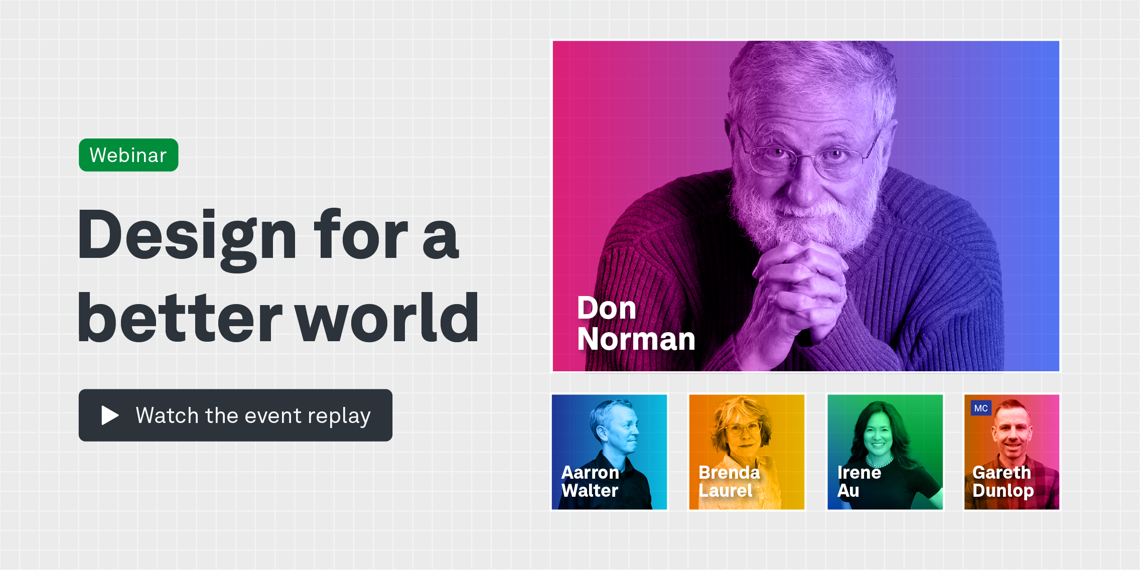
It’s easy to assume that digital spaces are fully accessible but that’s not the case. We were recently joined by Deque Systems’ Glenda Sims and Vice President and Patrick Sturdivant for our UX Insiders event Accessible UX: Challenge the Limits to discuss the importance of accessible UX and how to be a digital ally.
Glenda, Deque’s Chief Information Accessibility Officer, breaks accessibility down as something “where all people, regardless of disability, can get the same information and do the same things independently”.
However, Deque’s Vice President and Principal Strategy Consultant Patrick shows us how non-existent or incomplete accessible UX can fail disabled people. In a practical demonstration, he navigates the online space as a blind person using his JAWS screen reader (Screen readers scan web pages and apps and read text from them aloud in a synthesised voice) and shows us the highs and lows of shopping online.
The event itself is available to watch on playback but here are some of the highlights from our discussion.
Screen readers
“This is the voice that I like to use to do regular work with and this is the speed that I use,” says Patrick, explaining his chosen settings on JAWS. “Believe it or not, this voice here has been around for almost 25 years and it’s still one of the most popular voices.”
“As you can see, when you are blind and you’re working in tech, you need information very fast, very quick and very efficiently. So that’s why after 25 years, I’m still using the same software package.”
“I just hit the Ctrl key on my keyboard,” he demonstrates, sharing his screen and audio as JAWS reads the product headings out loud.
“I tell you that because many times the voice will start reading and you already know what it’s going to say and you don’t want to be bothered with it reading a tonne of stuff that you don’t need. Ctrl shuts the voice off temporarily and lets me move around.”
When I hit a brand new website, I don’t read the entire page, it would take too long. Just like you probably don’t read every word on every web page, you skim around and look around and then you focus in on what you want. I’m going to do the same thing but by looking at the headings.
”We are at the website of our favourite local grocery store, if you live in Central or South Texas, called H E B. I’ve been using this company’s software to order groceries and have them delivered for about four years, even before COVID.”
“During COVID, it was really critical that I was able to get groceries independently. So that you have an awareness I live alone,” Patrick adds, “and I’m very independent and get very frustrated when Patrick can’t do something by himself because he likes to be independent.”
Imperfect accessible UX
“One of the interesting things I want you to be aware of is that this company offers their online ordering through their website, as well as their mobile on their phone. I normally go back and forth depending on what it is I’m doing.”
“I will change platforms because there are some functions that are just easier to do on the web and there are some that are easier on mobile because it’s a lighter weight product,” he says, logging into the H E B website on his desktop computer.
Like any organisation, accessibility is something you never finish. You’re always on that journey. This company has done a lot of great work to make my life of ordering groceries a good one but they have some opportunities to still improve and I see that.
Adding items to his shopping cart, he encounters some imperfect accessible UX features on the web page.
“Don’t ask me why the past purchases aren’t available. But we’re flexible. We’re agile. We don’t give up and we don’t say no, we will get these groceries”.
He switches to the app on his phone and activates a screen reader there. He pulls up his past purchases and decides from that list which items he wants to buy today.
“59 items in my cart. So now the ability to change the quantities of things in my cart is a little hard on the phone, so I’m going to go back now to the desktop. Yeah, I know that sounds crazy but what when you’re a professional blind guy and your mission is to get the job done and eat something, you do whatever it takes. So now we’re back on my desktop.”
Back at his desktop, he tries to increase the number of items in his shopping cart but the website has incorrectly labelled plus and minus signs.
“Like I said, nothing is perfect,” explains Patrick. “This company is continuously working to make things better, so that’s what you need to remember.”
Most people who are disabled, we know when an organisation is trying to make things better and we know things aren’t perfect and it takes time. So you live with things.
Accessible UX equals independence
“Let’s talk about independence. Accessibility is so important. People always think that ‘Well, you know, you have people help you’. And I do have a lot of people that help me and I do appreciate all the help that I get. But there are times when you don’t want some help,” Patrick explains.
“Let’s think about some of the times that you may not want help. In the US we have to pay income tax every year, we have to report our income. For the longest time, I had to rely on people to help me do my income taxes. Now, yes, Patrick could hire a company to do them for him but he likes to do things on his own,” he jokes.
“There is software that allows you to do your income taxes and it’s come a very long way. I was able to use the software for the longest time but I still had someone help me with the very end. Because I had to print everything off, I had to sign things, address envelopes and mail a cheque,” says Patrick, listing the challenges that previously came along with submitting his taxes.
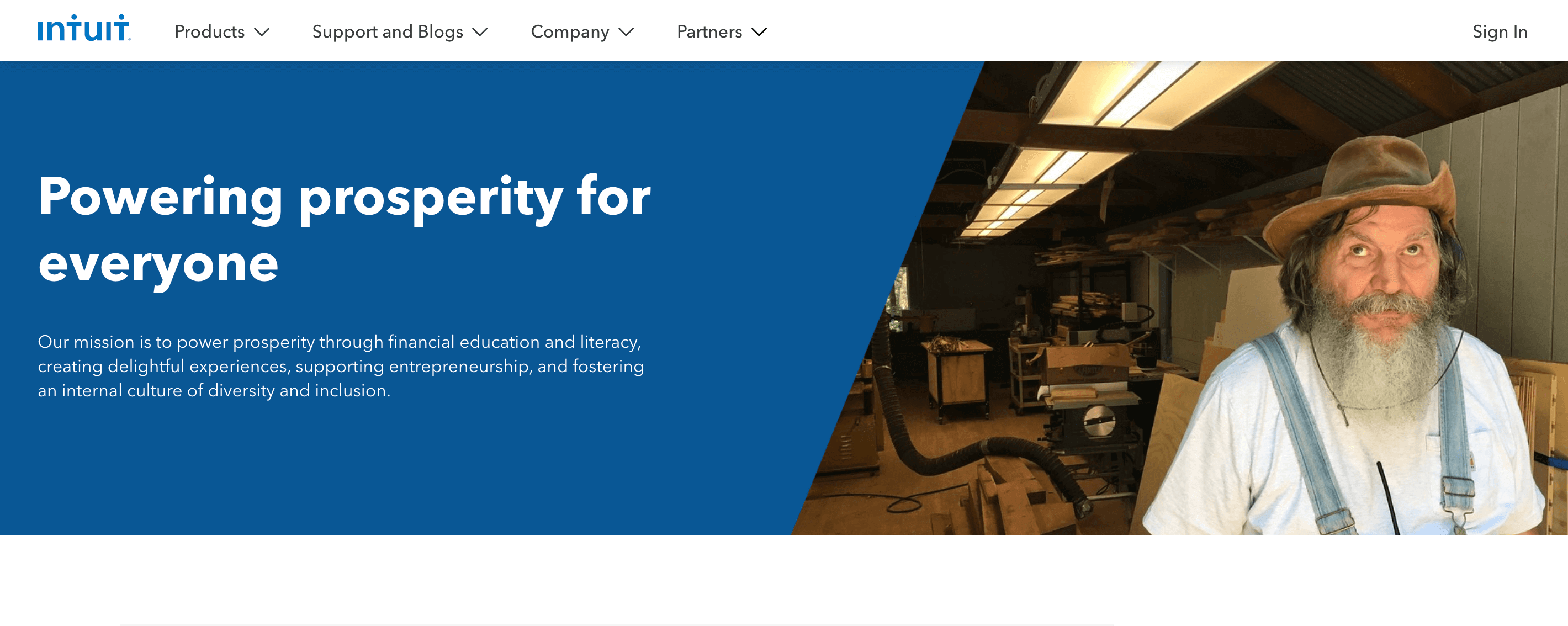
“Then one of the most exciting things in my life was when I could finally do my income taxes all by myself because of software made by Intuit. With Intuit, I can either receive funds electronically or send funds to the government electronically.”
I can do everything paperlessly – independent. And that was just the most wonderful thing because, you know, you just don’t want to share your finances with maybe your neighbour or a friend or even family members.
“There are other examples of where you want privacy: Voting, interacting with medical records, signing contracts. If you’re going to buy a new item that is kind of pricey and you have to sign a contract, you may not want your family to know how much money you’re spending on that new vehicle.”
“And by the way, I own two vehicles. I buy vehicles and I have a driver but I might not want my brother to know how much I paid for my new truck and I shouldn’t have to. I should be able to review that sales contract and sign it independently.”
You can read more about Intuit’s accessibility and inclusion design policies here.
Access across the board
“There are other things that I expect to be accessible. Digital accessibility to me is anything from consumer electronics like my TV, which is an Amazon Fire TV that has a screen reader, to other products, like this Tread,” says Patrick, pointing to the treadmill in his living room.
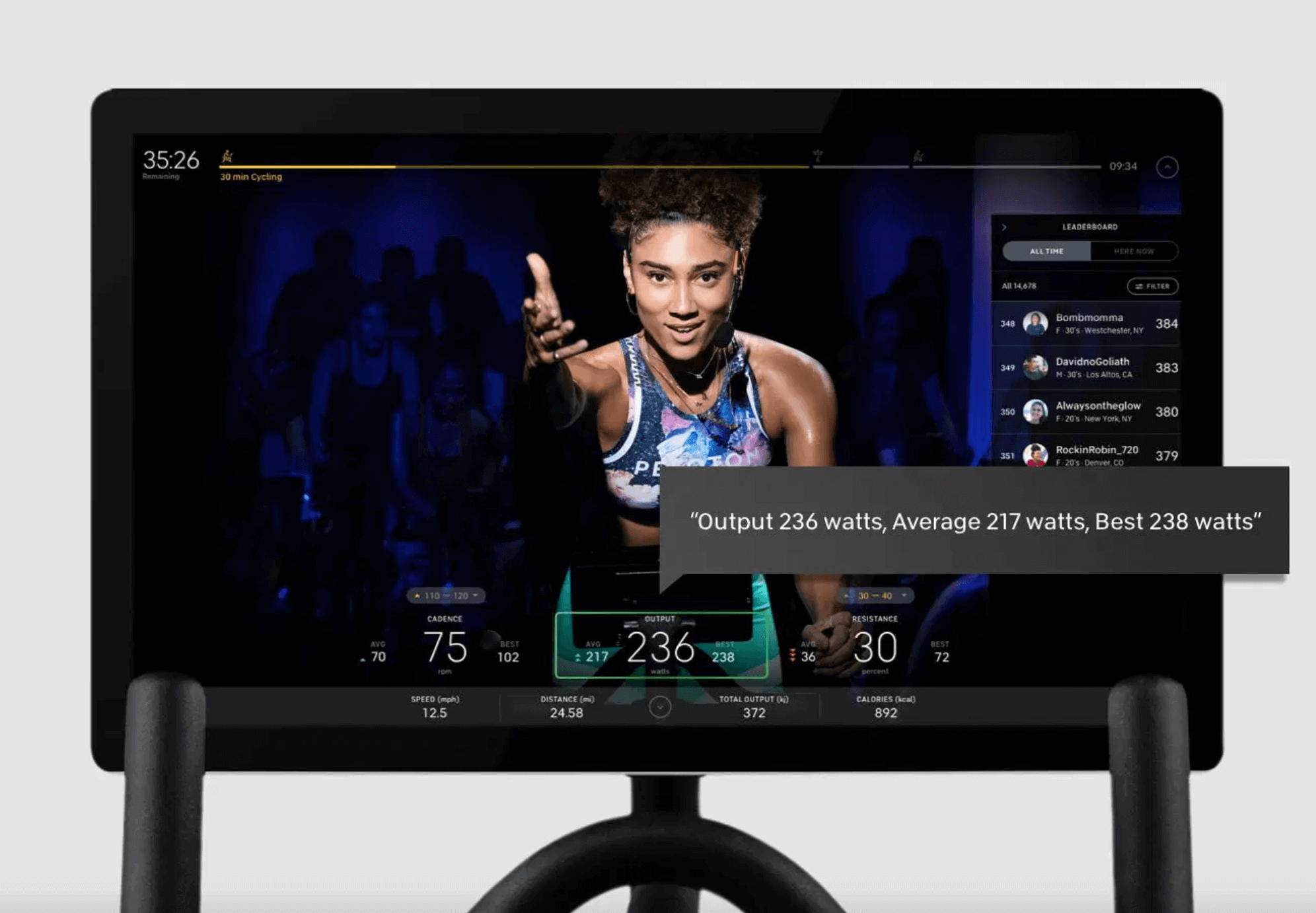
“This is the first treadmill that is accessible to a blind person because it’s got a screen reader on it. Peloton just announced that the Tread, as well as the bike which was out a few years ago, has the TalkBack screen reader.”
TalkBack is the Google screen reader included on Android devices.
“So I can have a fully inclusive and interactive Peloton jogging or running session on my Tread with full access to all the controls, all the stats and all the menus using the TalkBack screen reader.”
When I say digital accessibility is everywhere, I really do mean that it’s everywhere. And I should not have just one product to pick from. I want to go in and look at a list of 20 different microwave ovens and they all should be accessible to me.
|I should be able to pick the one that works best for me. I shouldn’t have to pick the microwave, the only one that is accessible. So we do have a lot of work still to do.”
Is it too late to become accessible?
“I learned never to say never because I’ve had to eat those words. It’s never too late, you can always go back and retrofit but the problem is it costs a lot of money. Let’s take that microwave oven for example,” Patrick explains.
“To take a microwave oven off the shelf and go retrofit it… To go through that whole process, to update everything and update your manufacturing process and the software to an existing microwave, it’s not worth it. Yes, you can do it. But it’s kind of late.”
The best time to want to be inclusive in your design is when you start with a blank sheet of paper. And you involve everyone at the table.
“So when you’re designing that microwave, or that website or the app on your phone, think about who is going to use it. Don’t just think about a 25-year-old male or female that has good vision, hearing or use of their hands.”
“Think about all kinds of people with all different age ranges, from all different backgrounds and all different abilities,” Patrick explains. “You want everyone to buy your product or use your software or your app. The best time to do that design that, the cheapest time to do that is at the very beginning.”
Accessible UX testing
“My best suggestion is to get out into the disability community. It takes time to build some relationships. Meet people and engage people with disabilities. Just get to know them as a person,” Patrick suggests.
“And by the way, once you get to know them, you have that network. You can start asking questions or asking them to help. You can take it to as much of a degree as you want.”
“But having an awareness for your own knowledge, so that when you do sit down and you’re designing that new…. whatever it is, you may not be an expert on being deaf or an expert on being blind but you ought to know a few pointers. ”
“Maybe if you have some contacts, if you need some details, you can pull in your network of people to get that input you need. Reach out to organisations for the disabled or to organisations like Deque that have all kinds of tools and resources to help get the training that’s out there.”
Just expose yourself to the world of possibilities, that you want your product to be used by everyone, because that is your goal. I would hope that the last thing you want to do is design something that leaves people out.


