As more businesses go online, content design or UX writing is increasingly becoming a critical field. Content design, also known as UX writing can take content—in this case, words—from ho-hum to extraordinary. Content designers ensure that the text featured throughout a digital product is as compelling and well thought-out as the design of the product itself.
In this article, we showcase ten great content design examples you can take inspiration from. First, though, a quick refresher on what content design is.
What is content design?
Words are the other half of the UX/UI design equation. Content designers are the people who craft the copy (i.e. the words) a user encounters whenever they use a product, like a website or an app. Content designers essentially design with language instead of pixels. So while content can mean a lot of different things to different people, in UX/UI, content refers to written product copy.
Content designers, also known as UX writers, create copy that guides and informs users as they navigate websites, apps, and other types of digital interfaces. Their work appears in everything from the menu and headers to body text and buttons.
Now we know what content design is, let’s explore some examples of excellent content design in action.
10 awesome content design examples to take inspiration from
1. Task Rabbit
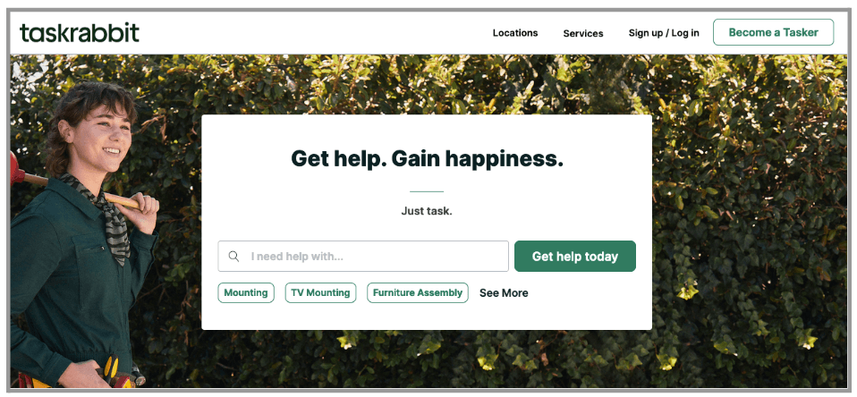
The home page for Task Rabbit is an uncluttered space of simplicity. The first thing you see is a box with a search window where you can find people who can help you with whatever home-related task you need.
But the bar doesn’t say “Search,” it says “I need help with…” and then there are examples underneath that can help the user decide how to state their request. The box is then followed by a button that says “Get help today.” It couldn’t be done in a more straightforward way and it’s all finely tuned to the people who have come to the website for help.
If that weren’t enough, at the top of the box is the statement “Get help. Gain happiness.” and then on the line underneath in smaller copy, “Just task.” It’s brief copy but it’s also reassuring, easing the user into the experience and convincing them to use the search box.
Key takeaway: Making the copy in and around the search box specific to the task and reassuring to the user will convince more people to search—and find—what they need.
2. Truly Pizza
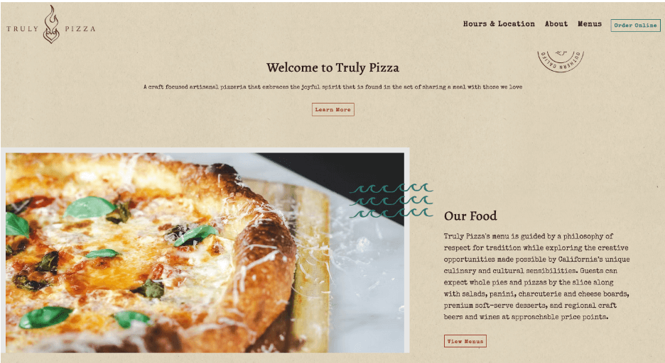
Truly Pizza has a website with little fluff but their homepage has copy that really knocks it out of the park. While the first thing you see when you land on the page is a rotating series of pictures, underneath is what truly matters. “Welcome to Truly Pizza” and a brief sentence that spells out Truly Pizza’s unique proposition explains where you are and why you’ve come there.
This is quickly followed by “Our Food” that again features copy that explains what makes Truly Pizza unique next to a photo of a delectable-looking pizza. It’s these things and their buttons, “Learn more” and “View Menu,” that really encourage the user to click and go deeper.
Key takeaway: Use brief messages and welcoming headings to bring the user into the experience and encourage them to click on links that will take them deeper into the website.
3. The Grooming Shed
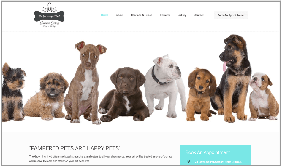
The Grooming Shed has an inspired home page. The biggest thing on there isn’t the business’s name or the name of the pet groomer, but a line of cute dogs and the words “Pampered Pets Are Happy Pets.” These two things work together to make the user think about dog grooming, and what the Grooming Shed can do for your pet.
There’s also more copy underneath the quote to reassure those particularly nervous pet parents about dropping their dogs off at the Grooming Shed for pet grooming. Those words are fairly brief but well thought out, and help further the case for this business.
Key takeaway: Never underestimate the power of the perfect picture combined with the perfect, but brief, phrase. They can do more to draw people in than a lot of pictures and copy ever can.
4. Monzo
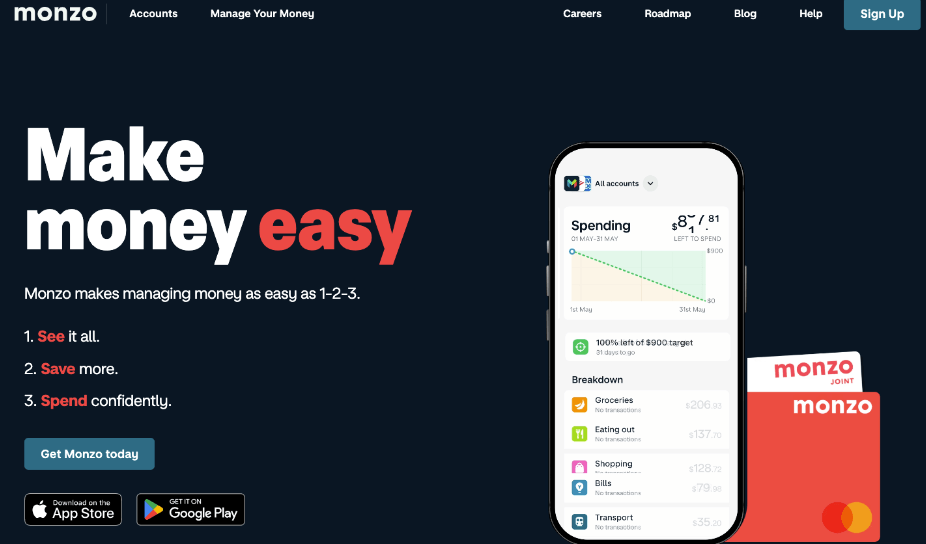
Monzo is one of a new breed of banking sites that prioritises users’ understanding of banks and money above all else. As a result, their whole site is streamlined to simply and easily explain what they can do for you and what they have to offer.
For example, on the homepage, they explain the ease of using Monzo with “See,” “Save,” and “Spend” in red so if you notice nothing else, you’ll notice those three words and understand what Monzo can do.
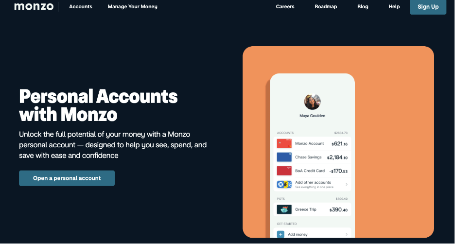
Similarly, on the personal accounts page, they reiterate the see, spend, and save proposition within simple text and they ask that the user “Open a personal account” instead of “applying” for a personal account, making it all seem like a more personal—and much more straightforward—experience. And it’s also backed up with a simple, friendly sans-serif font.
Key takeaway: Explain complex concepts in simple, straightforward language and with friendly, less corporate button copy that people will feel comfortable with.
5. The Academy Museum
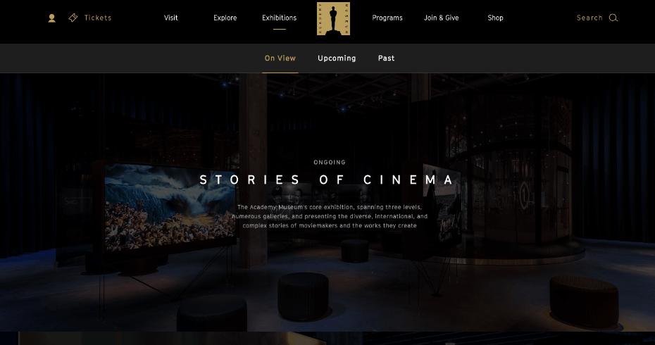
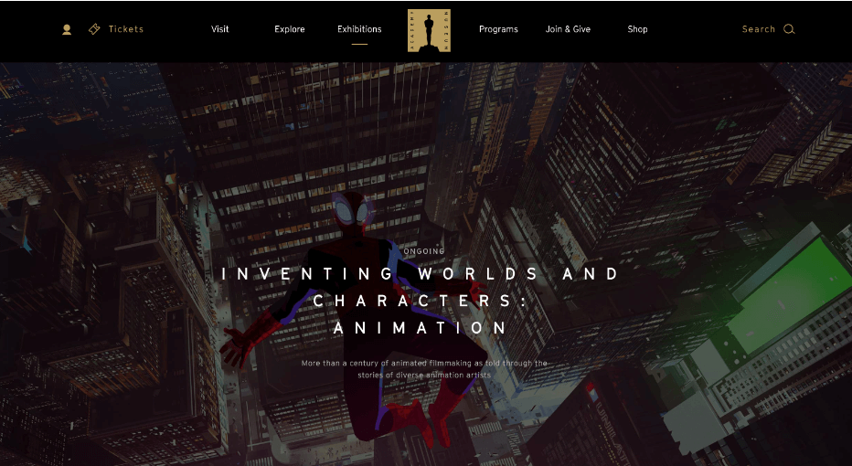
The Academy Museum is a fairly new museum in Los Angeles and it’s all about the art of moviemaking. The site’s exhibitions page does a nice job of explaining the various exhibitions the museum has with brief explanations and full page photos of each exhibit.
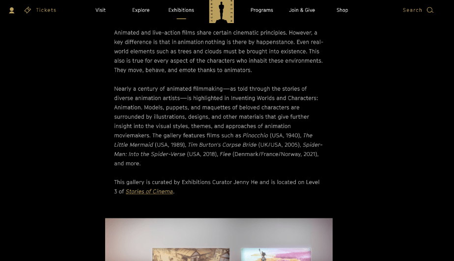
Click into the specifics of each exhibit and the page remains the same but is no longer greyed out, a subtle change that makes a big difference. If you scroll down from there, you’ll notice a big block of text about the exhibit that includes interesting and practical information about the specific exhibit, followed by a beautiful gallery or feature about the exhibit that shows part of the experience.
Through it all, the main menu is there with other places you can go if the exhibition page turns out not to be the page you’re looking for. It’s nicely put together and perfectly reflects the museum’s interest in and commitment to filmmaking.
Key takeaway: Use a website’s information architecture and copy to convey the overall breadth of the site in the main menu, even as the pages dig into the specifics.
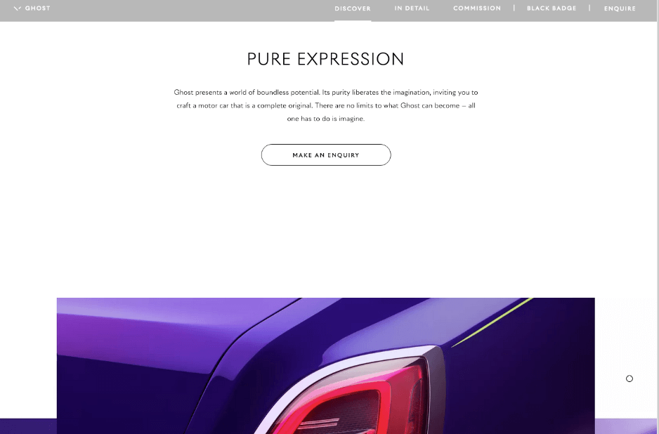
6. Rolls-Royce
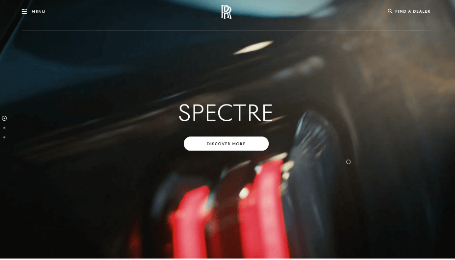
Rolls-Royce isn’t your average car company and the Rolls-Royce website knows it. It has a simple RR logo at the top of the homepage, as if they’re saying, “if you need to ask, you can’t afford it.”
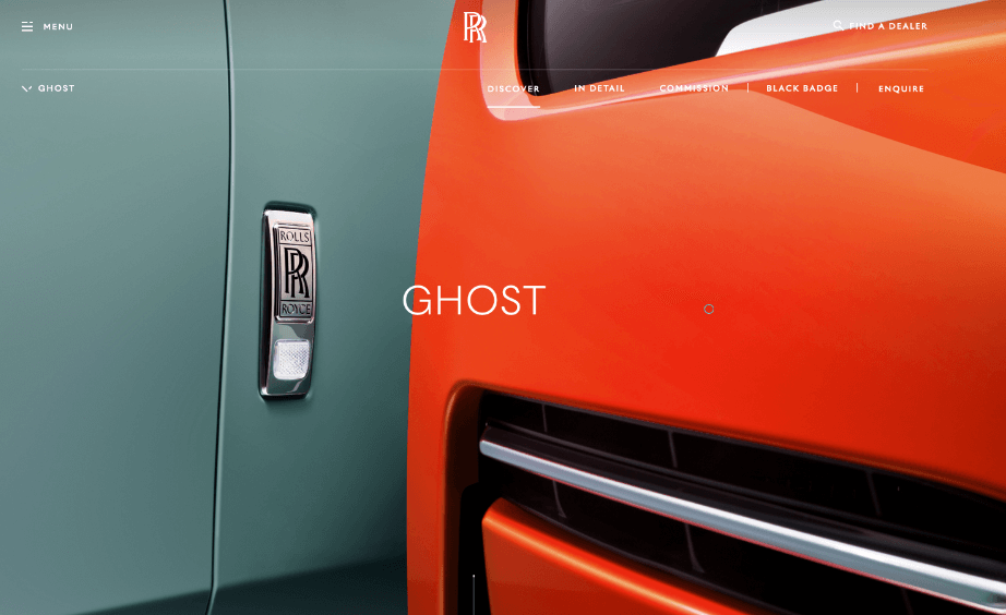
This is followed by several of their cars, which you can click into and see video footage of the car in action followed by brief text. This visual/text format is seen several times as you scroll, with the text telling you what you need to know without going into concrete specifics.
This is all backed up with a “Find a Dealer” link at the top of the page. The most important thing to this particular business is to get people to go see dealers about their cars, so that is the one thing that never leaves the page.
Key takeaway: If you have a recognisable product, you can use less text to describe its value proposition. But always have the most important call to action visible on the page.
7. Cultivated Wit
Cultivated Wit is a comedy company, and this is very evident in their approach to content design. Take their homepage. It starts with just a logo, but expands into much more, from the copy they use to getting people to join their email club (“Comedy can exist in new forms. Technology can be more fun. Homepage copy can be annoyingly vague.”) to the three panels about what they do.
It’s all amusing and charming and makes you want to read the words of the whole website. But perhaps the cleverest part of the website is at the bottom. This is where social account information and email addresses appear, just like it does for every website, but Cultivated Wit spices things up with its own brand of wit. It’s a small but noticeable difference to the overall website.
Key takeaway: Whatever your brand personality, let it shine through your website, including your social account information.
8. ModCloth
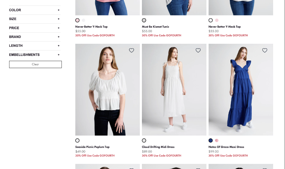
ModCloth is a clothing website which, at first glance, might seem pretty similar to many other clothing websites. But if you look deeper you’ll find some differences. First, the filters on the site are a fairly comprehensive bunch, with the option to find embellishments just as easy as finding colour and size.
Second, the name for each item of clothing is a pun, a play on words, or a clever label that’s a unique way to name things. This sets this clothing store apart.
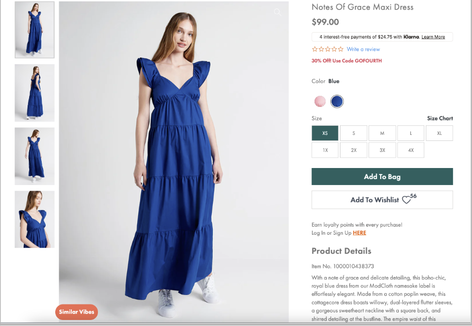
Third, when you click on an item, the description for each piece of clothing, which is to the side of the big photo of it, has a nice way of describing it, especially in the first line, which often incorporates the name of the item into the copy. It all comes together to make you feel good about shopping at this store.
Key takeaway: Use copy to charm and disarm customers and draw them into your site—and if you have an online store that could use filters, make sure they’re comprehensive and assigned meaningful labels.
9. Gov.uk
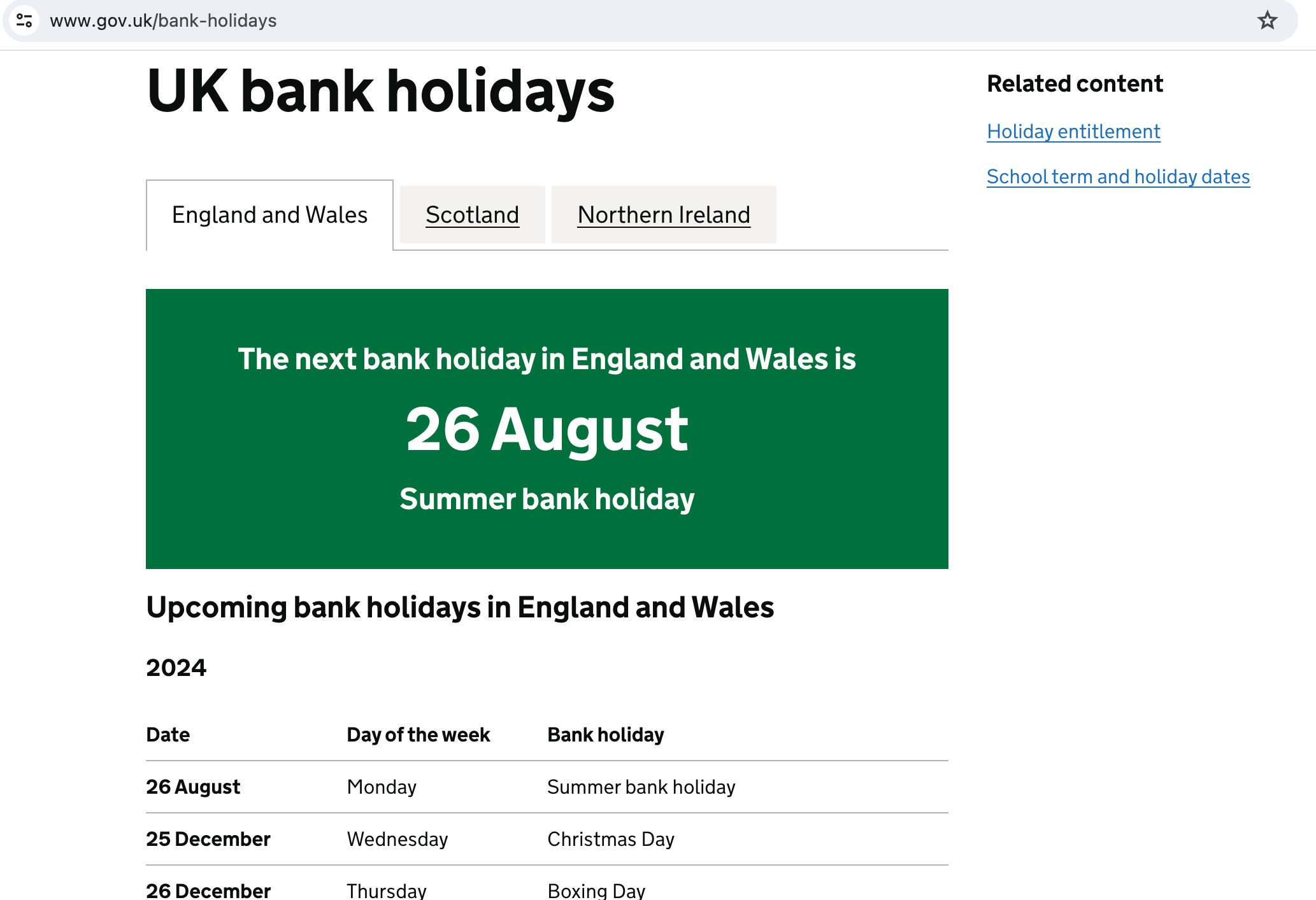
The UK government, like many government websites, has a page for bank holidays. These are the days that many people will have time off work, so it’s often worth knowing what holidays are coming up. The UK has figured out a novel solution to this problem. The next coming holiday is always shown in the big green box at the top of the page. It’s the biggest, most colourful thing on the page and therefore gets the most attention.
If you want information about all the upcoming holidays, you can get that information as well. The upcoming holidays are listed underneath the green box and Scotland and Northern Ireland are listed to the right of England and Wales.
If you scroll down far enough, beyond the future holidays, you’ll even get a list of past holidays. This page does everything you could wish, while prioritising the next holiday that’s coming up.
Key takeaway: Prioritise the most important information through your information architecture, placement of type, and other elements, but don’t forget about other useful information that should appear on the page as well.
10. A List Apart
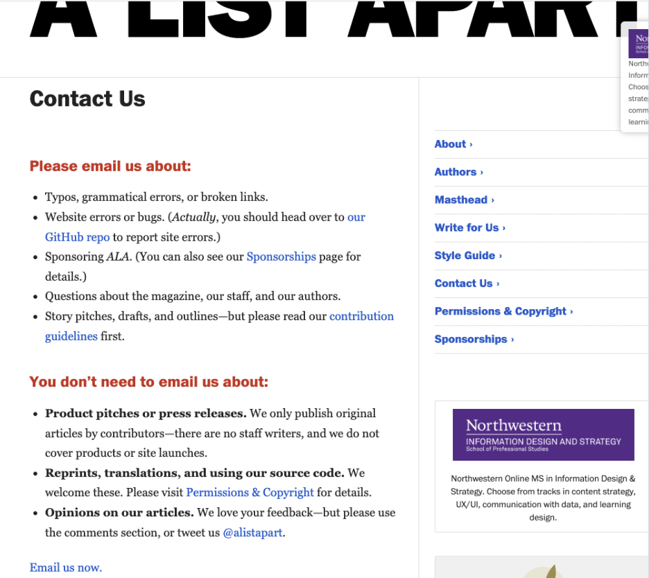
A List Apart is a website for those who work in the UX, UI, and tech industries. As a result, it’s got a winning design, but the most original example may be on its Contact page. This page gives a thorough understanding of what you can email them for—and what you don’t need to email them about. Only after they tell you all this do they provide a link to email them.
It’s a clever way to tell people what’s worth emailing them about and perhaps even more so, sets up what they don’t like to get emails about, and it makes it obvious they want you to read it by the placement of the link at the bottom. Plus, it’s organised and written in a way that’s friendly, engaging, and most importantly, won’t make people mad.
Key takeaway: Be thorough, in as few words as possible, but friendly when giving people information.
Learn more about content design
If you’d like to learn more about content design, check out our articles on The Future of UX Writing and Content Design, Content Design Principles, and A Complete Guide to Emotional Content Design.
You might also like:

