Content design is an essential building block of any good user experience. But achieving that perfect balance of style, organisation, usability, and clarity can be challenging—especially when dealing with complex topics. That’s why it’s so important to have a good understanding of the fundamental principles of content design that you can turn to time and time again for guidance.
In this blog post, we’ll explore six of those most important content design principles through real-world examples from industry pros who’ve put them into practice.
From providing accurate context to creating a cohesive structure, each of these key content design principles can elevate your content designs and ensure you’re communicating effectively with your audience. So let’s get straight to it!
What is content design?
Before we dive into the core principles, let’s have a quick refresher on what content design actually is.
Content design is a relatively new (yet increasingly popular) multidisciplinary approach to creating and structuring high-quality content to guide, inform, and delight users as they navigate the interface. Much like UX design, content design focuses on crafting content that meets user needs and encourages them to take certain actions that support business goals.
There are a variety of tasks and responsibilities that fall under a content designer’s hat; from conducting user research to creating a content strategy, and maintaining content across various platforms and channels to ensure the messaging is consistent and effective. Check out our complete guide to content design to learn more about this flourishing field.
6 Content design principles
1. Clarity
Clarity is the cornerstone of effective communication, ensuring your audience can quickly understand your message without any confusion or ambiguity. But how exactly do you go about conveying your message in a clear, easy-to-understand way?
For starters, use simple and straightforward language and avoid technical terms and jargon that might alienate your users. When you are tackling more complex topics, take the time to explain them carefully and thoroughly, breaking the message down into short, easy-to-digest blocks to avoid information overload.
Another way to enhance clarity and make your content more engaging is to use real-life examples that relate to your audience. This helps create a memorable message that resonates with them on a personal level. Visual content like graphics, videos, and images also help to reinforce your message and make it easier to retain.
Perhaps the most important gateway to clear content, though, is through hierarchy and structure. Using headings, bullet points, and lists to break down your content into clear, concise chunks will help your users quickly find exactly what they’re looking for, and understand what to expect from each block of content.
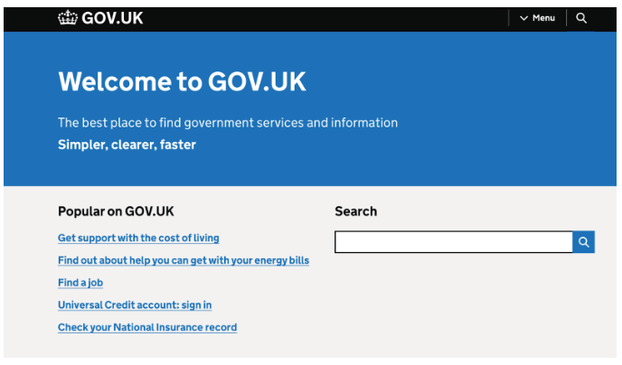
Example: Gov.uk
Most content designers recognise the UK government website as the gold standard of clarity in content design. No surprises there, as this is where British content design pioneer Sarah Winters created the discipline!
In addition to using plain and jargon-free language to communicate complex information effectively, the site employs a consistent and intuitive navigation system that allows users to easily find their way around the website.
Gov.uk also follows a logical and structured approach to content presentation. They’ve grouped information into sections and sub-sections, with headings and subheadings providing clear signposts for users. They’ve also used bullet points to boost readability.
What can we learn from Gov.uk? Logically organise your content by using clear navigation structures, descriptive labels, and headings.
2. Accuracy
Whether written or visual, accuracy is the foundation of credibility and trustworthiness in any content. Accuracy helps your audience determine how reliable you are as a source of information—so it shouldn’t be taken lightly.
On the surface, ensuring your content is accurate could mean auditing your text for typos and making sure there’s no conflicting information that might lead to a misunderstanding. Accuracy also means ensuring your content is factually correct and backed up by credible sources.
It might be tempting to let accuracy fall by the wayside when creating promotional materials. For example, you might want to use clickbait headings or overblown claims. But trust us—there’s truly nothing that could be worth damaging your company’s reputation!
It’s also worth noting that accuracy is particularly crucial in digital products like government, law, or medical websites, where people rely on this information to make high-risk decisions. To keep complex information accurate and up-to-date, you can (and should) conduct regular audits under the guidance of multiple subject matter experts.
Example: BBC News
It’s not easy to maintain high editorial standards on a news site, but BBC News stands as a prime example of accuracy in content design.
For starters, BBC News places a strong emphasis on transparency around their sources; providing proper citations, quotes, and references to help readers to trace the origin of the information. They also clearly distinguish between news reporting and opinion pieces, with labels differentiating between the two. This practice helps readers understand the difference between factual reporting and subjective commentary.
Of course, we’re all human—and mistakes happen. But BBC News has a dedicated process for promptly addressing mistakes and issuing corrections, which helps maintain the credibility of their content.
What can we learn from BBC News? Prioritise transparency. By presenting all the information as clearly as possible (e.g. how old the content is, the sources you’ve pulled from, what kind of content this is) your audience can decide for themselves how credible the information is.
3. Context
No two people are the same, and there’s no guarantee that your intended audience will interpret your content in the way you hoped they would. This is why context is such a crucial pillar of content design.
Context can significantly impact how a message is perceived and received by an audience.
Context can be anything from who the audience is (i.e., age, ability, socio-economic background, location) to the device they’re accessing the content on. To help your users get the most out of your content, it’s crucial to create content that’s context-sensitive.
For example, when creating content for social media, it’s important to keep in mind that social media users tend to have short attention spans—and are seeing your content in a fleeting moment among hundreds of other posts. With that in mind, the content should be short, attention-grabbing, and shareable.
On the other hand, when creating content for websites, the focus should be on providing more in-depth information like product descriptions, how-to guides, or informative blog posts—with relevant call-to-actions that relate to the subject matter of the content.
Context can also refer to the cultural and social background of the audience. For example, if you’re creating content for a global audience, you’ll want to keep the content as general as possible—avoiding any jargon or colloquialisms that might be specific to one culture or country, and ensuring your imagery reflects the diversity of your audience.
Example: Netflix
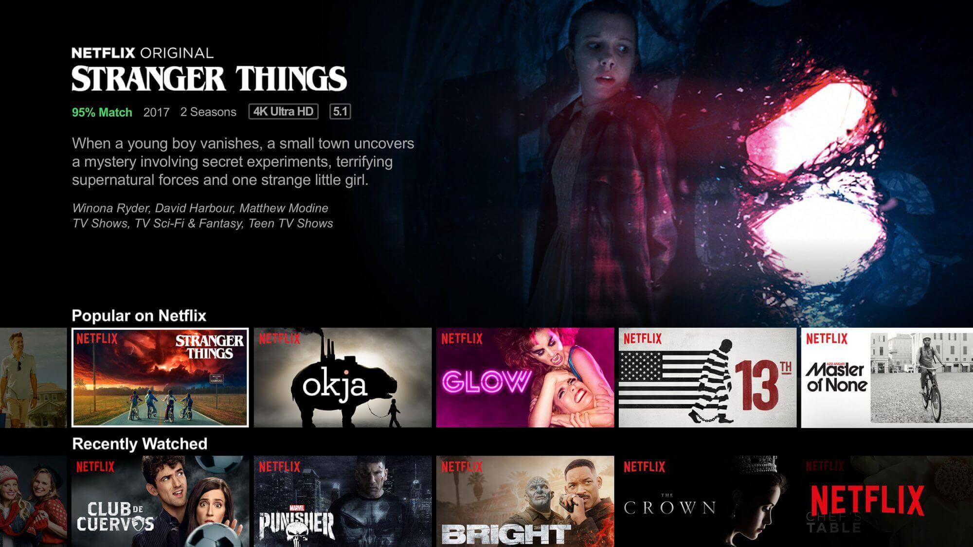
Netflix is a stellar example of contextual content design. In fact, the streaming giant is widely hailed as the pioneer of context-sensitive viewing experiences.
Most obviously, Netflix leverages user data and algorithms to provide personalised recommendations based on individual viewing habits, preferences, and ratings. They also acknowledge the importance of regional and cultural context by offering localised content and subtitles in multiple languages, and curating thematic collections or categories based on genres, moods, and themes.
Another way Netflix cleverly ensures context sensitivity is by providing “continue watching” functionality that allows users to pick up where they left off in a series or movie, even on different devices. This seamless transition between devices and sessions acknowledges the importance of maintaining device-based context for users.
What can we learn from Netflix? The better you understand your users’ needs and preferences, the better you can tailor the content for different contexts. Conduct some in-depth user research and allow those insights to guide your contextually relevant content.
4. Transparency
Earlier, we mentioned transparency as a pillar of accuracy. But transparency also stands alone as a guiding content design principle.
Transparency is about being open and honest with your audience about the sources you use, the objectives of your content, and any potential conflicts of interest. If you want a good relationship with your audience—and a good reputation—transparency should be the foundation upon which all other elements of your content strategy are built.
In today’s digital landscape, where misinformation is common and scepticism is high, transparency is more important than ever. When you’re transparent about your sources, you’re telling your audience that you’ve done your research and are committed to providing them with accurate and reliable information.
Transparency also means being clear about the objectives of your content. Are you trying to inform, persuade, or entertain your audience? Whatever your objective, it is important to be upfront about it, so your audience knows what to expect.
Another critical aspect of transparency is disclosing any potential conflicts of interest. If you have financial or personal interest in the subject matter you’re writing about, e.g. being sponsored to write a blog post, disclosing it to your audience will help them make an informed decision about whether to trust your content.
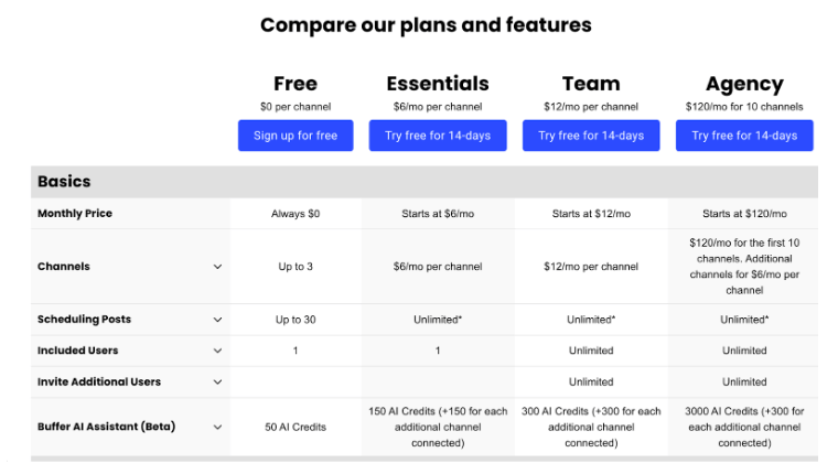
Social media management tool Buffer is known for openly sharing their knowledge and insights with their audience. They regularly publish blog posts, articles, and guides that provide valuable information on various aspects of social media marketing, content strategy, and workplace culture.
Buffer maintains transparency throughout their pricing and product pages, clearly displaying their pricing plans, features, and limitations so customers can make informed decisions.
What really stands out about Buffer is their commitment to openly addressing challenges, limitations, and areas where they may fall short. They acknowledge their mistakes, communicate their efforts to overcome challenges, and actively seek feedback from their audience. This transparent approach helps build trust, and tells users they want to improve.
Example: Buffer
What can we learn from Buffer? Your audience is smart—treat them as such! Give them all the information available, and come clean when you fall short.
5. Cohesiveness
Cohesiveness helps the content flow logically and coherently, with each section linked to the previous and the following one. Making sure your content design is cohesive also helps users understand the message—which leads to better engagement.
The best way to achieve a cohesive content design is to use a clear, concise, and consistent writing style. This means using simple language and sticking to one single voice. It’s also important to use strong headings and subheadings, link paragraphs with transition sentences, and repeat essential points throughout the content.
Cohesiveness isn’t just applicable to text; it’s equally important to establish consistency throughout your visual content (i.e., images, videos, and graphics). This helps manage users’ expectations and grasp the message quicker.
Sometimes, maintaining cohesiveness is as simple as proofreading and editing the content before publishing it. This way, you can catch any errors or inconsistencies that detract from the cohesiveness of the content.
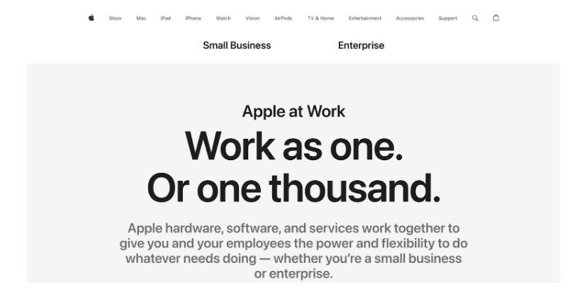
Example: Apple
Tech giant Apple pays meticulous attention to cohesiveness and visual harmony in their content design. The visuals, photography, and language used across its marketing materials and product interfaces complement each other seamlessly, creating a cohesive and aesthetically pleasing experience.
Whether it’s in their advertisements, product descriptions, or customer support materials, Apple integrates its messaging across channels, ensuring the content and tone are consistent and aligned with the brand’s values and positioning.
What can we learn from Apple? Creating an integrated content strategy is a great way to maintain a cohesive narrative that reinforces your brand’s messaging.
6. Inclusivity
If you want your content to be accessible and relevant to a diverse audience, regardless of their backgrounds, abilities, or identities, it needs to be inclusive.
In today’s world, inclusivity isn’t a ‘nice to have’—it’s an expectation. Inclusivity ensures that content represents and includes diverse perspectives, cultures, and identities. It acknowledges the richness of human experiences and helps combat bias, whether through representation in visuals, inclusive language, or storytelling that resonates with a wide range of audiences.
One of the key pillars of inclusive content is cultural sensitivity and nuances. This means avoiding any content that might perpetuate harmful stereotypes, and ensuring your content is relatable to a general audience. Your visual content, in particular, should reflect your diverse audience; including a range of ages, races, and abilities in your imagery.
Inclusive language is also critical to create a welcoming, accessible digital experience. In addition to using inclusive, gender-neutral and assumption-free language, it’s crucial to be mindful of tone—and avoid exclusionary language that might alienate certain users.
Learn more in this guide: How To Design Accessible and Inclusive Content (and Why It Matters).
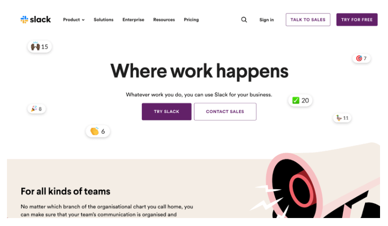
Example: Slack
Despite being a workplace tool, Slack is leading the way in terms of inclusive content—and not just because they foster inclusive communities by providing spaces for users to connect, collaborate, and share knowledge.
Slack uses inclusive language throughout its platform and content, avoiding gendered terms and opting for gender-neutral language wherever possible. They also showcase diverse representation throughout their visuals and marketing materials, using images and illustrations that reflect a variety of ethnicities, ages, abilities, and backgrounds.
Lastly, Slack prioritises accessibility in its content design. The platform boasts features like screen reader support, keyboard navigation, and colour contrast options to ensure individuals with disabilities can easily navigate the interface.
What can we learn from Slack? Inclusivity doesn’t need to be a minefield—but it does require mindfulness. Research your audience and regularly audit your content to ensure it’s as inclusive as it could be.
Round up
Content design isn’t just about finding the perfect words to make your message as clear as possible. It’s about creating something accessible, enjoyable, and welcoming for everyone—regardless of their ability or background. These guiding content design principles work together to keep you on track for amazing content your users actually like reading.
If you’re on a journey towards better content, we highly recommend these blog posts:
- The future of UX writing and content design: 5 major trends
- What’s the difference between UX writing and copywriting?
- What is UX writing and how do you do it? Tips for beginners
