Dark mode is an increasingly popular design choice—and, for many everyday users of apps, websites, and smartphones, it’s the preferred setting.
While dark mode might seem like a relatively modern trend, it actually stems from the very early days of computing. By default, some of the first computers featured black screens with green or amber text.
Then, as technology evolved, light mode soon became the norm, with modern interfaces designed to emulate white paper.
Now, dark mode is very much back in vogue—but it’s more than just an aesthetic trend. Designing for dark mode can be crucial for enhancing user comfort and, in some cases, improving accessibility. As such, it’s a key consideration in user experience design.
But what exactly is dark mode? And how can designers ensure that they’re getting it right?
Consider this your ultimate guide to designing for dark mode, complete with actionable tips, best practices, and real-world examples.
What is dark mode design?
When it comes to using an app, website, or device like a smartphone or laptop, you usually have the option to choose between light mode and dark mode.
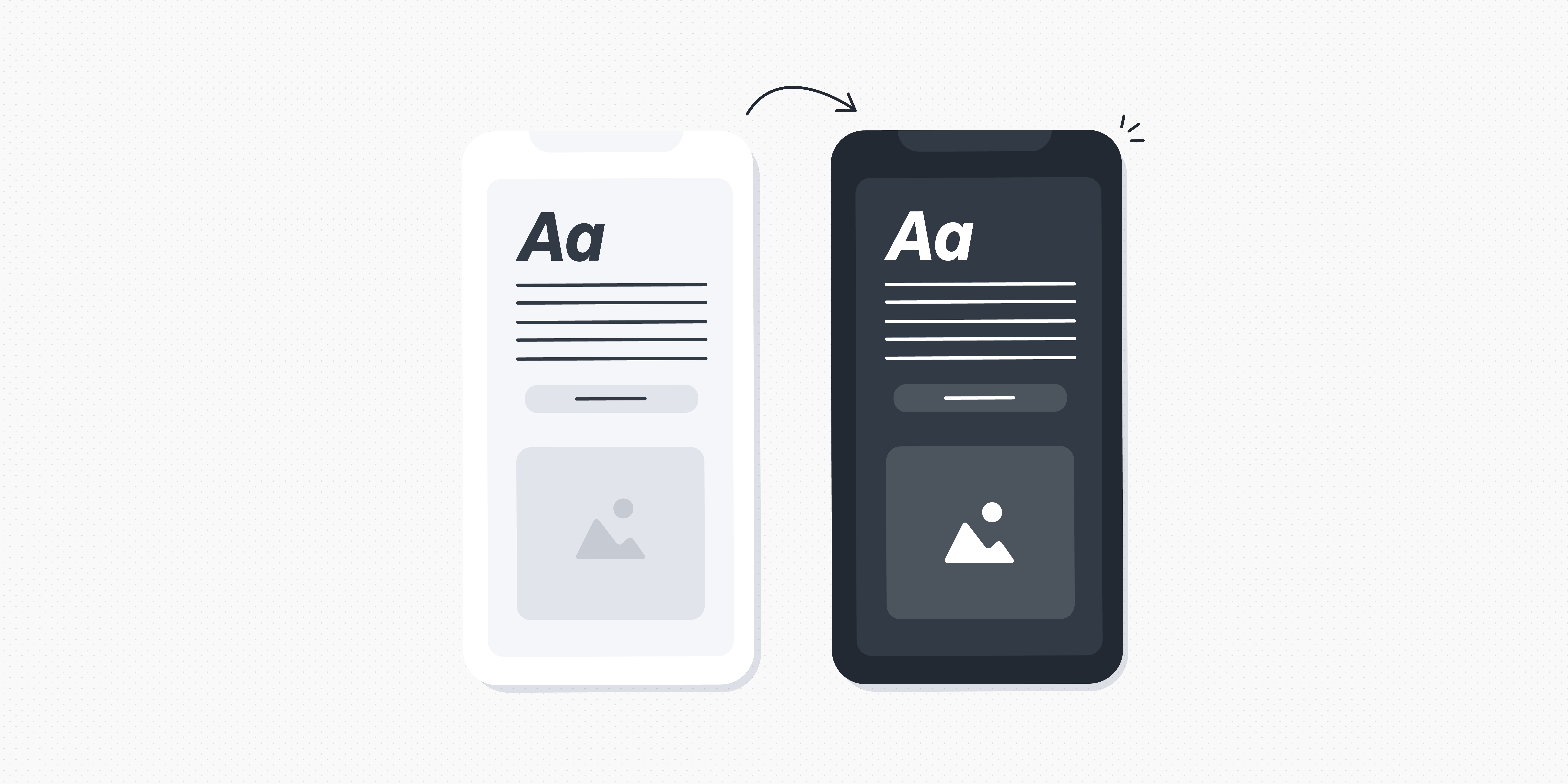
Light mode typically features darker text on a lighter background—and it tends to be the default option with most digital interfaces. Dark mode, on the other hand, uses lighter coloured text and UI elements on a darker background colour.
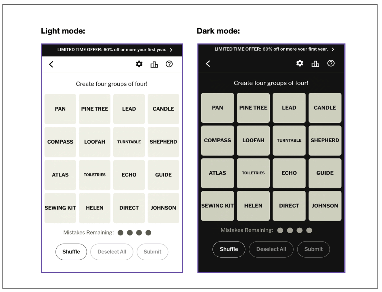
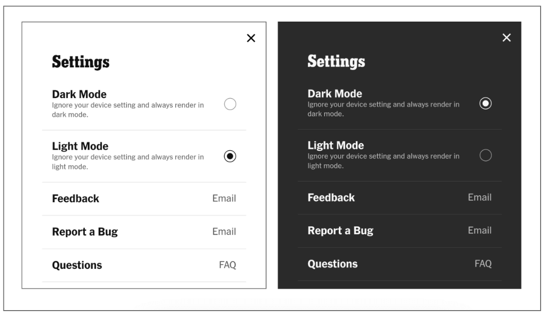
Take this example of the New York Times Games web app. By default, the app displays in light mode, but users can easily switch to dark mode in the settings menu.
Dark mode design is the process of designing user interfaces that are optimised for dark mode.
Sounds simple enough, right? But it’s not just a case of choosing a darker background colour and adding some white text. When designing for dark mode, you must think carefully about contrast, readability, accessibility, and overall visual appeal—but more on that later.
First, let’s consider the benefits of dark mode and why it’s become so popular.
Why design for dark mode? (The main benefits)
Designers and users alike love dark mode, and not only because of its modern and sleek aesthetic. When used in the right context, dark mode can significantly improve the overall user experience.
Dark mode can help to:
- Alleviate eye strain for the user: Dark mode emits less light than its brighter, more glaring counterpart (light mode), offering a softer, more gentle viewing experience. Many users find that this helps to reduce eye strain and is generally more comfortable.
- Reduce screen glare in dimly-lit environments: If you’ve ever woken up in the middle of the night and reached for your phone without dimming the screen first, you’ll know just how painful the sudden brightness can be. Dark mode helps to minimise the harsh contrast between the screen and the surrounding darkness—making it much more pleasant for low-light settings.
- Enhance accessibility: Users with visual impairments may find that dark mode improves contrast and readability. At the same time, users who are sensitive to bright light may find dark mode more comfortable and accessible.
Those are the benefits—but what about potential drawbacks? Are there any scenarios where dark mode should be avoided? Let’s take a look.
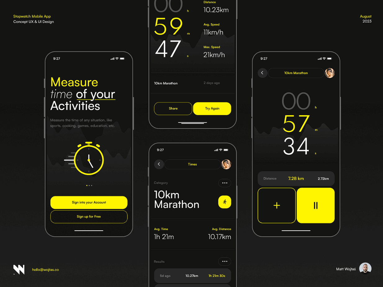
Dark mode design example: A stopwatch mobile app concept by Matt Wojtaś (source: Dribbble).
When not to use dark mode (the potential drawbacks)
In some cases, dark mode may not be the most suitable design choice. If you’re considering dark mode design for your next project, be sure to bear the following limitations in mind:
- In brightly-lit settings, dark mode can increase eye strain: In well-lit environments—such as outdoors on a bright, sunny day, or in a well-lit room—dark mode can make it difficult to view what’s on the screen. As such, light mode is much more appropriate for bright light.
- Dark mode is not ideal for content-heavy applications: If the interface features long blocks of text, dark mode can cause issues with readability. This is especially problematic if you use insufficient contrast when designing for dark mode, and can also be impacted by font style and size.
- Dark mode can reduce readability and accessibility for people with certain types of visual impairments: Users with certain types of colour blindness or low vision may find that dark mode reduces readability and makes the product less accessible and enjoyable.
When designing for dark mode, it’s important to balance the benefits against the potential drawbacks. Ideally, you’ll give your users the choice between light and dark mode—allowing them to flexibly switch back and forth depending on the context, environment, and their personal needs and preferences.
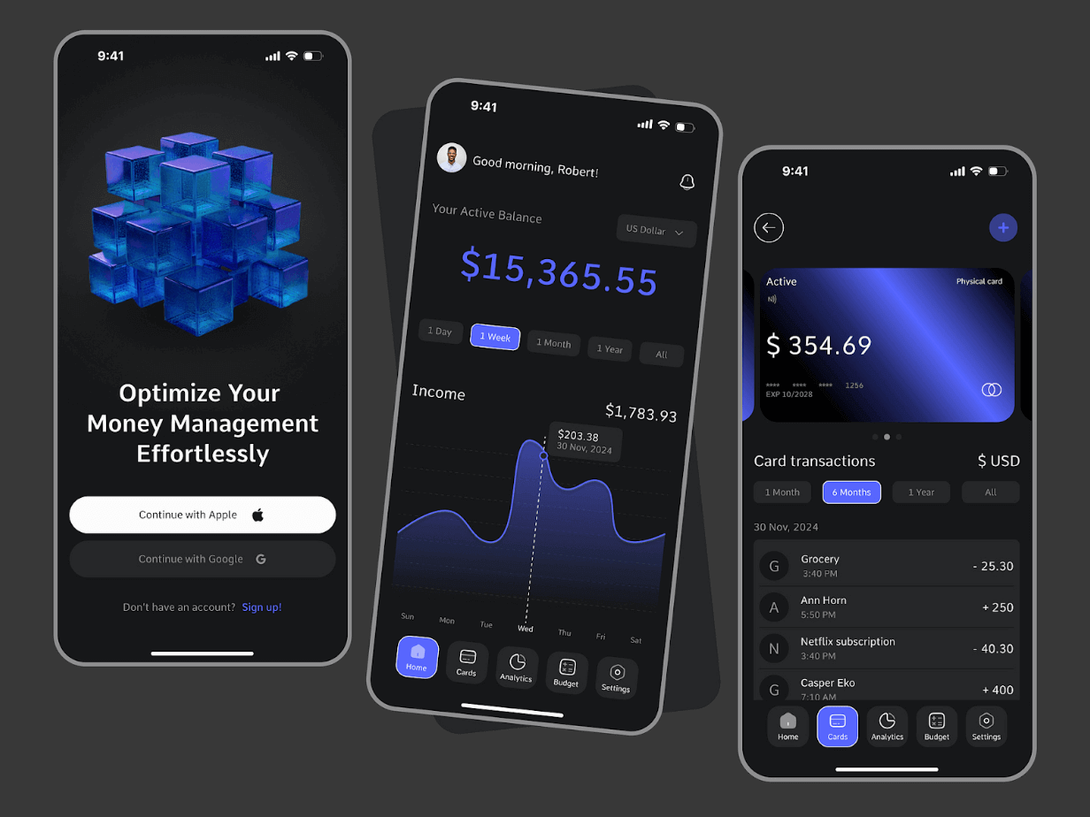
Dark mode design example: A financial management app concept by Bato Web Agency (source: Dribbble).
How to design for dark mode: actionable tips and best practices
Now we know what dark mode is and how it shapes the user experience, let’s get to the practical matter of actually designing for dark mode.
1. Steer clear of pure colours
When you start to design for dark mode, your first thought might be to place pure white text on a pure black background. However, using pure colours like this creates far too much contrast—which can cause serious eye strain for the user.
So what can you do instead?
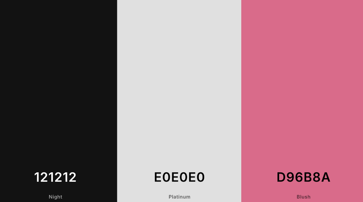
Consider dark grey for the background (e.g. #121212) and off-white for text (e.g. #E0E0E0).
For any primary and secondary colours in your colour scheme, opt for muted tones.
If your colour palette usually features vivid pink (e.g. #FF007F), you’d want to use a desaturated, more muted shade of pink for dark mode (e.g. #D96B8A). This would be ideal for buttons and highlights within the UI.
2. Ensure sufficient contrast
Contrast is crucial for readability and accessibility, so make sure you’re achieving sufficient contrast between text and other UI elements (e.g. buttons) and the background.
The Web Content Accessibility Guidelines (WCAG) recommend a minimum contrast ratio of 4:5:1 for normal text and 3:1 for larger text (18pt or 14pt bold). Use the WCAG Color Contrast Checker tool to check the contrast between different colour combinations.
3. Dial down on saturation
While bright, saturated colours look great in light mode, they’re best avoided in dark mode design.
Highly saturated colours can appear overly intense and visually jarring when placed against a dark background—and, if used for text, they’ll pose a great problem for readability.
But dialling down on saturation doesn’t necessarily mean you’re limited to dull, drab colours—it’s just about softening your hues so that they’re more cohesive and visually appealing within your dark UI.
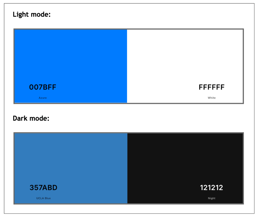
If you’re using a vibrant blue in light mode (e.g. #007BFF), for example, you might tone it down to a more subdued shade for dark mode (say, #357ABD).
4. Avoid shadows; use highlights and gradients instead
In light mode, you can apply shadows to various elements to create a sense of depth and guide the user’s attention to certain components. However, this doesn’t work so well in dark mode, where shadows will barely be visible against a dark background.
So what other options do you have?
Try using subtle highlights or gradients instead. If you’ve got a call-to-action button, for example, you might add a lighter coloured border to make sure it stands out and catches the user’s attention.
Another option is to apply a faint outer glow to individual elements. This will make them appear as if they’re slightly illuminated.
To do this, apply an outer shadow to your chosen element, using a colour that complements the element’s primary colour. Say you’ve got a button in blue, for example, you’d use a softer shade of that same blue for the outer glow.
Then adjust the shadow opacity so that the glow appears semi-transparent (say, 30% opacity), adjust the size so that the glow extends just a few pixels beyond the button’s outer edges, and apply a blur effect.
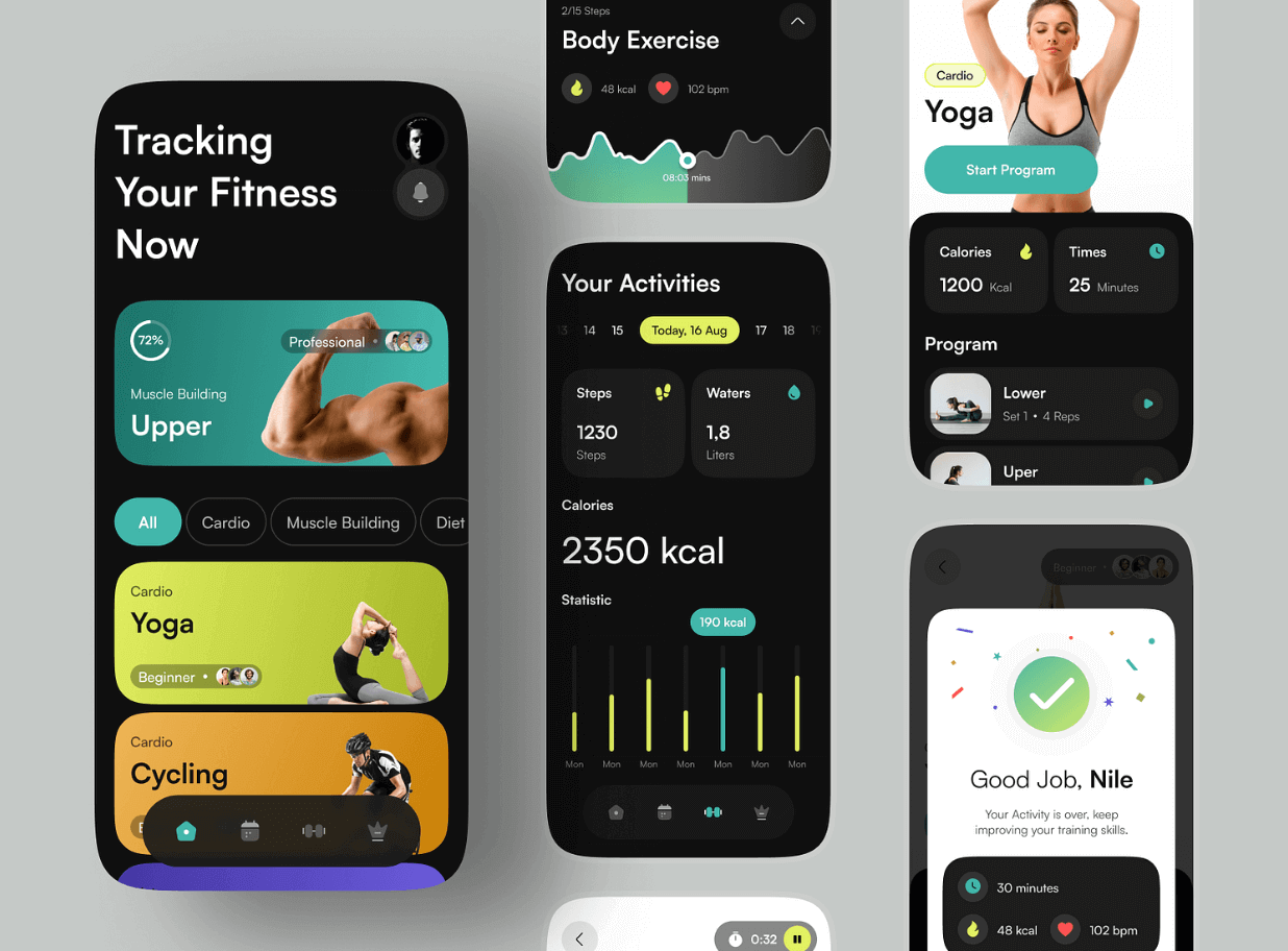
Dark mode design example: Fitness app design by Paperpillar (source: Dribbble).
5. Optimise all text for readability
Typography can make or break your dark mode design, so it’s essential that you style all text with care.
First and foremost, choose text colour wisely. For body text, lighter colours work best—such as off-white or light grey. As we mentioned earlier, avoid using pure white (this can feel overly harsh on a dark background). For headings, you can use slightly brighter colours. This helps to create a clear visual hierarchy, guiding the user towards important content.
Next, consider how different font weights can impact readability. You’ll find that thin fonts appear faint in dark mode, making them hard to read. As such, it’s better to use regular and medium weights for body text, and bold for headings.
Last but not least, play around with different font sizes and line spacing to optimise for clarity and readability.
6. Provide a toggle to switch between light and dark mode
Earlier in this guide, we outlined the benefits of dark mode together with some potential drawbacks. Ultimately, there are some scenarios where dark mode makes sense, and others where light mode is preferable.
It’s therefore important that your users can move between light and dark mode quickly and easily. Provide a simple toggle in the settings menu, or directly within the interface, so that users can set their preferences with just one click.
This flexibility ensures that users get the best possible experience of your product, whether they’re using it in bright sunlight or in a dimly-lit room.
7. Test your UI across different devices and environments
Before you develop and launch your dark mode design, you must make sure that it performs as intended in different scenarios.
Test your UI on a variety of devices, screen types, and sizes to make sure it’s consistent across mobile, desktop, laptops, and tablets. And remember: you’re not only checking for aesthetics here; you’re primarily looking for optimal usability, readability, and accessibility.
At the same time, see how your dark mode design fares in different lighting conditions. Test it in bright sunlight outdoors, in low lighting indoors, and in complete darkness.
If you can confidently conclude that your dark mode design is functional, accessible, and visually appealing in all contexts, you can consider it a success.
Key takeaways
Nowadays, users expect to move flexibly between light and dark mode—without compromising on functionality, accessibility, or aesthetics. As such, mastering the art of dark mode design is crucial if you want to create exceptional digital products and stellar user experiences.
When designing for dark mode, many of the same rules and processes apply: choosing appropriate colours, ensuring plenty of contrast, optimising text for readability, and rigorously testing your designs before you get them developed.
Learn more about UX design
Designing for dark mode is just one of the many considerations to keep in mind when creating apps, websites, and other types of digital products. For more practical guides and insights, check out the following:
- What is a design system and why is it useful?
- 6 tips for improving your product design sketches
- How to design for AI-first products
For more in-depth, hands-on training, check out the Professional Diploma in UX Design. You’ll learn the full UX design process from start to finish, work on practical projects for your UX portfolio, and finish the course with an industry-recognised qualification. Learn more about the curriculum via the course page, or book a call with an education advisor.

