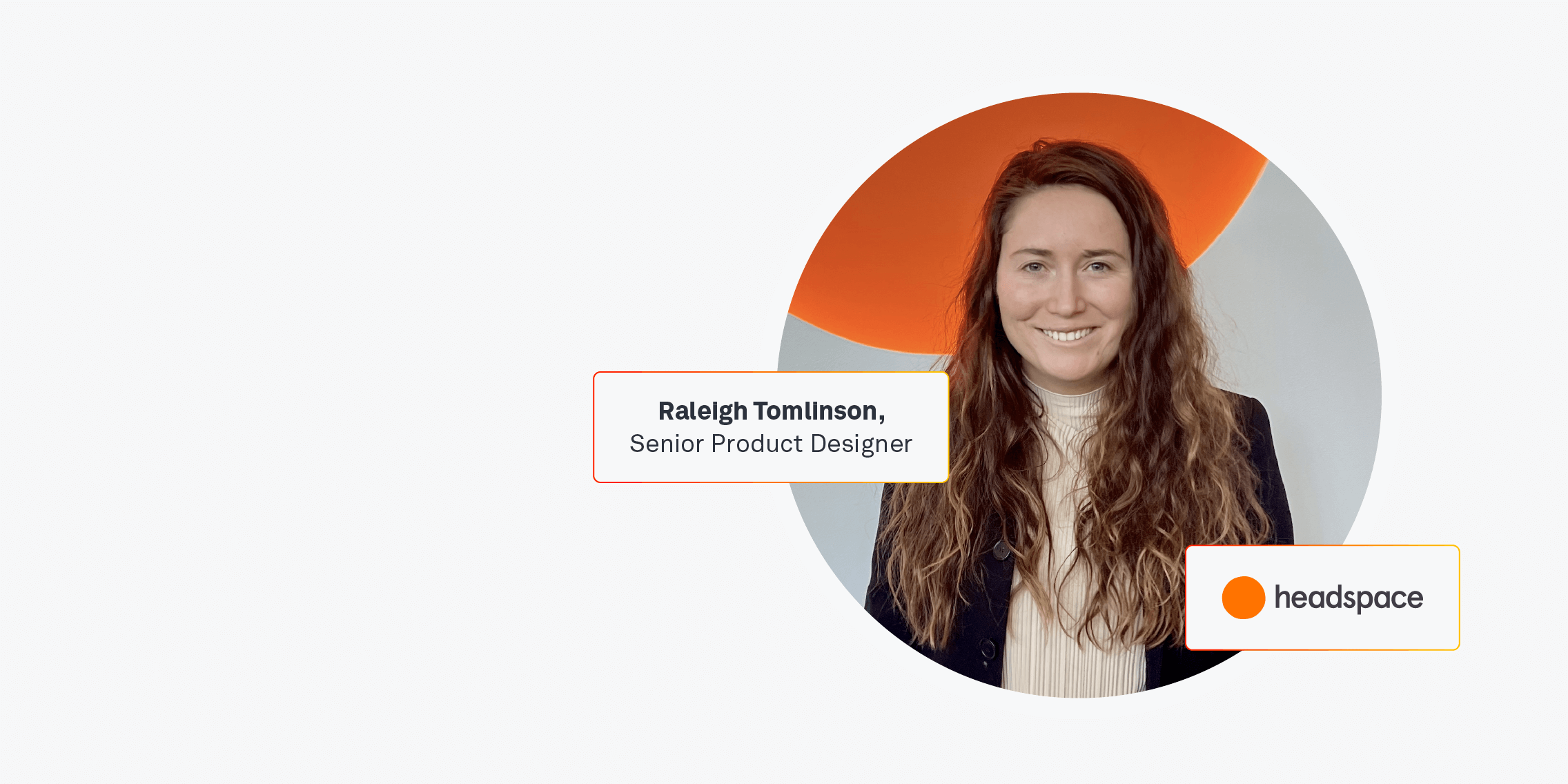
We had the chance to chat to Raleigh Tomlinson, the Senior Product Designer with Headspace, as part of our Day in the Life live event, which you can watch here.
Headspace is a meditative app that aims to improve the health and happiness of the world and Raleigh focuses on creating engaging experiences that help users learn how to use meditation, a behaviour that’s often challenging for users.
With a team consisting of therapists, wellness and mental health professionals, the app has over 70 million users who sign up to turn meditation into an everyday practice.
The balance between good design and wellbeing can be difficult to achieve but Raleigh gives us an insight into her working day and explains how Headspace allows people to approach life with a pause button in the back of their pocket.
Could you tell us a little bit about your background before you started with Headspace?
I got into design as a freelancer. I did a boot camp and I was about one month into it when I found my first freelancing project. I always tell people who reach out to me to make freelancing a part of your identity because you can start to do UX design work, even if you’re still learning. That was really a big thing for me. I started building my portfolio and one freelancing project led to another… Before I joined Headspace, I had done about 12 products.
Even though I was only about a year or two into the field, I came with a really strong portfolio during the interview and application process.
Headspace is actually my first full-time job but I’ve been here for over a year and it’s been wonderful.
It’s interesting to hear that you got a job so fresh into entering the UX industry because most students would be concerned about job opportunities.
Yeah, and the field is growing – it’s a really important scope of work. Being able to build products that really resonate with human needs is the difference between adoption or a product that just ends up in some abandoned graveyard somewhere. So finding out what problem you can solve for users and how you can make something that creates meaningful value in people’s life is becoming more and more of a priority for product teams.
What are your responsibilities in Headspace?
So my team is the Growth and Acquisition Team and I’m focused on the funnel experience. I ask: what does it feel like for new members who are trying out Headspace for the first time? How do they find us? And how do they come on to our products? I’m thinking about web as well as native. On native, you know, it usually starts with an instal but people are coming from all different frames of mind.
Headspace is a meditation product and sometimes people come to meditation because they want to reduce stress. Sometimes people come because they want to feel more energised. Those are very different mental models to approach a product with so how I try to approach onboarding and that initial behaviour of meditation is really “what is that need state and how can we meet people where they’re at to help them get started?”
You keep mentioning people – there’s the people who create the product and then there’s the people who use the product. How important is it to collaborate with other teams when it comes to creating a fully functioning app?
We have squads in Headspace and there’s different squads that operate with different goals. So while my squad is growth-focused, other squads are focused on long-term engagement and long-term behaviour change. On my squad, there’s one designer, which is me, and then there’s a product manager, who is typically the person who runs the velocity of every experiment. They’re the ones that often prioritise.
We usually don’t have any problems with the amount of ideas we want to pursue but there’s always constraints around engineering resources and time. We don’t want to have the designer running in a bunch of different directions, so the product manager really helps keep us all focused.
Once I have created a design, I work with engineers to make sure that that design is implementable. They’re the ones that are actually building it and on my team, we have over 10 engineers; we’re actually hiring right now, so we’re going to be up to 18 engineers by the end of probably next quarter.
Part of my job is also to make sure that I’m ahead of the engineers. You don’t want the engineers to have no work to do.
It’s really a matter of prioritising based on what’s most important for the users and the business. But also delivering consistently and enough ahead of time so that I can stay ahead of engineers.
When it comes to the research process, what advice do you have for beginners when it comes to speaking to so many different people?
You don’t need to talk to a lot of people because there’s a difference between quantitative and qualitative understanding.
You can send out a huge survey to 11,000 people and get back really clear percentages on answers and see how many people are using Headspace for stress and how many are using it for anxiety but you don’t always get to the why behind those answers.
I like to balance qualitative and quantitative research but typically you only need to talk to five people to have some really strong hunches of the why behind why people are acting the way that they’re acting.
Data is one of those things where, depending on how strong the signal is, is probably how much of a sample size you need. So for example, if all five of those people are saying the same thing… Say they all come onto the product and they all get a headache. And when we give them this one screen and they say “Why are you giving me a pop up here? Like that’s so frustrating?”
That’s a really high signal because that has emotion and all five of them said the same thing. But if you have a group of five, and three of them say “Oh, that was a little bit frustrating to have that pop up right there”, but then have them interact with it and say, “Wow, that was a really great experience. I’m really glad that you introduced that to me at that moment”, then you probably need to do more research or test another variation because you don’t have enough data to make a conclusive conclusion.
So many everyday products leave users feeling very drained but Headspace is different because it leaves people feeling calm and energised. Can you talk about the design challenges you face designing a meditation product?
Our goal isn’t to have people come on and spend five hours on Headspace. Our goal is to have regular engagement and regular behaviour building so that people can become more able to deal with stresses and anxieties in their life, and be able to approach their life with a pause button in the back of their pocket.
But how do you introduce that into people’s lives when there’s a million other things going on? There’s a challenge there. People know that it’s good for them but how do you help people get there? One of the things I’ve noticed, partly from user interviews, is that it starts really small. So you know, it’s a one minute meditation…
If you can get someone to successfully meditate for one minute, and they can feel that little bit of sense of calm or relief, you’re much more likely to get them to come back or start to build a five minute habit.
When you take this very real human reaction and very real human response to your app, how do you literally translate that into the measure of success?
So one way is an NPS (Net Promoter Score) in app toast. If you’re not familiar with in app toasts, it’s one of those little lines at the bottom of the page that pops up on occasion that asks users “on a scale of one to 10, how are you enjoying your experience”. We use getfeedback.com and we have a very high NPS score, hovering in the 76 range, which is pretty high for most products.
We have people who leave really telling feedback and that is something that we build into our success metrics.
There are things that are harder to measure, like Headspace as a brand. A lot of the brand equity is because Headspace is a good actor in the world. People are familiar with the free social good that Headspace has done. We gave free access to health care workers during the pandemic and we give free access Headspace to educators. People are aware of some of the social impact that Headspace has done, which elevates the brand and creates brand equity. That is a little harder to measure, because there’s not necessarily one metric that you can see where that brand equity is playing off, but it impacts who subscribes and who uses Headspace long term.
What is Headspace’s approach to making sure that the design is human-centred?
When you’re learning UX and you’re learning about human-centred design, it sounds like the human is always going to be the top priority but in the real world, you have very specific success metrics. I think part of the success in reaching your mission – and not just having business success – is being really specific and what those success metrics are. So for example, is it just more people subscribing? Or is it also how many people are reaching relief or how many people are consistently coming back?
It’s tough because we typically evaluate the success of products by very quantitative data and so I have had a lot of practice in turning UX goals into business goals. Sometimes the business will say that you need to raise this metric by 10% in six months. Something that a product manager will look at and say “Okay, that’s the outcome” but very rarely is that outcome reached by just brute force, right?
You don’t have a successful product by just telling people that you need to sign up for this product. You have a successful product by creating transformative experiences for people.
And so the way that you raise those metrics, and the way that you deliver from a business perspective, is often through increasing the warmth and the value of an experience.
What is the main advice you have for anyone freshly starting out in product design?
My advice is to get experience because I found that personally, freelancing was a lot more within my scope of ability. At first l it took me a lot longer to do things so being able to charge an hourly rate and work based on my own schedule was a lot more manageable for me. Also, it’s really great when you’re going to a new job interview to be able to show you’re active in the workforce. People rarely hire new designers that say “I’ve haven’t gotten started at all” or “I had some job like a year ago, but I haven’t been doing anything lately”.
You really want them to see that you’re active.
You can volunteer. I volunteered for UXPALA, which is the professional network of user experience professionals, and reached out to some folks to invite them to speak. That was really good for my network building. There’s Amazing Design People’s List. It’s a mentoring site. That’s a really great way to find mentors that are in the design industry. There’s also UX Coffee Hours, which are hosted by Google. That one has been one of the biggest unlocks for me. They have a lot of really amazing professionals in user research in design and a few other categories.
Another one is to be specialised. Most of the time, you’re gonna have to choose. Am I a researcher? Am I a user experience designer or am I a UI designer? Headspace have product designers, which is UX and UI. So I do full stack design but in most cases, you will choose one or the other. zoom in and get as specialised as you can.
I know I’m just saying a bunch of advice, but one other is writing. That’s a really big way that people can find you.
If you write articles and blogs, a lot of you probably have really interesting things on your mind about design. I know that some of my most interesting thoughts around the philosophy of UX came when I was just getting started and writing is a really great way for people to find you and reach out to you.

