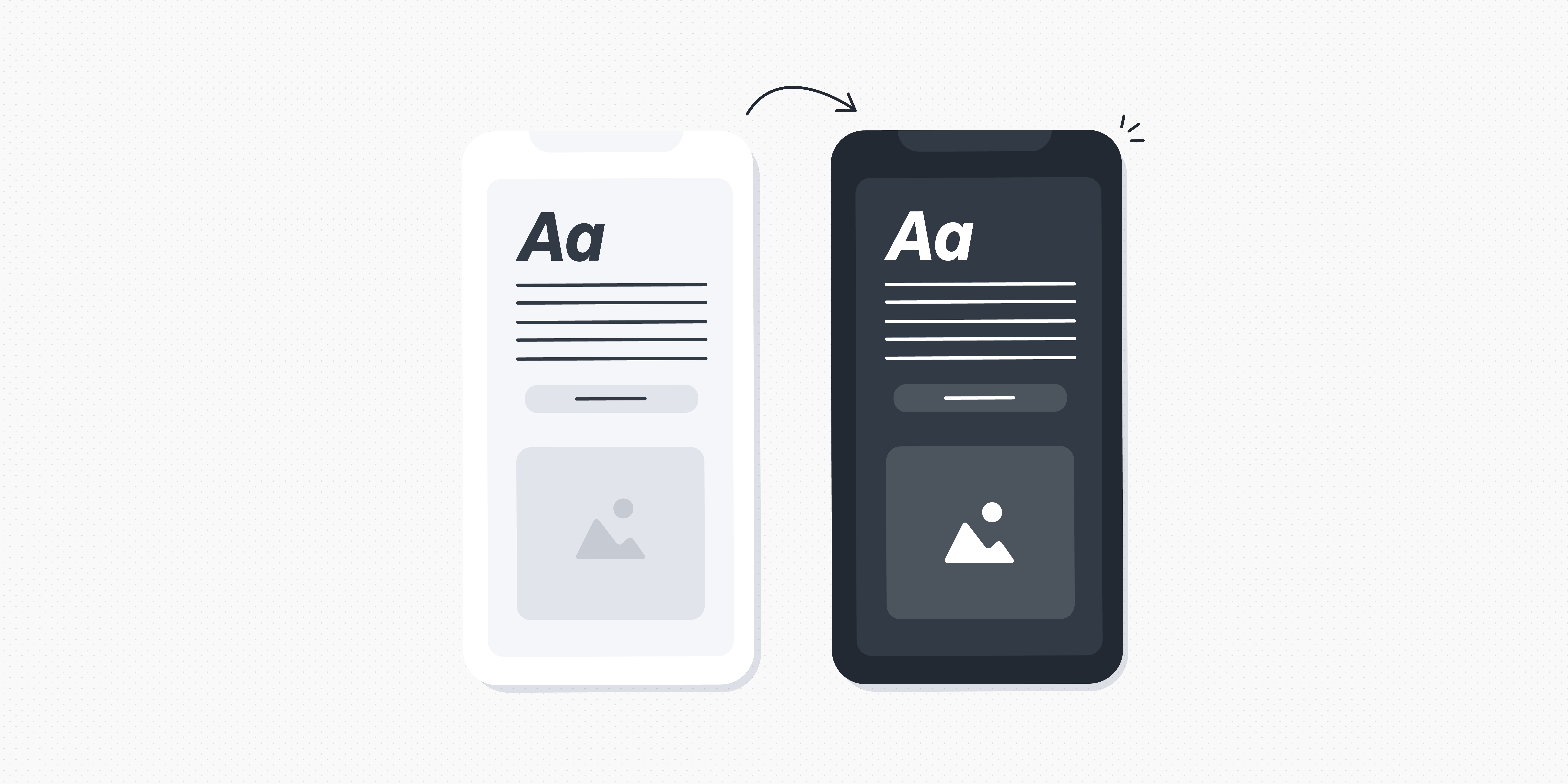
Mobile devices have become an inseparable part of our daily lives, empowering us with instant access to information, entertainment, and endless possibilities. With people increasingly using mobile more than desktop, user expectations for dynamic and beautiful mobile experiences have never been higher.
In this blog post, we’ll explore some of the key considerations when designing for mobile—from understanding user needs to creating efficient interactions. We’ll also take a look at a few real-world examples that illustrate how these design techniques come together.
- What is mobile UI?
- Designing for mobile: 5 best practices for UI designers
- 5 awesome mobile design examples (and what we can learn from them)
Let’s dive in!
What is mobile UI?
Mobile UI refers to the visual and interactive elements that make up a mobile device’s user interface. It includes the design and layout of components like buttons, icons, menus, navigation bars, input fields, and other graphical elements that users interact with on their smartphones and tablets.
To ensure they’re creating seamless and intuitive user experiences on mobile, UI designers have a lot to factor in—like limited screen real estate, touch gestures, varying device orientations, and diverse user contexts to create an engaging and user-friendly experience. With less space to play with, UI designers have to employ intuitive navigation patterns, visual cues, and responsive design principles to ensure the content is accessible above all else.
Read next: A complete glossary of UI terms
But mobile UI isn’t just about functionality. 52.08% of web visits are from mobile versus 47.92% from desktops. People are increasingly using mobile for all facets of daily life, from exercising to online shopping—and just about everything in between. As mobile usage continues to rise, today’s users expect sleek, visually appealing mobile experiences that engage and delight them.
Crafting amazing mobile UI experiences is no small feat—but don’t panic! Despite the constraints of small screen sizes, there are plenty of plus sides to mobile design.
For example, mobile UI design allows for unique, tailored experiences optimised for smaller screens and touch interactions. Mobile devices also go where users go, providing convenient and contextually relevant experiences that cater to users’ needs in real-time, regardless of their location. Moreover, mobile UIs are much more interactive than desktops. Gestures, swipes, and taps can make the overall user experience more engaging and immersive.
So, how should UI designers go about creating mobile UIs that are as accessible as they are aesthetically pleasing? Read on to find out!
Designing for mobile: 5 best practices for UI designers
As we explored in the previous section, designing for mobile has its own unique set of challenges and opportunities. As the mobile landscape continues to evolve, it’s crucial for UI designers to stay ahead of the curve with exceptional, accessible mobile user experiences.
To help you navigate the complex world of mobile design, we’ve compiled five best practices for UI designers of every level.
1. Embrace mobile-first design
One common pitfall UI designers face when designing for mobile is designing for desktop and web before adapting the design for smaller screens. Mobile UIs should be more than an afterthought—which is why adopting a mobile-first mindset is crucial.
Start by understanding (and embracing) the constraints of mobile, including smaller screen size, touch-based interactions, and varying network speeds. You can then prioritise essential elements and functionalities to ensure they shine on smaller screens. This strategy also forces you to make thoughtful choices about what stays and what goes, resulting in a lean, optimised design.
2. Streamline navigation
Smooth navigation is a vital ingredient for any successful mobile UI. With limited space, it’s all the more important to present navigation options in a concise and organised way. Well-structured navigation simplifies user interactions by reducing cognitive load and the number of steps required to access the desired content.
Avoid overwhelming users with excessive choices or complex menu structures. Instead, opt for simple menu structures, clear labels, recognisable icons, and gestures (like swipe and pinch-to-zoom).
3. Create responsive layouts
When designing for mobile, it’s important to consider the range of screen sizes and orientations of different devices. Here’s where responsive design principles can help. By crafting layouts that seamlessly adapt to different screen resolutions and aspect ratios, you can ensure that your app or website is a joy to use on any device.
The best way forward is to use responsive grids, which adjust content depending on screen size and shape. Fluid typography is also great for mobile UI, automatically adjusting font size and line length to ensure legibility on any screen size.
4. Prioritise content hierarchy
With limited screen real estate, ensuring optimal content hierarchy is crucial. Organising information logically helps manage users’ expectations and quickly find what they’re looking for. Headings, menus, colour, typography, and spacing all play a role in mobile content design. You can also use progressive disclosure to present information in bite-sized chunks, helping users get all the information they need without becoming overwhelmed by text.
5. Optimise for touch interactions
This might seem like an obvious best practice, but it’s worth emphasising. The extent to which a mobile UI is optimised for touch can truly make or break the whole user experience.
Designing larger touch targets is key for accommodating varying finger sizes and minimising the risk of accidental taps—which avoids users getting frustrated. It’s also important to ensure there’s enough space between each element, so users can comfortably ‘tap’ with accuracy. Don’t forget to add microinteractions, which let users know that their ‘tap’ has been registered. You can learn how to create microinteractions in this guide.
5 awesome UI mobile design examples (and what we can learn from them)
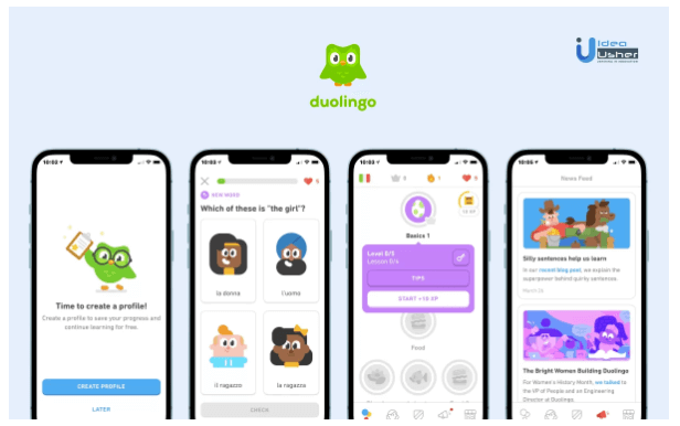
Duolingo
[Via Idea Usher]
Bursting onto the scene in 2011, Duolingo quickly became the gold standard in language learning. The company boasts a playful and intuitive app that breaks down the content into small, digestible lessons, and leverages gamification techniques to make language learning enjoyable and motivating.
Duolingo also provides instant visual feedback on user responses, which keeps users engaged.
What can we learn? Bite-sized content, clear hierarchy, and delightful visuals make mobile UI experiences more accessible and enjoyable. And don’t forget to make it fun!
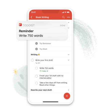
Todoist
[Via Todoist]
Todoist is an intuitive task management app that helps users stay organised, manage their to-do lists, and track the progress of their tasks across multiple devices. The platform offers an all-encompassing solution for disorganised users, helping them streamline their productivity and stay on top of their tasks and deadlines.
Todoist’s UI focuses on simplicity and clarity, providing users with a clean, no-frills interface, complete with customisable reminders and notifications to keep users on track.
What can we learn? The Todoist app is a masterclass in minimalistic design principles; from clear information hierarchy to intuitive task management. Keeping the interface clean can help users stay focused on the task at hand, and feel empowered to navigate the interface with confidence.
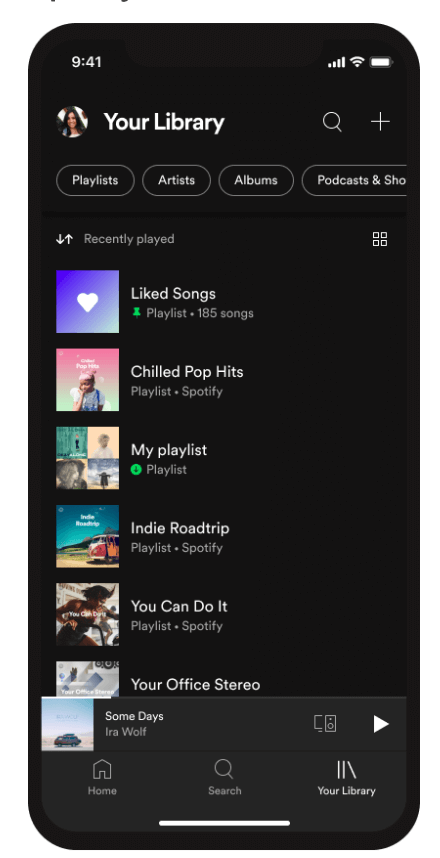
Spotify
[Via Explore Spotify]
Today, when we think of streaming music, we think of Spotify—which is a testament to their consistently high-quality user experiences, and commitment to constantly adapting their app based on evolving trends and user needs.
The Spotify app excels in several areas, most notably its engaging visual design—which uses album art, cover images, and vibrant colours to enhance the app’s aesthetic appeal. Spotify also offers a seamless cross-device experience, allowing users to switch between platforms without losing their progress or preferences.
Moreover, the app boasts playful and interactive design elements, from animations when interacting with album covers to the “like” and “dislike” gestures.
What can we learn? Incorporating animations and microinteractions into your design will enhance user engagement and create a more interactive overall experience. And if you have art or graphics as part of your UI, don’t be afraid to let them shine!
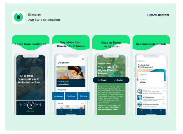
Blinkist
[Via UI Sources]
Blinkist offers insights and summaries of non-fiction books across various genres, condensing full-length books into “Blinks” that capture main ideas and key concepts. The platform is a go-to resource for personal development seekers, with a vast library of curated book summaries that you can listen to or read on the go.
Reading on mobile can be a challenge, but the talented Blinkist designers have thought it through. With clean typography, appropriate line spacing, and adjustable font sizes, the app offers a distraction-free reading experience—free from visual clutter. They’ve also navigated the challenges of being a content-forward app by employing a clear visual hierarchy, ensuring key information stands out and is easily scannable.
What can we learn? Employing a consistent visual hierarchy means you can get the right information to your users at the right time, without overwhelming them. Prioritise accessibility and the rest will follow!
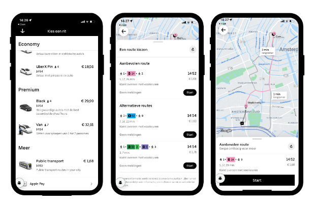
Uber
[Via Uber]
Uber has revolutionised the way people get around by providing convenient and on-demand transportation services. The app provides estimated fares, real-time tracking, and seamless payment options, making ‘hailing a taxi’ hassle-free.
The Uber app embraces simplicity, focusing on a few essential elements that help users quickly complete tasks. Uber also provides clear and concise information about available drivers, estimated arrival times, and pricing—helping users confidently make informed, time-sensitive decisions.
What can we learn? Emphasising simplicity helps users make informed decisions, even in high-pressure or stressful situations.
Round-up
Mobile UI design can be a daunting task—but it doesn’t have to be! All you need to do is get familiar with mobile’s native conventions so you can adopt a mobile-first mindset. Mobile design is constantly evolving, so be sure to follow best practices and stay up-to-date with emerging trends so you can create accessible, attractive, and competitive mobile UIs.
To learn more about creating beautiful user experiences, check out these blog posts:
- 8 UI design dos and don’ts (with examples)
- How to take your UI from good to great: 5 simple hacks for creating beautiful user interfaces
- The 10 best user interface (UI) design tools to try in 2023
