Good digital user experience (UX) design is essential for the success of any website, application, or digital product. Not only does it offer an intuitive and enjoyable experience to end-users, good UX also promotes loyalty and trust—two essential pillars of any good business strategy.
Effective digital UX design is as much an art as it is a science. Getting the balance right between aesthetics and usability isn’t always easy—but with the sheer number of websites and apps available for users, usability is what sets some digital experiences apart from the rest.
In this blog post, we’ll share some inspiring examples of good digital UX design in action; from sleek mobile apps to engaging websites.
Here’s what we’ll look at:
- Babbel’s personalised onboarding flow
- DoorDash’s guest view
- Evernote’s feature release
- Airbnb’s booking system
- Grammarly’s demo document
- Reddit’s redesign
- Semrush’s light-to-dark mode toggle
Here we go!
1. Babbel’s personalised onboarding
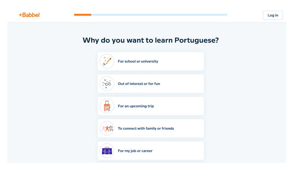
Babbel offers users an intuitive UX experience that helps learners of all levels quickly find their footing, whether you’re a seasoned linguist or just beginning your language-learning journey.
It’s common practice for apps to take your information first and personalise your experience upon sign-up. Babbel makes personalisation a priority by instead offering users a selection of quick upfront options that help them understand:
- The users’ motivations behind learning a new language
- How they learn best (e.g., live lessons or on-demand tutorials)
- How many hours per week they can commit to learning a new language
…all before they’ve even typed in their name or email address. This way, the app can curate a bespoke experience upon sign-in—with everything ready to go following the users’ personal preferences.
Why is this good UX?
So much of good UX is about trust. Users are often apprehensive about committing to a new app because they have no idea if it’ll even be right for them. By presenting clear, personalised choices related to the users’ learning experience, they’re much more likely to trust that Babbel has their best interests in mind.
Indicating where they are in the sign-up process with the progress bar also gives users more control and information.
2. DoorDash’s guest view
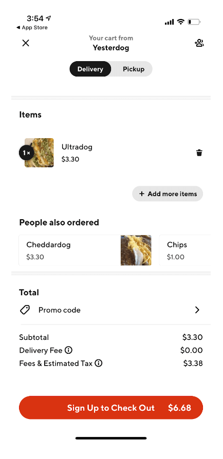
Like Babbel, one of the most common pain points users have with apps is the pressure to submit their personal information before they’ve had a chance to explore the product and assess its value. And also like Babbel, popular food delivery app DoorDash has a solution.
Alongside the usual sign-in options, DoorDash gives new users the option to continue as a guest. Once they’ve browsed the food options in their local area and made their choice, they can place the order by submitting their personal and payment details (or, in other words, signing up).
Why is this good UX?
Studies have shown that around 11% of users abandoned their purchase after being asked for too much information upfront. DoorDash’s guest option means users can discover the product’s value, and confidently sign-up knowing the app has what they’re looking for.
3. Evernote’s feature release
New feature releases can be disruptive—especially if it includes multiple and significant changes to the platform. To avoid inconveniencing users mid-flow, it’s essential to keep users in the know so they can adjust to the changes quickly.
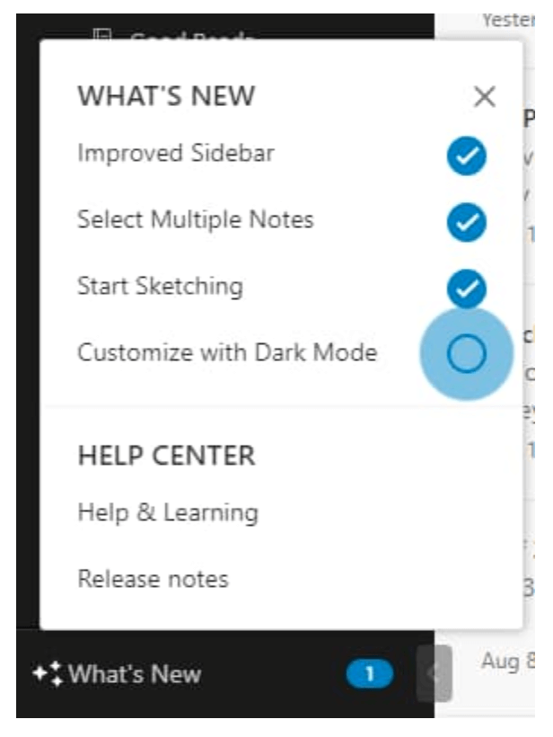
Note-taking app Evernote has set the bar high with its user-centric approach to feature releases and updates. The platform has a ‘what’s new’ tab on the sidebar which provides an overview of the latest updates and changes.
Once clicked, a tooltip will come up with a short explanation of how each new feature works. Users can also click on ‘release notes,’ which provides additional context into why each update exists—and how it’ll help users improve their activity.
Why is this good UX?
Rather than being caught off-guard by a new feature, Evernote drives feature adoption by providing a permanent place on the platform for new updates to live. This way, users explore the feature in their own time rather than feeling pressured to learn it straight away. The release notes also help users understand how the feature directly relates to them, subtly encouraging them to try it.
4. Airbnb’s booking system
Organising a trip can be stressful—and Airbnb understands this better than most. On a mission to create a world where anyone can belong anywhere, Airbnb has developed an intuitive platform that caters to all your travel and accommodation needs. One of the platform’s stand-out features is its user-friendly booking process, which makes booking a reservation simple and pleasurable.
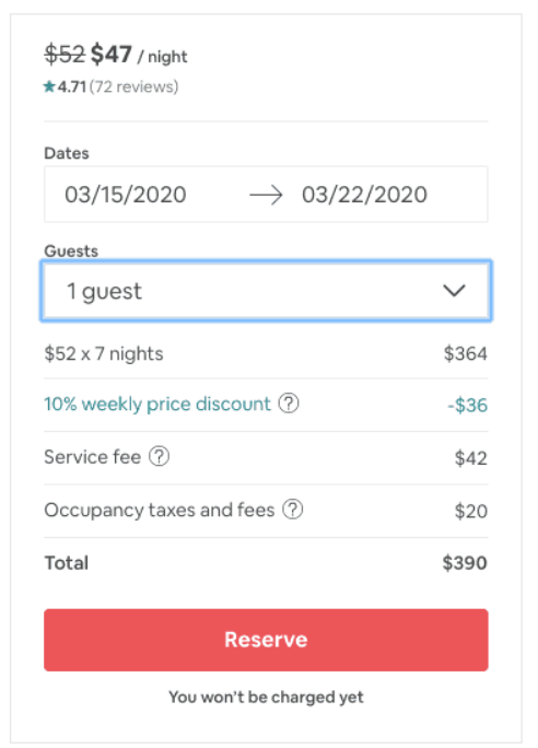
The booking system is designed to display only the necessary information, with users given helpful previews of all inputted data before committing. In addition, one clear CTA (call for action) indicates that nothing is final until the booking is approved, putting the user at ease.
Why is this good UX?
Airbnb prioritises convenience and simplicity on the crucial booking page; reducing friction with minimal steps, straightforward navigation, and clear indications of what’s coming next. The simple layout also means users don’t have to sift through paragraphs of unnecessary information.
5. Grammarly’s demo document
Sometimes, onboarding with new applications can feel like a chore. Users can get frustrated by lengthy, confusing product tutorials—especially when they’re keen to get started.
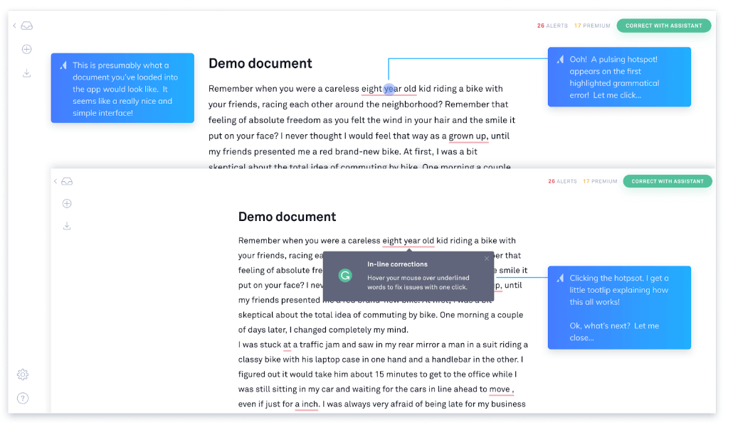
Grammarly’s onboarding process explains each of its features in an intuitive, step-by-step way, allowing novice users to get onboarded and start using the app immediately.
Once users sign up for the app, they’re taken to a demo document filled with pre-generated text. Using various phrases as examples, the tool highlights notable features with dynamic pulsations and underlines, which expand into quick explanations and tooltips upon interaction. This logical, guided walkthrough of how each feature works allows users to get to know the tool in a contextualised way.
Why is this good UX?
As the Aristotle quote goes, “For the things we have to learn before we can do them, we learn by doing them.” This hands-on onboarding approach contextualises the key features and allows users to get comfortable with the tool—even if they don’t necessarily have a pre-written document to get started with yet.
6. Reddit’s redesign
A website redesign is no small feat. Even if a website needs a facelift, it’s hard to make wide-scale changes to an interface users know and love.
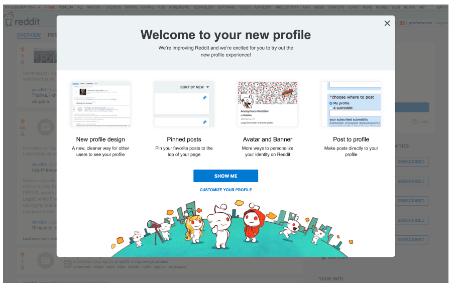
Popular forum website Reddit introduced an array of new changes in their site redesign, including multiple options for users to customise and personalise their profiles. Rather than getting users to click through a series of tooltips (which would take a very long time, given the number of new features), Reddit kept it simple by presenting the essential components of the redesign in one complete window.
Redditors then have the choice of being shown each feature through a dynamic product tour, customising their profiles, or closing the window and navigating the new and improved site on their own.
Why is this good UX?
This clear pop-up provides a snapshot of key information, with multiple CTAs that allow users to choose how they want to explore the new site.
7. Semrush’s light-to-dark mode toggle
Once hailed as a ‘nice to have,’ UX designers are beginning to recognize the increasing importance of dark mode when designing interfaces. It’s no secret that dark mode makes digital interfaces easier on the eyes, but the benefits go beyond aesthetics: Dark mode can reduce eye fatigue and accessibility issues for visually impaired users who struggle to read text on a light background. It can also contribute to better battery life by putting less stress on the device’s display.
The option to switch to dark mode is usually found in device display settings or software applications. The Semrush Blog provides a rare example of dark mode in websites, with a toggle that allows users to browse the site in light or dark mode depending on their needs.
Why is this good UX design?
This feature is a prime example of how subtle UI elements can make a huge impact. With a toggle switch that allows users to choose their display, users have much more autonomy over how they interact with the site and interpret the content. The result? They’re more likely to stay on the site for longer rather than click off due to eye strain or issues with brightness.
Round-up
Good digital UX design doesn’t need to be complex or fancy. As we’ve seen from these examples, sometimes the simplest solution is the most effective.
It’s all about finding ways to keep friction to a minimum and help users get the most out of your digital product. By keeping user needs and behaviours front and centre, you can create digital experiences that successfully solve your users’ problems and pain points—without compromising on aesthetics.
If you’re curious about what bad UX design looks like, check out our blog post on good UX vs. bad UX.
To keep learning about good (and bad) UX design, we also recommend these blog posts:
- 6 everyday UX examples (that aren’t websites or apps)
- 7 fundamental UX design principles all designers should follow
- What are dark patterns in UX?


![The 10 best prototyping tools for UI/UX designers [2025 Update] 11 UI UX prototyping tools header image](https://www.uxdesigninstitute.com/blog/wp-content/uploads/2025/01/93_UX_Prototyping-tools_Illustration_blog-1.png)