From pixel-perfect layouts to responsive websites, Figma has earned its spot as the new industry standard for design tools. As a result, it’s the software of choice for many design teams—and today, every UI designer needs a basic understanding of how to design in Figma.
If you’re new to UI design, learning your way around any new design tool can feel intimidating. But you’re in luck: As well as being one of the most advanced and versatile design tools on the scene, Figma is also incredibly beginner-friendly.
In this blog post, we’ll get you up to speed with an introduction to Figma’s basic features. Before you know it, you’ll be a Figma pro—whipping up beautiful, user-friendly interfaces in no time.
Here’s what we’ll cover:
Introduction to Figma
Figma is a free web-based design tool that allows you to create and collaborate on high-fidelity, interactive prototypes. It’s also a vector design tool, meaning you can create detailed illustrations without losing quality.
Figma allows you to quickly create mockups of web and mobile apps using a simple drag-and-drop interface. The tool is especially suited for UI designers, because you can go from low-fidelity wireframes to responsive, clickable prototypes without writing any code.
In Figma, you can also create:
- Icons
- Logos
- Apps
- Websites
- Presentations
Figma boasts many of the same features as other popular design tools like Sketch—such as icons, grids, and layout guides. But there are a few unique benefits that make Figma stand out.
Notably, Figma is the only design tool that works on any platform; including Mac, Windows, and Chromebooks. This makes it highly accessible—particularly among larger tech teams with different people using different devices.
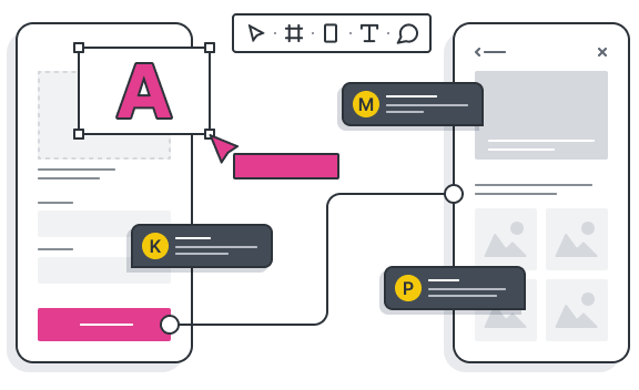
Figma is also known for its collaboration features. Designs can seamlessly be shared, reviewed, and collaborated on (even for non-Figma users), empowering frictionless workflows among design teams.
To learn more, check out our roundup of the best UI design tools.
How to get started with Figma
Now we have a sense of what Figma’s all about, and why it’s worth taking the time to learn—it’s time to get set up!
First up, you’ll need to have a Figma account. You can create a free account on the website and either continue to use the tool on the web or download the Figma desktop app.
After signing up, you’ll be asked to choose a preset or template depending on the kind of interface you’re designing. You’ll have the option of a phone screen, desktop, presentation, wireframing kits, or a blank canvas.
For the purposes of this blog post, let’s say you’re designing a website. For this, you’d choose a desktop frame.
The first thing you’ll notice when you open Figma for the first time is that it’s not like Photoshop or Illustrator. There are no layers or tools floating around. Instead, everything is contained on one screen. This makes editing easier than ever, because you can see all of your design together at once and make edits from any object in your design (this can be especially helpful if you’re working on iconography or typefaces).
Let’s look at the four main areas that make up the Figma interface:
- Menu bar: At the top of the screen is where all of the basic features live: Main menu, region tools, shape tools, drawing tools, resources, comments, and sharing.
- Layers: On the left-hand side of the screen are the layers, where all your elements are listed. You can organize these elements by frame, group them, and rename them.
- Canvas: The canvas is the main space in the middle where you’ll view, create, and design your interfaces.
- Inspector: The inspector sits on the right-hand side, offering detailed information and settings for whatever object or element is selected.
Now, it’s time to get designing!
Everything you need to start adding to your frame is in the menu bar on the top left-hand side. Here, you can select things like shapes and text boxes to embellish your blank canvas with elements. You can refine and edit each element using the inspection bar on the right-hand side—like rounding off the corners of a rectangle to create a button, or cloning text.
Pro tip: Be sure to name your elements as you go along, so you can easily identify each component as you refine your design. You can rename and group elements on the left-hand side by double-clicking the name.
To move around a page’s design area, select an object by clicking on it; then use your mouse wheel or hold down SHIFT + left-click or drag the object to move around (dragging will align objects perfectly). To duplicate an item or group of items from one place on a canvas to another place, hold down CTRL and drag.
If starting from scratch feels too overwhelming, we recommend checking out one of Figma’s free wireframe kits. These contain basic pre-designed elements and templates which you can drag, drop, and customise to create speedy designs.
Try and challenge yourself to create a basic wireframe of a website homepage using basic elements like shapes and text. Check out this list of Figma shortcuts to help you get to know the interface better, and voila—you’re officially a Figma user!
Next steps: Advancing your Figma skills
As a beginner Figma user, you’ll want to master the basics first before exploring some of the tool’s more advanced functions. However, Figma is a highly user-friendly and accessible tool—and once you’ve gotten the hang of it, you’ll quickly gain the confidence to push the boundaries with your designs.
Here are five handy tips for advancing your Figma skills:
- Practice makes perfect: Make Figma part of your daily routine. Once you’ve gotten comfortable using the app, you’ll start stumbling across new features, uses, and shortcuts that make your design workflow even faster. The more confident you get, the speedier you’ll be—and before long, Figma will feel like second nature.
- Design collaboratively: Figma was created with collaboration in mind, so part of your learning process should involve some group design sessions with your colleagues, friends, or design mentor. Feedback and sharing features are important parts of the tool, so it’s important to get comfortable with using them.
- Learn from the experts: YouTube is brimming with free Figma tutorials that often come with templates, so there’s no need to start from scratch each time. Simply plug them into your existing project file while following along with instructions provided by UI designers who’ve successfully completed similar projects before moving on to something more ambitious.
- Get inspired: So many of the world’s most beautiful and creative digital experiences have been designed in Figma. To expand your understanding of how to use the tool—and the kinds of designs you could create—try browsing sites like Dribbble, Behance, and Pinterest (using Figma tags). You can also check out some of the templates and UI kits created by other Figma designers on the ‘inspiration’ page of the community hub.
- Make use of the community: Figma has an active and supportive community forum, where you can share your designs, learn from more experienced designers, and find solutions for any roadblocks you run into when using the tool. You’ll also feel more comfortable using the tool knowing there are hundreds of other beginner UI designers who are on the same journey!
Looking for more ways to sharpen your UI design skill set? Check out our guide to becoming a better UI designer.


![The 10 best prototyping tools for UI/UX designers [2025 Update] 2 UI UX prototyping tools header image](https://www.uxdesigninstitute.com/blog/wp-content/uploads/2025/01/93_UX_Prototyping-tools_Illustration_blog-1.png)

