The goal of any user experience project is to ensure users have a positive experience with a product. Yet, between the initial idea and the polished final product rests a complex web of decisions that impact the user experience in big and small ways. To provide structure and direction to the process of making these decisions – and to ensure each decision is made at the appropriate point in the process – the 5 elements of UX design act as a guide for every designer.
These 5 elements of UX design were first introduced to us by innovative user experience designer Jesse James Garrett, who wrote a book called The Elements of User of Experience. In it, he explains the steps user experience projects should go through, as well as the issues UX designers should consider at each step.
Because his book was published in 2002, well before the first smartphone was released, Garrett’s ideas were specific to user experiences designed for websites. However, his elements turned out to align so well with the process of creating smart, well-considered user-centric designs, they can be used as a framework for any project that requires a satisfying, cohesive user experience.
The 5 elements of UX design
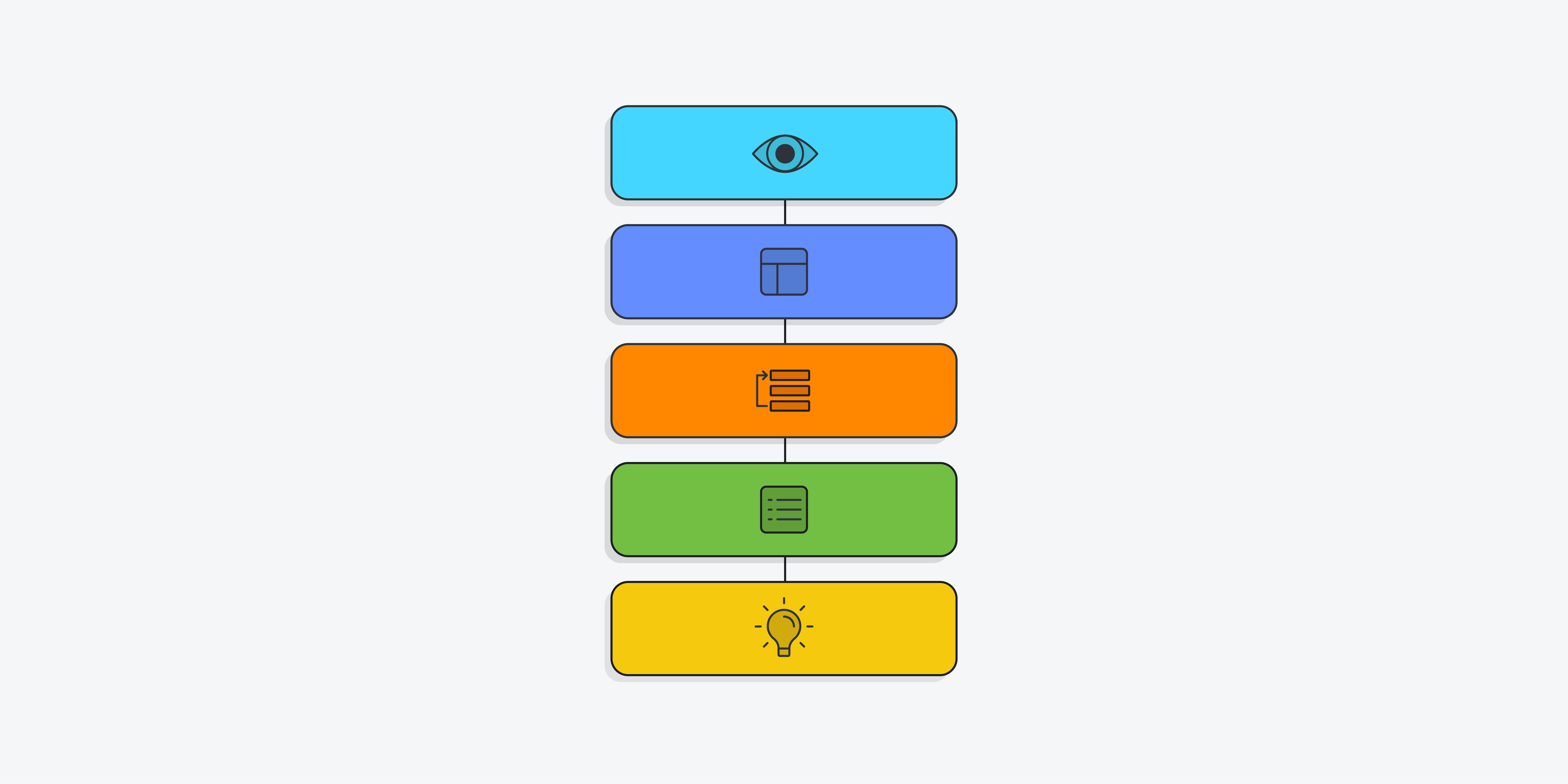
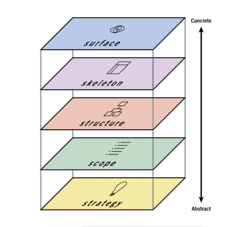
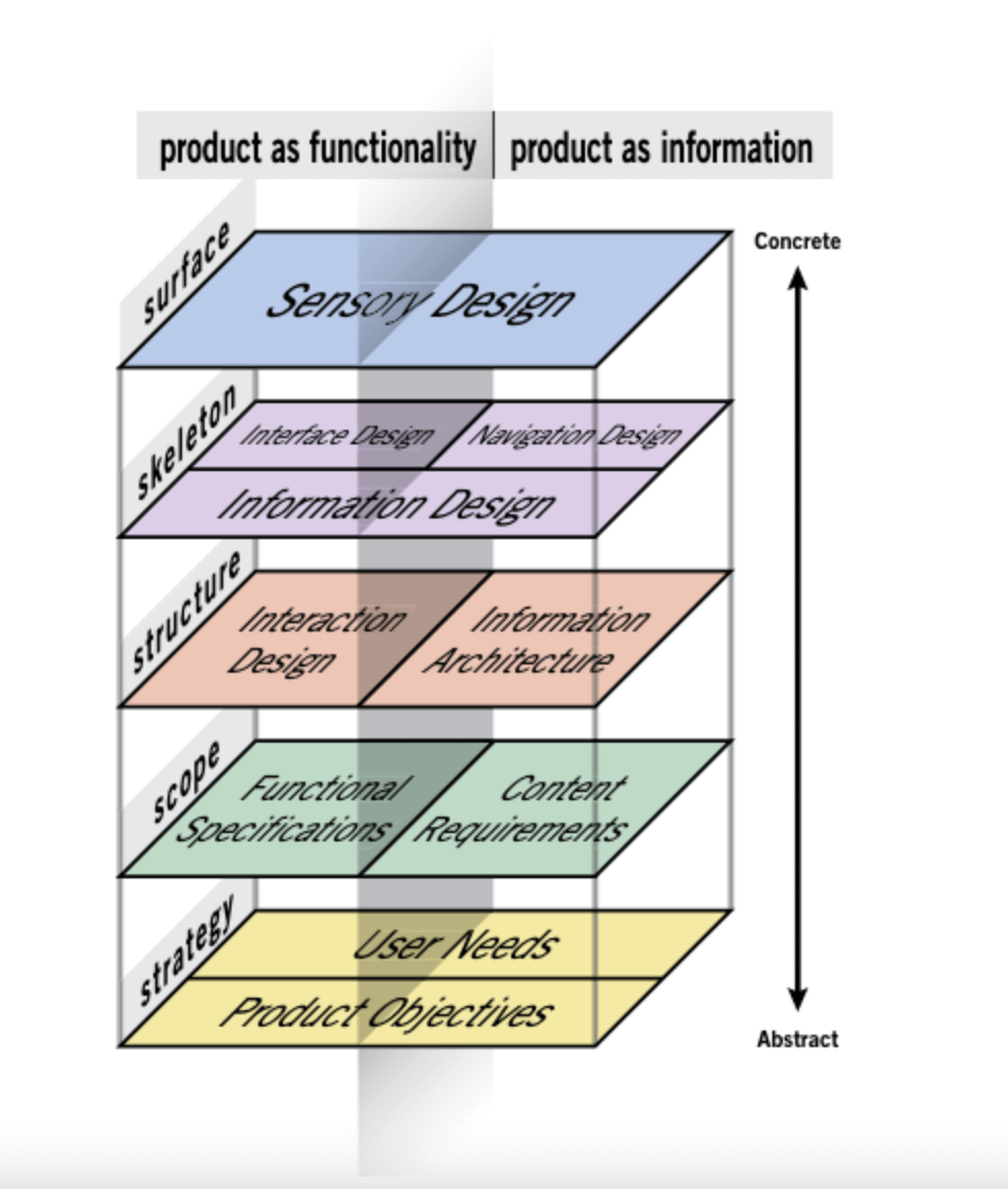
As can be seen in the diagram below, the 5 elements of user experience exist on 5 separate planes, each one stacked on top of the previous one to create an outline of the process UX teams can follow for every new project they design. From bottom to top those planes are strategy, scope, structure, skeleton and surface. Each one builds on the next as the project goes from abstract to increasingly more concrete until arriving at the finished product. In addition, each plane requires meeting different goals or completing different tasks.
Let’s look at each plane in more detail.
Strategy
The bottom plane of the model is Strategy. As the most abstract and least constrained part of the project, this is where decisions should be made about what objectives the product should be designed to meet. These objectives should include the goals that both the clients and stakeholders behind the product want to meet and the goals of the users, who will eventually look to the product to solve specific problems for them.
For example, let’s say we’ve been hired to build an app that helps people find charging stations for electric cars. On the one hand, we must be sure to meet the product objectives, which in this case would be goals such as, “Informing electric car owners of the nearest place to charge their cars”.
On the other hand, we need to meet user needs if we want users to come to our app for information. That means we need to understand what goals users would have when using the app, which we can discover through user research. In this case, we might want to learn if users would want our product to provide directions to the nearest charging station, information about how many chargers are available there and how much it costs to charge a car at each listed charging station.
Scope
After deciding on the strategy, the scope of the product can be determined and laid out in detail. It’s here that all a product’s features are decided upon, including the information that users can find and the functionality that users can interact with. On this plane, the UX team will create a set of functional specifications that identifies and describes every single feature of the product and a list of content requirements that identifies every single piece of content that will be included.
For instance, in our car charger finding app, on the functional specifications side we might want to include a feature to save previously discovered charging stations in our functional specifications. Meanwhile, in our content requirements we might list information like images of each charging station, maps of their locations, and details about the voltage of each available charger.
Structure
Once the scope of the product has been outlined, it’s time to start working on the structure. This is where each element of navigation will be decided, including where in the product each page can be found and where users can go after arriving at a given page. This involves defining the interaction design and information architecture of the product.
On the interaction design side, we need to decide how users will interact with the site and how the system will respond, including what will happen if errors are made. This can be conveyed through conceptual models that explain each part of the user interface – usually in a flow chart format – that defines what users can do and how the product will react to each potential choice the user makes.
On the information architecture side, we need to structure the content the product offers in a way that makes it easy for users to find what they’re looking for. This can be conveyed through documents like site maps that outline the hierarchy and pattern of each part of the product.
For example, to convey the structure of our electric car charger finder app, we might create a site map that shows the hierarchy of the product. This could include a home page where users can enter a location to find car charging stations. This could then lead to a list of stations each with a link that takes users to pages for individual stations.
In addition, we could also create a user flow where we show how the system responds after a user enters their location information. It can account for what happens if the system finds nearby charging stations and if there’s an error that prevents the system from successfully understanding the location information provided.
Skeleton
After deciding how the product will be structured, its skeleton can be designed. This entails deciding where the navigation and functional elements from the previous plane will go on each product page. It’s here that UX designers will make decisions about the product’s information design, creating wireframes and prototypes that arrange each part of the product, including the buttons, links, images and text. These are laid out in a way that ensures that users can quickly move through each page to find the information they need, while also understanding which elements of each page are interactive and which are not.
For instance, in our app, if we want to explain what users will see when they navigate to a page that describes a specific electric car charging station, we would create a wireframe that provides a blueprint of where each component of the page would go. Perhaps we have a header with the app logo and navigation back to the complete list of stations. This will be followed by an image of the charging station, followed by a link to a map of the location followed by text providing practical information about the station. This will help visualise each piece of functionality and content that will appear on the page and its placement.
Surface
The wireframes and prototypes created on the skeleton plane will be used on the surface plane – the top and most concrete plane – to create the final pages for the product. At this stage, we’re concerned with the users’ sensory experience. This includes how the colours and textures employed in the visual design help them understand how to navigate through and interact with the site, and how the presentation of content draws their eye to key information.
For our electric car charging app, this could mean creating a consistent colour palette and layout, where the logo appears at the top of the page, the most important information appears in a wide column in the middle of the page, and less important information is relegated to each side of the page. This layout anchors users with its consistent visual style while enabling them to easily find the information they’re seeking.
While the diagram above is a neat and tidy way of laying out the 5 elements of UX design, the reality is much messier. In an ideal world the work required for each plane would be wrapped up before tackling the next one. But in real life, you’ll work on more than one plane simultaneously and each decision made on one plane will impact every plane above it. As a result, you’ll want to finish work on each plane before work on the plane above it is completed. This will ensure that the decisions on each plane align with one another.
What does universal design have to do with the 5 elements?
According to the Centre for Excellence in Universal Design: “Universal Design is the design and composition of an environment so that it can be accessed, understood and used to the greatest extent possible by all people, regardless of their age, size or disability.”
This doesn’t just mean we should design products, services and environments that take account of the needs of people with disabilities or other special requirements but that we should create designs with the needs of all users in mind so that our designs are accessible to as many people as possible.
The process of utilising the 5 elements is intended to help UX designers systematically consider and account for every user need and functionality requirement of each product. This should include considering the needs and requirements of people of all kinds.
For example, the users of our car charging finder app are owners of electric vehicles, however those owners are likely to encompass a wide range of ages and abilities. As a result, in using the 5 elements as a framework for designing the app, we should consider the wide range of users who might access it. In the process, we will also be practicing universal design.
What does design thinking have to do with the 5 elements?
Tim Brown, the Executive Chair of the design firm IDEO defined design thinking as “a human-centered approach to innovation that draws from the designer’s toolkit to integrate the needs of people, the possibilities of technology, and the requirements for business success”.
Like the 5 elements of UX design, design thinking is an approach to solving design problems that starts with working to understand the problem and ends with a final product. The intent of design thinking is to enable people to be as creative as possible while keeping the people a product is designed for at the centre of every decision, even as business requirements and the limitations and possibilities of technology are also considered.
In many ways, design thinking dovetails nicely with the 5 elements and both approaches share the same basic goals and perspectives. As a result, implementing the 5 elements is one way to practice design thinking, as long as the designers involved maintain an open-minded, user-centric approach to the design process, something all UX designers should strive for in every project.
Want to read more about UX design? Take a look at the 7 fundamental UX design principles that all designers should know. Or if you’re more into the psychology behind UX design, take a look at our post on UX personas and how to use them.

![The 10 best prototyping tools for UI/UX designers [2025 Update] 6 UI UX prototyping tools header image](https://www.uxdesigninstitute.com/blog/wp-content/uploads/2025/01/93_UX_Prototyping-tools_Illustration_blog-1.png)