Flat design is an ever-popular approach to digital design, favouring 2D elements and a modern, clutter-free aesthetic. Plenty of big brands use it, and there are many benefits of keeping things flat and simple.
But, at the same time, flat design can pose problems for usability. This raises the question: How can you use flat design without negatively impacting the user experience?
It’s a good question, and we’ll seek to answer it right here in our ultimate guide to flat design. Keep reading to learn:
First things first: What is flat design? Let’s find out.
What is flat design and where does it come from?
Flat design is a minimalistic, 2D approach to web design
Flat design is an approach to web and user interface (UI) design that favours two-dimensional elements. It’s all about simplicity, minimalism and, often, bright colours. While some design styles seek to mimic the real world with 3D elements, flat design is intentionally and decidedly, well, flat.
A brief history of flat design
Flat design first came onto the digital scene in the early 2010s, but its origins can be traced back much further. Let’s take a brief look at the history of flat design:
- The Swiss Design Movement of the 1940s and 50s. The Swiss Style (otherwise known as the International Typographic Style) is a minimalist design approach that was pioneered by influential Swiss graphic designers such as Ernst Keller, Armin Hofmann, and Josef Müller-Brockmann. Flat design as we know it today takes much of its influence from the clean minimalism of the Swiss Style.
- The rise of digital design and skeuomorphism in the 1990s and early 2000s. It’s impossible to talk about flat design without mentioning skeuomorphism. As the digital revolution took hold, the early 1990s gave us the Internet and the late 1990s/early 2000s brought us mobile technology such as smartphones and tablets. Skeuomorphism emerged as an approach to designing for digital interfaces, incorporating 3D elements to mimic the appearance of objects in the real world. Most early operating systems and software were designed in this style.
- The launch of Microsoft’s Windows 8 operating system, Apple’s iOs 7, Google Material Design, and the rise of responsive design in the late 2010s. It’s often said that flat design emerged as an antidote to skeuomorphism and all its 3D realism. Big names in tech, including Microsoft, Apple, and Google, started using flat design. And, with its simple, 2D elements, flat design proved easier to scale and shrink for different screen sizes—the perfect solution to the ever-growing need for responsive design.
Flat design vs. skeuomorphism vs. Material Design: What’s the difference?
To understand what flat design is, it’s useful to talk about what it isn’t—and to consider how it compares to other design styles. On that note, let’s explore the difference between flat design, skeuomorphism, and Material Design.
Flat design, as we know, is all about 2D elements, clean lines, minimalism, and simplicity.
Skeuomorphism, on the other hand, seeks to mimic how objects appear in the real world. In skeuomorphic design, a digital representation of a calculator would include shadows and texture in order to realistically simulate a physical calculator. This is basically the opposite of flat design.
Material Design is Google’s own design language. Released in 2014, you can think of it as the middle ground between skeuomorphism and flat design. It uses elements such as light, motion, and shadow to create something a little more real-world adjacent than flat design, without going as far as the elaborate 3D designs of skeuomorphism. You can learn more about Google’s Material Design here.
What are the key characteristics and principles of flat design?
You can recognise flat design for its:
- 2D elements and simple shapes
- Bright, high-contrast colours
- Simplicity and lack of depth—flat design doesn’t use shadows, gradients, texture, bevels, or embossing
- Simple typography, usually sans-serif fonts
- Ample use of whitespace
- Symmetrical, grid-based layouts
- Overall clean and modern aesthetic
The pros and cons of flat design
Now we know what flat design is, let’s weigh up the pros and cons.
The benefits of flat design
There are several advantages of embracing flat design when creating digital products:
- Flat design is responsive. Flat design follows a grid-based layout, meaning that it’s inherently responsive. With more and more designers taking a mobile-first approach—that is, designing websites and digital products for mobile first and then scaling up for desktop—flat design can make the job easier.
- Flat design often improves readability and accessibility. Flat design focuses on simple 2D elements, ample white space, simple typography, and an overall clutter-free aesthetic. This helps to create a highly readable, easily digestible, and often more accessible design.
- Flat design looks great. This is one of the major reasons why flat design is so popular. Many brands (and their users) love the sleek, modern, and clean aesthetic that flat design creates.
The drawbacks and criticisms of flat design
There are two main concerns associated with flat design: usability and low information density.
The biggest issue with flat design is how it impacts the usability of an interface. When all elements on the page appear completely flat, how do users know which elements are interactive?
As users, we’re accustomed to recognising interactive elements through visual cues—for example, clickable buttons might appear to be raised, or form fields may stand out as such because subtle shadowing gives them depth.
In flat design, these visual cues are missing. That can make it difficult for the user to distinguish between interactive and non-interactive elements. This, in turn, makes it difficult to complete their desired tasks and actions.
The second issue with flat design is low information density. Information density refers to the amount of information (usually text) presented on a screen or webpage. Flat design is all about minimalism and keeping things clutter-free, so it naturally favours low information density.
While this may be great for aesthetics, it isn’t necessarily the most helpful approach in terms of giving the user the information they need. Imagine you’re browsing through an online health shop and all you see is images of supplements, without any information regarding price, ingredients, recommended dosage, and purported health benefits?
The website may be aesthetically pleasing in its simplicity, but the process of actually choosing and buying supplements without the key information readily available could be pretty frustrating.
Using flat design therefore calls for a balancing act. You want to draw on the benefits of its simplicity without affecting usability or compromising the user experience. Cue flat design 2.0!
What is flat design 2.0?
Flat design 2.0, or semi-flat design, is the next generation of flat design. It adheres to most of the key principles of fully flat design—ample whitespace, high-contrast colours, simple typography—with the addition of subtle shadows, highlights, and layers.
This not-entirely-flat approach adds a touch of depth to the interface, helping to overcome some of the usability issues associated with fully flat design.
Not only does flat design 2.0 ensure a more user-friendly experience. It also gives designers a little more creative freedom, removing some of the limitations of flat design. If it’s a simple, clean aesthetic and a first-class user experience you’re after, flat design 2.0 is probably the perfect middle ground.
Flat design examples: Dropbox, Miro, and OptimalWorkshop
Now you’re familiar with flat design, you can probably already think of some examples you’ve encountered in the real world. Let’s take a look at some brands that embrace flat design (and flat design 2.0) to create successful digital products.
Flat design example #1: Dropbox
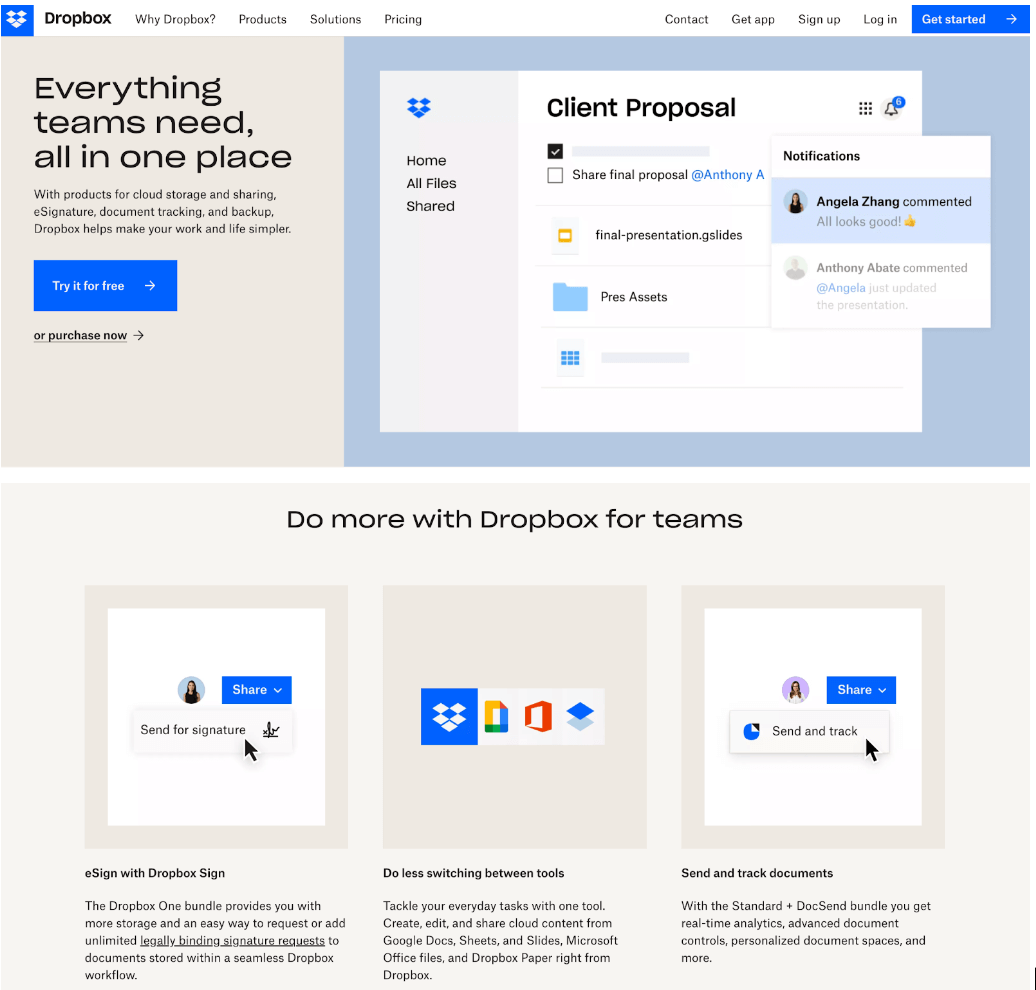
Dropbox has become something of a poster child for flat design. It’s the epitome of clean, clutter-free UI, easy-to-read type, and fuss-free iconography.
Note how the Dropbox website also incorporates some elements of flat design 2.0 to ensure a user-friendly and informative experience. It’s still clear which buttons are clickable, and they’ve gone for medium information density so the user can learn about the product and its most useful features. A highly successful approach to flat design!
Flat design example #2: Miro
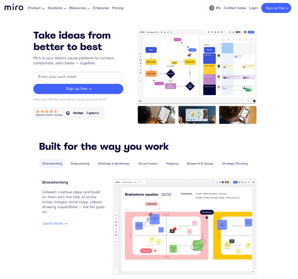
Miro is another great example of flat design in action. This much-loved virtual whiteboard and collaboration tool is a masterclass in the power of generous whitespace, bright, high-contrast colours, and simple yet compelling visuals.
While adhering to the main principles of flat design, Miro still manages to create a playful interface that’s full of brand personality. And, similar to Dropbox, they’ve not used flat design to the detriment of usability or user experience. The user finds all the information they need on the website, presented in concise sentences and bitesize chunks. The perfect balance!
Flat design example #3: OptimalWorkshop
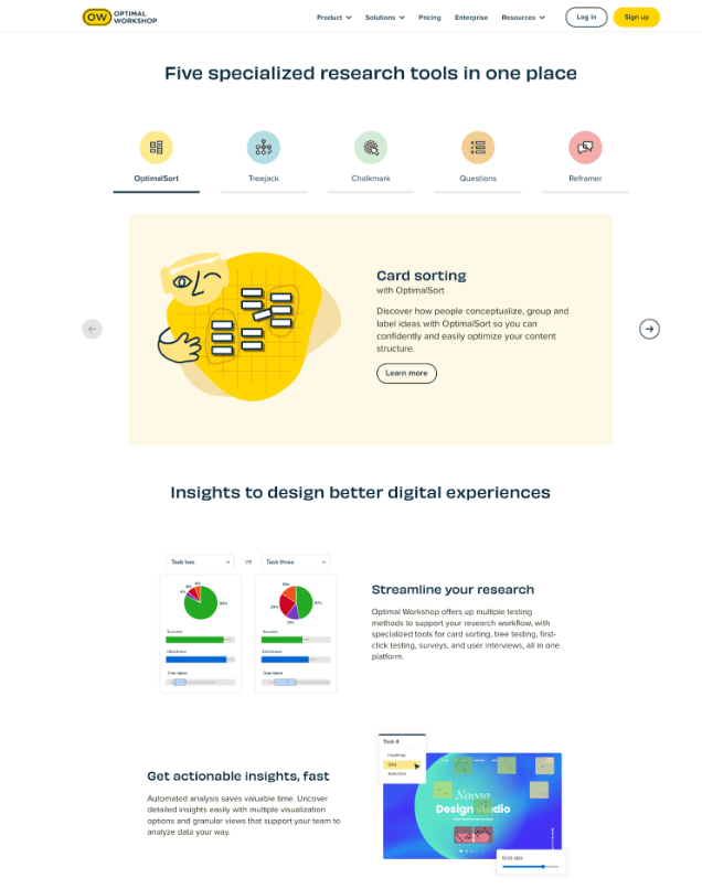
You’re likely already familiar with OptimalWorkshop, one of the best UX research tools on the market. The OptimalWorkshop website is also one of the best examples of flat design we’ve come across.
OptimalWorkshop ticks all of the usual flat design boxes. But, beyond that, it serves as an excellent reminder that flat design doesn’t have to be boring or overly professional. With the addition of custom icons and cute illustrations, they’ve designed a website that’s both simple and highly engaging. A fun, unique take on the flat design trend!
How to use flat design: 7 Actionable tips and best practices
If you’re a fan of the fuss-free aesthetic and want to use flat design for your next project, here are some tips and best practices to get you started.
1. Use sans-serif fonts
Sans-serif fonts are all those fonts you associate with a modern, minimal aesthetic.
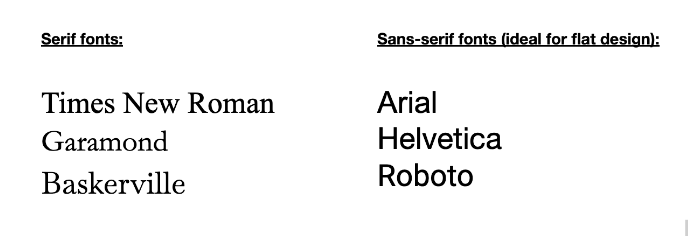
Serifs are the small lines attached to the letters, as you see in serif fonts such as Times New Roman, Garamond, and Baskerville. As the name suggests, sans-serif fonts don’t have them!
Popular sans-serif fonts ideal for flat design include Arial, Helvetica, and Roboto.
2. Use bright colours and high contrast
Flat design favours a minimalist approach, and so colour is your opportunity to inject some visual appeal and grab the user’s interest. Not only that: bright, vibrant colours help to create contrast and establish visual hierarchy, enabling the viewer to distinguish between different elements on the page.
As you’ll have seen in our flat design examples, bright, high-contrast colours are a key feature throughout the flat design trend.
3. Incorporate plenty of whitespace
Whitespace is a must if you want to successfully achieve the clean, clutter-free aesthetic that flat design is renowned for.
Whitespace, or negative space, refers to the empty space or ‘breathing room’ around and between different elements on the page. It helps to improve the overall readability of the page, and can also draw attention to individual elements by making them appear to stand out.
And remember that whitespace doesn’t have to be white! See this vibrant yellow used on the Butter website? That still counts as negative space, and has the same effect.
4. Provide visual cues for interactive elements
Earlier in this post, we talked about how flat design and its lack of depth can make it difficult for users to recognise interactive elements. You don’t want to compromise usability in the name of aesthetics, so make sure you provide sufficient visual cues for the user.
You might add some subtle drop shadows to buttons and form fields (in the style of flat design 2.0), or emphasise interactivity through underlined call-to-action text—for example, “Sign up here” clearly indicates that a button is clickable.
5. Aim for medium density of information
Another potential issue with flat design is that it limits the amount of information you can share with your users. While it’s important to avoid information overload—no one likes a text-heavy app or website—you also want to avoid information underload. That is, not providing your users with enough information simply to maintain a clean, clutter-free aesthetic.
Refer back to our previous examples of great flat design as demonstrated by Dropbox, Miro, and OptimalWorkshop. They all go for medium density of information; not too little, but not too much. Aim to strike the same balance.
6. Don’t be afraid to inject some brand personality—flat design doesn’t have to be boring!
Flat design is simple and minimalistic, but that doesn’t have to mean monotonous, uninspiring, or bland.
Don’t be afraid to inject some personality into your flat design. Consider designing some custom icons (following the key principles of icon design in the process), featuring some playful illustrations, or adding some subtle animations.
A few small touches of personality will help to keep the user engaged, infuse some delight into the user experience, and create a memorable brand identity.
7. Err on the side of flat design 2.0—usability comes first
Last but not least, use flat design with caution. If ever you feel that your quest for sleek, clean aesthetics is starting to come at the cost of usability, it’s time to rethink. If in doubt, err on the side of flat design 2.0 for the best of both worlds.
Follow these tips and best practices and you can successfully embrace flat design without compromising the user experience. And, if you’d like to learn more about what it takes to create awesome digital products, check out these guides:
- 10 Essential User Interface (UI) Guidelines All Designers Should Follow
- What Does Good UI Design Look Like? 9 Examples to Delight and Inspire You
- How to Incorporate User Feedback in Product Design (And Why it Matters)




![The 10 best prototyping tools for UI/UX designers [2025 Update] 9 UI UX prototyping tools header image](https://www.uxdesigninstitute.com/blog/wp-content/uploads/2025/01/93_UX_Prototyping-tools_Illustration_blog-1.png)