Trends are a dominant force in the design world and the latest rising trend in UX is fun. You may have noticed that some everyday apps and websites have added more colourful and somewhat silly features to help brighten up their service and add some joy into the user’s experience. While it’s not a new phenomenon by any means, the fun side of UX is out and proud and here to stay.
To some people, design can be a very serious thing. Using sombre colours to demonstrate professionalism and practically using a template approach to images, it used to be difficult to distinguish the homepage of any websites from the other if their logos and names were removed. In the same way that we can see gentrification affecting cities and towns, UX gentrification means that all products face the danger of looking the same.
Be we can be serious about the fun side of UX. How can we make a product usable and entertaining?
What is fun UX?
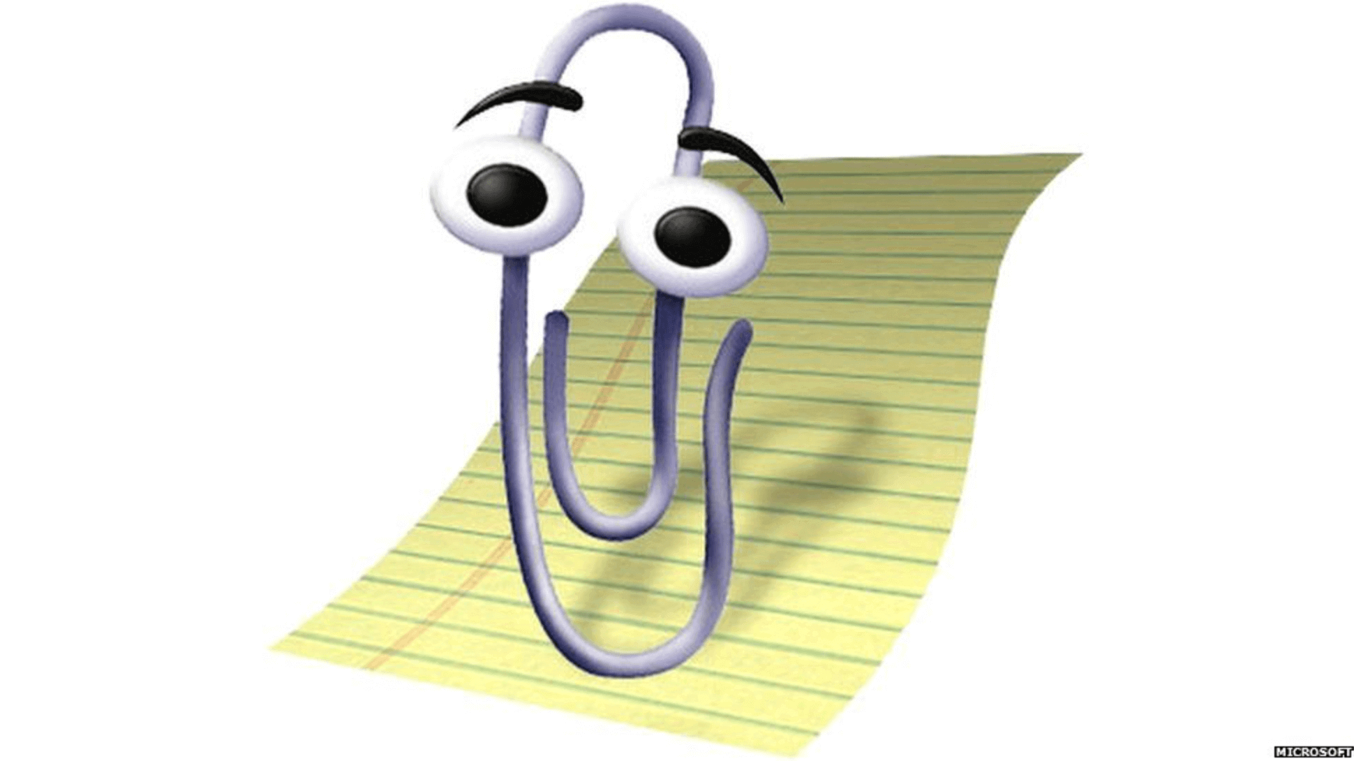
Perhaps we could credit Clippy or Clippit, the paper clip Office Assistant who first debuted in Microsoft’s Office 2000, with being an early example of fun UX. Created to be helpful to people who were unfamiliar with the workings of letter writing in Office, as people became more fluent in tech and computers, Clippy soon became a nuisance and was drastically killed off in 2007.
However, from puppy-eared filters on Instagram stories to celebratory animations on project tools, fun UX is now everywhere.
Where did it begin?
Emoji
The origins of emoji – or emoticons, as they were known for a time – can be linked back to three starting dates. In the 1960s, the Russian novelist and professor Vladimir Nabokov suggested in The New York Times that “there should exist a special typographical sign for a smile — some sort of concave mark, a supine round bracket”. In 1982, the computer scientist Scott Halman suggested that we could use : – ) and : – ( to replace text, which would later influence the Wingdings Microsoft font.
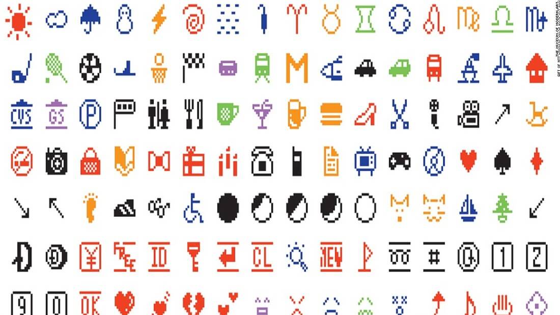
However, it was in and around 1997 that emojis that most of us are familiar with first appeared. A Japanese telecommunications company released the SkyWalker DP-211SW, a mobile phone that came with, allegedly, the first-ever set of emoj. The 90 black and white images were 12 by 12 pixels and they covered the basics: numbers, sports, time, moon phases, the weather and, of course, the Poo emoji.
With the popularisation of instant messaging, like MSN and AOL, and the increase in mobile phone use at the turn of the Millennium, the emoji became more commonplace. The emojis that we are most familiar today can be traced back to Shigetaka Kurita designs, which first appeared in 1999 on the Docomo mobile phone. Apple wouldn’t introduce their own emoji keyboard until November 2008 on the iPhone OS 2.2.
Today, roughly 3,500 emojis come pre-installed into Apple and Android keyboards and Kurita’s 176 emojis are now on display in Museum of Modern Art in New York City as a typographical timepiece.
GIFs
In May 1987, the first GIF appeared on the internet. Created by CompuServe’s Steve Wilhite, the still image of an airplane that appeared to be moving through clouds was the first of its kind; an image file that wouldn’t lose quality when shared.
The first run of GIFs was limited to a palette of 256 colours and could only last a few seconds. As people became more familiar with them in chat rooms, instant messaging systems and social media, they could design their own without any time or colour limit.
In 2013, Google created a search engine specifically for GIF files and in 2015 Facebook made it possible to use these files on social networks, with Twitter following suit in 2016. In 2018, Revolut, the payment app, allowed users to attach GIFs to their transfers to make “things friendlier, more social and dare we say it, more fun!?”
Filters
While Facebook had the ability to recognise and tag people in photos on their platform since 2010, facial recognition and augmented reality really kicked off with Snapchat. While Snapchat is known as the pioneer of accessible AR, all credit is owed to the Ukrainian startup Looksery, which specialised in face tracking and face modification for real-time videos.
Snapchat bought Looksery in 2015 for a light fee of US$150 million and introduced Snapchat Lenses, which used AR technology to integrate 3D elements into camera phones, and instantly became a hit.
By detecting people’s faces and then mapping and digitally modifying them, people morphed into puppies or bearded and tattooed versions of themselves. It became an all-consuming pastime for some users so, of course, Facebook followed suit and launched Instagram Stories in 2016.
Any scroll through Instagram Stories will see that there’s an AR filter for every occasion. When our options used to be limited to a handful of Superzoom effects – the emo-tastic falling leaves, a confetti downpour of love hearts, the flashes of paparazzi cameras and flames – users can now create their own. From simple quizzes to face altering effects that turn you into Yoda.
Since 2020, Zoom has become a staple part of online communication at work and at home. While some of us dreamt of faraway places during lockdown, the Zoom filters use Livecam Avatar software that allows us to turn into pirates or, quite famously, a cat. The “I’m not a cat” Zoom call became a warning and a moment of comic relief for us all.
Nowadays, the use of AR technology is so commonplace that toddlers love them, although it’s mostly adults who choose to be held by Shrek or to become a member of One Direction.
In an interesting twist, Facebook announced in November 2021 that they would no longer use facial recognition as they had “many concerns about the place of facial recognition technology in society”.
Getting serious about fun
While some people may argue that fun isn’t an everyday necessity, fun UX helps people lighten up. Just like Clippy tried to do in the 90s, fun UX can help people make their way through the workload or make work not just seem fun but actually be fun.
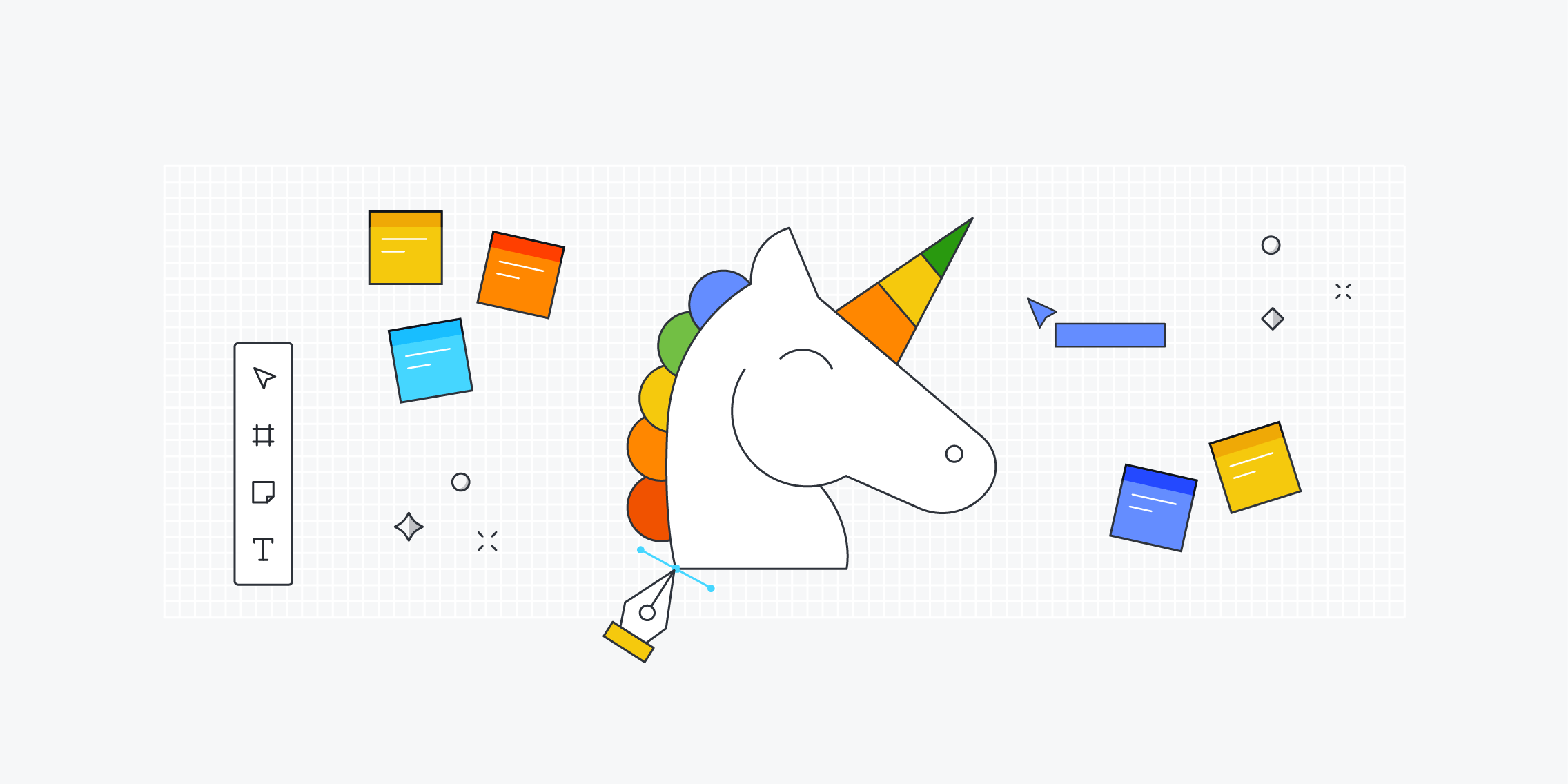
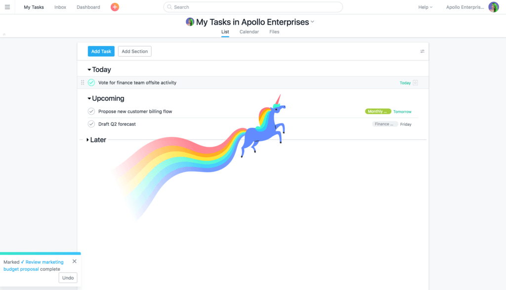
A great example of the celebration marker in Asana. Whenever a task is completed, a dazzling unicorn rocketeers across the screen, congratulating the user for getting things done. What started as an April Fool’s joke in 2015, soon became a staple part of the project management app because it made people so happy.
In fact, people loved the Asana unicorn so much that in 2016, they added a yeti, a narwhal and a phoenix to the celebrations creatures list to keep them company. Why?
“Not only did our users adore the unicorn and his rainbow contrails, we’ve come to see them as a manifestation of the amazing collaboration that happens on Asana and the great results teams produce every day,” they wrote on their blog.
Connecting to other people
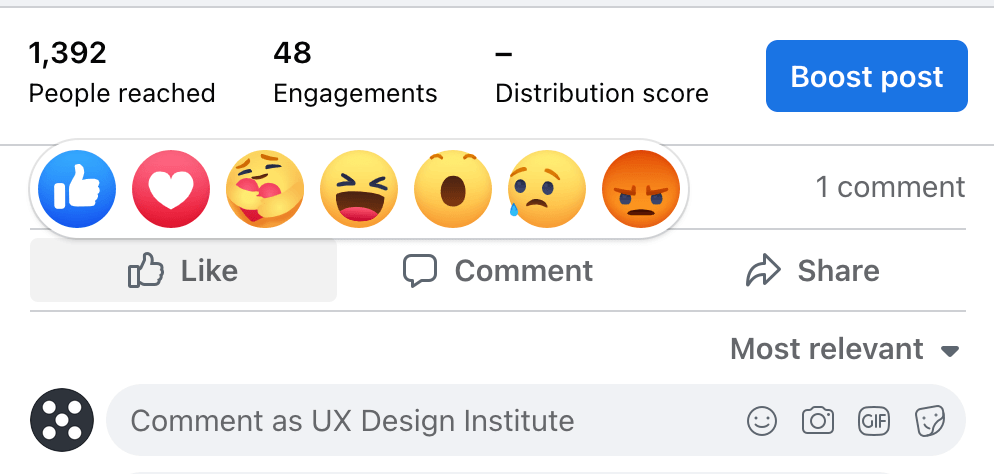
There will always be some people who use emojis or gifs to soften the blow of a cruel message but it can also allow people to connect on a more human level. Since the “like” reaction to Facebook and LinkedIn statuses was upgraded to include happy, sad and angry faces, we could connect to people more accurately. So instead of liking a redundancy announcement, you can show your disdain instead.
In the messaging app Slack, which is commonly used by workplaces, a full range of gifs and emojis is available. This means that colleagues and bosses can give a quick response – praise hands gif, dancing lady, massive thumbs up – to any message shared without having to think of an appropriate text reply. Although a very simple gesture, it allows for a dash of personality to shine through while keeping a lighthearted atmosphere in the group chat.
Stronger connections lead to stronger relationships, even if that connection all comes down to a good gif.
Empty states and error screens
One area where fun UX regularly pops up is when a screen has no content or when things go wrong. Empty states are most common when people are first using a product. They explain what’s missing and instruct users what to do next. For example, if you get a new phone and you have no messages in your inbox, an illustration will tell you that there’s nothing to see here and you should send someone a text.
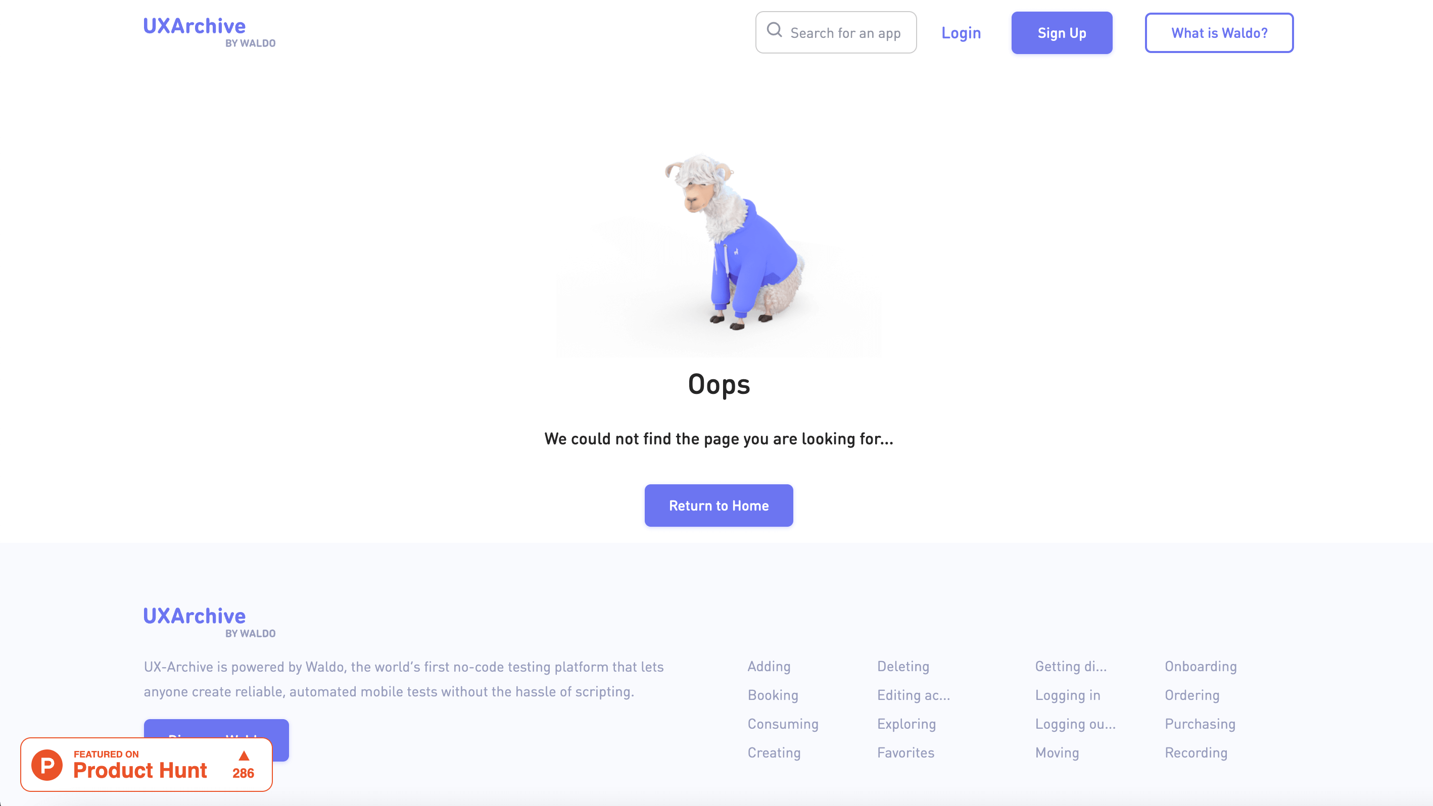
Similarly, if an error occurs in an app or on a website or you lose internet connection, fun UX can step up and soften the blow of the technical issues. For example, if you use a URL that no longer exists, the website might use a ghost animation – or a sad llama – to tell you that what you’re looking for is no more and how to find it.
This is a very common and clever use of fun UX, so much that Dribbble even has its own tag dedicated to funny empty states.
Don’t force the fun
Clippy was perhaps vilified because he popped up every time you used Microsoft Office assuming that you always had entry level abilities to write letters or create excel sheets. Users had no choice when it came to Clippy but people have a choice now.
On Facebook or LinkedIn, no one is forcing you to display your emotions in a post reaction – the standard “like” button is still functional. Asana allows users to opt out of the Celebrations animals if, for some reason, mythical and magical animals aren’t their thing. Filters on Zoom have to be manually activated but, more importantly, they have to be manually deactivated too.
When can we play?
Fun, as ever, is subjective so implementing any new features into a product will require some usability testing. Seeing how users respond to your new designs will determine if your plans are really fun or simply wacky. Asana’s unicorn is – once again – a great example. While it was intended as a joke, the positive response meant that the Celebrations feature became a permanent and adored fixture.
All of these features are fun because they’re unexpected. They add a spontaneous flash of colour to daily chores without coming across as overbearing or try-hard. Even though UX design values consistency, if fun was a consistent feature in everyday products, our everyday tasks would suffer. Unless, of course, fun is the sole purpose of the product.
So if you want your product to have a fun side, figure out at what point the user needs it most. Do they need to be cheered on as they make their way through their weekly chores? Do they need help with delivery messages in a light and breezy way? Will they appreciate a fun diversion if your product is experiencing some tech issues?
By testing the waters and not overdoing it, smattering a little bit of fun into your product can go a long way. Whether you are giving your product a new lease of life or hoping to connect with your users on a new level, start small and build upwards from there.
And if you ever are concerned that you’re taking too far, ask “What would Clippy do?” and do the opposite.

![The 10 best prototyping tools for UI/UX designers [2025 Update] 10 UI UX prototyping tools header image](https://www.uxdesigninstitute.com/blog/wp-content/uploads/2025/01/93_UX_Prototyping-tools_Illustration_blog-1.png)