Colour is one of the most powerful tools in a designer’s toolkit—and choosing a product or brand’s colour scheme is one of the most important decisions a designer can make.
Working with colour isn’t simply a case of picking your favourite hues and hoping for the best. It’s a little more technical, requiring knowledge of the colour wheel, achieving colour harmony, and understanding how different colours can influence people’s emotions and behaviours.
These are all crucial aspects of colour theory, and we’ll explain them—and more—in this guide.
We’ll demystify some of the most confusing colour theory jargon, clarify the most important concepts, and show you, in practical terms, how to apply colour theory to your work as a designer.
Here’s what we’ll cover:
Let’s begin our journey into the dazzling world of colour theory!
What is colour theory? A definition
Colour theory is a set of concepts, principles, and guidelines that help artists and designers to use colour effectively in their work. It’s based on a combination of science, maths, and psychology—a fascinating discipline!
Colour theory helps us to understand the anatomy of colour, how different colour combinations work together to achieve different effects and the role that colour plays in creating a strong brand identity and a delightful user experience.
Once you’re well-versed in colour theory, you can confidently choose the most effective colour schemes for a given product or design project. You’ll be able to use colour to connect with your target audience and to improve the readability, usability, and accessibility of your designs.
The power of colour is truly endless—and colour theory will help you to unleash it. But, before we jump into the specifics of colour theory, let’s consider why colour is so important in the design field.
Why does colour matter in design?
When it comes to designing successful products, colour isn’t merely a decorative layer. It defines the entire visual brand (along with other elements such as typography, logos, and imagery), and it impacts the end user’s perception and experience of the product.
Here’s why colour matters beyond aesthetics:
- Colour is crucial for brand identity and recognition. When you think of some of the most famous brands, you can probably visualise their brand colours off the top of your head. Ikea? Blue and yellow. Starbucks? Green and white. The NHS? Blue and white. You get the gist! Colour is at the heart of all the most memorable brands.
- Colour can evoke emotions and impact people’s mood and behaviour. According to colour psychology, different colours can elicit different emotional responses. This, in turn, can impact a person’s behaviour—which is especially interesting in the context of designing products and services that are geared towards particular user actions. We’ll take a closer look at colour psychology later on in this guide.
- Colour helps to create contrast, which improves the readability and accessibility of digital products. When designing an app or a website, how do you ensure that all text is clearly legible? How do you make sure that all the different UI elements are easily distinguishable from one another? You use colour to create contrast. This has a major impact on the ease and accessibility of the entire user experience.
As you can see, colour isn’t just beautiful. It’s functional, too, and must be applied with care. On that note, let’s dive into the fundamentals of colour theory.
Colour theory basics: Primary, secondary, and tertiary colours
Primary, secondary, and tertiary colours form the basis of colour theory. You’re probably already familiar with these concepts, but we’ll provide a quick refresher here just in case:
- Primary colours are those that cannot be created by mixing other colours together. The three primary colours are red, yellow, and blue.
- Secondary colours are created by mixing two primary colours together. The three secondary colours are orange, purple, and green.
- Tertiary colours are the result of combining a primary colour with a secondary colour. There are six tertiary colours: magenta (red mixed with purple); vermillion (red mixed with orange); violet (blue mixed with purple); teal (blue mixed with green); amber (yellow mixed with orange); and chartreuse (yellow mixed with green).
With primary, secondary, and tertiary colours, we’ve got twelve colours in total. But that’s not where the possibilities end! Each of those basic colours comes in a range of different variations, opening up a whole spectrum of colours to choose from.
You can think of these different variations as the elements or properties of a colour, and we’ll introduce them next.
Understanding the elements and properties of colour: Hue, shade, tint, and tone
How do we get from just twelve colours (three primary colours, three secondary colours, and six tertiary colours) to the much broader range of colours we know exists in the world?
Four words: Hue, shade, tint, and tone.
These are settings you can dial up or down to achieve different variations of each colour, giving you a much wider array of colours (or colour variations) to work with.
Here’s what each term means:
- Hue is the colour in its purest form. When you mix two primary colours (hues) to get a secondary colour—say, mixing red and yellow to get orange—you’re mixing the hues of red and yellow to get the hue of orange. All primary and secondary colours are hues.
- Shade. Now, if you want to create a darker version of a colour, you can add black to a particular hue. For example, if you add black to blue, you’ll get a darker version of the original blue colour.
- Tint is the opposite of shade. If you want to achieve a lighter version of a colour, you can add white. As such, different colours can have a range of shades and tints in varying degrees.
- Tone, sometimes referred to as saturation, is achieved by adding grey (i.e. white and black) to the original hue. Again, adding both white and black will give you yet another variation of that colour.
You can see how, with the dialling up and down of these various properties, the spectrum of colours available for you to work with extends well beyond the twelve primary, secondary, and tertiary colours.
Now things are getting more complex! How do designers make sense of all the different possibilities and potential colour combinations? Cue the colour wheel.
An introduction to the colour wheel and the 6 main colour schemes
What is the colour wheel?
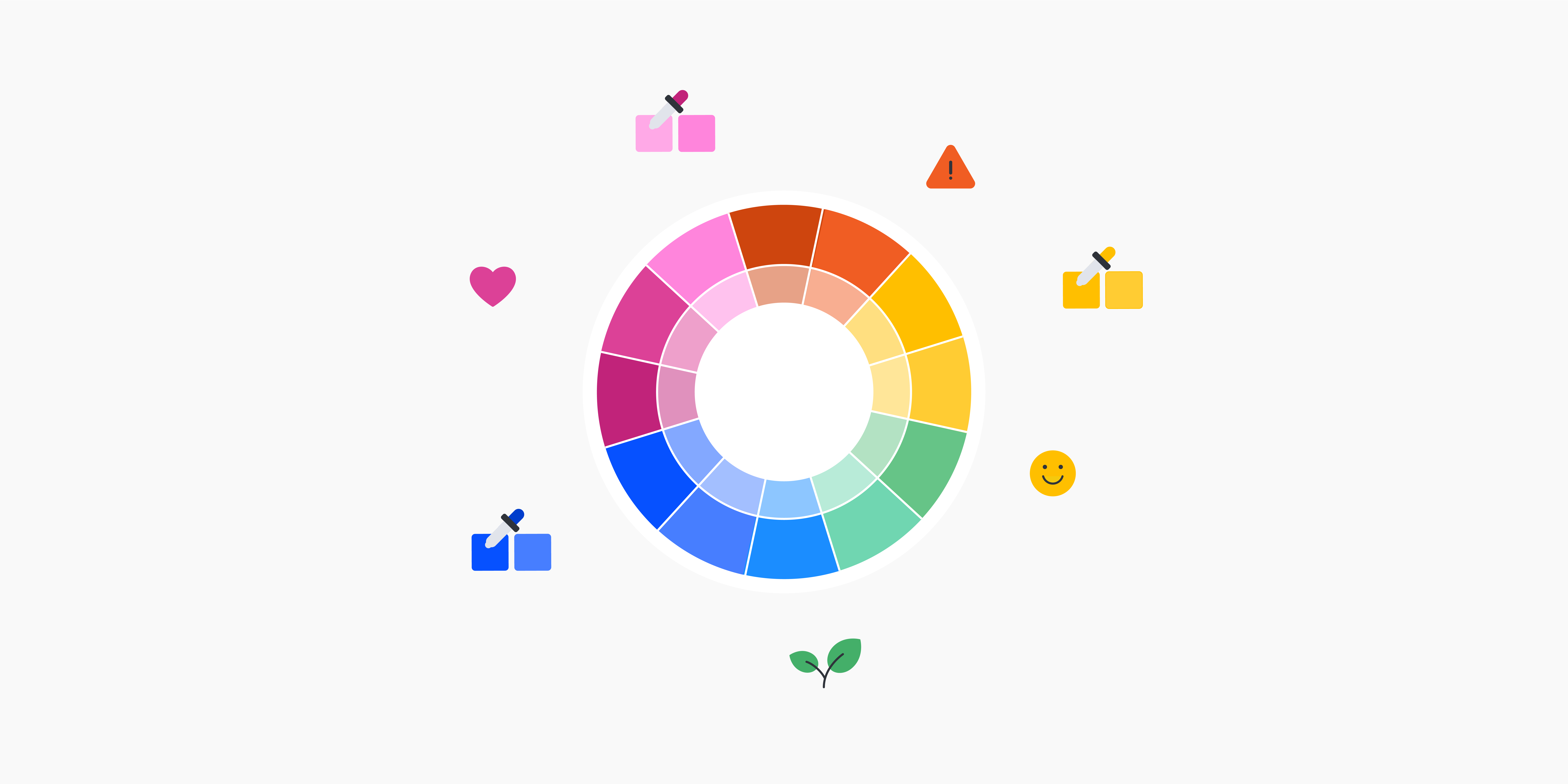
The colour wheel is a circular representation of all the different colours and their possible variations. It depicts all the primary, secondary, and tertiary colours, as well as their respective hues, shades, tints, and tones.
The colour wheel is an incredibly useful tool because it allows you to see, at a glance, the relationship between different colours based on their position on the wheel.
These can be broken down into different colour schemes—otherwise known as colour palettes or colour combinations.
The 6 main colour schemes
Colour schemes are essentially combinations of colours that work well together. Each colour scheme helps to achieve a different effect, so your choice will depend on the design context and your goals.
- Complementary: A complementary colour scheme uses two colours which are located directly opposite each other on the colour wheel. Complementary colour pairings achieve the highest level of contrast.
- Analogous: An analogous colour scheme uses colours that are next to each other on the colour wheel. If you were creating an analogous colour scheme made up of three colours, you’d choose your main colour and the colour either side of it. For a five-colour scheme, you’d add the colours that are next to your second and third colours on the wheel (i.e. the outer colours). Analogous colours harmonise well together but create minimal contrast.
- Monochromatic: As the name suggests, monochromatic colour schemes use just one colour in various tints, shades, and tones. Monochromatic palettes are often associated with simplicity, elegance, and ‘cleanness’. Note that you won’t achieve much contrast with a monochromatic colour scheme.
- Triadic: A triadic colour scheme comprises three colours that are evenly spaced around the colour wheel. A triadic combination of colours is great for creating high contrast while achieving harmony.
- Split-complementary: A split-complementary palette takes one dominant colour and the two colours that are directly next to the dominant colour’s complement on the colour wheel. In other words, to choose the second and third colours in a split-complementary scheme, find the colour directly opposite your first colour on the colour wheel (that’s its complement) and then choose the two colours that are located next to (i.e. either side) of that colour.
- Tetradic: This is also known as a double complementary or rectangle colour scheme. Tetradic colour palettes use two complementary colour pairs. If you were to cut out a paper rectangle and place it at different angles over the colour wheel, you’d find your colour pairings at each of the rectangle’s four points.
Now we know all about how different colours work together to form colour schemes, let’s introduce another key concept: colour psychology.
An introduction to colour psychology—how do different colours make us feel?
Colour psychology explores how different colours can impact our mood, emotions, and behaviours. As a designer, the colours you choose will conjure up certain associations and/or elicit certain emotions. As such, a product’s colour scheme can have a big impact on how a user feels when they interact with the product.
So, when working with colour, it’s important to be aware of the symbolic meanings typically associated with each colour—and how these can vary across different cultures and user groups.
Here are some common colour associations:
- Red: Love, passion, energy, danger, power, intensity.
- Pink: Romance, delicacy, softness, nurture, optimism, playfulness, fun.
- Blue: Wisdom, dependability, calm, peace, relaxation, coolness, sadness.
- Green: Nature, freshness, health, renewal, prosperity, jealousy.
- Yellow: Hope, optimism, fun, joy, happiness, warmth, danger, caution.
- Orange: Energy, warmth, optimism, abundance, kindness, warning, danger.
- Purple: Royalty, nobility, glamour, mystery, luxury.
- Black: Elegance, power, sophistication, strength, luxury, sadness, grief.
- White: Purity, simplicity, tranquillity, peace, openness.
As you can see, some colours hold contradictory associations—such as blue which can evoke feelings of calm and peace, but may also be associated with sadness. It all depends on the context and on the person perceiving it.
What are the best colour tools for designers?
We’ve covered a lot of theory. But, when it comes to working with colour, you don’t necessarily need to pore over the colour wheel every time you start a new project, or spend hours running back over colour theory to ensure you’re making effective colour choices.
As with most aspects of the UX and UI design process, there are tools that can help you. So what are some of the best colour tools for UX and UI designers? Let’s take a look.
Colour pickers and colour palette generators
- Adobe Color—a colour wheel and colour palette generator, used to create and browse colour schemes.
- HueSnap—a free colour picker and colour palette generator tool. Use the colour picker to ‘extract’ colour from existing graphics, or create brand new colour schemes from scratch.
- Khroma—uses AI to learn which colours you like and enables you to generate custom colour palettes.
- Coolors—a free, beginner-friendly colour palette generator with extensions for Adobe Photoshop and Illustrator.
- Colormind—uses deep learning (a type of AI) to generate colour schemes.
Tools for checking colour contrast
- WCAG Color Contrast Checker—enter your colour combinations to check if they pass conformance (i.e. that they provide enough contrast to comply with accessibility guidelines).
- Coolors Color Contrast Checker—calculates the contrast ratio of text and background colours.
- Adobe Color Contrast Analyzer—type/paste in the HEX code for your text and background colours to get a contrast ratio.
Tying it all together: How to choose the right colour palettes and use colour theory to design beautiful, user-friendly products
As a designer, your goal is to make effective colour choices for a given product or project. You then need to apply your chosen colours so that the end result is aesthetically pleasing, accessible, and user-friendly.
So how do you go about that? How do you actually use colour theory in practical terms? Let’s take a look.
Consider the brand identity
If you’re designing for a particular brand or developing a brand identity from scratch, you first need to consider what brand values you want to convey. What does the brand stand for? What values does it embody? What industry is it operating in?
All of these factors will determine your colour choices. For example, colours that work well for a luxury beauty brand may not hit the mark for a financial technology company. That’s because those brands have different values and purposes.
Think about the people who will perceive your colours
This goes hand-in-hand with brand identity. As you choose or create a colour palette, it’s important to consider your target audience. Who will be perceiving the colours? What kind of reaction or emotion do you want to evoke? What kind of colour scheme is most likely to resonate with them as they engage with the product at a particular moment in time?
Here you want to apply some colour psychology. Consider what different colours mean to your target audience and how your colour choices might influence their emotions.
Use colour to create contrast (and make your designs more user-friendly)
Once you’ve decided on a colour palette, you’ll then apply those colours throughout the product you’re designing. As you do so, it’s essential to ensure that you’re creating sufficient contrast.
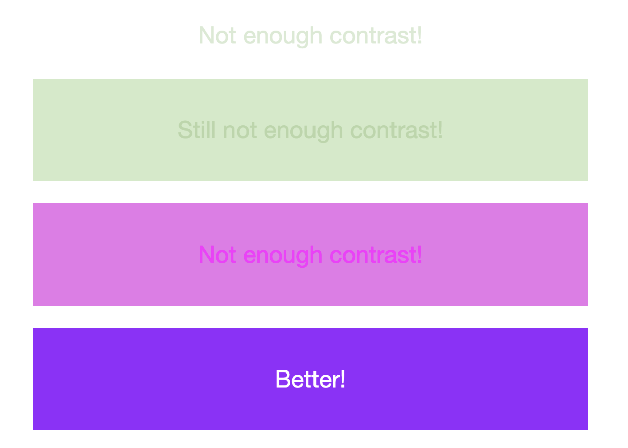
Contrast is crucial for accessibility. Think how difficult it is to read, say, light grey text on a plain white background, or white text overlayed on a busy image or textured background.
The Web Content Accessibility Guidelines outline a set of standards that must be met in order to ensure that web and digital content is accessible for everybody, including people with disabilities. These guidelines state that text and interactive elements should have a colour contrast ratio of at least 4:5:1.
When applying colour, use colour contrast checkers (like those we mentioned previously, including the WCAG Color Contrast Checker) to ensure that you’re meeting accessibility standards.
Use colour to establish a visual hierarchy and achieve consistency
How you organise different elements on the screen or page determines their importance in the overall visual hierarchy. For example, you might place the most important information at the top of the screen so the user sees it first.
Colour also plays an important role in establishing visual hierarchy. Use high colour contrast or dial up colour intensity to make important elements stand out, use colour to group related elements, and apply colour consistently to help the user learn your interface—for example, by learning to associate certain colours with certain actions or information.
Being strategic with your application of colour helps to ensure that your product is not only beautiful and on-brand, but also easy to learn, use, and navigate. And that’s ultimately what good design is all about!
That’s a wrap!
That marks the end of our ultimate guide to colour theory. Hopefully, you now feel much better equipped to choose effective colour schemes and use colour to connect with your target audience, improve the accessibility and usability of your products, and develop strong and memorable brand identities.
Of course, colour is just one aspect of a delightful user experience. If you’d like to learn more about creating beautiful, user-friendly products, discover the power of mood boards in this guide, learn the 7 fundamental principles of icon design here, and take inspiration from these 9 examples of great UI design from around the web.


