Whether you’re a seasoned UX/UI designer or just starting out, the Rule of Thirds should be part of your design toolkit. This simple, centuries-old principle can elevate your interfaces to new heights—making them more balanced, professional, and effective.
In this complete guide, we’ll explore why the Rule of Thirds is so useful, when to use it, and best practices for harnessing it into your designs. So let’s dive in!
What is the Rule of Thirds in UX/UI design?
At its core, the Rule of Thirds is a compositional principle that helps UX/UI designers create balanced and visually engaging layouts. It involves dividing your design area into a 3×3 grid, creating nine equally sized quadrants. The main idea is to position key elements along these gridlines or at their intersections. This grid-based approach adds structure and guides the user’s eye to desired areas, enhancing overall usability and visual appeal.
The Rule of Thirds has its roots in art and photography as a way to create balanced, compelling images. By applying this principle to your UX/UI designs, you can create a sense of harmony and balance, making it easier for users to navigate through your interfaces.
Source: Codrops
When implementing the Rule of Thirds in UX/UI design, it’s crucial to consider how and where you place elements within the grid. The top-left intersection point, for example, is often referred to as the ‘primary focal point.’ This is where you might place the most important element of your design, like a call-to-action button or punchy headline copy. By positioning this key element at the primary focal point, you can immediately capture the user’s attention and guide them towards the desired action.
Why is the Rule of Thirds useful for UX and UI designers?
The Rule of Thirds isn’t just a design principle; it’s a passport to intuitive, beautiful, and adaptable digital experiences. Let’s take a closer look at the three biggest benefits of employing the Rule of Thirds in your designs.
Visual hierarchy
Following the principle of the Rule of Thirds will help you create a structured and visually captivating layout that effectively highlights the most important elements on a screen. By placing secondary elements along the gridlines or at the intersections, you can establish a visual flow that leads the user through the interface. For example, you might position a navigation menu along one of the vertical gridlines, making it easily accessible and visible to the user.
This emphasis not only guarantees that the key content grabs the user’s attention but also facilitates intuitive navigation, ultimately transforming complex interfaces into seamless, user-friendly experiences.
Read next: What is information architecture?
Balanced composition
The Rule of Thirds isn’t just about aesthetics; it’s about crafting a harmonious balance. By strategically positioning elements across the grid, you avoid clutter and give each element its own breathing space. This is particularly useful when designing interfaces with multiple elements, like a homepage or a dashboard.
The Rule of Thirds also complements the natural way users scan and perceive information. By aligning content with how users intuitively interact with interfaces, you can leverage the users’ cognitive patterns, reducing cognitive load and facilitating a more seamless and accessible user experience.
Responsive design
In our multi-device era, adaptability is paramount. The Rule of Thirds provides a sturdy foundation for designs to shine across varying screen sizes. By dividing the screen into thirds, you can easily adapt your layout for different screen sizes and orientations, ensuring your interface performs at a high quality across devices.
The Rule of Thirds vs. the Golden Ratio vs. the Phi Grid
While researching the Rule of Thirds, you might have also come across other popular compositional design techniques—namely the Golden Ration and the Phi Grid.
So how do they differ from each other? And when should you use one over the other?
Let’s take a closer look.
The Golden Ratio
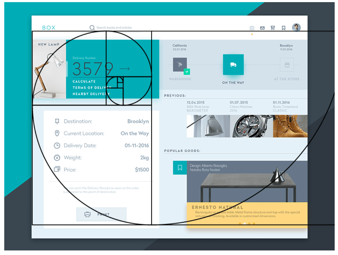
The Golden Ratio, often represented by the mathematical constant phi (φ ≈ 1.618), defines a proportional split of roughly 38% and 62%. When applied to UX/UI design, the Golden Ratio helps create aesthetically pleasing compositions by dividing elements in a way that maintains a consistent ratio. More specifically, it draws the viewer’s eye to the “sweet spot” at the smaller section, creating a sense of aesthetic harmony.
Check out this example of a landing page with the Golden Ratio layered on top. It looks a bit like a seashell, which is indicative of the Golden Ratio mimicking our relationship with nature and art.
Source: UX Planet
Based on our intuition, it’s unlikely we would ever look slap-bang in the middle of a piece of content—instead, our eyes follow this natural pattern and land on an off-centre focal point. Following the Golden Ratio, the designers have made sure our attention is drawn to a key piece of content that includes an action point to drive us to the rest of the site.
The Phi Grid
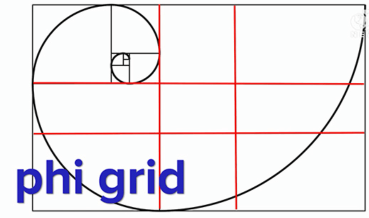
Inspired by the Golden Ratio, the Phi Grid is its evolved cousin in the photography and design landscape. Instead of equal thirds, the Phi Grid divides the frame into sections based on the Golden Ratio’s proportions. Here’s an example of the two-layered together.
The Phi Grid provides a more nuanced grid structure for compositions, particularly beneficial when you’re aiming for a slightly off-centred yet harmoniously balanced design.
So, how do the Golden Ratio and Phi Grid compare to the Rule of Thirds?
While the Golden Ratio and Phi Grid have their merits, the Rule of Thirds offers a simpler and more versatile approach. It’s easier to implement and adapt to different screen sizes and layouts. Unlike the fixed ratios of the Golden Ratio and Phi Grid, the Rule of Thirds provides more flexibility in placing key elements precisely where they need to be.
Amazon‘s homepage flawlessly follows the Rule of Thirds. Across the page, nine evenly distributed boxes present captivating text and content for a balanced way to present multiple products and CTAs without overwhelming the user with information.
Source: Logrocket
When to use the Rule of Thirds (and when not to use it)
The Rule of Thirds is often hailed as the go-to principle for creating balanced and engaging visuals. But like all rules in design, it’s important to understand when to employ it and when it’s not the right technique. Let’s walk through a few guiding principles for knowing when to use the Rule of Thirds.
When to use the Rule of Thirds:
- Guiding user focus: If you have a primary call-to-action or a key piece of information, placing it on one of the grid’s intersections can help draw user attention exactly where you want it.
- Creating visual balance: When designing a page with multiple elements—like text, images, and buttons—the Rule of Thirds helps to ensure the elements don’t compete with each other (as we saw with the Amazon homepage).
- Enhancing imagery: When incorporating images or graphics into your design, aligning key components (like a person’s gaze or an object) with the Rule of Thirds can make the visuals more compelling.
On the other hand, look out for these situations when the Rule of Thirds might not work:
- Experimental designs: If you’re aiming for a unique and unconventional layout, the Rule of Thirds might limit your creativity. Don’t be afraid to break away from the grid and explore different possibilities!
- Minimalistic interfaces: For designs with few elements on the screen, sticking to the Rule of Thirds might be unnecessary.
- Data-heavy interfaces: While the Rule of Thirds can add visual appeal, it might not be the most effective approach for displaying large amounts of data.
Best practices for using the Rule of Thirds in UX/UI design
Now that you understand the fundamental concepts and considerations behind the Rule of Thirds, here are some actionable best practices to help you leverage its full potential in your next project.
Start with key elements
Before diving deep into the design process, start by identifying the most important components of your interface—whether it’s a call-to-action button, a hero image, or a headline. Position these pivotal elements at the intersections of your grid to ensure they quickly capture the users’ attention and drive interaction.
Maintain consistency
While the Rule of Thirds can be a guiding principle, consistency across your platform should be a top priority. If certain pages or sections veer away from this rule for specific reasons, ensure that the overall design language remains cohesive. A disjointed user experience can confuse users and disrupt the flow.
Don’t overcrowd intersections
While the intersections are prime real estate for important elements, try to avoid the temptation to overcrowd them. Placing too many items close together can defeat the purpose, leading to a cluttered interface. Remember, the rule is as much about what you place on the intersections as it is about providing breathing space for each element.
Balance text and imagery
When working with both text and images, use the Rule of Thirds to establish visual harmony. For example, you could align a headline with a horizontal line, while a supporting image or graphic sits on the opposite third line. This balance means neither element overshadows the other, which makes for a much better overall look and feel.
Test and iterate
While the Rule of Thirds is a powerful tool for beautiful, functional designs, the ultimate judge of effectiveness is the end-user. Regularly gather feedback, employ A/B testing, or use heatmaps to understand how users interact with your design. If certain elements aren’t performing as expected, don’t hesitate to iterate, even if that means scrapping the Rule of Thirds for something else. We’ve written a guide to UX testing to help you on your way.
Key takeaways
In the world of UX/UI design, the Rule of Thirds offers a consistent framework for creating intuitive and visually appealing interfaces. Its application provides a balance between design aesthetics and user-centric functionality. As digital design continues to evolve, understanding and utilising foundational principles like the Rule of Thirds ensures that interfaces remain both engaging and user-friendly.
Remember: It might have the word ‘rule’ in the title, but you don’t need to follow it strictly. You can use the Rule of Thirds to inform your design decisions, but don’t be afraid to break away from it when necessary. Every design project is unique, and sometimes deviating from the grid can lead to innovative and creative solutions.
To learn more about design composition, we recommend reading our guide to UX design principles all designers should know.


