Ever paused to admire a website’s bold header, or felt drawn to the poetic layout of a blog? That’s typography design working its magic, silently influencing our interactions as we navigate digital products.
Typography design is an essential part of any visual communication. It’s the art of arranging type to make written language legible, readable, and visually appealing. In this comprehensive guide, we’ll explore the exciting world of typography design—and learn how you can bring digital experiences to life with stunning typographic compositions.
Let’s get learning!
What is typography, and why is it important?
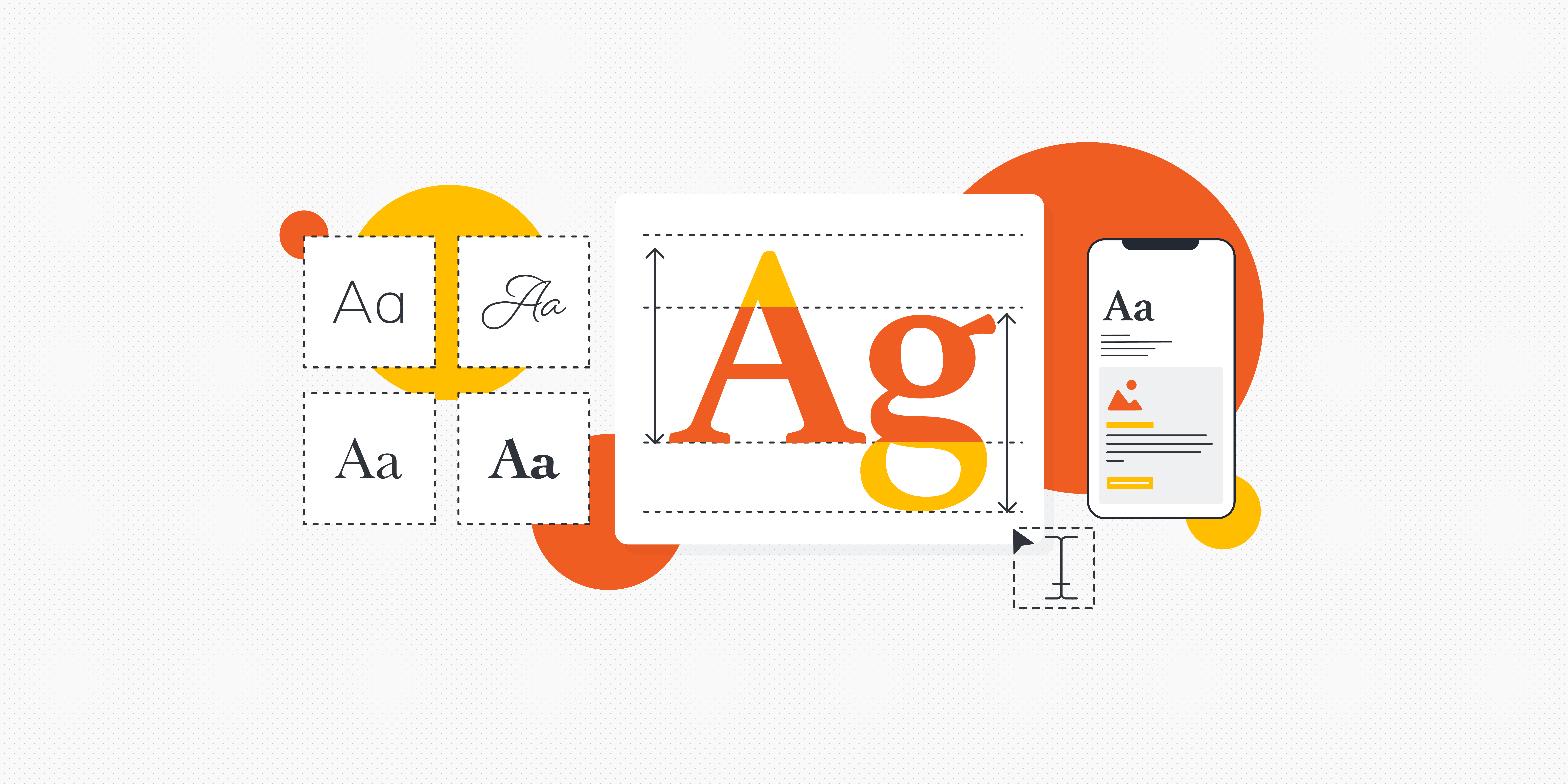
Typography is more than just picking a pretty font. It’s an art that involves selecting fonts, setting font sizes, line spacing, and organising text elements to create a harmonious balance between copy and design.
So, why does typography matter so much in web design? When you land on a website or explore a digital product, the ease with which you read and absorb information matters. Great typography ensures that every word is clear, inviting, and organised. It also sets the tone of the digital experience or brand. Typography can whisper elegance, shout excitement, or convey trustworthiness. In an online world where first impressions are crucial, typography plays a vital role in helping users navigate the interface with confidence.
But it’s not just about aesthetics—typography also has a whole host of accessibility considerations. If the text is too small, it could give your users eyestrain. Too large? It’s like someone shouting in their face. In a world where digital accessibility is paramount, good typography ensures everyone, regardless of visual abilities, can navigate and understand content with ease.
But it’s not just size at play. Ever clicked on a site and instantly knew where to go or what to read first? That’s the typography subtly guiding you around the interface through formatting techniques like bold, italics, and colour (we’ll dive more into hierarchy a little further along!). You can learn more in our ultimate guide to UI design.
Key typography terminology explained
At its core, typography design is both an art and a technical discipline. While its beauty lies in visual appeal, understanding its foundational terms will help you understand the technical side.
Before we dive deeper, let’s familiarise ourselves with some essential typography terminology:
- Typeface: This is how the text is styled. Typeface plays a crucial role in conveying the overall tone and personality of a design. It sets the mood and creates a visual identity for the content. Different typefaces evoke different emotions—for example, a bold and elegant typeface like Baskerville could be perfect for a formal invitation, while a playful and whimsical typeface like Comic Sans might work for a children’s book.
- Font: Fonts are the variations within a typeface. They determine the weight, style, and size of the letters. The weight of a font refers to how thick or thin the strokes are. A bold font has thicker strokes, while a light font has thinner strokes. Styles like italic and oblique add emphasis or slant to the letters.
- Leading: Leading refers to the vertical spacing between lines of text. It plays a vital role in readability and aesthetics. Not enough leading can cause lines to blend together, while excessive leading can create unnecessary gaps. It’s all about having enough leading to allow the reader’s eyes to move smoothly from one line to another without feeling cramped or overwhelmed.
- Kerning: Kerning is the art of adjusting the spacing between individual letters. It ensures that the gaps between letters are visually pleasing and consistent. Proper kerning is crucial for legibility and preventing any awkward collisions or overlaps between characters.
- Tracking: This term relates to the horizontal spacing across a broader range of characters or words. Adjusting tracking means altering the overall letter spacing, either widening it for a more airy feel or tightening it for a compact look.
The 5 fundamental principles of typography design
Typography design isn’t just about choosing or adjusting the font or size. Like any art form, it operates on foundational principles that guide designers toward creating visually appealing and effective compositions.
Let’s dive into the five key principles that can make or break your typography design:
Hierarchy
When we talk about establishing hierarchy, it means differentiating various textual elements so their importance is instantly apparent. This differentiation can come through variations in font size, weight, colour, or even typeface.
Imagine an online article. The title, being the primary focus, is the largest text on the page, possibly in bold and perhaps even in a distinctive colour. Subheadings, which break down the article’s main sections, are smaller than the title but more pronounced than the body text. The body text is consistent in size and weight, leading the reader smoothly through the content. Side notes or quotes might be in a different colour or font style.
Each typographical choice guides the reader, signposting the information in order of relevance.
Alignment
Alignment determines how the text lines up on a page or screen, creating a clear path for the viewer’s eyes to follow. There are four primary types of alignment:
- Left-aligned: Often the default choice in many cultures that read left-to-right, left-aligned text starts uniformly at the left margin and tends to be the most legible and familiar for many readers—making it a go-to for long blocks of text.
- Right-aligned: Right-aligned text is standard in cultures that read right-to-left and can be used strategically in design elements to create contrast or direct attention.
- Centred: Centering text means that it aligns equally from both the left and right margins. It can give a balanced and formal feel that can be disruptive for large blocks of text—so designers usually reserve this alignment for titles, headers, or short bits of content.
- Justified: Here, text stretches to align with both the left and right margins, giving a clean, box-like appearance you might find more commonly in print, i.e., newspapers.
The key takeaway? Alignment isn’t just an aesthetic choice. It impacts readability, guides the viewer’s gaze, and reinforces the content’s intent. By making intentional alignment choices, designers can significantly influence how viewers interact with the interface.
Whitespace
Sometimes, what you don’t see is as powerful as what you do see. Whitespace (or negative space) refers to the empty areas around and between elements. Whitespace ensures the design doesn’t feel crowded, giving each typographic element room to breathe and enhancing overall readability.
Just as a dense paragraph can sometimes feel like a chore to read, a design without adequate whitespace can feel cluttered and overwhelming. Whitespace breaks up content into digestible chunks, making it easier for readers to process information and understand the message.
Contrast
Contrast, in typography design, acts as the dynamic interplay between different elements, creating visual interest and guiding viewers’ attention. By using varying degrees of contrast, designers can evoke emotion, create emphasis, and improve legibility.
Beyond font, size, and colour, there are a few ways designers can create typographic contrast:
- Weight: Font weight refers to the thickness of the characters. By juxtaposing bold text against its regular counterpart, designers can highlight certain sections or create a visual hierarchy.
- Background: Whether it’s a gradient, image, or pattern, the background behind the text can either enhance text readability through contrast or diminish it if the contrast is too low.
- Spacing and layout: The arrangement of text elements relative to one another and the space around them can introduce contrast. Tight-knit clusters of text next to spacious layouts or varying line heights can guide the viewer’s journey through the content.
Consistency
Whether it’s a website or app, consistent typography reinforces brand identity. Using a consistent set of typefaces and styles allows readers to quickly identify and connect with a brand or product, building trust and fostering loyalty.
Consistent typography also offers a roadmap for readers. When headings, subheadings, body text, and captions consistently use the same styles, readers instinctively understand the structure and flow of content, making navigation more intuitive. This doesn’t mean every element should look the same—but it’s all about ensuring that the content feels cohesive and retains a unified message.
Typography design tips and best practices
Typography is an art, but it’s also grounded in practicality. Any designer strives towards visually captivating designs, but the ultimate goal is clear communication and a good user experience.
Let’s go through a few golden rules for beautiful and effective typography design:
- Prioritise legibility: Above all else, your text needs to be readable. Ensure that your font choices, especially for body text, are clear and legible at varying sizes. Fancy fonts might look intriguing, but if they hinder comprehension, it’s best to save them for specific highlights or headings.
- Mind the mood: Different typefaces carry different moods and tones. A playful script might be perfect for a birthday invitation, while a professional report might demand a more restrained, serif font. Match the mood of your content with your typography choices. To learn more, we’ve written a guide to emotional content design.
- Limit font usage: A common rookie mistake is using too many fonts. Stick to 2-3 typefaces—one for headings, one for body, and maybe an accent font. This limitation ensures consistency and prevents your design from feeling messy or overwhelming.
- Watch spacing: The space between letters (kerning), lines (leading), and paragraphs (tracking) significantly impacts readability. Too tight, and your text feels squashed; too loose, and it feels disjointed. Strive for a balanced spacing that allows your content to breathe without losing cohesion.
- Stay colour-conscious: Typography isn’t just about typefaces; it’s also about colour. Ensure your text contrasts nicely with its background, and avoid colours that strain the eyes or distract from the message.
- Test and tweak: Especially in digital contexts, always A/B test your typography across different devices and screen sizes. What looks crisp on a desktop might become unreadable on a mobile screen. Adjust and optimise as needed.
Read next: 5 mobile design best practices for UI designers.
How to get started with typography design
So there we have it—a complete beginner’s guide to the exciting art of typography design. If you’re inspired to consider pursuing a career in typography design, there are some steps you can take to get started.
If you’re a visual learner, YouTube is brimming with expert designers sharing their wisdom, from understanding the nuances of type anatomy to perfecting the art of kerning. If you’re searching for daily inspiration, Pinterest offers a rich tapestry of font pairings, innovative layouts, and typography mood boards to ignite your creative spark.
For those who prefer a structured learning approach, short courses are the way to go. Websites like Coursera and Udemy have curated modules on typography design. While these courses provide an excellent foundation, diving deeper into a comprehensive course like the UX Design Institute’s Professional Certificate in UI Design will amplify your skillset tenfold.
Like any skill, typography design takes practice. Keep experimenting, learning, and refining your techniques. The more you practise, the better you’ll become—so don’t be afraid to get stuck in!


