If you’re involved in designing apps and websites—be it in a professional capacity or as a hobby—you’ll want to learn as many tricks as you can to achieve optimal results.
Beyond the fundamental rules of user interface (UI) design, there are certain tweaks you can make to really take things up a notch.
In this guide, we share our 5 golden rules for creating beautiful user interfaces:
- Follow the 60-30-10 colour rule
- Leverage the power of contrast
- Get your shadows right
- Use plenty of whitespace
- Tweak your text alignment
Each of our hacks will instantly improve the aesthetics of your UI and enhance accessibility and usability. What are you waiting for?!
1. Follow the 60-30-10 colour rule
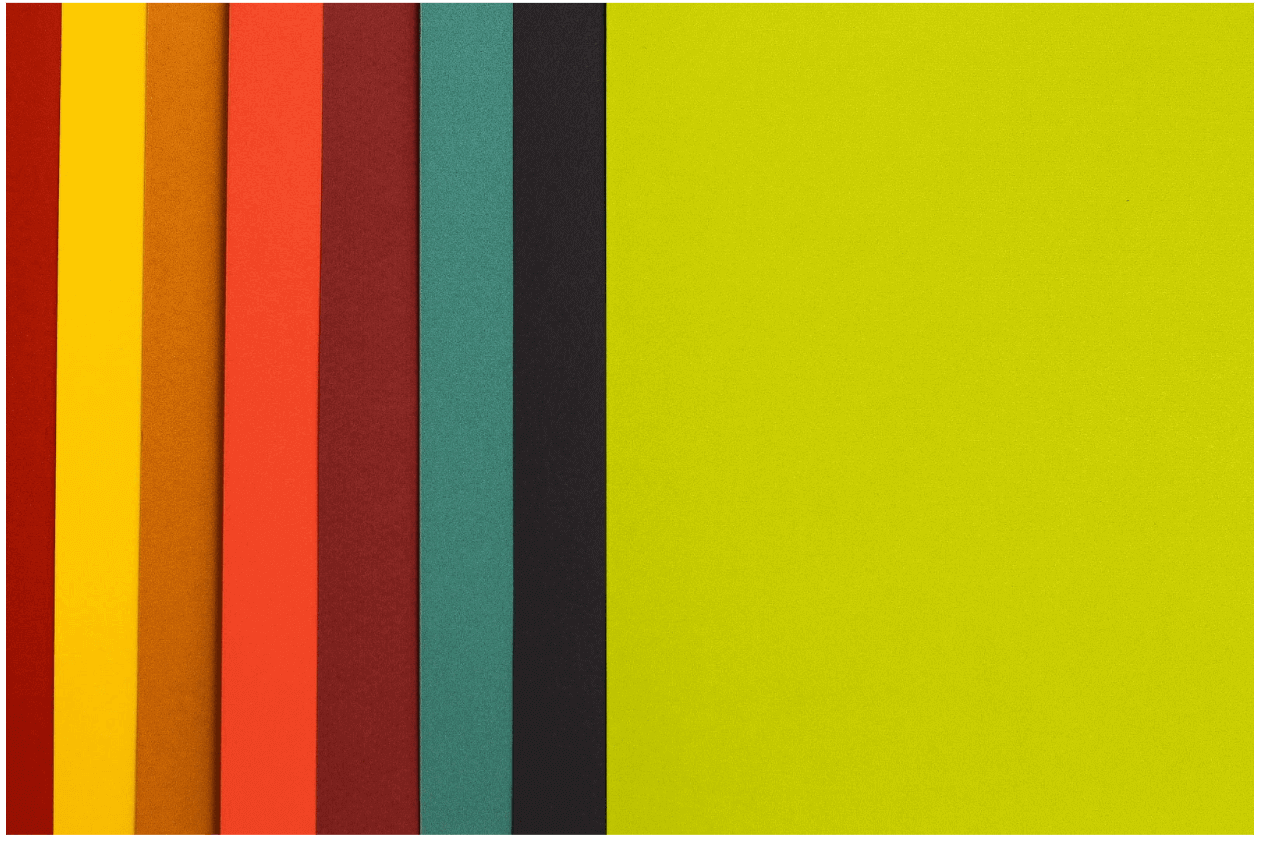
Photo by Hamed Daram on Unsplash
The 60-30-10 rule is used by interior designers to create a balanced colour palette—and you can use it to improve your UI designs.
According to the rule, your colour palette should comprise:
- A dominant or primary colour (60%)
- A secondary colour (30%)
- An accent colour (10%)
60% of your UI design should be in your dominant colour, 30% in your secondary colour, and 10% in your accent colour. This should result in a cleaner, more balanced interface which is easy on the eye.
For an example of how the 60-30-10 rule can transform your UI designs from good to great, check out this case study written by designer Ayobami Adelugba on How the 60-30-10 rule saved the day when designing app screens.
2. Leverage the power of contrast
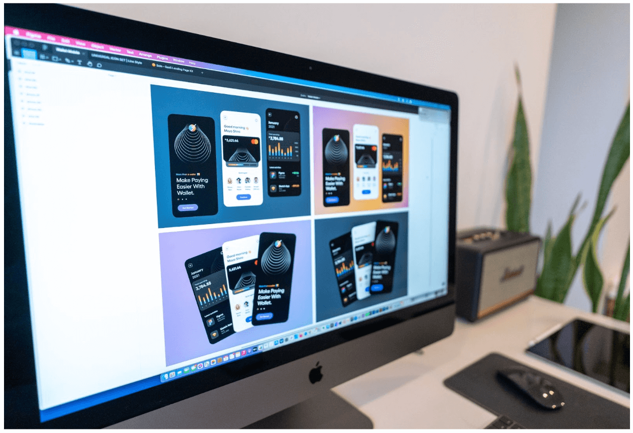
Photo by Tran Mau Tri Tam ✪ on Unsplash
Contrast is a fundamental principle of UI design. It helps the user to distinguish between different elements, and it’s essential for ensuring that text is easily legible. As such, it greatly impacts usability and accessibility.
If you want to create beautiful (and usable) user interfaces, make sure there’s plenty of contrast:
- Between images and text. You can use a simple overlay to improve the contrast between images and text. You’ll find 7 tips for overlaying text on imagery here.
- Between text and the background. For example, if you’re placing text on a light background, make the text darker.
- Between different sections and elements on the page. You can use colour contrast and whitespace to emphasise where one section or element ends and another begins.
You can create (or increase) contrast by using dark and light colour; by contrasting colour temperatures (for e.g. combining warm colours like red, orange, and yellow with cool colours like blue, green, and purple); and by contrasting textures (e.g. placing a textured image on top of a ‘smooth’ background).
3. Get your shadows right
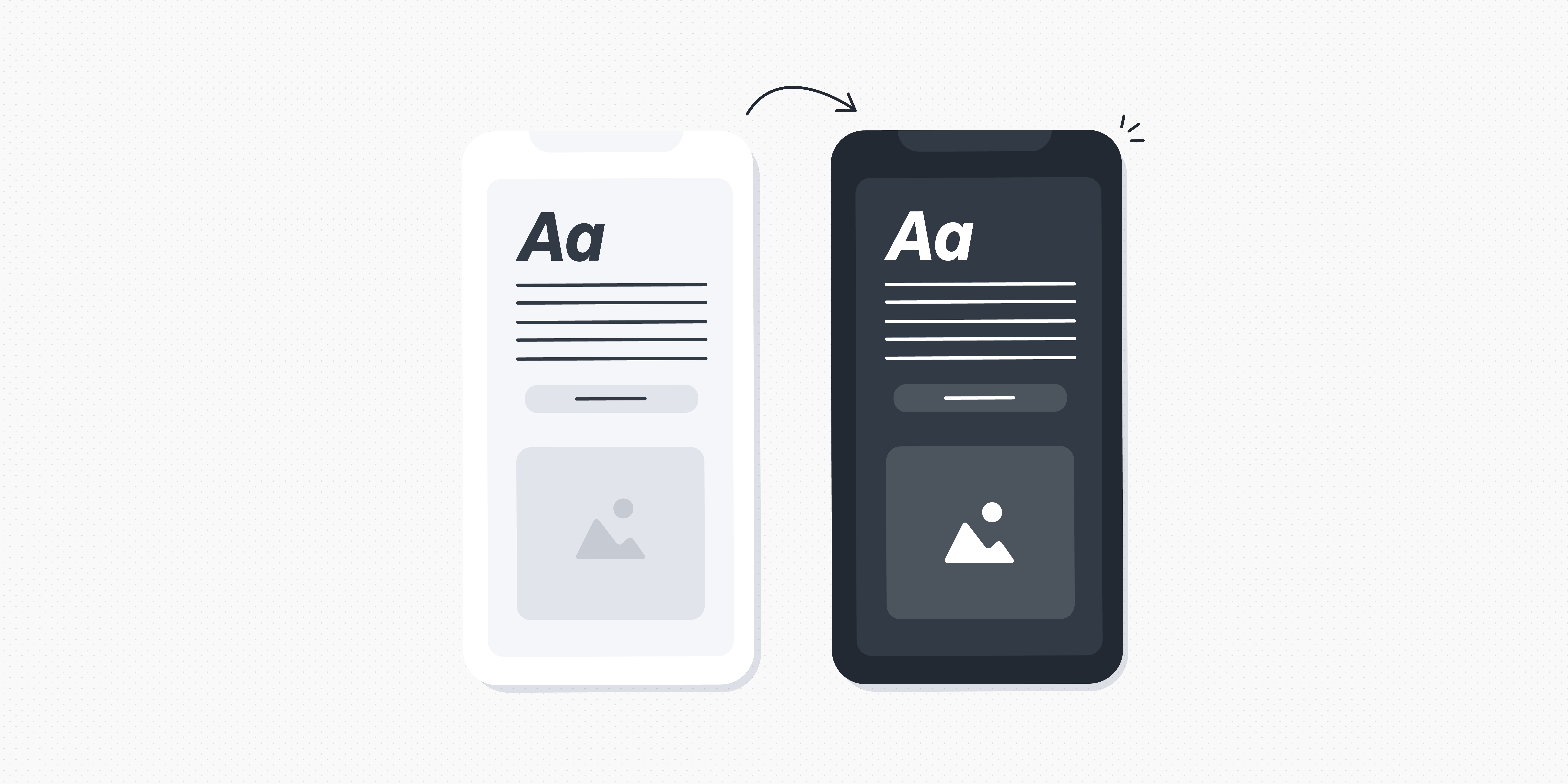
Image taken from texts.com
Subtle shadows are a great way to add depth to your designs. But there’s a common mistake designers make when using shadows—and it can undermine an otherwise beautiful interface.
So what’s the mistake? Inconsistency in terms of where the light source is situated.
When creating shadows, consider where the light is coming from—and bear in mind that it should only be coming from one source, which is usually above the object it’s casting a shadow on.
So: Rather than having some elements with shadows formed at the bottom (as if the light source is above them) and some elements with shadows to the left (as if the light is coming from the right), create your shadows consistently based on one light source position.
It’s a small yet significant detail, and worth paying attention to. For more shadow best practices, check out this post: How to use shadows in UI design.
4. Use plenty of whitespace
Image taken from omio.co.uk
You’re no doubt already familiar with whitespace and why it’s so important. Also known as negative space, it’s the ‘empty’ space around different elements on the page, and between different sections.
Whitespace impacts both aesthetics and usability. It breaks up the different UI elements, reducing visual clutter and making it easier for the user to scan and digest the content in front of them. See the previous screenshot taken from the Omio website for a good example of whitespace in action.
If you’re looking for a simple yet highly effective way to dramatically improve your UI designs, ask yourself: Am I using enough whitespace? Do the elements on each page/screen have enough room to breathe?
Adding more whitespace will instantly declutter your designs and ensure a more polished finish. Experiment with increasing your whitespace until you find the perfect balance.
5. Follow text alignment best practices
Image taken from duolingo.com
Another simple yet transformative UI design hack is text alignment.
You might be inclined to use centre alignment, thinking that it gives your designs more symmetry—but, in doing so, you may be harming your website’s readability and accessibility.
If you want to level up your UI, follow these text alignment best practices:
- Left is best for longer text. Any text longer than one or two sentences should be aligned left. This feeds into the way we naturally consume text (think of books and blog articles).
- Limit centre alignment to headlines. As a rule of thumb, save centre alignment for headlines and very short snippets of text (one or two sentences).
- Right alignment is for special cases only. You can use right alignment if you’re presenting numbers/data in a table, and for website navigation.
The duolingo website is a great example of how text alignment enhances UI—in terms of both aesthetics and accessibility. Only the H1 uses centre alignment, with all subsequent text aligned left.
Scan through your designs to make sure you’re not committing any text alignment faux pas, and adjust accordingly. Remember: Left is best.
Transforming your UI designs from good to great: The takeaway
With some small and simple tweaks, you can transform your UI designs—taking them from modest to beautiful and enhancing their accessibility and usability. That’s what great UI design is all about!
Keep our 5 golden rules in mind and create UI designs that truly excel:
- Follow the 60-30-10 colour rule. Base your UI designs on a primary/dominant colour (60%), a secondary colour (30%) and an accent colour (10%) to create balance and harmony.
- Leverage the power of contrast. Ensure plenty of contrast between text and images, between text and background, and between different elements on the page. This helps the user to distinguish between different elements.
- Get your shadows right. Avoid the common mistake of creating shadows which appear to come from different light sources. In other words, all shadows should fall in the same position (e.g. under the object) to reflect the natural way that shadows are created in the real world.
- Use plenty of whitespace. For instant decluttering, add more whitespace. Try doubling up, or experiment until you find the right balance.
- Follow text alignment best practices. Keep the majority of your text left aligned to mimic our natural reading style. Save centre alignment for short headers only, and right alignment for special use cases (e.g. presenting data in a table).
Want more UI design tips, best practices, and inspiration? Check out these guides:
- 7 Principles of Icon Design all UI Designers Should Follow
- What Does Good UI Design Look Like? 9 Examples to Delight and Inspire You
- How to Become a Better UI Designer: 9 Expert Tips

