One of the biggest lessons that we learned in recent years is that if life can be made easier, we should do all we can to achieve that. Many people are embracing a simpler life in a post-Covid world and it’s an idea that we should also implement to improve UX design.
So, how can we insert a similar sense of balance into everyday products? The answer is straightforward: do less.
Cluttered websites and complex phone apps can contribute to the stress of our daily lives if they don’t load properly or fail to give us the information that we are looking for. But if we enact simple but clever practices into our designs, users will not just continue using our products but happily using them too.
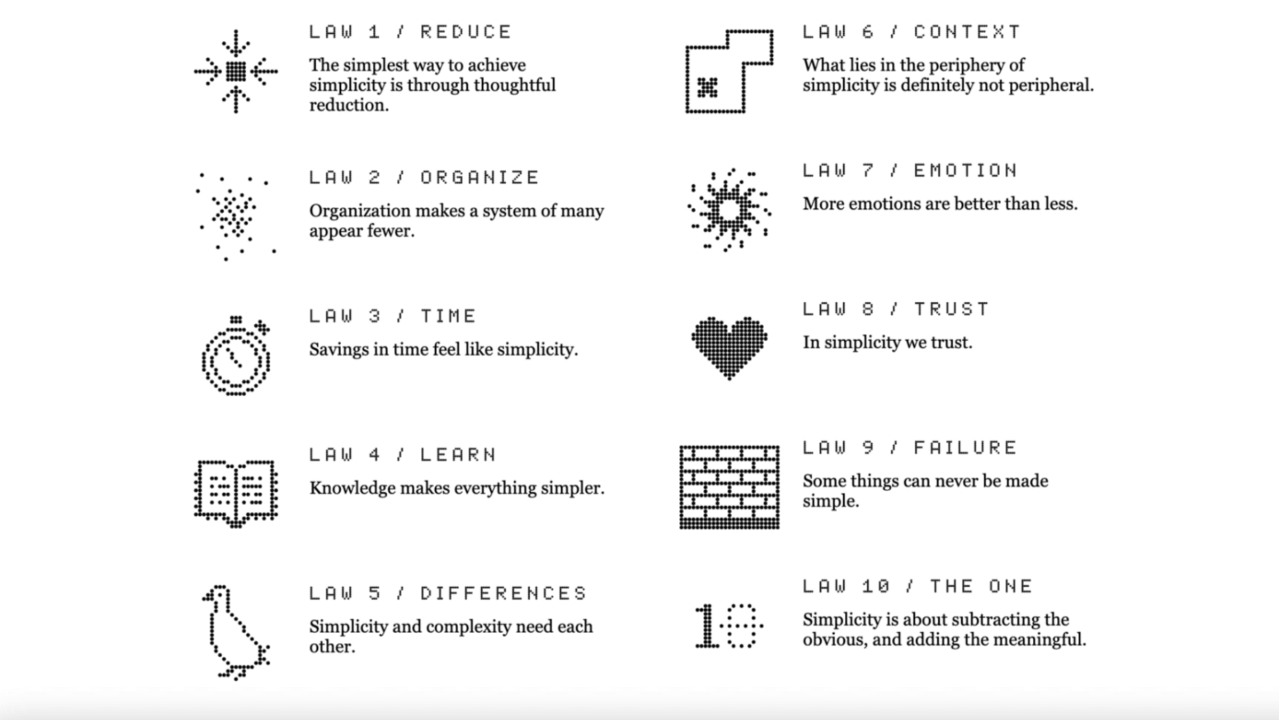
When it comes to clear-cut messaging, less is more. In The Laws of Simplicity, technologist and product experience leader John Maeda offers ten laws for balancing simplicity and complexity in business, technology and design. We take inspiration from his laws to apply simple and effective UX Design that requires less fussy features while giving the user more in return.
Identify your product’s purpose
While it may be tempting to offer a range of services, identify your product’s leading purpose before you begin developing prototypes. By having a definitive purpose, your users will immediately recognise if they have a need for your product. For example, the product description for WhatsApp is “reliable messaging” and it can be used to send messages, make calls and share files, video and voice notes. However, it doesn’t step outside the lines of communication by offering weather updates or including built-in shopping links and that’s what makes it so useful.
Remove the clutter
To create a stress-free experience that’s easy on the eye, remove any text or design elements in the wireframing process that distract from the product’s purpose. Through user research, you can assess which features are secondary, unused or totally unnecessary and, as a result, provide a cleaner space to navigate. Always ask “why is this here?” and if you can’t find an answer, consider removing it entirely.
Share users’ engagement in a meaningful way
While research is a key element of UX Design, users are generally not interested in seeing a list of numbers. If you want to share data that mark changes, growth or achievements in your product or acknowledge the relationship between the product and its users, display it in a visually engaging way. By using clever graphs or entertaining in-app animations, such as Spotify’s end-of-year Unwrapped campaign, users will see – and share – the direct link between them and the product’s success without getting bogged down by numbers.
Allow for quick and easy decision making
When people use your product, they want to be led by your professional expertise. They want to know that they can trust your suggestions, rather than wasting their own time researching what it is that you have on offer and weighing up the pros and cons. By creating a streamline effect by guiding them along with direct instructions, you eliminate the effort that they have to put in.
Provide quality choices for users
When you are presented with too many options, it can be overwhelming and eventually lead to “decision fatigue”. This point is explored further in Hick’s Law, a key practice in UX Design. “The time it takes to make a decision increases with the number and complexity of choices”, which can lead to irrational or rushed decisions.
In our Why Less is more in UX module, we cite Barry Schwartz’s Paradox of Choice as a resource. He suggests that too much choice “produces paralysis rather than liberation”. We can have it all but what if having it all is simply too much? To solve this, we shouldn’t overload users with options and choices. We should create a smooth decision-making process rather than creating extra work for them.
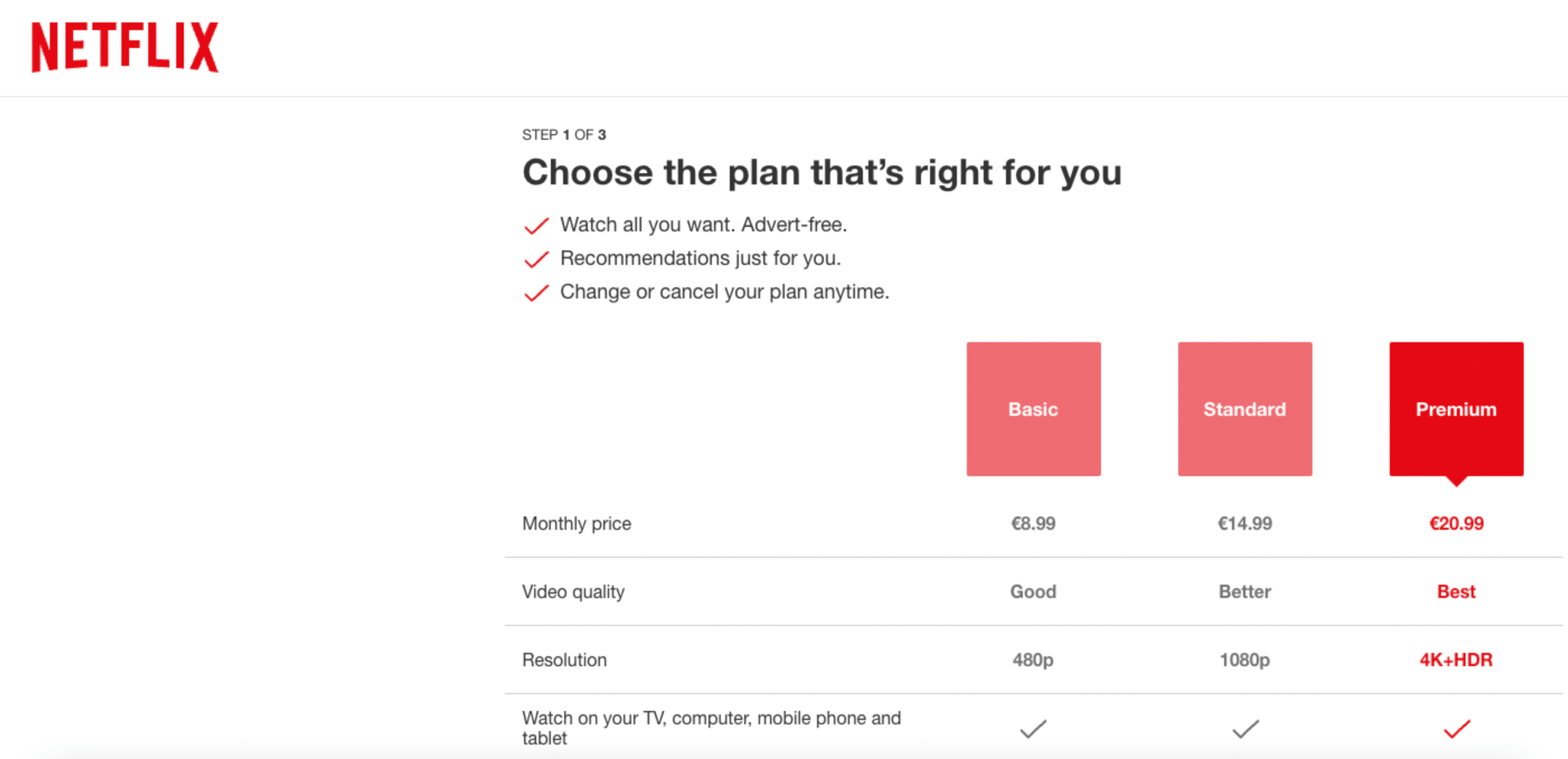
Using Netflix’s payment plan as an example, look how they break down the different costs and services within each plan. There’s little room for hesitation and no questions are left unanswered.
Highlight the logical next steps
To make sure your user doesn’t get lost within your project, plan their journey from start to finish with clearly labelled sections and directions. Ask what is it that they want from you and what is it that you need them to do? For example, if you are selling a product, your customers will need to read up on the product in the information section. Within that section, they should clearly see the “buy” button option. This is known as the Law of Common Region, which is explored further in UI Design, and it creates a clear structure for the user to follow.
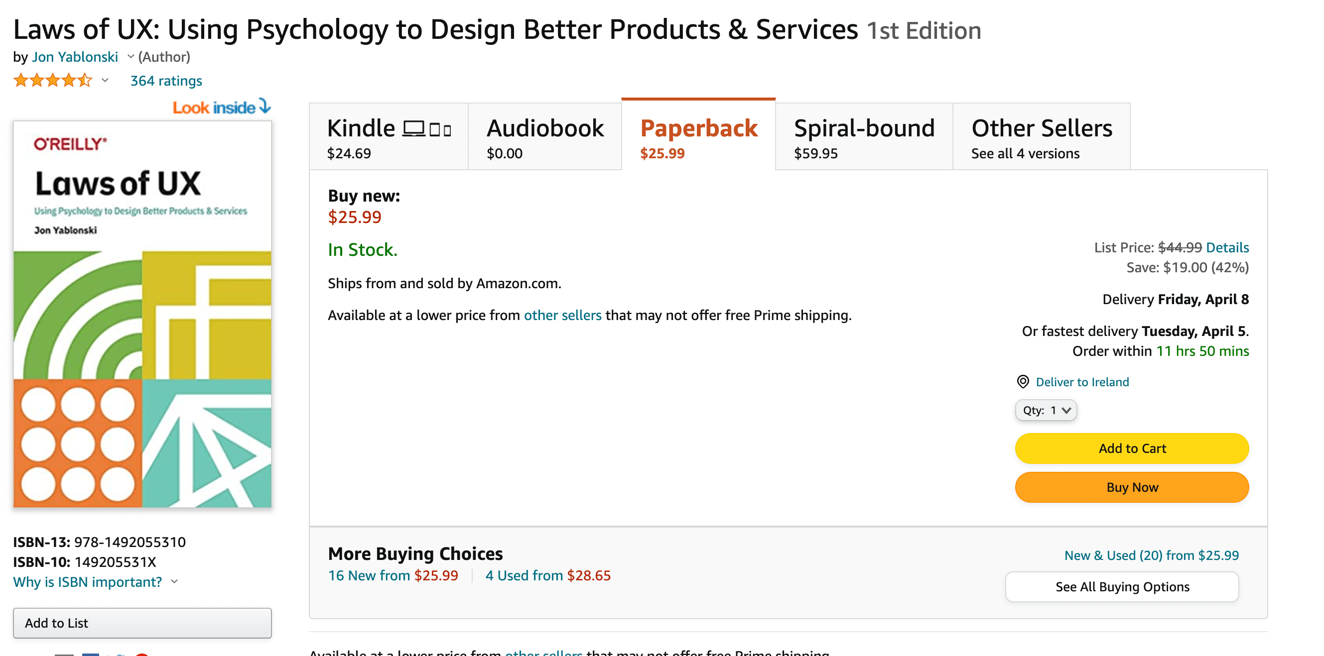
Amazon gives their users two options when they are reading up on a product: add to cart or buy now. The first allows them to keep browsing and return to the product later, and the second option allows them to buy the product instantly.
Prioritise information
Users usually take a “skim reading” approach to whatever page they are on, with the brightest or biggest font style drawing their eye to the most important information. Inspired by Gestalt’s focal point principle, the brain appoints a visual hierarchy on things that stand out from a regular pattern. Anything that doesn’t follow a pattern grabs our attention first and anything that does comes second.
“Chunk” similar sections
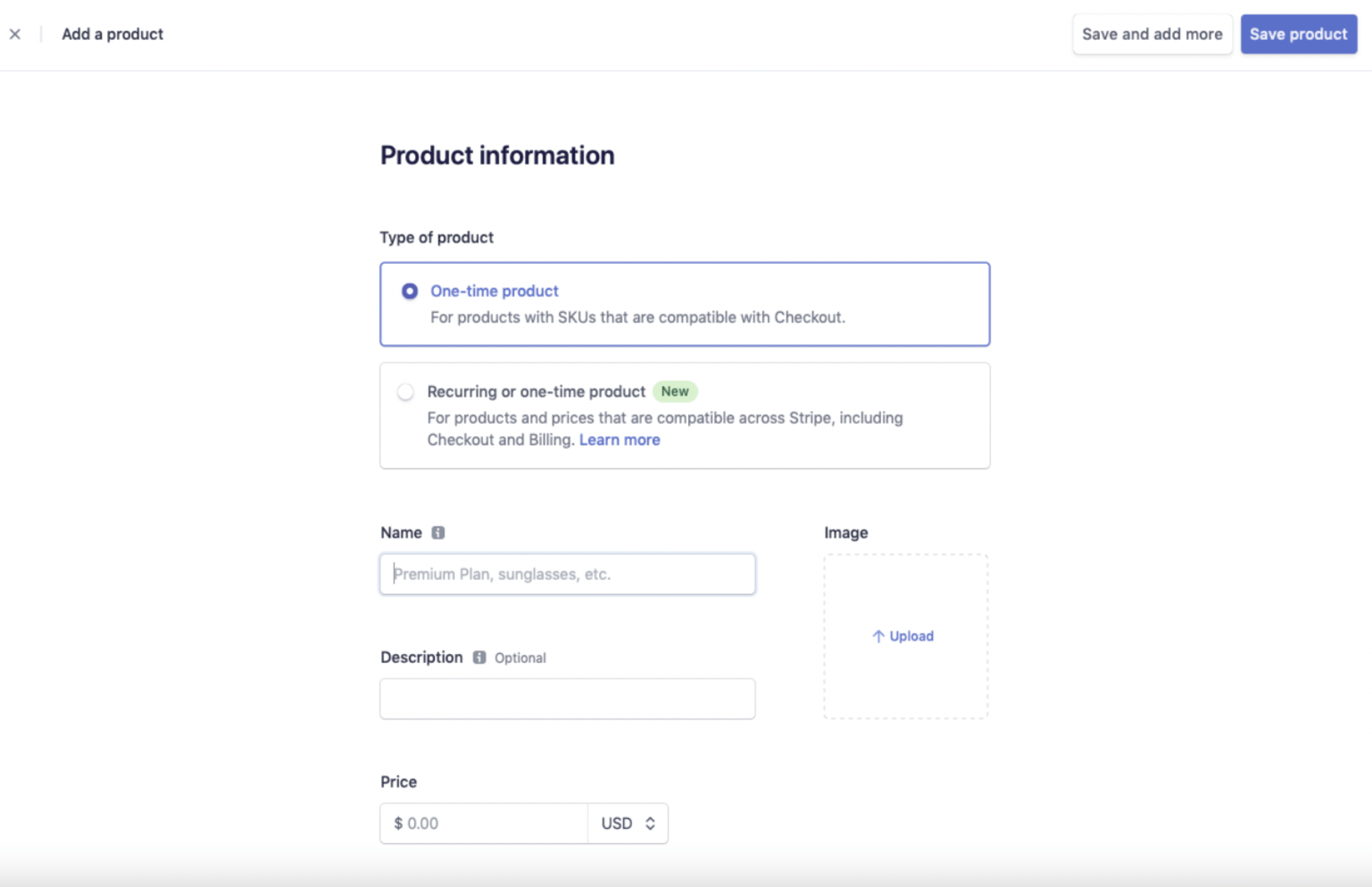
Instead of having multiple categories that cater to the extreme individual purpose of each feature or product, group similar items in one section for a sensical and relatable experience. This is referred to as “chunking” and it stems from Miller’s Law, which suggests that the average person can keep roughly seven items in their working memory. By “chunking” and adding a defining border around each group, the user can share and process data faster and remember it more easily.
When creating a product in Stripe, they chunk each section very clearly so that the listing process is quick, easy and very clear.
Stripping back on features is one of the most beneficial things you can do in UX and if you’d like to read more about improving UX, read this guide on choosing the right UX and UI protoyping tools, our favourite documentation tools, our top ten wireframing tools and our ultimate guide to the best UX tools you should be using this year.



![The 10 best prototyping tools for UI/UX designers [2025 Update] 9 UI UX prototyping tools header image](https://www.uxdesigninstitute.com/blog/wp-content/uploads/2025/01/93_UX_Prototyping-tools_Illustration_blog-1.png)