 1")
Some products fit seamlessly into our day-to-day lives. They take the hassle out of annoying or complicated processes or bring fun and motivation to an otherwise dull or challenging task.
Some products seem to serve no purpose at all or present more problems than they actually solve. Others attempt to address a sticky pain point but fail miserably.
That’s the difference between good and bad product design—and you’ve no doubt experienced both.
But what is it that separates great products from mediocre ones? What exactly does good product design look like in action?
Keep reading. In this post, we explain what defines ‘good’ product design and share 5 real-world examples.
What is product design?
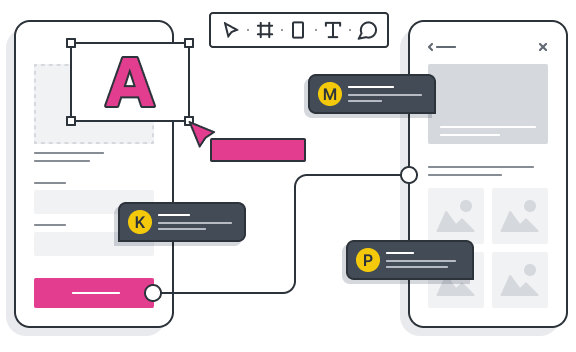
Product design combines research, strategy, UX and UI design to create products that are useful, user-friendly, and aesthetically pleasing. The goal of product design is to effectively solve a specific problem and fill a gap in the market.
With the ever-accelerating boom of digitalisation, product design is a burgeoning field. The global product design and development services market is expected to be worth an astonishing $32.93 billion by 2030 (that’s a compound annual growth rate of 10.08%).
The need for product design skills has never been greater, and product designers find themselves in increasingly high demand.
According to the UX Design Institute’s State of UX Hiring Report 2024, 66% of hiring managers surveyed expect to recruit UX and product professionals in 2024, with UX designers, UX researchers, and product designers at the top of the hiring list.
In a similar vein, careers website Zippia predicts a promising job outlook for product designers. Product designer roles are expected to grow at a rate of 3% between 2018 and 2028, and product designer salaries have also increased by 6% in the last five years.
Product design is critical for bridging the gap between technology (which is getting more and more advanced) and the people who use it. In the digital realm, it spans everything from apps and websites to software, virtual reality experiences, e-commerce platforms, and more.
We’ll delve into some real-world examples of awesome product design shortly—and you can learn more about what product design is (and the process behind it) in this guide.
How do you know if a product design is ‘good’?
Good product design:
- Serves a functional purpose by providing a solution to a specific problem. It’s not about design for design’s sake, but rather, filling a gap in the market and creating something that people actually need.
- Is usable and user-friendly. Product designers must create products that are easy to use, understand, and navigate. In a digital context, this involves designing systems and interfaces that are intuitive, straightforward, consistent, and predictable, in line with the fundamental principles of user experience (UX) design.
- Is aesthetically pleasing. You’ll notice that, in addition to being delightfully straightforward, all the best digital products look great. Good product design usually shows up in the form of a clean, clutter-free interface, a visually appealing colour scheme, and compelling animations and microinteractions. Learn more about what good UI design looks like with these examples.
Now we know what product design is and what constitutes good product design, let’s explore some of the best product design examples within the digital realm.
5 inspiring product design examples (and what we can learn from them)
1. Forest mobile app for focus and productivity
Forest is a mobile app designed to help you stay focused and avoid distractions while working, studying, or socialising. Whenever you want to focus on a particular task, you simply open the app and set a timer for how long you’d like to go uninterrupted.
With each timer set, you plant a virtual tree that grows for the duration of your task. However, if you exit the Forest app or use other apps before the timer is up, your tree will wither and die.
For every focus session successfully completed, you earn virtual coins which you can spend on planting a real tree, thanks to the app’s partnership with Trees for the Future.
 2")
 3")
What the Forest app teaches us about good product design:
The Forest app is a great product design example for several reasons. First and foremost, it has a clear and specific purpose, addressing a common problem that many people will relate to. That’s where every good product begins!
Not only does it provide a welcome solution to that problem; it does so in a way that’s intuitive, engaging, and highly motivational. The app is simple and easy to use thanks to the clear, straightforward interface, and it successfully uses gamification to add an element of fun and encourage repeated use.
2. Moleskine Timepage smart calendar app
You may associate Moleskine with high-quality notebooks and physical stationery, but did you know that they’ve now ventured into the realm of digital product design, too?
Moleskine Timepage is a smart calendar app that combines your events, maps, contacts, and weather into one easy platform, working with your existing calendar so you don’t need to set up anything new.
If you ever find yourself struggling to keep track of work meetings, social events, and personal appointments, Moleskine Timepage provides a welcome solution. Instead of switching between multiple apps, you can have a clear overview in one centralised location.
 4")
Screenshot of the Moleskine Timepage smart calendar app on mobile (above) and smart watch (below).
 5")
What the Moleskine Timepage app teaches us about good product design:
The Moleskine Timepage app highlights the importance of providing a seamless user experience. It takes a potentially complex and frustrating task—having to juggle many different events and appointments—and turns it into something smooth and easy.
The design is sleek and intuitive, and the app integrates seamlessly with other popular apps such as Google Calendar and iCloud. It also includes smart features such as predictive weather information for upcoming events, as well as plenty of customisation options.
This is great product design at its best, combining aesthetics, functionality, and usability while solving a real pain-point.
3. Splitify bill-splitting web app
Often, the best product design examples are also the most simple—like Splitify, a beautifully basic yet incredibly useful web app that takes the hassle out of splitting bills among a group.
We’ve all been there: that painful moment at the end of a meal when the bill comes and you have to figure out who owes what, not to mention factoring in the tip and any taxes. Splitify has been designed to solve this very problem, and it delivers the most straightforward solution imaginable.
To use this genius product, you simply visit the Splitify website, select your desired split method (even split, weighted split, or advanced weighted split), and enter the necessary details such as number of people, the items that each person ordered, the price of each item, and any additional fees on the bill. You can even add shared items under ‘table shareables’.
Once all items have been added, just press ‘Finish’ and you’ll see a clear table showing who owes what.
 6")
 7")
What the Splitify app teaches us about good product design:
You don’t need to create a visually stunning interface or add tonnes of fancy features to excel at product design. Often, simplicity is the best approach.
If the Splitify app had too many features and functions, it would only overcomplicate the (already complicated) process of trying to split a bill. In this case, the clear-as-day design, straightforward language, and deliberate absence of distracting visuals all ensure a smooth, accessible experience that everybody can use—tech-savvy or otherwise.
4. Sorted tax software for freelancers
Every freelancer will know just how taxing the admin of self-employment can be. Keeping on top of your cash flow, preparing invoices, and submitting all the necessary reports on time can quickly become overwhelming.
Throw in the added complication of doing it in a foreign country, in a language that’s not your native tongue, and you’ve got quite a task on your hands.
Fortunately, the creators behind Sorted spotted a great opportunity to simplify the topic of freelance taxes in Germany. They created a brilliantly user-friendly platform that syncs with your bank account to automatically track earnings and expenditure, calculates how much you owe (or are owed), and takes you through the process of submitting your income tax return at the end of the financial year—all in English.
The product interface is clean, clutter-free, and easy to navigate, and the product itself has all the features you need to stay on top of your accounts.
 8")
What Sorted teaches us about good product design:
Sorted teaches us two very important lessons about good product design.
First, the importance of user research. Sorted solves virtually every single pain-point associated with being a freelancer in Germany, which suggests that it’s the product of rigorous and extensive exploration of the target audience. This is crucial for any kind of product design, and especially so when you’re focusing on a niche or complex problem space.
Second: you don’t need to make a trade-off between functionality and simplicity. Although Sorted offers many powerful features—as it needs to in order to effectively serve its purpose—it’s still incredibly simple to use.
This is achieved through the very clean design, logical information architecture, and helpful microcopy featured throughout (also highlighting the importance of UX writing in the product design process).
In fact, the richer and more complex your feature set, the simpler your design should be. Good product design is all about usability, after all.
5. Rightmove online property portal
Rightmove is the largest online property portal in the UK, designed to simplify the process of finding your next home to buy or rent.
Without a product like Rightmove, sifting through the thousands of properties available and finding one that actually meets your requirements (and your budget) would be nigh on impossible. But, with this meticulously designed portal, you’ve got everything you need to streamline the search and make an informed choice.
You can locate suitable properties simply by typing in your desired postcode or drawing your search area, save properties of interest, keep track of your communication with agents, and access a wealth of expert resources to guide you through the process.
The creators behind Rightmove have successfully built the go-to resource for property seekers in the UK, and it’s all thanks to excellent product design.
 9")
What Rightmove teaches us about good product design:
There are many moving parts to coordinate when looking for a property, and you could very quickly lose track of your search. However, Rightmove provides an excellent product design example by giving property-seekers complete control.
Everything about the portal has been designed to put you in the driver’s seat—from the simple search bar placed right at the top of the screen, to the advanced search and filtering options, right through to the in-portal messaging function.
The product interface itself is intuitive and aesthetically pleasing, featuring high quality photos, modern illustrations, and white space in abundance. Although the property listings are detailed and you’re presented with lots of information, it’s all packaged in a way that’s digestible and skimmable—ensuring that your property search is more enjoyable than overwhelming.
And, last but not least, an important factor for digital product design: the Rightmove portal is fully optimised for mobile, ensuring a seamless experience from one device to the next. This allows you to pick up where you left off, whether you’re searching at home on your laptop or with your smartphone on the go. The best digital products transition fluidly across platforms and devices, and Rightmove has nailed that perfectly.
Learn more about product design
We’ve shared just a handful of brilliant product design examples, and there are thousands more out there. All of these products make our lives easier in some way—and none of them would exist were it not for the talented product designers who created them. And, as our world grows increasingly digital, product design skills are more important than ever.
If you’re curious about what it’s like to work in product design, check out these posts for further industry insights:
- What does a product designer do? The role, skills, and salaries
- What separates great designers from good ones? An interview with Adam Glynn-Finnegan, Staff Product Designer at Netflix Studio
- A day in the life of a product designer with Revolut’s Margarida Botelho
Already thinking about your own product design career? Learn how to design the products of the future with the UX Design Institute’s 9-month Product Design

Emily is a professional writer and content strategist with an MSc in Psychology. She has 8+ years of experience in the tech industry, with a focus on UX and design thinking. A regular contributor to top design publications, she also authored a chapter in The UX Careers Handbook. Emily also holds a BA in French and German and is passionate about languages and continuous learning.


 12")