User experience design may seem like an all-cognitive, all-rational affair. But the reality is that emotions play a huge role in UX. From the moment we land on a website, pull up an app, or start to play a VR game, we are having an emotional response, even if that response is subconscious. Emotion may make us love one app and reject another, even if we’re not aware of that response. As a result, understanding how to design for emotions and build better affective interfaces is vital to good UX design.
In this article, we’ll explore the basics of emotion in UX design and affective interfaces. We’ll also share some examples and consider how to apply emotional UX design to your own projects.
Here’s what we’ll cover:
- The role of emotion in UX design: What is emotional design in UX?
- What is an affective interface?
- Three levels of emotional processing
- What are some examples of emotional design and affective interfaces?
- How to apply emotional design in UX
- Wrapping up
Let’s go!
The role of emotion in UX design: What is emotional design in UX?
Emotional design is about designing in a way that elicits emotions, such as excitement or satisfaction, to deliver a positive experience for the user. This is one way for UX designers to create products that are not only useful and valuable, but also a joy to use.
In fact, products that evoke positive emotions are bound to have a bigger impact than those that evoke neutral emotions. Consequently, products that trigger positive reactions are bound to lead to greater user loyalty and create a more impactful user experience.
What is an affective interface?
Affective interfaces are user interfaces that appeal to the emotional experiences of the user. A 2017 thesis at the University of Saskatchewan found that affective interfaces have a significant effect on human judgement and decision making. In fact, affective interfaces change human emotions. This is a powerful demonstration of the effect of emotional design on human behaviour.
Through emotion in UX design, UX designers are trying to get users to be loyal to the product or brand. But affective interfaces can do so much more than that, if required. They can influence decision making and emotions, guiding the user towards certain actions which may be in line with the company’s goals.
While this may feel sinister, most companies have the intention of getting their users to like them. In the process, their affective interfaces will appeal to the positive emotions of their users. Appealing to their users’ positive emotions will impact their success, and ultimately their bottom line.
Three levels of emotional processing
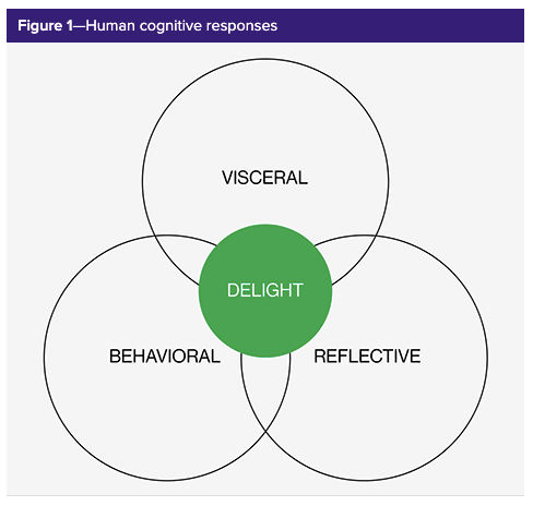
When exploring how designs can influence people’s emotions, Don Norman defined three different levels of emotional processing: visceral, behavioural, and reflective.
- Visceral: This is the first level of emotional processing and it happens when the user first encounters a product. Our responses are subconscious and instinctive and related to sensory information, such as how the product looks and feels.
- Behavioural: The middle level of emotional processing, this relates to the product’s usability and whether or not we like it. This level lets us evaluate the ease of use or behavioural experience of a product and analyse the consequences of that experience. How user-friendly was the solution? How long did it take to find? Good behavioural design encourages trust.
- Reflective: The highest level of emotional processing, this involves conscious thought, interpretation, and reasoning. Here, a user strives to predict the impact of the product on their life and reflect on its impact on their self-image, through things like features, meaning, and cultural aspects. Users form an overall impression at the reflective level.
The best emotion in UX design incorporates all three levels of emotional processing. When a design appropriately appeals to all three levels, users will have a positive experience.
Source: UXmatters.
What are some examples of emotion in UX design and affective interfaces?
Here are a few examples of emotional design.
Threadless
Threadless sells t-shirts and other apparel. Their clothes are made by artists who use the site to make money. Therefore they owe it to the artists and to the users to make the best impression possible.
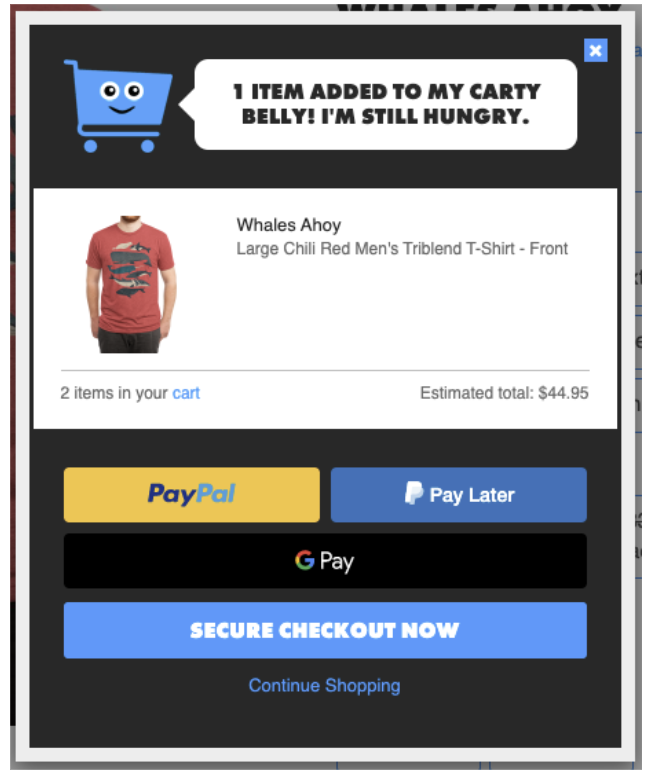
They do that by using emotional design to provide little details of humour. When you navigate to any t-shirt and decide to buy it, when you click on the “Add to cart” button, you see the friendly cart and a message in text that says something like “1 item added to my carty belly! I’m still hungry.”
Source: Threadless.com.
The happy looking cart with a humanoid face is charming and the copy changes each time you click the “add to cart” button to express the cart’s pleasure. This makes adding items to your cart fun, and it still influences you to buy.
Squarespace
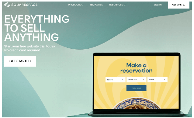
Squarespace is among the most popular website builder tools, providing everything you need to make the process simple and easy. There’s only one problem: there are many services like this. So what differentiates Squarespace?
The home page does an excellent job of summing it up. In clean, crisp copy, the site explains that it offers “Everything to sell anything.” Then it offers a free website trial with no credit card required.
Source: Squarespace.
This is not only a great tagline; it uses storytelling principles, a major tenet of emotion in UX design, to tell a story. The tagline evokes a personal narrative for anyone who goes to the site to create a website or other product; one where their website or other product manages to make them all kinds of money. That’s a powerful story full of emotions like joy, self-esteem, and pride.
GEICO
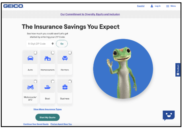
Source: GEICO.
GEICO insurance is known for having a gecko as its mascot, and mascots are a major facet of emotional design. The large gecko greeting you draws the eye and introduces whimsy into the experience. It also makes it that much more likely that you’ll fill out the quote finder because you like that feeling of whimsy.
Insurance is typically not a fun thing to worry about, but the gecko makes it bearable, plus the gecko makes the GEICO brand memorable in a way it wouldn’t be otherwise. It’s no wonder the gecko is featured so strongly on the home page.
How to apply emotion in UX design
The key elements of emotional design are all about building an emotional connection with your users. The goal is to make users feel a specific way, whether that’s amused, delighted, or even angry when the product requires it.
Here’s how you can apply emotional design and create a more impactful user experience:
- Design a personality: Engage users through a mascot or other consistent images. This will be a positive experience for users while giving the product a signature personality.
- Create a strong brand: Use a unique theme and keep it consistent. Some brand elements should be available on each page. This will give a great first, third, and three hundredth impression of the product.
- Create the right tone with copy: The font should suit the image you’re going for and the copy itself should be appropriate.
- Tell stories: Use principles of narrative design to provoke desire, like showing them part of a product before sign up or testimonials before they buy. You can learn more about how to use storytelling in UX design here.
- Use humorous messages: Use playful or humorous messages throughout the experience, especially in error messages.
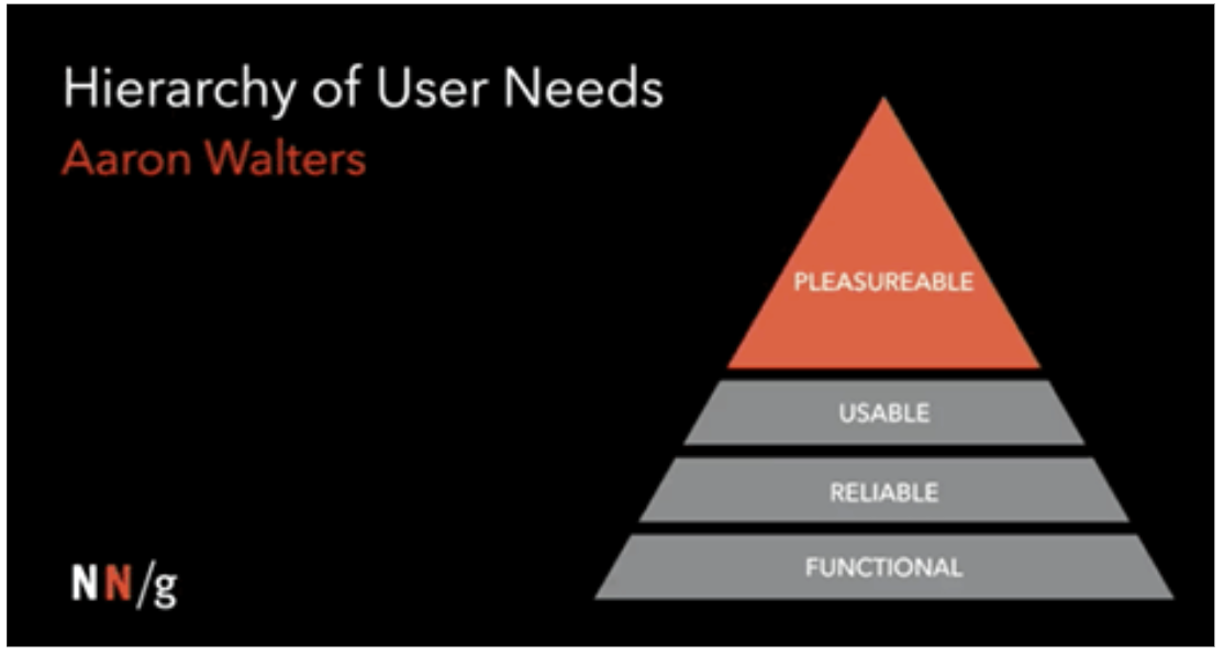
But most of all, make sure your foundation is solid before applying emotional design principles. Aaron Walters says that in order to make a product work, you need to apply a four-tier pyramid that goes from functionality to reliability to usability and finally to pleasurability. Unless the other three tiers are well made, the pleasurable layer—the layer that has to do with emotional design—won’t stick.
Source: UXmatters
Wrapping up
This guide should help you get started with emotional design in UX. Specifically, after making sure you have a solid foundation in functionality, reliability, and usability, don’t forget about pleasure, or emotional design. There are many ways you can implement emotional design, including humorous messages, telling stories, designing a personality with a mascot or other consistent images, building a strong brand, and creating the right tone with copy.
Want to learn more about creating powerful user experiences? Read about a day in the life of a digital product designer at the LEGO Group, or check out these 7 examples of good digital UX.

![The 10 best prototyping tools for UI/UX designers [2025 Update] 9 UI UX prototyping tools header image](https://www.uxdesigninstitute.com/blog/wp-content/uploads/2025/01/93_UX_Prototyping-tools_Illustration_blog-1.png)