From the time we’re born, our lives are filled with stories. Whether it’s a fairy tale, a narrative about our family or an anecdote about why we’ve chosen to use a specific product, we’re hard-wired to pay attention to stories. As a result, stories are how we understand the world and our place in it.
While it may seem far removed from the characters and plots that make up stories, storytelling in UX design can actually be a useful tool in a UX designer’s toolbox.
Storytelling in UX design is a phrase that you may have comes across in articles or discussions around UX design but it’s really another way of looking at or understanding the UX design process.
In this post, we’ll discuss how storytelling can enhance UX design by covering the following:
- An introduction to storytelling in UX design
- Using storytelling to understand users
- Using storytelling principles to improve UX design
An introduction to storytelling in UX design
A typical story, no matter how simple, follows a basic story arc. That arc begins with establishing who a protagonist is and what they want. A conflict that prevents the protagonist from reaching their goal is then introduced, leading the protagonist to take action to attempt to get what they want and overcome the conflict.
This builds to the story’s climax. Following the climax, there’s a resolution of some kind – either positive or negative – and then the story comes to an end.
This arc is illustrated in the graph taken from Simple Usability:
If we think about a user as the protagonist of a story, we can see how this story arc maps onto a users’ journey. We see them encounter a conflict to reaching a goal, discover our product as a possible solution, use our product and (hopefully) resolve their conflict.
This means UX designers play a key role in a user’s story by creating designs that can help them meet their goal and resolve their conflict. Understanding how this story arc plays out as a user seeks out and uses a product can help a UX team better understand and emotionally connect with their users.
This connection will enable them to remember their users better, keeping their goals and issues top of mind as they create a product’s UX.
Stories engage many more parts of our brains than a simple list of facts or figures does. According to psychologist and UX consultant Susan Weinschenk, this is “because you are having a richer brain event, you enjoy the experience more, you understand the information more deeply, and you retain it for longer”.
As a result, using storytelling and story principles throughout the design process can result in a richer, more successful user experience.
Using storytelling to understand users
When UX designers start a new project, their goal is to understand the product’s users and what problems their product can solve for them. User research can answer these questions.
However, those results won’t have much weight if they’re not presented in a way that creates understanding and empathy for a product’s users. The easiest way to create understanding and empathy is through storytelling.
Here are two ways to make that happen:
Personas
UX designers use personas to define their target users. Personas are fictional representatives that sum up the general traits and goals of real users. When UX designers create a persona they usually give it a name, photo, demographic characteristics (like age and gender) and a series of issues and needs. This information could be presented as a list but it’s far more powerful to tell a story about the persona.
For example, if user research indicates a major group of users for a dating app we’re designing are divorced, middle-aged women with teenage kids and full-time jobs, your persona’s story might be something like this:
“Stacy is a 42-year-old banking executive who recently went through a rough divorce. Her kids stay with her during the week and with their father during weekends. Stacy feels ready to start dating again but between spending time with her kids and long hours at her job, she has little time to meet someone.
She’s nervous about dating again after being married for two decades. She wants to find a way to fit dating into her busy life while ensuring she’s not wasting time meeting people she isn’t interested in.”
This is a memorable story that creates empathy for Stacy and it will enable the UX team, as well as clients and stakeholders, to get on the same page about who they’re designing for and why.
With the additional emotional component of storytelling, the whole team is likely to be more motivated to try to solve Stacy’s problems through their product, instead of focusing on their own perceptions of what the product should be. As a result, the product will be more user-centric from start to finish.
User scenarios
Using storytelling to bring personas to life is only the first step in understanding our users. It introduces the protagonist and their goals but that’s just the beginning of the persona’s story. To continue their story, we need to create user scenarios.
Scenarios address how a user will interact with our product and how they will use it to solve their problems. Scenarios can be simple or complex but they should be presented in the form of a story with a beginning, middle and end that takes the user from problem to solution.
For example, from her persona, we already know Stacy wants to start dating again but she is nervous about reentering the dating pool and has limited time to fit dating into her schedule. A scenario could lay out a sequence of steps that tell the story of how our dating app could meet her needs.
That scenario could look like this:
- Stacy discovers our dating app and its emphasis on divorcees with children.
- Stacy downloads the app and creates a quick profile. She fills out a questionnaire about what she’s looking for in a potential partner, including demographic characteristics, what interests she’d like a partner to share and how serious a commitment she’s looking for.
- The app uses a special algorithm to suggest potential partners to Stacy, which she can approve or deny.
- After a few days, Stacy finds one of the people she was interested in has also expressed interest in her. The app already provides information on Stacy’s and her date’s schedules, enabling them to easily plan a coffee date at a time that’s convenient for both of them.
This scenario could expand to cover how Stacy interacts with or adjusts her app usage after her date. Additional scenarios could also be created to explain the app’s features and how Stacy uses them in more detail.
These scenarios would all follow the story arc that begins with Stacy recognising a conflict or obstacle to meeting a goal (an inability to find a date) and ends with Stacy finding a resolution to that conflict (finding someone to go out with) by using the app.
While user scenarios can be presented on their own, presenting images and photos with each step in the scenario will ensure each story scenario is even more powerful and emotionally resonant.
Using storytelling principles to improve UX design
As the scenarios discussed above demonstrate, user experiences follow a pattern that unfolds like the story arc from the beginning of this post. As a result, it can also be useful to reference story principles when making decisions about a product’s UX design.
Pragya Bhardwaj of Solute Labs suggests there are three key storytelling principles that are especially important to consider in UX design: pacing, sequence and tone.
Pacing
Stories unfold at their own pace; some are quick and sleek, others are slow and deliberate. UX design is the same way. Choosing the right pace for your product can be the difference between drawing your users in or driving them away in frustration.
Pacing requires that users are served up an appropriate amount of information at the right time. If you provide too much information too quickly, users will get overwhelmed. If you provide too little information too slowly, users will get frustrated.
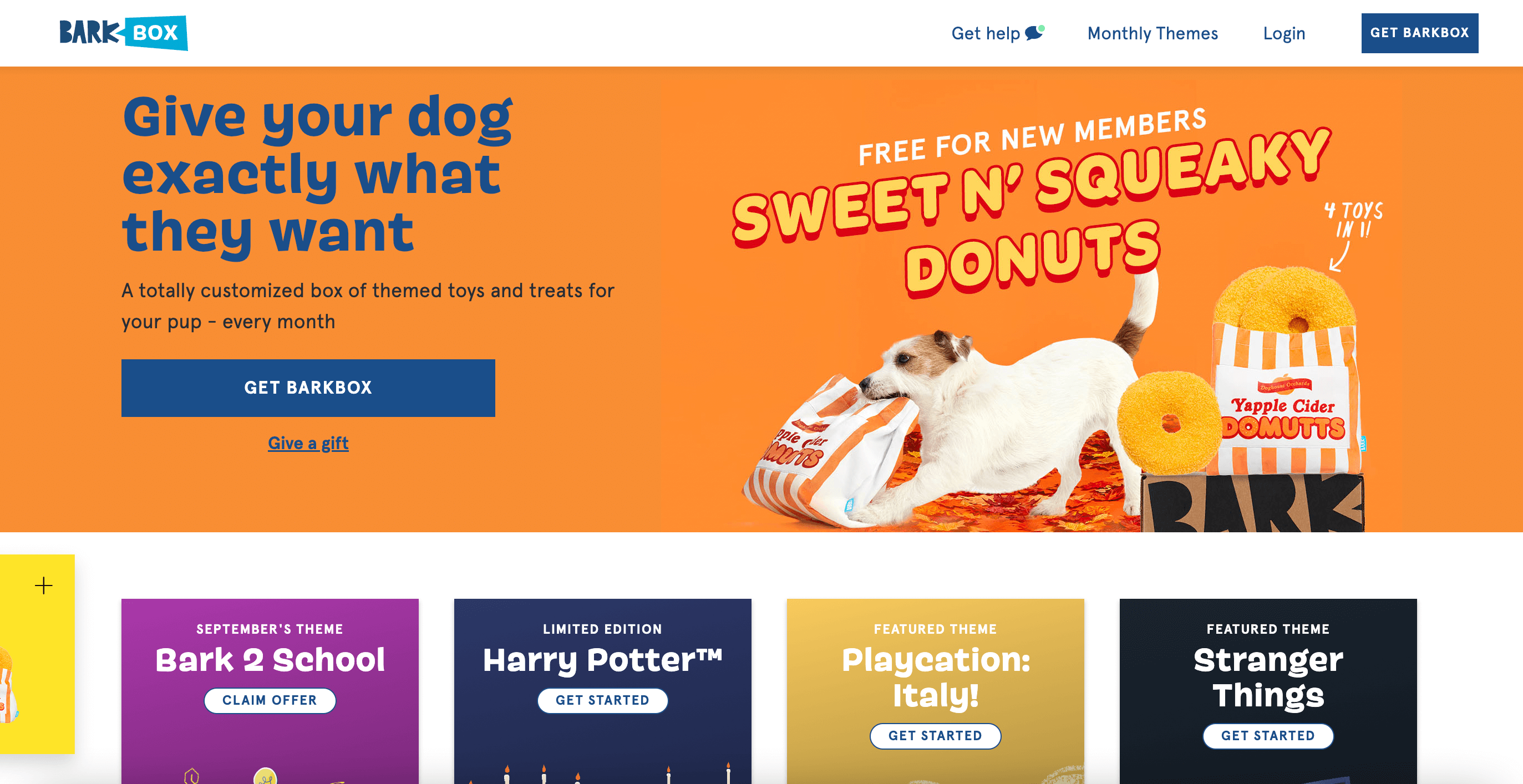
Consider the website for BarkBox, a monthly subscription box for dogs. The home page is paced in a way that gradually serves up more information to users as they scroll down while never becoming overwhelming.
The top of the page includes a value proposition with a cute picture of a dog playing with a toy, helping users envision what it would be like if they got BarkBox for their dogs.
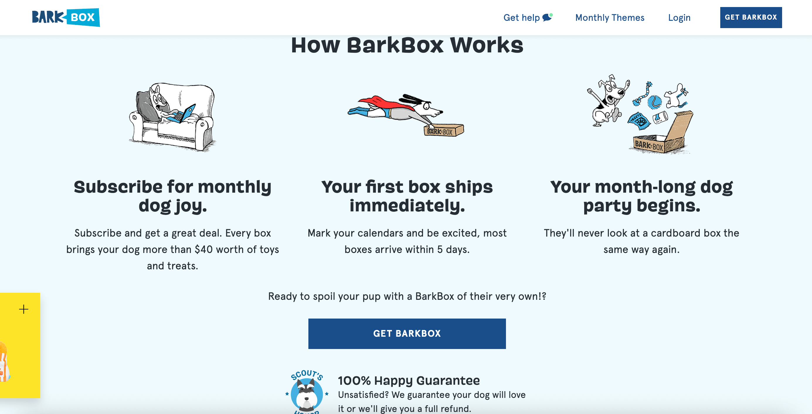
This is followed by thumbnails including more cute images and descriptions of BarkBox themes and then underneath this there’s information about how a BarkBox subscription works broken into three steps, with no more text than needed and adorable cartoon images.
The BarkBox homepage is well-paced and, as a result, friendly and engaging. It never overwhelms users by giving them too much information, nor does it frustrate them by failing to explain what they sell. Instead it uses images and text to provide just enough information to capture users’ interest.
Sequence
In order to follow a story from beginning to end, it must have an understandable sequence. If it’s not clear that the conflict came before the climax or that the climax happened before the resolution, the audience will become confused and won’t understand or enjoy the story.
Sequence is also important in UX design. While sometimes UX design is more like a Choose Your Own Adventure story, where users make decisions about where to go and what to do at key points, it’s important that the UX designer makes careful choices about when and where to help users access certain information and make certain decisions.
Let’s look at BarkBox’s website again. Clicking the link to sign up for the subscription brings users to a series of screens where they provide answers to a series of questions and then make their purchase. Each question is served up one at a time in a sequence from easier to slightly more complicated.
While the first screen asks users to enter their dog’s name and gender, later screens ask for their dog’s breed and allergies, to avoid getting boxes with specific kinds of treats. After the user answer several questions about their dog, they make decisions about what kind of subscription they want and finish up by providing their payment and shipping information.
This sequence is not only logical and easy to understand but it also creates anticipation. By asking users to answer questions about their dog first, the sign-up process gets users thinking about their pet.
This means that when they’re finally asked to commit to a subscription, they’re thinking about all the fun their dog will have with BarkBox, not the money they have to spend to purchase it.
Tone
Finally, pace and sequence work in tandem with tone. In a story, the tone helps the audience know what to expect, whether the story is dreamy and mysterious or jaunty and carefree. Products and brands must establish a tone also. Tone gives a product personality and perspective, and helps users know what kind of product they’re interacting with.
In a user interface, tone is established through the use of both words and images, which means both the UX and UI designers will have to work together to ensure the tone fits the product.
Using the BarkBox website as an example, from the moment users land on the homepage, the website establishes a light-hearted tone that’s all about the fun and anticipation of making the users’ dog happy. By extension, this makes the user happy.
That tone is not established by the words written on the site alone; the font, colour and image choices all work together with the words to contribute to BarkBox’s tone. Those choices ensure that users get an impression of BarkBox as a company that loves dogs and wants to provide toys and treats that will bring them joy. Since this is a goal BarkBox’s users will share, that tone will immediately make users like and trust BarkBox.
Conclusion
Every UX designer will look at their design process differently. Storytelling in UX design is one such way to break down the design process into a easy-t0-consume narrative for the designer, stakeholders and clients.
It’s an easy way to map out your product’s journey, from its conception to right up to its launch. So while other designers may view the journey differently, storytelling is a straight-forward approach to knowing who the users are and what they want to achieve with your product.
If you are interested in the different processes behind UX, you can read more about the 7 fundamental design principles all UX designers should know here. You can learn more about the importance of personas here and what an average day for a UX designer looks like here.





![The 10 best prototyping tools for UI/UX designers [2025 Update] 10 UI UX prototyping tools header image](https://www.uxdesigninstitute.com/blog/wp-content/uploads/2025/01/93_UX_Prototyping-tools_Illustration_blog-1.png)