Mobile apps have become an indispensable part of our daily lives in today’s digital world. From social media platforms to banking apps, we rely on these tools to connect with others, stay organised, and access information on the go. With so many use cases and so much opportunity for innovation, it’s no wonder mobile app design has skyrocketed as a field.
In this complete guide, we’ll explore the ins and outs of mobile app design—from core principles and best practices to real-world examples of awesome mobile app design (and what we can learn from them).
Ready to craft visually stunning and user-friendly mobile apps? Let’s learn!
What is mobile app design?
Mobile app design refers to the overall process of creating the visual and interactive elements of a mobile application. It’s a multidisciplinary field that encompasses everything from the user interface (UI) design, which includes the visual elements like buttons, icons, and graphics, to the user experience (UX) design.
A well-designed mobile app does more than just look good. It has to provide a seamless, intuitive experience for users. Mobile app design demands a deep understanding of user behaviour coupled with the technological constraints inherent to mobile platforms, e.g. screen size.
Unlike on desktop, mobile screens offer limited real estate, meaning designers have to approach mobile app design in a way that turns the limited space into an asset rather than a challenge. This means prioritising essential elements over others. Designers also have to carefully consider how users interact with the application, i.e. gestures like swiping, pinching, or tapping—and ensure the interfaces are optimised for touch.
Think of popular apps you use daily – from social media platforms to OTT apps. The reason they’re so ingrained in your routine is likely because of their easy-to-navigate design, logical flow, and inviting aesthetics—all of which are the result of a mobile app designer meticulously considering exactly how you would use the app. This careful balance of functionality, aesthetics, and accessibility is what makes mobile app design such an exciting and sought-after career path.
How to achieve the best mobile app design: 7 UI principles
Designing a mobile app is as much an art as it is a science. It’s not just about the visual appeal, it’s about how users interact and engage with the application. To create a successful mobile app design, here are five key UI principles to keep in mind:
1. Simplicity is key
In mobile app design, less is more. A cluttered interface not only detracts from the user experience but can also overwhelm and confuse users. The most memorable and effective mobile designs prioritise simplicity, showcasing only the most essential elements and functionalities. Every design choice should have a clear purpose. By eliminating excess and embracing simplicity, you can create a more focused and user-friendly app environment.
2. Consistency matters
Consistency forms the backbone of trust in design. When users encounter consistent UI elements—whether it’s fonts, colours, or button styles—they quickly become familiar with the app’s environment, making navigation and task execution more intuitive. This consistency shouldn’t just be superficial; it should extend to interactions, gestures, and feedback mechanisms. Establishing a design system or style guide early on can be invaluable. It serves as a blueprint, ensuring that the design remains uniform across various screens.
3. Prioritise readability
Apps communicate with the user, usually through text. This makes the choice of typography, font size, and contrast extra important. The textual content should stand out against its background, ensuring users don’t have to strain or struggle to absorb information. Given their size, mobile screens present unique challenges for readability, making it even more crucial to opt for fonts and sizes that are legible (even at a glance). An app’s design might be aesthetically pleasing, but if its content isn’t easily readable, you’ll struggle to keep your users happy.
4. Feedback is crucial
Imagine pressing a button and nothing happens. Without feedback, users are left in the dark, wondering if their actions were processed. Whether it’s a swipe or a tap, every interaction with the app should elicit a response. This could be in the form of a subtle animation, a colour change, or even haptic feedback. These microinteractions reassure users that their actions have been registered—as well as adding some personality to the app.
5. Design for thumbs
With mobile devices predominantly being handheld, a significant chunk of user interactions are thumb-driven. This physiological reality should shape design decisions. Primary actions and essential elements should be within easy reach of the thumb, ensuring users can navigate and interact with the app comfortably. The concept of the “thumb zone,” which refers to the most accessible areas of a mobile screen for the thumb, should guide the placement of key UI elements. By catering to this thumb-driven navigation, designers can enhance usability and ensure a smoother, more natural user experience.
6. Strategic use of push notifications
Push notifications can be a double-edged sword in mobile app design. When used effectively, they keep users engaged and informed. But if overused or poorly timed, they can easily annoy users and lead to app uninstalls. Try to find a balance here: A well-crafted push notification strategy factors in the user’s preferences, time zones, and interaction patterns. Notifications should provide real value, whether it’s an update or reminder. Offering users the flexibility to customise their notification preferences can also enhance their overall experience (which is ultimately the end-goal).
7. Embrace personalisation
In the age of data-driven experiences, personalisation has emerged as a cornerstone of user-centric design. Users have come to expect apps to cater to their unique preferences, habits, and needs. An app that remembers a user’s preferences, offers content based on past behaviour, or even greets the user by name can make the experience feel all the more special. Whether it’s through AI-driven content recommendations, personalised user interfaces, or adaptive features, personalisation can significantly enhance user engagement and satisfaction.
You can learn more in our guide to UI design best practices when designing for mobile.
Awesome mobile app design examples
Now that we’ve covered the principles and best practices in mobile app design, let’s take a look at some inspiring examples to spark your creativity.
Citymapper
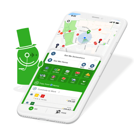
Doing exactly what it says on the tin, Citymapper is a popular travel app that makes urban commuting seamless—whether you’re in your hometown or exploring somewhere new. The app shines by offering real-time public transportation data, as well as fast alternative commute options.
What they got right: With its vibrant colour coding, Citymapper makes navigating complex city transit systems intuitive. Its design cleverly incorporates real-time data and feedback, helping users quickly choose the best route for them. It consolidates multiple transportation modes, from walking to ride-sharing, painting a complete picture for the commuter.
The app also cleverly uses colour coding to draw the users’ attention to key elements, while keeping the overall theme green and white to avoid confusion.
Takeaway: Citymapper exemplifies the need for dynamic, real-time content in apps while emphasising the role of colour in enhancing user navigation.
Notion
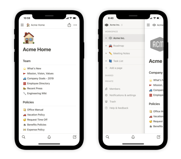
Notion is an all-in-one productivity and workspace tool that seamlessly integrates note-taking, task management, databases, and collaborative workspaces into a single platform—making planning and ideation easier than ever.
What they got right: Where most apps focus on singular functionalities, Notion brings them under one roof without overwhelming users. It boasts a modular design, allowing users to tailor their workspace based on their needs. Its drag-and-drop functionality, combined with a minimalist design, makes ease of use the priority.
Takeaway: Notion is a masterclass in making complex, content-heavy apps easy. It shows that with intuitive design principles, even multifaceted apps can offer a smooth user experience.
Spotify
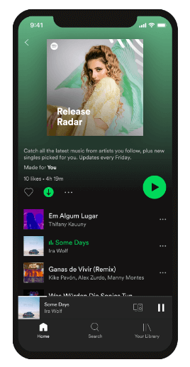
Spotify stands as a giant in music streaming, connecting millions with a vast library of songs, playlists, and podcasts from artists and creators worldwide. When you think of the word ‘playlist,’ you think of Spotify.
What they got right: Spotify’s mobile design lies in its personalisation. The app constantly curates and evolves its song recommendations based on individual listening habits, seamlessly presenting users with playlists like “Discover Weekly” and “Daily Mixes”. This tailored approach ensures that users continually encounter new yet relevant music, enhancing their overall listening experience.
Takeaway: Spotify emphasises the importance of data-driven personalisation in app design. From Spotify, we can learn that understanding and catering to individual user preferences can significantly boost engagement and user satisfaction.
Useful tools for mobile app design
To bring your mobile app design ideas to life, here are some indispensable tools that can streamline your workflow.
- Figma: Figma’s browser-based nature makes it a go-to choice for mobile app design. It offers pixel-perfect precision, ensuring designs look impeccable on mobile screens of all sizes. What’s more, Figma’s comprehensive component library streamlines mobile-specific UI elements, speeding up the design process.
- Framer: As we explored earlier, mobile app interfaces aren’t just about looks; they’re about feel and interaction. This is where Framer shines, letting designers prototype intricate mobile-native interactions. With its intuitive drag-and-drop interface, designing mobile app animations and interactions becomes a tactile experience, mirroring the hands-on interaction users have with mobile apps. Framer’s adaptability also helps designs look and function properly across different mobile devices.
- InVision: The strength of InVision in the mobile app realm lies in its ability to create rich, interactive prototypes from static designs. It simulates the mobile user experience, giving designers and stakeholders a genuine feel of the app’s flow and functionality before development. Plus, its mobile mirroring feature, where prototypes can be viewed directly on devices, ensures an authentic representation of the final product.
- Adobe XD: As a versatile tool from the Adobe family, XD is fine-tuned for mobile app design. Its repeat grid feature is great for designing consistent UI elements common in mobile interfaces. XD’s auto-animate also ensures smooth transitions, mimicking the native mobile animations users expect from apps.
- Sketch: Renowned for its clean interface and precision, Sketch is a mainstay in mobile app design. Sketch has a wide range of plugins to choose from, many of which are tailored specifically for mobile design. Plus, with its artboard presets for various mobile devices, starting a new design for specific phone models is a breeze.
For more useful tools, check out this ultimate guide to the best UX and UI design tools.
Final thoughts
Designing a mobile app that truly stands out from the crowd and leaves a lasting impact requires a deep and comprehensive understanding of UI principles, user behaviour patterns, and the latest advancements in mobile technology.
By diligently following these guidelines and continuously learning from real-world examples of successful mobile applications, you will be well-equipped to create visually stunning, intuitive, and highly engaging mobile apps that captivate and delight your target audience.
If you enjoyed this blog post, we think you’ll enjoy our guide to designing for mobile: 5 best practices for content layout.
