Case studies are the cornerstone of any UX design portfolio. A well-written and formatted case study can make the difference between catching a hiring manager’s eye and being overlooked.
However, it’s not easy to figure out the best way to present a UX design case study, especially if you haven’t created one before. How much detail should you go into? How many images should you include? Should you only present polished final work, or should you show the iterations and setbacks you went through along the way?
This post will demystify the process of presenting a case study in your UX portfolio. While there is no one-size-fits-all method for creating a case study, these guidelines will give you a clear structure to follow.
We’ll first provide an overview of what a case study is, as well as a basic outline for writing them. Then we’ll dive deeper into each section that should be included in a case study, complete with real-world examples.
Here’s what we’ll explore:
- What is a UX design case study?
- How should a case study be structured?
- What should be included in each case study section?
- Final thoughts
What is a UX design case study?
A UX case study is a detailed summary of a project you designed. Case studies go beyond the polished final product of your design work to tell the story of one project from beginning to end. That means explaining through both text and images what the project was, how you and your team tackled the design problem, and what the final results were.
The objective is to give hiring managers insight into the way you think, including how you approach and solve UX problems and how you overcome challenges. This will help them understand how you’d fit into their UX team if they hired you. Each case study you include in your portfolio is a chance to showcase how you employed your strengths and skills as a UX designer at each stage of the design process.
As a result, the UX case studies you create will have a big impact on whether you are selected for a job interview. And, during an interview, you’ll likely be asked to talk about your case studies so hiring managers can learn more about your past UX design experience.
How should a case study be structured?
Case studies can help your UX portfolio stand out from other job applicants—but only if you can clearly articulate your design thinking and process through them. The best way to do this is to think of each case study as a story with a beginning, middle, and end.
Each section of your case study should build on the previous section as you guide your reader from the inception of the project to your final deliverables. Along the way, you should include clear, concise explanations of what you did alongside images of the project. In addition, each section should be presented with a strong visual hierarchy so that readers can easily understand both the project and your contributions to it by scanning your case study .
Each case study will be different depending on the project you’re explaining and the details you’re highlighting. However, the following is a general outline of the main sections to include:
- Introduction
- The problem
- Users
- Process and iterations
- Final design solution
- Results and key takeaways
What should be included in each case study section?
Let’s outline the key information you should include in each section of your case study.
Introduction
In this section, you’ll provide context for the project. This is often the part of the case study that readers will pay especially close attention to, so it should be brief but informative. You’ll start with an overview of the project, including the company it was for and the product that you were tasked with designing.
You’ll then articulate your role and responsibilities on the project. Be honest about what you did and how you contributed. If the case study is about something other than a client project, such as a project for a class, you should mention that too.
You can also include details about the project that you’ll expand on later—such as the problem you were presented with, how you and your team began to approach the project, and some information about the results of the design you ultimately delivered.
For visuals, you can include anything from the logo of the company you were designing for, a picture of the “before” state of the product if you’re detailing a redesign, or an image of the final product you designed.
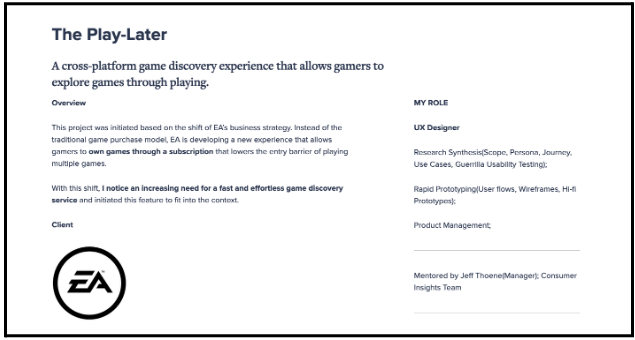
A good example of a case study introduction can be seen in Yi Tang’s case study for a game discovery experience, designed for the gaming company EA.
Source: Yi Tang’s portfolio
In the introduction, he provides a good overview of the project, including the client and the goals of the project, and his role and responsibilities are clearly articulated. Most importantly, the information is easy to scan and understand.
The problem
This is where you’ll start to get into the specifics of the project by explaining the design problem you were tasked with solving. Why was this project valuable to both the product’s users and the company’s business goals? Include any research or competitive analysis data that helps explain why the project was important, including any surveys of users or usage data.
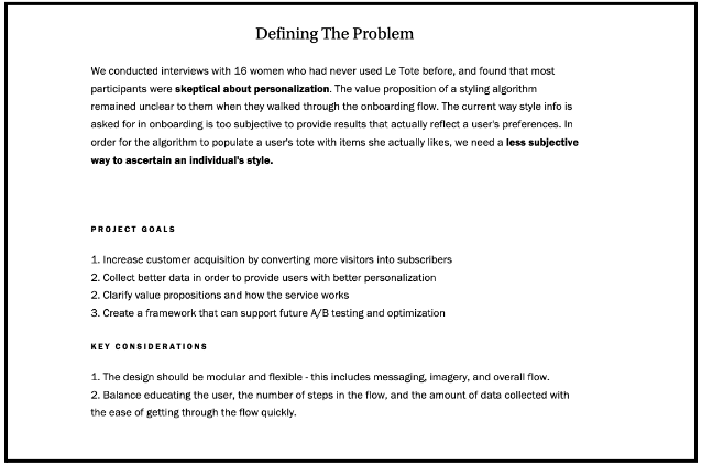
There are multiple ways to approach this section. For example, in her case study for Le Tote’s fashion rental subscription service, Helen W. Bentley explains the problem across several blocks of text, while ensuring that the key information stands out through the clever use of bold-faced type, a list of project goals, and a separate list of key considerations. All of this works together to explain why the project was necessary for the business and how it could help users.
Source: Helen W. Bentley’s portfolio
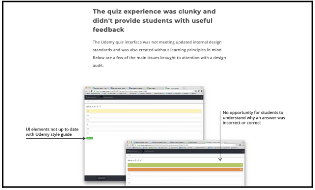
Meanwhile, in her case study for Udemy’s online quiz experience, Frances Tung uses a combination of text and images to explain the problem and why a redesign of the experience was necessary for both the company and Udemy’s users.
Source: Frances Tung’s portfolio
Users
In this section, you’ll go into more detail about who your users are. This section is the place to showcase any user research that was done for the project, and is especially important if you’re applying for a position as a UX researcher. If that’s the case, you might want to include images of transcripts or other documents that specify how you used research to better understand your users.
This section should also describe any findings about users’ goals and needs when it comes to the product, and include deliverables such as user personas and journey maps.
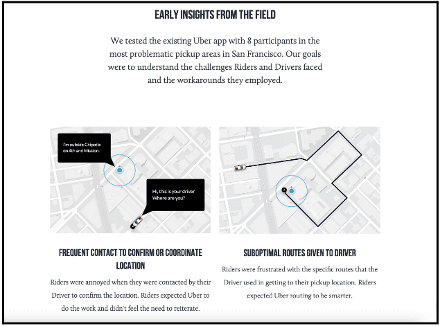
For one example, check out Simon Pan’s redesign of the Uber app’s pickup experience.
Source: Simon Pan’s portfolio
User research was conducted to understand users’ pain points with the current app. In just a couple of sentences, Pan explains the study that was performed to capture how users were thinking about the app experience. Pan then describes the findings that came out of it.
Process and iterations
For UX designers, this is the most important part of the case study because it’s a chance to demonstrate your design thinking skills, including how you make design decisions and how you respond to challenges and setbacks.
Here you’ll explain the steps you took to solve the problem and why different design decisions were made. Don’t be shy about detailing several iterations of the project as you got closer and closer to the final design solution. If you worked within specific constraints, encountered setbacks, or had to make compromises during the design process, describe those as well. They’ll help hiring managers understand how you respond to adversity.
You can include a range of deliverables in this section, including:
- Whiteboard or paper sketches
- Low or medium fidelity wireframes and prototypes
- Site maps
- User flows
Of course, you can’t include every document showing every iteration the design went through. So choose some good representative examples to give hiring managers an idea of how the project progressed over time.
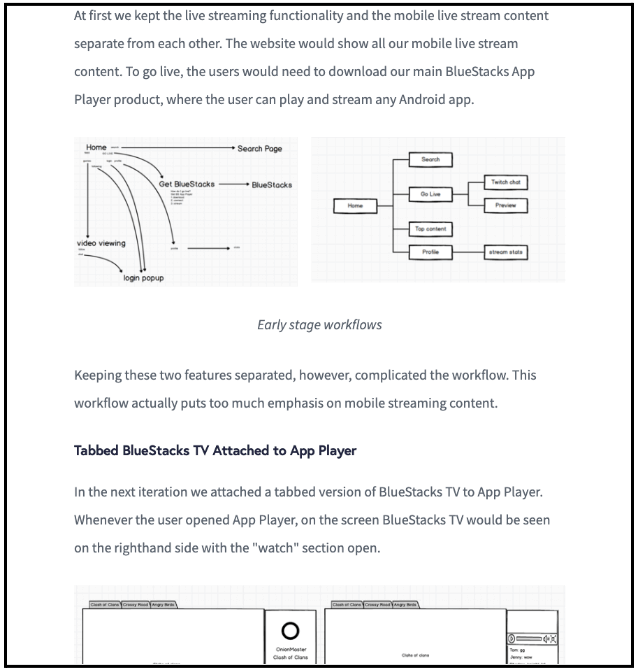
Consider Emily Yeh’s case study of a tool for BlueStacks TV that allows users to stream computer apps to Twitch. Emily tells the story of the various iterations the project went through, including why certain ideas didn’t work and what was done to improve them. She also provides one or two visuals to illustrate her thought process at each stage.
Source: Emily Yeh’s portfolio
Final design solution
This section is reserved for revealing the final design solution you arrived at. You should explain what went into any final design decisions, and include images of the final product (or high-fidelity mockups), as well as the final UX documents that you created, such as prototypes or wireframes.
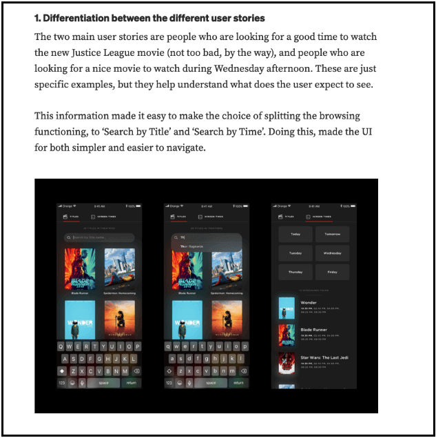
One good example comes from Ariel Verber’s case study of a redesign for a movie ticket booking app.
Source: Medium
He uses both text and images of the final product mockup to clearly explain how his solution arose from his user research.
Results and key takeaways
After you’ve presented the final design solution, it can be tempting to call it a day. But don’t! This final section will make a strong conclusion to your case study by explaining the impacts of your design solution (if you’re aware of them) and what you learned from the project.
For projects that have been launched, you should detail any results that demonstrate how the product improved the user experience and helped meet business goals. This could be analytics that show an increase in the number of users visiting or the average time spent with the product, metrics that demonstrate an increase in sign ups or purchases, or any data about improved user satisfaction you might have access to.
It’s also worthwhile to include a retrospective of the project that describes any learnings you took away from the experience. After all, no project is perfect. This is an opportunity to explain how working on the project helped you grow and evolve as a UX designer, including the next steps you’d like to take to make further improvements to the product, and anything that will influence how you approach other UX projects.
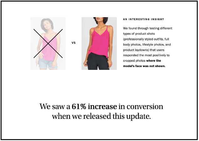
For example, in Helen Bentley’s case study for Le Tote, the final section describes a surprising finding from user testing that led to a simple change that had a big impact on conversion rates.
Source: Helen Bentley’s portfolio
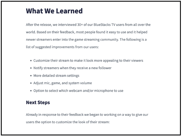
Meanwhile, Emily Yeh’s case study for BlueStacks TV’s tool to send apps to Twitch does a nice job of describing what her team learned from their initial launch of their product, as well as the next steps they are already in the process of designing.
Source: Emily Yeh’s portfolio
Final thoughts
Creating a UX design case study can feel overwhelming. But remember: you know your project best and should be able to clearly articulate it, both in writing and through images. While the focus in UX is often on designing deliverables, written and visual communication is also an important part of the job. A UX case study not only shows off your design thinking skills; it’s also a chance to demonstrate your communication abilities. If you can combine the two into a stellar case study, you’ll be all the more likely to get a hiring manager’s attention.

