[This article has been updated for 2024]
User experience (UX) design is the process of creating products and services that solve a specific user problem, while ensuring that the proposed solution is both easy and enjoyable to use. It takes a lot to get the user experience just right and there are many different factors to consider.
Fortunately, there are some universal UX design principles to guide you in making the right decisions and putting the user first.
What are the 7 user experience (UX) Design principles?:
The 7 principles of design that all designers should follow are:
1. User-centricity
2. Consistency
3. Hierarchy
4. Context
5. User control
6. Accessibility
7. Usability
We will go into more detail about each principle and why they are important to get right for your users to ensure the best user experience.
The 7 UX Design principles:
1. User-centricity
The first of the principles of user experience (UX) design, User-centricity, is to create products and services that solve user problems. As such, everything a UX designer does should be steeped in the principle of user-centricity.
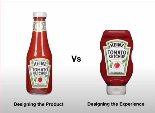
User-centricity means putting the user’s needs first and making decisions based on what you know about them and what they want from the product. For example, the individual who designed the ketchup bottle on the right probably did user research to discover that people would prefer this bottle design.
User-centricity is built into the UX process, starting with user research to identify the problem you need to solve and to understand who your target users are, moving through to user testing to gauge how well the product meets the user’s needs.
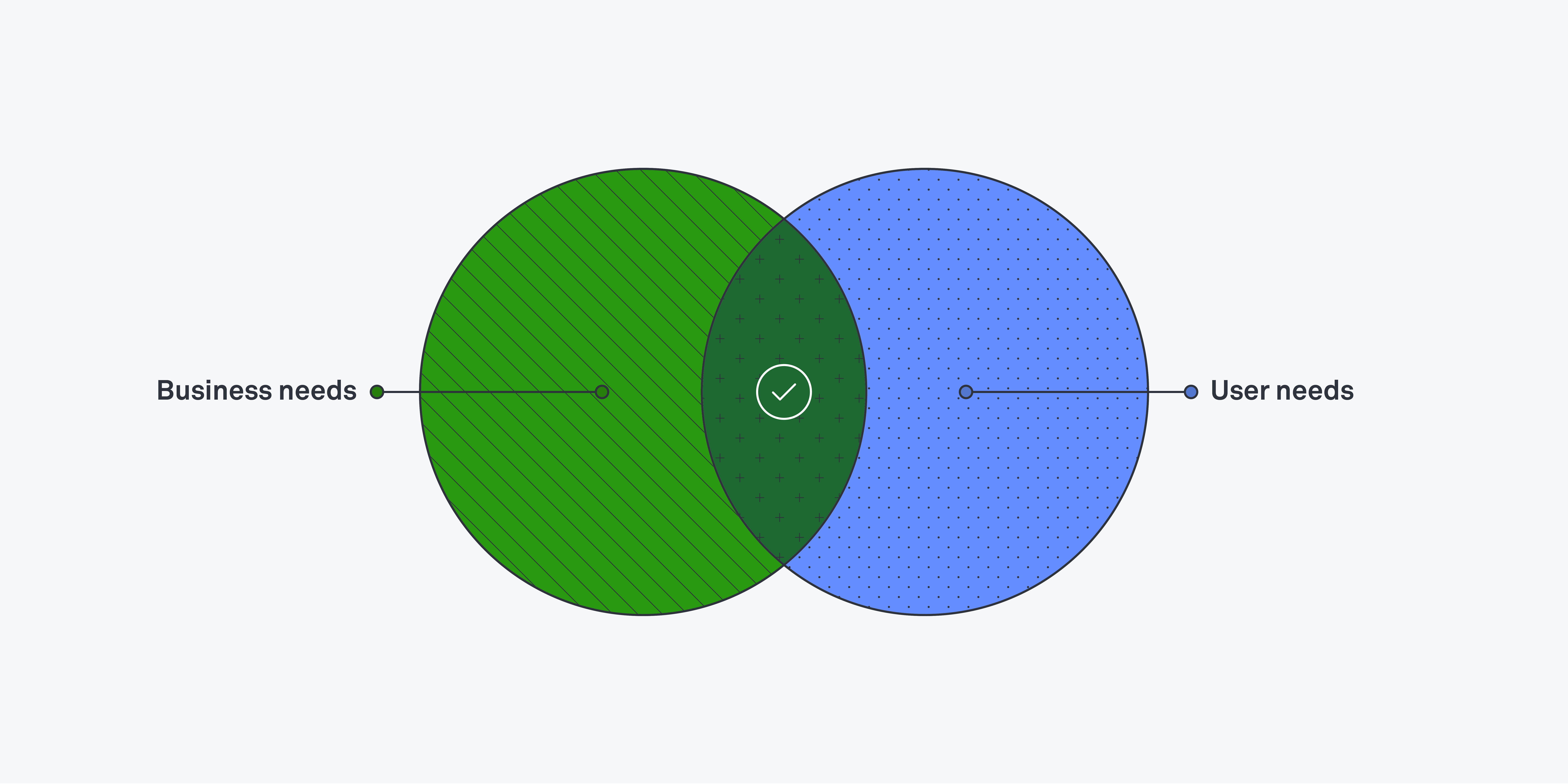
Whenever you tackle a new UX project, make sure you honour the user-centricity principle and do what’s best for your users while balancing the needs of the business.
2. Consistency
The second of the UX design principles, Consistency, is creating products that solve specific user problems, it’s essential to adhere to the UX design principle of consistency.
There are several layers to consistency in UX design. On the one hand, you want to keep your designs consistent in terms of how they look and function across all pages/screens and products within the same brand or product family. Whether it’s an app, a website, or a social media feed, there should be consistency in your visuals, such as buttons and links, and in your tone so, for example, your products are consistently business-like, irreverent, or playful.Maintain consistency and adherence to standards.
For example, in the first row in the graphic above, the icons used are consistant in size but not in style. Meanwhile in the second row they’re consistent in both, making them better to use across applications.
At the same time, consistency also extends to meeting the user’s expectations for the kind of product you’re designing. For example, if you’re designing a flight booking app, your users will come in with certain expectations of how the app should function based on their experience with similar apps on the market. You don’t need to copy your competitors, but equally, you don’t need to reinvent the wheel.
By being consistent with what your users expect, you’ll create a product that’s easy to use, with a very low learning curve for the user. That’s a key part of ensuring a smooth user experience.
3. Hierarchy
The third of the UX principles, Hierarchy, is an important UX principle as it shapes how the user navigates a product — and how easy or complicated the process is.
Hierarchy relates to information architecture as well as the visual hierarchy of individual pages and screens. As a rule, you’ll want more important elements at the ‘top’ of the hierarchy (i.e. more prominent and easier for the user to find).
So what’s the difference between information architecture and visual hierarchy?
Information architecture refers to the sitemap; the overall structure and organisation of your website or app and how the user navigates from one page or screen to another.
For example, if you land on a website home page, you’ll likely see different menu items at the top of the page. If you click on each item, you’ll either be taken to another page or be given more options to choose from (e.g. in the form of a drop-down menu). For instance, on the home page below, you’ll see a number of optoins when you roll over the “Get Involved” navigation item, but they’re organized by how important they are from left to right and up and down. So “Take action” is more important than “Travel with us.” This is all part of the website’s information architecture, with some items higher up in the hierarchy (i.e. more immediately visible) and others requiring more clicking around to find.
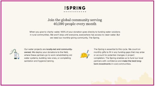
Visual hierarchy considers how individual elements are laid out on a page or screen. More important elements can be emphasised by placing them at the top of the page or screen, using larger font or using different colours to help them stand out. For example, in the page below, you’ll read the headline first and then get into the details further down the page because of the size of the fonts and how they’re arranged.
Hierarchy helps the user to navigate your product as it draws attention to the most important pages and elements, ensuring they can easily find what they need.
4. Context
The fourth of the UX design principles to bear in mind is context.
When designing a solution to a user problem, you can’t design in a vacuum. You need to understand who your users are and the context in which they’ll use your product(s). Context considers the circumstances in which your product will be used and how certain factors might impact the user experience.
As a designer, ask yourself: What device(s) might people use to access and interact with my product? Where might the user be? Are there factors such as noise which might interfere with the experience? What kind of emotional state are they likely to be in?
For example, mobile browsing is now the primary way most users access your website, so your website must be optimised to this form of web-browsing. So even though the website below looks beautiful when your browsing it on the web, it’s not set up for mobile browsing and therefore doesn’t work as well in that context.
Understanding the context around the interaction between your product and the end user will help you to factor in potential limitations (e.g. background noise, not being able to use hands while driving, etc) and design a better user experience.
5. User control
Another important element of UX design principles centres on giving the user the right amount of control over how they interact with a product.
Jakob Nielsen, co-founder of the Nielsen Norman Group, cites user control and freedom as one of the ten most important usability heuristics for web design. As explained on the NNG website:
“Users often perform actions by mistake. They need a clearly marked ‘emergency exit’ to leave the unwanted action without having to go through an extended process.”
This is especially true with AI automation. There must be a balance between AI and user control, that gives users the ability to override AI decisions. For instance, we’ve all experienced a text message fail where the AI that autocorrects our messages gets it wrong. There are ways to reverse this but usually we’ve hit “Send” before we’ve noticed there’s a problem.
10 autocorrect text fails you need to see right now
So, the principle of user control is all about helping users to correct or reverse errors without throwing the entire user experience into disarray. You can build user control and freedom into your product by incorporating “Undo” and “Redo” functionality, providing “Cancel” buttons and clearly labelling alternative actions and routes the user can take if they want to revert a particular action.
6. Accessibility
The sixth of the UX design principles, Accessibility, is critical to good UX and all UX designers have a responsibility to understand what it means and to factor it into the design process.
Accessibility is about ensuring your product or service is accessible to and usable for as many people as possible. It includes catering to the needs of people with disabilities, as well as understanding how different environments or situational factors might impact the user experience.
One example of designing for accessibility could be to use high colour contrast to ensure that text is legible for users with visual impairments. Check out the homepage below for an example.
For more real-world examples of accessible design in action, check out these websites which have nailed the accessible design principle.
7. Usability
The last of the UX design principles, Usability, is quite simply, a measure of how easy a product is to use. You can’t create a good user experience if your product isn’t usable – so of course it’s an essential UX design principle.
There are five components of usability to consider:
- Learnability: How easy is it for users to get to grips with your product the first time they use it? Things like consistency and information architecture can enhance the learnability of a product.
- Efficiency: Does the design of the product allow the user to complete their desired tasks quickly and efficiently?
- Memorability: When users come back to the product after a while of not using it, is it easy for them to re-familiarise themselves with how it works?
- Errors: How many errors do users typically make when using the product and how severe are these errors? Is it easy for users to recover from errors? This relates to the principle of user control.
- Satisfaction: Is it pleasant and enjoyable for users to engage with the product? Does it provide a satisfying user experience, or a frustrating one?
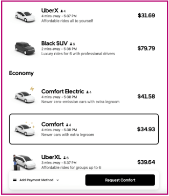
For instance, the Uber app, below, is extremely usable and easy to get started with, making it simple to get a ride.
As a UX designer, you should prioritise usability over aesthetics. Incorporate usability testing into the design process to identify (and fix) usability issues, ensuring a user-friendly and efficient user experience overall.
Bear these seven UX design principles in mind and you’ll be well on your way to creating enjoyable products that are a hit with your users.
Want to attend a university-accredited program to learn more about UX? Consider UX Design Institute’s Professional Diploma in UX Design
And wWant to learn even more UX principles and concepts? Check out this glossary of 101 UX terms all designers should know and the 21 laws of UX.

