Whether you’re a budding UX designer or a seasoned professional, there’s lots you can learn from others in the field.
Are you building your UX portfolio from scratch, or revamping your existing website? Then you’ll want to get some inspiration first.
Here is our hand-picked selection of the best UX portfolio examples from around the world—and what you can learn from them.
1. Niya Watkins
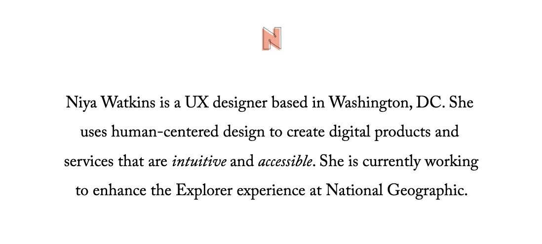
Niya Watkins is a UX designer based in Washington, DC. Her UX portfolio example ticks many of the obvious boxes—clean design, user-friendly navigation and well-structured case studies.
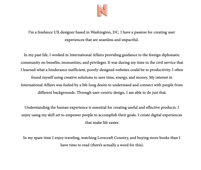
However, what really stands out in Niya’s UX portfolio is her “About” section.
Now, your “About me” page is not necessarily the first thing someone will look at when they’re viewing your UX portfolio. But if they do navigate that far, it’s an important opportunity to tell your story and say something memorable.
Niya does exactly that in just four short paragraphs.
First, she states exactly who she is and what she does.
Then (and this is the best part) she tells the story of what she was doing prior to UX—and how it steered her towards a career in design.
Niya describes how, while working in the civil service, she learned “what a hindrance inefficient, poorly-designed websites could be to productivity” and how she often found herself “using creative solutions to save time, energy and money”.
She goes on to share her beliefs about what it takes to be a good designer: An understanding of the human experience. Last but not least, Niya tells us about her interests outside of design—a personal touch that helps to connect with the reader.
Niya’s “About” section is powerful, personal, and memorable. It’s not just an afterthought; it’s a crucial part of her portfolio and her personal brand.
Key takeaway from Niya’s UX portfolio examples:
Your “About me” page matters more than you might think. Follow in Niya’s footsteps and craft an “About” section that:
- Tells a personal, meaningful story about why you’re passionate about UX
- Fits into four short paragraphs (or less)
- Gives the reader a glimpse of the human behind the portfolio
2. Olivia Truong
Olivia Truong is a New York-based product designer with one of the most beautiful UX portfolios on the web.
But we’re not here to simply admire her delightful homepage. The real star of the show in Olivia’s portfolio is her richly embellished UX case studies.
Case studies are the centrepiece of your UX portfolio. They don’t just showcase your best work; they demonstrate your understanding of the UX process and your approach to problem-solving.
The best UX case studies are enriched with supporting materials beyond just the finished product. And, if you ever need inspiration for what that could look like, turn straight to Olivia Truong’s UX portfolio.
Olivia doesn’t just include app screens and wireframes. She goes above and beyond to include data, photos, quotes, and interactive prototypes.
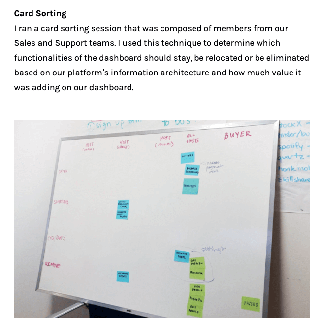
Here’s a photo of a card-sorting exercise Olivia completed as part of her Universe Dashboard case study:
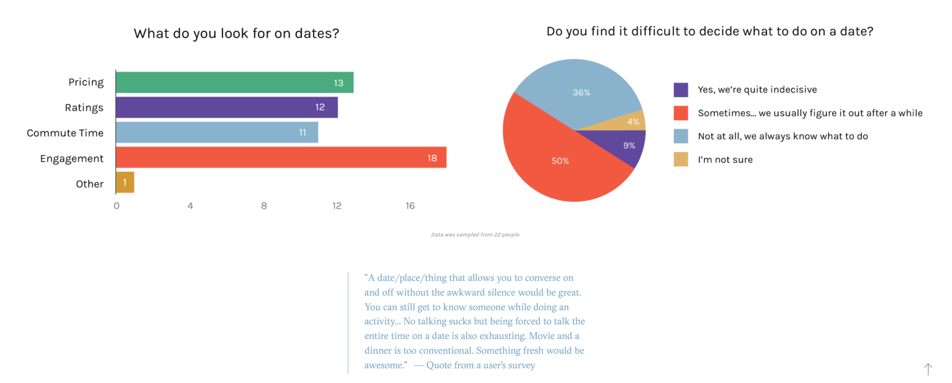
Here are some data visualisations and a quote gathered as part of her user research for a dating activity app:
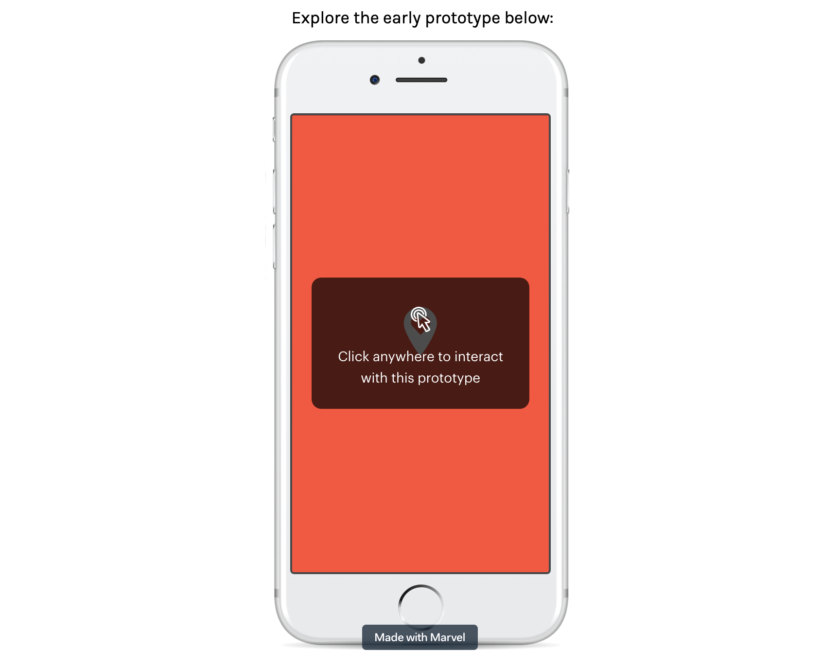
In the same dating app case study, Olivia includes this interactive prototype. If you view it on Olivia’s website, you can click around it to see how the app works:
And here are some nicely captioned photos of ethnographic field studies Olivia conducted as part of her Ticket Manager case study:
Olivia’s case studies are rich with a variety of artefacts. This allows us to get right up close to her process and to see how she works—and that’s exactly what hiring managers want when they look at your UX portfolio.
Key takeaway from Olivia’s UX portfolio examples:
Your portfolio should demonstrate how you work as a designer. Take inspiration from Olivia and bring your case studies to life with a variety of images and media. Beyond the usual wireframes and final screens, consider including:
- Photos or videos of you in action (e.g. conducting user interviews, card sorting or affinity mapping)
- Quotes and data visualizations from your user research
- Interactive prototypes
3. Pendar Yousefi
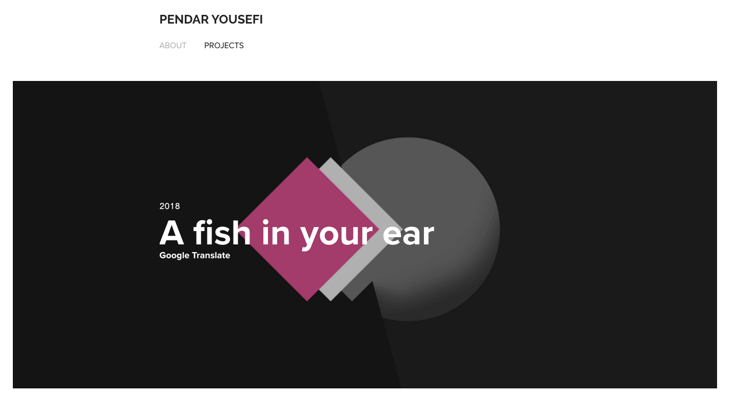
Pendar Yousefi is currently Head of UX for Google Translate & Languages, and his UX portfolio is a lesson in the power of storytelling.
Navigate to any one of Pendar’s UX case studies and you’ll find not just a clearly explained process, but a captivating, fully immersive narration of his UX work.
Pendar is clearly a natural storyteller, and he presents his UX case studies like epic adventures. He starts by setting the scene, providing relevant (and riveting) context before leading up to the problem statement.
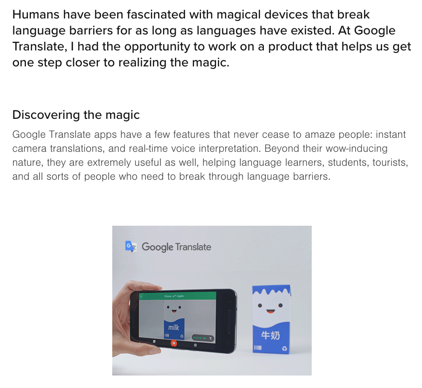
For example, his Google Translate case study opens with:
“Humans have been fascinated with magical devices that break language barriers for as long as languages have existed. At Google Translate, I had the opportunity to work on a product that helps us get one step closer to realizing the magic.”
He then narrows the focus towards the product and the people he’s designing for:
“Google Translate apps have a few features that never cease to amaze people: instant camera translations, and real-time voice interpretation. Beyond their wow-inducing nature, they are extremely useful as well, helping language learners, students, tourists, and all sorts of people who need to break through language barriers.”
Having well and truly captured the reader’s attention, he sets out a clear problem statement followed by a detailed account of his journey towards the solution.
Throughout his case studies, Pendar shares insights into his thought process, using phrases such as “So we went back to the drawing board and asked ourselves…” and “So what was going on? When we dug in, we found that…”
Pendar takes the reader on a journey, writing in a way that almost makes you feel like you’re working alongside him—or at least witnessing him at work. An extremely powerful technique for demonstrating your approach to UX.
Key takeaway from Pendar’s UX portfolio examples:
Pendar uses storytelling to share his design process and his approach to problem-solving. When writing out case studies for your UX portfolio, take a leaf out of Pendar’s book. Aim to:
- Craft stories (i.e. case studies) that have a clear beginning, middle and end, with you as the protagonist
- Set the scene and capture the reader’s attention. Who are you designing for and why? What’s the context behind the design problem, and why should the reader care?
- Write in the first-person voice, inviting the reader into your thought process
4. Stephanie Lawrence
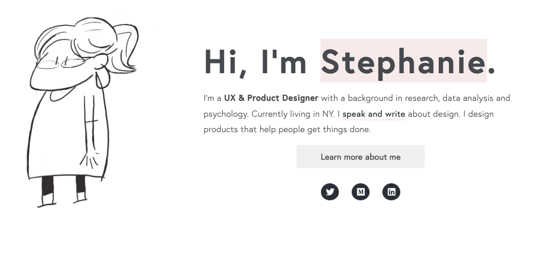
Stephanie Lawrence is a UX and product designer with a background in research, data analysis and psychology.
There’s lots to love about Stephanie’s UX portfolio, starting with those delightful cartoonesque animations and the clean overall aesthetic.
But, as you know, the best UX portfolios don’t simply look great. Above all else, they demonstrate what kind of designer you are.
Still, as you’re building out your UX case studies, you might be wondering: How can I stand out from other designers? Aren’t we all following the same formula?
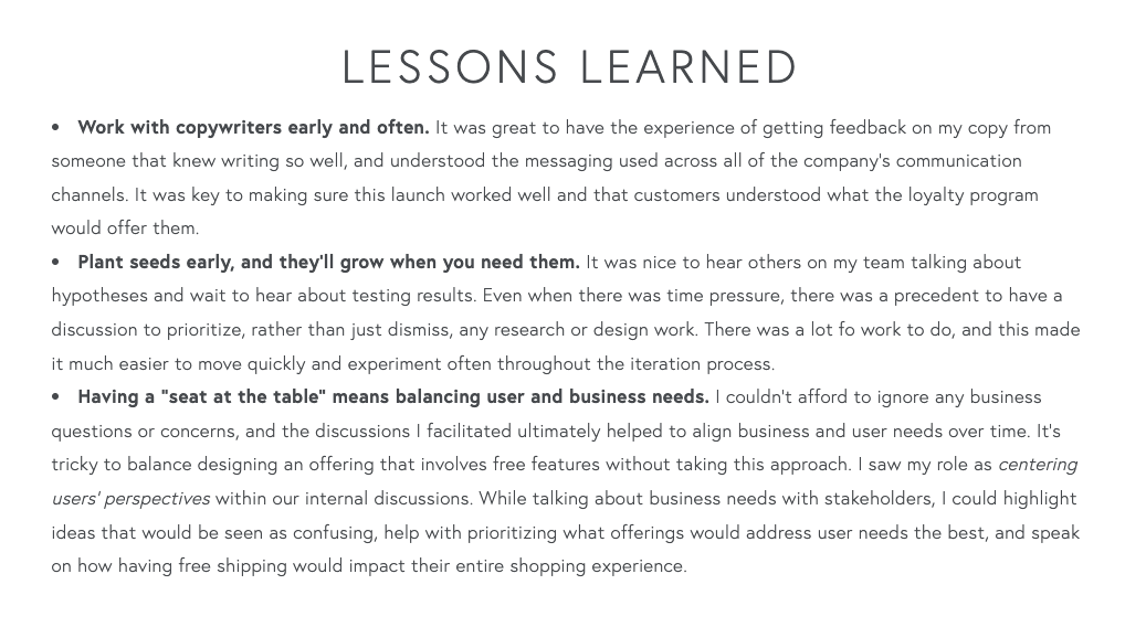
Look no further than Stephanie’s portfolio. Stephanie adds a noteworthy twist to her UX case studies with a “Lessons Learned” section.
Beneath the “Results”, Stephanie outlines her key learnings from each project. She shares things like “Work with copywriters early and often”, “Don’t make assumptions” and “What I will do differently next time”.
This is powerful not only because it’s unique, but also because it sends a clear message about Stephanie: that she’s a reflective designer who continuously strives to learn and grow.
And that’s what great UX design is all about—constantly learning and iterating, refining your process, and understanding the impact of your work on both the end users and the business.
Stephanie demonstrates that highly sought-after quality of self-awareness, all in the simplicity of a bullet-point list.
Key takeaway from Stephanie’s UX portfolio examples:
Hiring managers don’t just want to see evidence of your hard skills through wireframes and prototypes; they want to know what it’s like to work with you. Follow Stephanie’s lead and infuse your UX case studies with reflections and learnings. You can do this by:
- Highlighting challenges you encountered during a particular design project, and how you overcame them
- Stating what you’d do better or differently if you were to start this project again
- Pulling out key takeaways in a bullet-point list at the end of each case study
5. Jeff Shibasaki
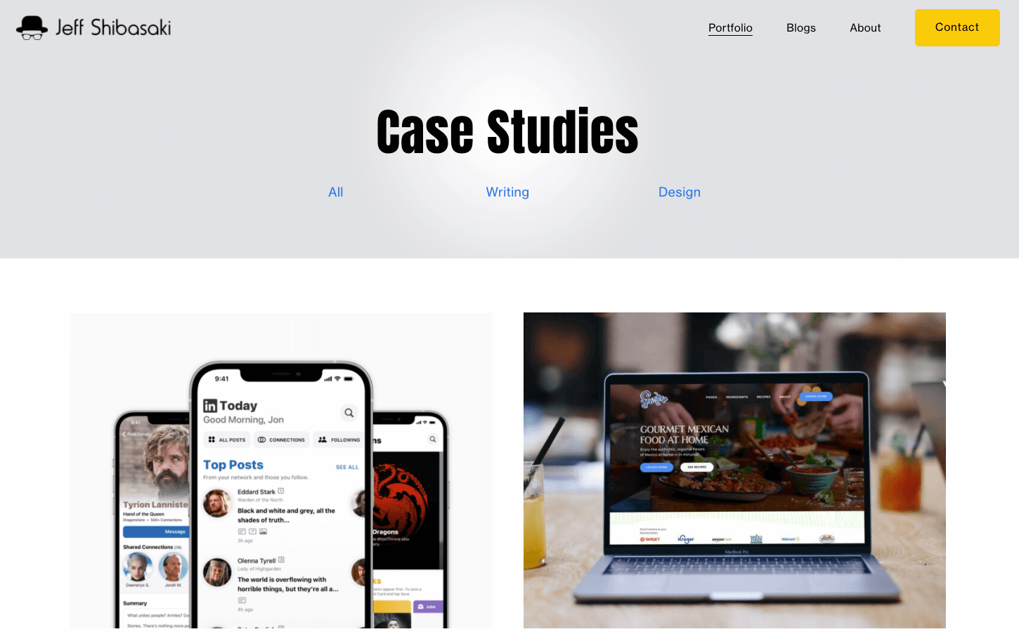
Jeff Shibasaki is an Atlanta-based UX designer and writer—and an esteemed connoisseur of the unsolicited redesign.
Like a true UXer, Jeff sees opportunities everywhere to improve the products and services around him. And he turns them into case studies for his UX portfolio. In fact, about 90% of Jeff’s UX portfolio consists of unsolicited redesigns.
As you’ll see from Jeff’s portfolio, virtually anything can be redesigned—from websites and apps to processes and services. This is great news if you’re short on material for your UX portfolio.
Jeff sets an excellent example of how you can take any UX problem you encounter, tackle it like a real design project, and feature it in your portfolio.
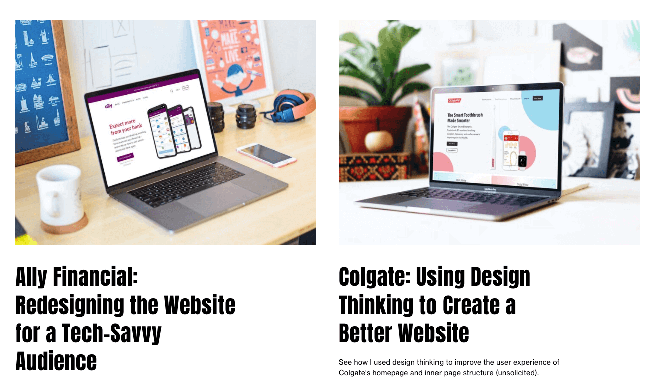
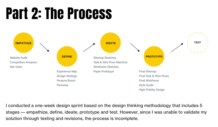
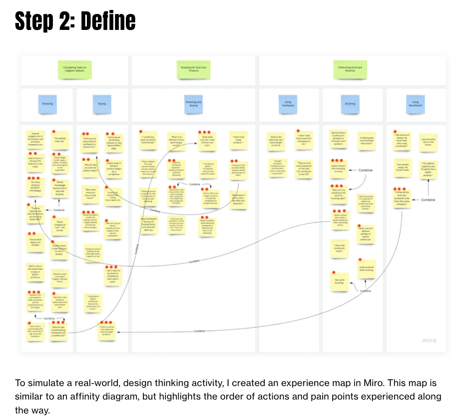
Check out Jeff’s unsolicited redesign of the Colgate website for inspiration. It looks just like any other UX case study: it has a clear problem statement, it describes the process Jeff followed, and presents the final solution.
The only clear (and critical) difference is that all of Jeff’s unsolicited redesigns are labelled as such. You must be transparent about the fact that it’s an unsolicited redesign rather than a paid or requested project—you don’t want to run into any issues with the company, or be making any false claims.
Key takeaway from Jeff’s UX portfolio examples:
You don’t need loads of real-world experience to demonstrate your UX skills. Jeff has created a professional and varied portfolio based largely on unsolicited redesigns—and you can, too. Here’s how to get started with unsolicited redesigns:
- Look for opportunities to apply your UX skills. Could your banking app benefit from a redesign? Is your favourite dating app lacking certain features?
- Apply the UX process and document it in the form of a UX case study
- Always state clearly and prominently that it’s an unsolicited redesign
6. Lola Jiang
Lola Jiang is a UX designer based in California, currently working at Google.
Not only is Lola an excellent designer with a perfectly polished UX portfolio. She also knows exactly how to communicate the value of her work through measurable outcomes and metrics.
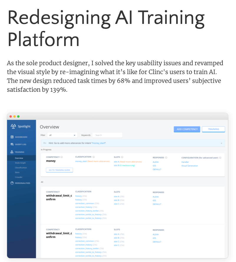
Take Lola’s AI training platform redesign for example.
The very first thing she tells us, right at the top of the page, is that the new design she came up with “reduced task times by 68%” and “improved users’ subjective satisfaction by 139%”.
We haven’t even seen how she did it yet, but we’re already impressed.
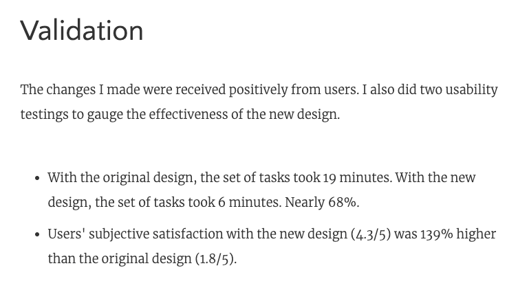
Further down, she elaborates on these outcomes in a dedicated “Validation” section.
Here, Lola shares the results of her usability tests, explaining how users were able to complete a given set of tasks in 6 minutes with the new design (compared to 19 minutes with the old design).
She also states that the new design increased user satisfaction by 139%—and explains how this figure was calculated.
In just a few sentences, Lola has provided tangible, measurable proof of the value of her work. This is backed up by some short, personal quotes provided by real users.
The effect is powerful. Before even reading the full case study, we believe that Lola is an impactful, results-driven designer. A compelling case for including data in your UX portfolio!
Key takeaway from Lola’s UX portfolio examples:
UX design isn’t just about finding solutions; it’s about improving people’s lives in some way. Likewise, your UX portfolio isn’t just about showcasing your work; it should also communicate real-world impact and value.
Here are some ways you can add proof of impact to your portfolio:
- Write a clear statement of impact for each case study. For example: “I redesigned the Treatwell app to improve customer satisfaction ratings by 87%”.
- Include quantitative data (e.g. a % boost in customer retention) and data visualizations (such as bar charts)
- Feature testimonials from users describing how your work has improved their life or work in some way
7. Jonathon Dakarai
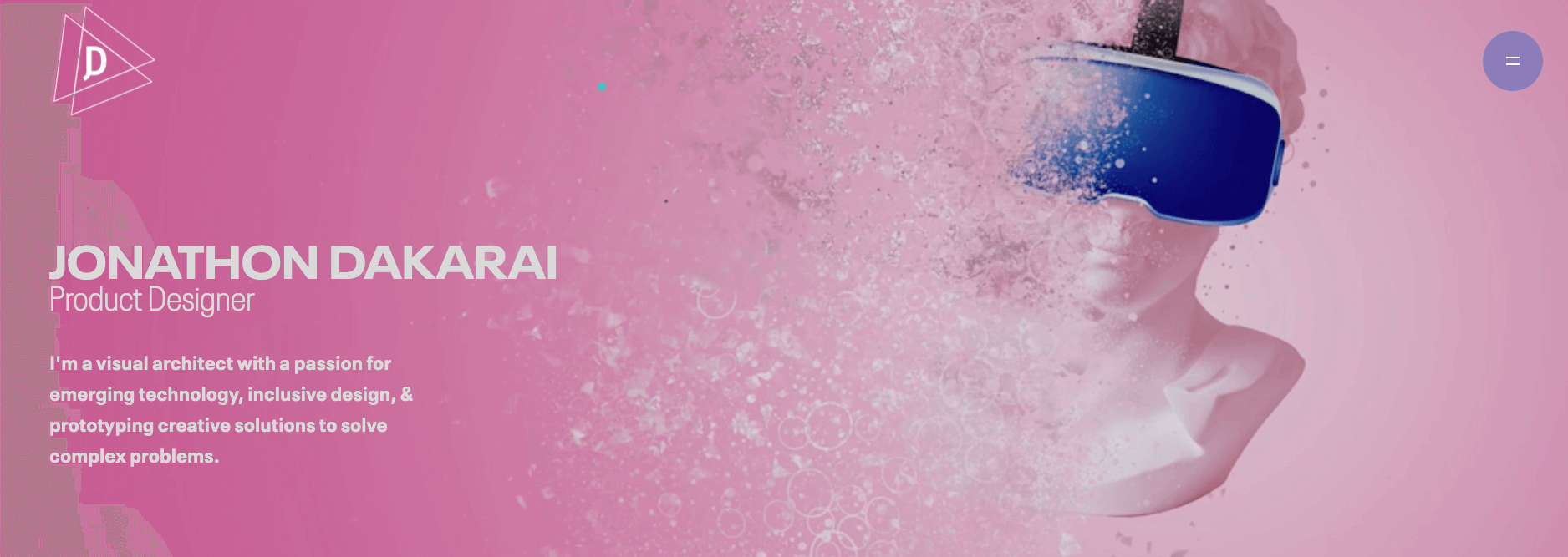
Jonathon Dakarai is a product designer and visual architect whose UX portfolio is a true work of art.
And, when you leave the homepage to view Jonathon’s actual work, you won’t be disappointed. In fact, we think Jonathon deserves an award for most impressive UX case study.
One of the biggest challenges you face when building your UX portfolio is organizing your work into coherent, insightful case studies. You want to include all different aspects of your process, but you don’t want to overwhelm the reader or lose them along the way.
This is especially true of projects where you’re involved in not just one or two stages, but the entire process from conceptualization to final UI.
So how can you condense a whole project’s worth of work into a single case study?
Take Jonathon’s believr case study for inspiration.
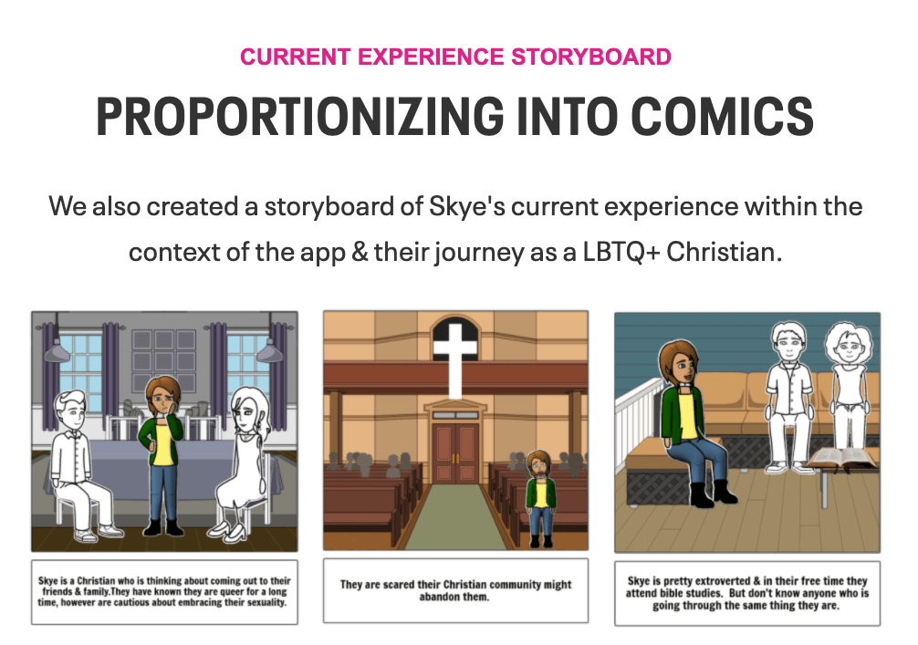
Over the course of a 3-week design sprint, Jonathon was tasked with designing a dating app for LGBTQ+ Christians looking to connect with friends or dates.
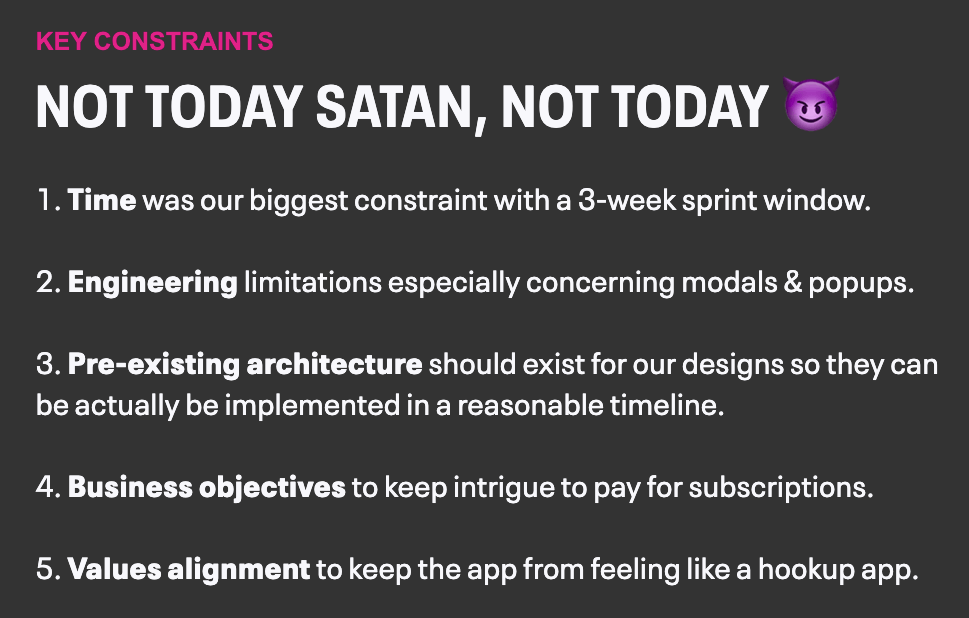
Jonathon’s portfolio pretty much ticks all the “good UX case study” boxes. Jonathon provides relevant context, defines the challenge, explains their role, and even outlines key constraints of the project.
After extensive scene-setting, Jonathon documents the process they followed to reach the final solution—from survey design and user interviews, all the way through to storyboarding, prototyping and usability testing.
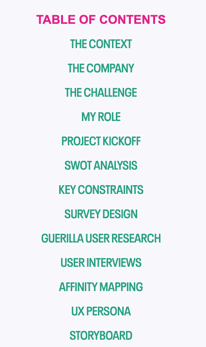
Jonathon’s believr case study is extremely long, but they’ve designed it like a true UXer. Right at the top of the case study, you’ll find a clickable table of contents, allowing you to jump to the sections you’re most interested in.
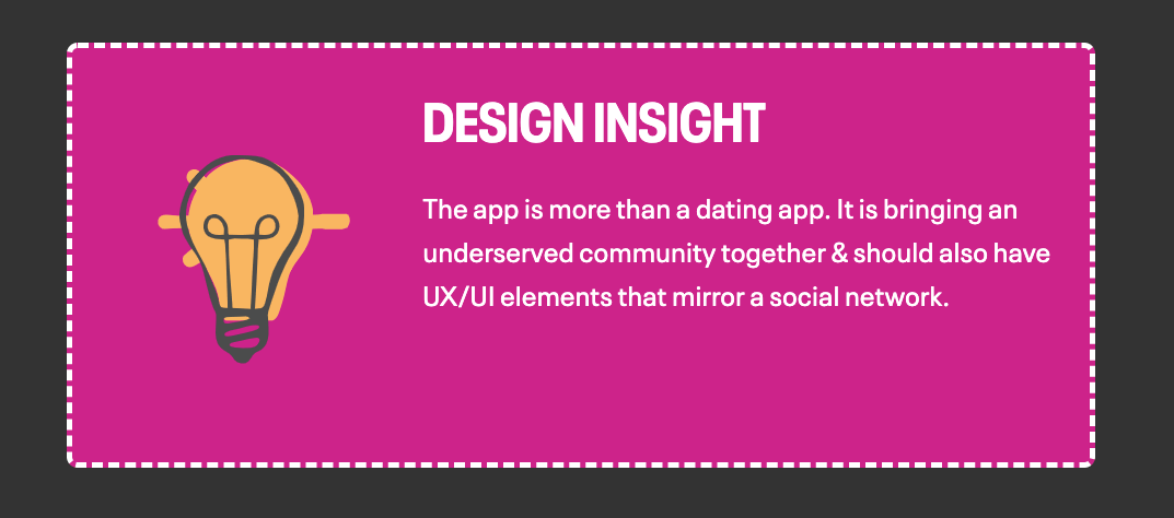
And, in amongst the sea of information, you’ll find these eye-catching pink boxes highlighting key design insights:
Jonathon has gone above and beyond to build the most comprehensive, insightful, easy-to-navigate UX case study we think we’ve ever seen.
Key takeaway from Jonathon’s UX portfolio examples:
Not all UX case studies need to be as long as this one. But, if you are struggling to condense everything down, try Jonathon’s approach instead. Focus not on cutting information out, but on presenting it in the most logical, user-friendly way possible.
Here are some tips:
- Include a clickable menu right at the top of your case study, allowing the user to jump to specific sections without scrolling
- Order your case study logically, mirroring the way you approached the design task itself
- Break it up with highlight boxes and key takeaways for each section
8. Elizé Todd
Elizé Todd is a UX designer, speaker and influencer based in LA.
Elizé is pretty well-known in the industry, and her portfolio is a great example of how your website can be used to showcase your skills and expertise beyond the UX process itself.
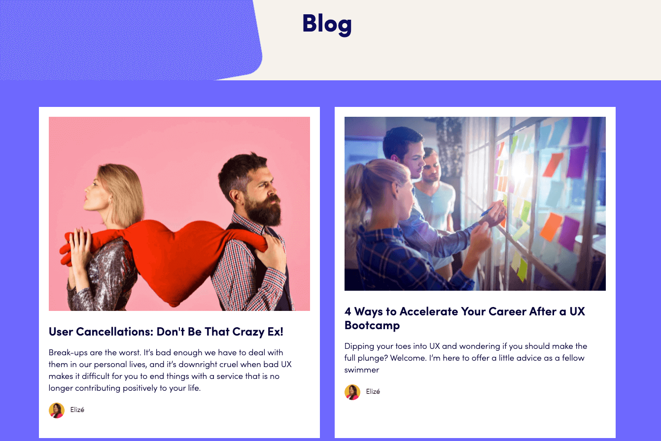
In addition to the customary case studies, Elizé’s portfolio also features events and workshops, educational content from her YouTube channel, and a blog full of tips and advice for early-career UX designers.
As she’s progressed in her career and grown her following, Elizé has adapted her portfolio website to stay in keeping with her personal brand. As such, her portfolio focuses on what she can offer as a teacher and mentor in the field.
That’s what’s displayed most prominently on her homepage.
Elizé uses her portfolio not just to showcase her work, but as an all-encompassing marketing tool. It conveys her personal brand and reflects who she is—and the value she brings to the design industry.
Key takeaway from Elizé’s UX portfolio examples:
Your portfolio can showcase much more than just your knowledge of the UX process. Take inspiration from Elizé and treat your portfolio as a branding and marketing tool. In addition to your UX case studies, here are some ways to highlight your expertise:
- Include a blog section where you write about your experiences as a UX designer, or share tips and advice
- Showcase any achievements you’re especially proud of—whether it’s hosting an online UX meetup or winning an award
- Share any other design-related work or passion projects, such as illustrations, animations, or coding work
9. Anca Dobrea
Anca Dobrea is a UX designer based in Dublin, Ireland. She’s a newcomer to the field, and her portfolio is proof that you don’t need a ton of experience to create a professional, attention-worthy UX portfolio.
Anca used to work in digital marketing. After completing her UX certification with the UX Design Institute in 2020, she landed her first job as a UX designer.
She’s not been in UX for long, but her portfolio has every base covered: A meaningful “About Me” page, and 3 well-structured case studies to showcase her UX skills.
And, when you dig deeper into Anca’s case studies, you’ll find that she’s an extremely creative designer who never let her lack of on-the-job experience hold her back.
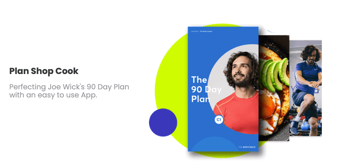
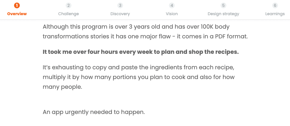
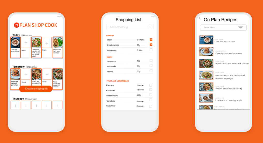
In her Plan Shop Cook case study, Anca demonstrates how she applied her UX skills to a real user problem she was facing. As a user of the Joe Wicks Body Coach programme, she discovered its one major flaw: that it comes in the form of a PDF.
Anca notes how “It took me over four hours every week to plan and shop the recipes. An app urgently needed to happen”.
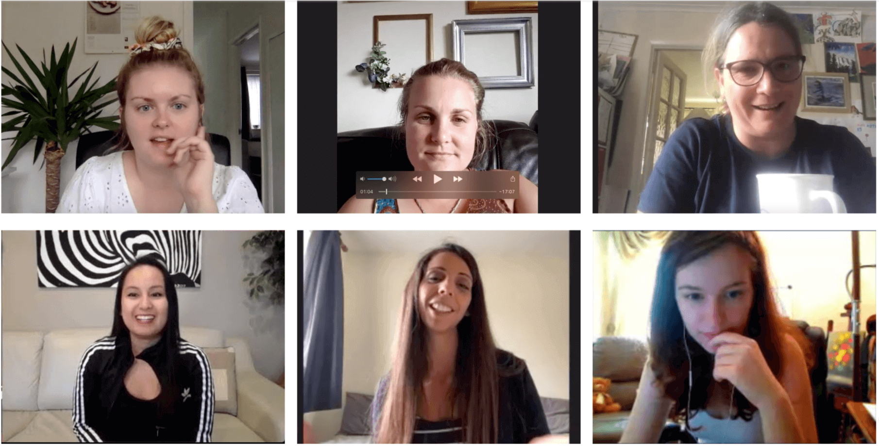
From there, Anca embarked on a full-blown UX project, using the Joe Wicks Facebook group to conduct user research via Zoom.
And, as all good designers do, she documented her process and her learnings for her UX portfolio.
Anca’s portfolio demonstrates exactly what hiring managers want to see: that she’s a solution-driven designer focused on solving real user problems. That’s what stands out above all else—not her newcomer status.
Key takeaway from Anca’s UX portfolio examples:
You don’t need on-the-job experience to create a professional UX portfolio. Apply your UX skills to real user problems and turn them into case studies, just like Anca did. Here are some tips for creating your first portfolio without any experience:
- Volunteer your UX skills to a non-profit organisation or local charity
- Design to solve a problem that you personally encounter
- Always follow the same process you would apply if you were hired by a client, and document it as though it’s a real project (it is!)
Feeling inspired? Learn more about what to include in your UX portfolio here, or get started with our step-by-step guide on how to build your UX portfolio from scratch.

