When you think of UX design, you think of user-friendly interfaces that have been designed for accessibility and transparency. After all, the whole point of UX is positive user experiences, right?
Well, not always.
In some cases, UX designers can take advantage of how users habitually interact with websites and apps to subtly manipulate them into performing certain actions. This is known as dark patterns.
This blog post will lift the lid on dark patterns in UX; from which kinds of dark patterns you should look out for, to why UX designers should avoid using them.
Here’s what we’ll cover:
- What are dark patterns in UX? A definition
- Why should UX designers avoid using dark patterns?
- The 12 types of dark patterns (with examples)
- How to avoid dark patterns: Best practices for UX designers
- Round up
What are dark patterns in UX? A definition
A dark pattern is a design feature that subtly encourages users to perform a specific action. Just like good UX, most dark patterns are invisible to users. But unlike good UX, dark patterns benefit the company (rather than the user) by using deception as a tool for conversion.
Often disguised as normal user interface elements or content, dark patterns can deceive users into:
- Paying more for a service or product
- Subscribing or opting in to ongoing communications from the company
- Sharing their data for company use
- Making ill-informed decisions based on fake or vague information
- Agreeing to unsavoury terms and conditions
UK–based UX designer Harry Brignull first coined the term in 2010, defining dark patterns as “a user interface that has been carefully crafted to trick users into doing things, such as buying insurance with their purchase or signing up for recurring bills.”
A pretty scathing definition—but nevertheless, dark patterns remain just as prevalent today. In 2022, the Federal Trade Commission (FTC) released a report that highlighted a significant rise in the use of dark patterns across sectors and products; from e-commerce to children’s apps.
“Our report shows how more and more companies are using digital dark patterns to trick people into buying products and giving away their personal information,” said Samuel Levine, Director of the FTC’s Bureau of Consumer Protection.
Why should UX designers avoid using dark patterns?
Dark patterns are widely considered to be unethical, and some States in the US have even passed legislation to make them illegal. Other companies have normalised them so much that they’ve absorbed dark patterns into their design conventions.
So are dark patterns really that harmful? And what’s the case for avoiding them?
Dark patterns exploit human psychology
Users tend to interact with websites and apps in the same way—and have come to expect some elements to be in certain places; like a menu bar at the top of the page, or a ‘next page’ button at the bottom right. This means that when a user lands on a website, they’ll scan the content rather than reading everything carefully—and proceed based on the visual cues they associate with certain actions.
Dark patterns will take advantage of the way that users intuitively use websites and apps by disguising hidden clauses or opt-ins in places that users wouldn’t usually pay that much attention to. Users might then blame themselves for being fooled, thinking “how did I not spot that!”
Dark patterns can damage a brand’s reputation
No one likes to be deceived—especially not by a company who they assumed had their best interests in mind. It’s also important to note that not all dark patterns are invisible to users: Some are more obvious than others, and can result in frustrating user experiences, which, in turn, can lead to negative feedback—and a complete breakdown of trust.
These days, most consumers rely heavily on the reviews and experiences of other users to help them decide whether a brand is worth their time. News about dishonest or deceptive practices can spread like wildfire—and you’ll run the risk of losing future customers, as well as existing ones.
Dark patterns go against the principles of good UX
Arguably the most compelling reason to steer clear of dark patterns is that they’re fundamentally counter-intuitive to good UX design. UX design focuses on understanding user needs, and advocating for those needs at every stage of the product design process to ensure the user has a positive, friction-free experience. After all, a positive experience means the user will actually want to visit your website or app again.
On the other hand, dark patterns lead to interactions that benefit the company, not the user. Dark patterns seek to confuse and deceive users, rather than provide clarity and accessibility.
The 12 types of dark patterns (with examples)
Hidden costs
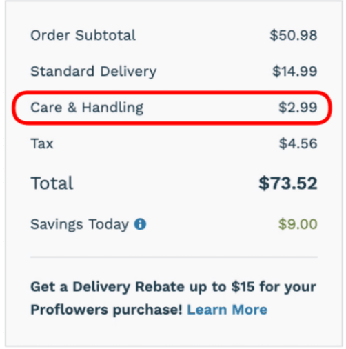
A common practice in e-commerce, hidden costs involves tacking additional fees (i.e., service fees, shipping costs, VAT) onto your order to make the end price significantly higher than originally advertised.
[Via Fyresite]
Bait and switch
With the bait and switch, companies will ‘bait’ users into clicking on buttons they think will lead them to certain pages or initiate a specific action—only for something unexpected to happen instead. This dark pattern famously landed Microsoft in hot water when Windows customers tried to close a pop-up asking them to upgrade the software—but discovered that the ‘close’ button triggered an immediate software update.
[Via Deceptive Design]
Forced continuity
Forced continuity takes place when a company tricks you into entering your payment details to sign up for a ‘free trial,’ only to start billing you as soon as that free trial ends (with no warning). Amazon’s subscription model is a classic example: Users will click ‘subscribe and save’ for a cheaper price, unaware that Amazon will automatically re-order the item without asking.
[Via Evident ID]
Roach motel
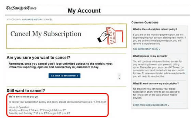
Have you ever felt like subscribing to a service was the easiest thing in the world, but every time you go to cancel your subscription, it feels impossible? This is known as roach motel: When companies make signing up intentionally straightforward (i.e., a two-step process) but add unnecessary steps to cancelling your account—or bury the ‘unsubscribe’ button in a small, unsuspecting corner of the site.
In this case, companies are banking on users getting so frustrated that they eventually give up and keep the subscription!
[Via Pivotal IT]
Misdirection
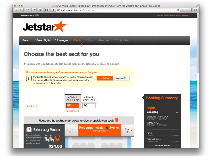
Misdirection distracts the users from the task at hand by encouraging them to focus on something different. In this example, this aviation company is distracting the user from selecting their own seats (or opting out of the selection altogether) with a bright banner that lets you know that they’ve pre-selected the seats on your behalf, with an added cost.
[Via Deceptive Design]
Confirm-shaming
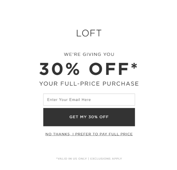
Confirm-shaming uses clever wording to shame users for opting out or declining a service—and aims to guilt trip them into changing their minds. For example, the opt-out button on a newsletter pop-up might read “no thanks, I don’t want amazing deals in my inbox” rather than a simple “no thanks.” When worded like this, the alternative sounds much more desirable—leading users to think, “Hmm, maybe I do want deals in my inbox!”
[Via UX Booth]
Sneak into basket
As the name suggests, this dark pattern sees companies sneak undesired items into users’ baskets somewhere along their purchasing journey. This is usually due to a hard-to-spot checkbox or drop-down that users must select to opt out of an additional cost.
[Via PNGKit]
Friend spam
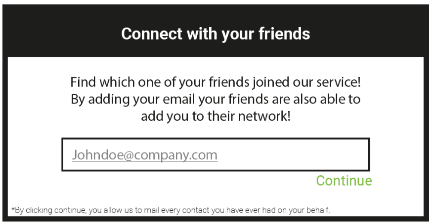
Friend spam is when a platform asks for your social media login details under the guise of helping you connect with people you know. Instead, they spam your contacts with messages that appear as if they’ve come from you, but have actually come from the system.
[Via UX Collective]
Disguised ads
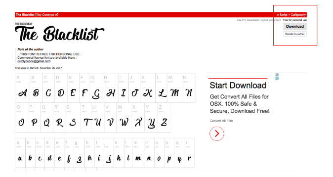
This is one of the most common dark patterns used on free sites. When you visit a page, ads may be disguised as something else, like an article or news item, or placed in a way that makes them hard to distinguish from the real content—like a ‘download’ button on a free font website. You usually won’t realise it’s an ad until you click on it, and suddenly get spammed with pop-ups or taken to an unrelated product page.
[Via Medium]
Trick questions
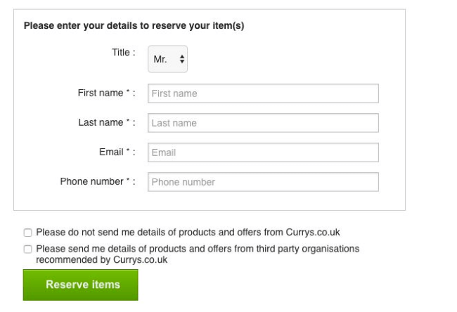
Trick questions often show up on forms, and involve a subtle language that tricks users into answering a question wrong—or agreeing to something they didn’t intend to. Below is a prime example: Users would usually check a box to opt in, but due to a subtle change in language that most users would miss, they instead have to check the box to opt out.
[Via Deceptive Design]
FOMO
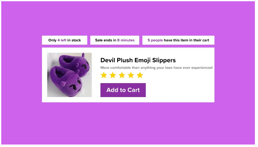
FOMO, or ‘fear of missing out,’ is used to pressure users into quick purchases by including information about how many people have bought—or are intending to buy—the item within a specific time frame (i.e., in the last day or hour). This gives users the impression that the item is in high demand, leading them to think they have to act fast or they might miss out.
[Via Medium]
Price comparison prevention
Comparing the prices of similar items is a common step in any user purchasing journey. Some websites automatically show similar products for an easy price comparison, but others will intentionally hide or obscure pricing information to dissuade users from choosing the cheaper alternative.
[Via Shopify]
How to avoid dark patterns: Best practices for UX designers
Design for transparency
The best way to build trust and loyalty with your customers is to design for transparency.
This includes:
- Making the option to opt out, unsubscribe, or cancel as clear as possible
- Using neutral, straightforward language that helps users make informed decisions
- Making sure each page or element appears as expected
Designers can influence how users interact with the digital product, from the colours of the buttons to the order of information on the page. But it’s their responsibility to use that skill to benefit the user, not the company. That means making the most essential bits of information as clear as possible.
The more information users have, the more empowered and confident they’ll feel to give the company their money.
Set ethical design standards
Dark patterns can often be so subtle—and seemingly innocent—that they slip through the cracks, even if a design team theoretically doesn’t agree with them. A good way to avoid dark patterns is to emphasise ethical design in the company’s design system: i.e., the practices, policies, and rules that guide the product development process.
In addition to strict guidelines against the use of dark patterns, the design system could include ethical alternatives for common design patterns. With an easy reference point for viable, product-specific alternatives to dark patterns, ethical design practices will quickly become the new company standard.
Research and test
One of the best ways to avoid dark patterns—and find suitable alternatives—is to conduct extensive user research to determine users’ needs, pain points, and expectations. These insights will highlight what information and context users need at each stage of the journey, and how to emphasise them throughout the design.
Once the website or app is up and running, it’s also worth testing the product with real users so you can continue optimising the product with user needs in mind.
Read next: How to conduct UX testing
Practice empathy
A critical pillar of UX is being able to put yourself in the users’ shoes. If you’ve bought anything online, chances are you’ve fallen victim to a few hundred dark patterns—some you were aware of, and some which went over your head.
Think back to a time when you felt frustrated about not being able to find an ‘unsubscribe’ button, or the heartbreak you felt in response to an item you wanted suddenly being out of your budget thanks to unexpected additional costs. Keep that feeling in mind whenever you might be tempted to slip a dark pattern into a checkout page or form. If you don’t like being deceived, your customers won’t either!
Balance user needs with business goals
In some cases, it’s sales and advertising executives—not designers—who push the use of dark patterns. Sales and advertising executives are primarily concerned with making the business more money, whereas UX designers will prioritise user needs above all else. These conflicting priorities can sometimes lead to a clash.
To make sure you’re designing a product that benefits everyone, it’s worth collaborating with key stakeholders throughout the business to re-frame the benefits of good UX design (i.e., Better user engagement, more trust, competitive advantage) so that they correlate with business goals (i.e., Increased profits, better reviews, more brand advocacy).
We expand on this topic in our guide to balancing business needs and user needs in a product.
Round up
Unfortunately, dark patterns are commonplace in today’s digital landscape. Some companies would argue that they’re relatively harmless. But using dark patterns can have severe long-term effects on the overall user experience of a website or app, like losing customers or a damaged reputation, that overshadow any short term benefits—like increased conversion or higher sales.
The bottom line is that dark patterns contradict the fundamental principles of UX design. Good UX is driven by empathy, transparency, and user-centricity. Stick to these principles, and the trust you build with your users will only grow!
To learn about UX design, check out these blog posts:
- UX design for beginners: How to learn UX and get started in the field
- What is the UX design process? A step-by-step guide
- The value of UX design

